The original Optic Stats Stack has been replaced by the Optic Stats 2 Stack. If you currently own Optic Stats you can upgrade by using the Purchase Order Lookup Form. The download link for Optic Stats will download Optic Stats 2.
Naming
Settings Panel
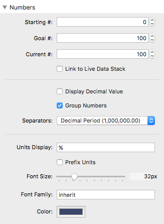
Starting #: The number that the Stack will start counting from (when the ‘Count Numbers’ animation has been enabled).
Goal #: The number used to determine 100% Fill. Note: Setting this value to ‘0’ will cause the ‘Count Numbers’ animation to count down instead of up.
Current #: The number used in conjunction with the Goal # to determine the current Fill percentage. This value will be displayed after the ‘Count Numbers’ animation has been completed.
Link to Live Data Stack: Requires the Live Data Stack, will allow you to import a Current # value from a Google Spreadsheet.
Display Decimal Value: Optionally add a decimal value to the Current #. Decimal numbers will animate if the ‘Count Numbers’ animation has been enabled.
Group Numbers: Adds a separator in-between groups of 3 numbers. (IE 1,000,000 or 100.000.000)
Separators: Change the format of the decimal and number grouping separators.
Units: This is what will display directly to the right of the Current #.
Prefix Units: This will move the Units to the left of the Current #.
Font Size: Adjust the size of the Number and Units.
Font Family: Font the Number and units will use. The default value ‘inherit’ will use whatever font your Theme is currently using. See this page for a list of usable fonts. You can also add a custom name of a font that you have imported.
Color: Adjust the color of the Number and Units.
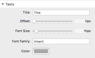
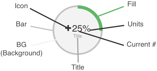
Title: This is a title that will display below the number and units.
Offset: Increasing this value will add space in-between the Number and Title.
Font Size: Adjust the size of the Title.
Font Family: Font the Title will use. The default value ‘inherit’ will use whatever font your Theme is currently using. See this page for a list of usable fonts. You can also add a custom name of a font that you have imported.
Color: Adjust the color of the Title.
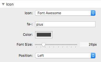
Icon: Optionally add an icon to display next to the Current #. You can either use Font Awesome (must add the Font Awesome Stack to the editor) or use a custom square image.
fa-: Add the name of the Font-Awesome icon you want to use here. For a complete list of usable icons and their titles check out this link here: http://fontawesome.io/icons/
Color: Adjust the color of the Icon.
Font Size: Adjust the size of the Icon.
Position: Change the position of where the Icon is displayed.
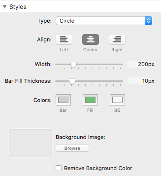
Type: Choose from 7 display type options. Each has a unique design and animation.
Align: Change the alignment of the entire Optic Stats Stack.
Width: Define the width (will also define the height if the height option is not present) of the Optic Stats Stack. Note: This stack is responsive, so in the event you define a dimension that is larger than the stack’s container it will shrink to fit the container.
Height: Define the height of the Optic Stats Stack. This option is only available when the Type has been set to ‘Horizontal Line’ or ‘Vertical Line’.
Bar Fill Thickness: This sets how wide the Bar or border displays.
Colors (Bar): This controls color of the progress bar container.
Colors (Fill): This controls the color of the progress bar.
Colors (BG): This controls the color of the circle’s background.
Background Image: Optionally add a background image. Note: The image will not be visible if the BG Color is not transparent.
Remove Background Color: If you do not want to use a transparent color, you can enable this option to remove the background color all together and display the image only.
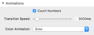
Count Numbers: Enables the number counting animation.
Transition Speed: This sets how long (in milliseconds) the progress bar filling and number counting animations will take to complete once the Stack is visible on screen.
Color Animation: Optionally add a color animation to the Fill.