Setup
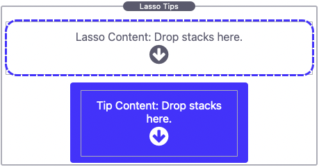
After adding the stack to the Stacks editor you will see two “Drop stacks here” sections to take note of. The Lasso Content section is located at the top and the Tip Content section is located at the bottom.
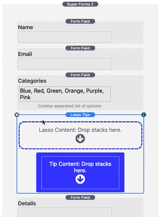
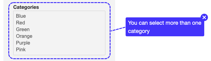
To get started you will need to place the stacks content the tip will apply to in the top Lasso Content section at the top. In our example we will be adding a form field stack that is apart of a form stack. We have first placed the Lasso Tips stack inside of the form stack and then dragged the form field into Lasso Tips.
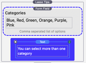
Next we’ll need to add relative content in the Tip Content section at the bottom. You can add just about any stack as content to the tip. In our example we have added a simple text stack.
The only thing left to do is to setup how the tip is displayed/dismissed and customize the style. See the Settings Panel section below to learn how to customize Lasso Tips.
Settings Panel
Lasso Tip Settings
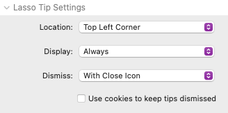
Location
Select from 8 different locations for the tip content to display. The tip will display outside of the Lasso Content area and will automatically adjust position if it would otherwise display offscreen.
Display
Select from 4 different display options.
Always: The tip will always be visible unless dismissed.
On Hover: The tip will only be visible once the mouse has hovered the lasso content.
When Toggled: This option adds a “?” icon toggle to the top right of the lasso content. The tip will only be visible when the toggle is clicked. A close toggle will also be added to the top right of the tip content.
With Custom Link: The tip will only be visible when a custom link is clicked. You can create a custom link by setting any link’s URL value to #lasso-open and placing the link inside of the lasso content area.
Dissmiss
Select from 4 different dismiss options.
On Click: The tip can be dismissed by clicking anywhere on the lasso content or on the tip content. Tip content is not interactive with this option enabled as any click will dismiss the tip.
With Close Icon: This option adds a “x” icon button to the top right of the tip content. The tip can be dismissed by clicking the “x” icon button.
Never: Tips with this option enabled cannot be dismissed.
With Custom Link: The tip can be dismissed when a custom link is clicked. You can create a custom link by setting any link’s URL value to #lasso-close and placing the link inside of the tip content area.
Use cookies to keep tips dismissed
Enable this option to prevent the tip from displaying a second time someone visits the page if they were already dismissed.
Lasso Tip Styles
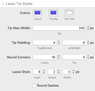
Colors
Lasso: Adjust the color of the dashed lasso that surround the lasso content. Supports opacity.
Tip Bg: Adjust the color of tip content background. Supports opacity. Set the opacity to 0 to make the background transparent.
Tip Text: Adjust the default color of the tip text. This color can be overwritten by other stacks settings used as content.
Tip Max-Width
Defines the max-width of the tip content. If the tip content is simply text the width will match the text width up until this defined max-width.
Tip Padding
These values adjust the padding on the inside of the tip content.
Round Corners
These values adjust the corner rounding of the lasso and tip content.
Lasso Style
These values adjust the style of the dashed lasso.
Dash: Adjusts the length of the dashes.
Space: Adjusts the length of the space between the dashes.
Width: Adjusts the thickness of the dashed lasso.
Round Dashes
Enable this option to round the corners of the dashes.
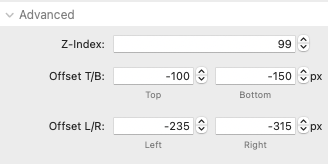
Advanced
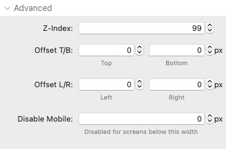
Z-index
Controls the Z positioning of the stack in relation to other stacks on the page. This only needs to be adjusted if content appears over top or underneath the stack that should not.
Offset T/B & Offset L/R
Adjusts the lasso’s dashed top, bottom, left, or right line position. Positive values will increase the distance of the line from the lasso content. Negative values will move the line inwards overlapping the lasso content. This setting is useful when you only want the lasso to wrap/highlight a certain part of an image or element.
Disable Mobile
Optionally disable tips from displaying on devices with a device/browser width below the defined value.
Offsetting the Lasso Position & Nesting tips
There may be situations where you want to highlight a certain section or part of an image/element instead of the entire thing. The Advanced section in the settings panel includes offset values that can be used to adjust where and how large the lasso appears. We would recommend checking out the first example found at the top of the included example project file.
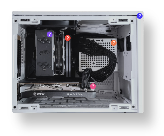
This example uses multiple nested tips each highlighting a different section of an image. The tips are nested by placing each Lasso Tips stack inside of the next stack’s Lasso Content area with the last stack containing the actual image.
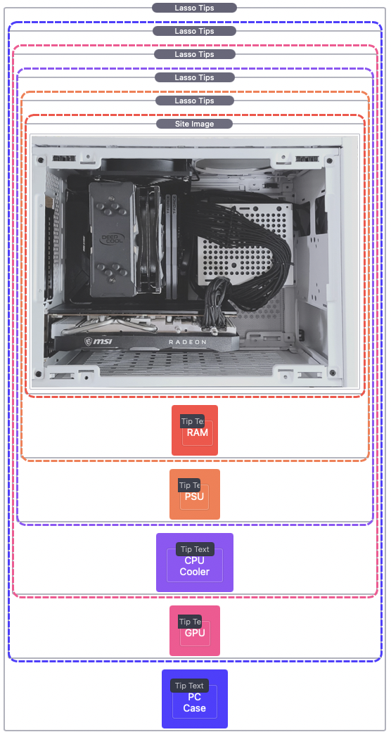
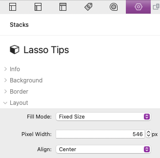
In this example each of the Lasso Tips stacks have adjusted offset values to highlight a different section of the image. We needed to make sure the image displays at a fixed size so that the dashed lasso lines stay correctly positioned at different browser/device widths. To do so we have selected the outer most Lasso Tips stack and set the “Fill Mode” to “Fixed Size” and set the “Pixel Width” to our desired size.
We use negative values to move the dashed lasso lines inwards overtop of the image. Switch to preview mode when changing the offset values to see placement and make fine adjustments.