Set Up
- Double Click to Install both the cleanAccordionCont.stack and cleanAccordionInner.stack.
- Drag & Drop the cleanAccordion stack into a Stacks page.
- By default, there will already be one Content Panel inside cleanAccordion, give it a title in the top section.
- Add a description – for this you need to drag a content stack (text,html,image, etc.) into the “Drop Stacks here” section below the panel title.
- Select the Content Panel element for customization options – make yours look sweet!
- Press the blue add panel button to add more Content Panels.
Creating Links That Open Specific Panels
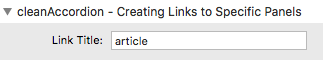
You have an option to create a “Link Title” per accordion. This title is what you will use when creating links that start cleanAccordion open to a specific panel. By default the “Link Title” is “article”.
To create a link, first get the URL of the page cleanAccordion is placed on. In our example we will use https://onelittledesigner.com/rapidweaver-stack/cleanAccordion/ (cleanAccordion’s preview page). At then end of the link place a ? (question mark) followed by the “Link Title”(“article” for this example), an = (equals sign), and a number (representing the position of the panel you want to open).
https://onelittledesigner.com/rapidweaver-stack/cleanAccordion/?article=5
When this link is clicked on, the page will open and the cleanAccordion with the Link Title “article” will open to panel #5. Click the example link above and you will notice the middle cleanAccordion on the preview page is open to panel #5.
Setting tabs as links
Click on the individual tab that you want to edit. Switch the default Slider option to “Link On (Slider Off).” Then in the URL Option field enter the URL you wish to link to. This will eliminate the sliding effect and instead use the link you wish to send users to.
Using Icons
To use Icons you must first drag and drop the Font Awesome stack into the Stacks page.
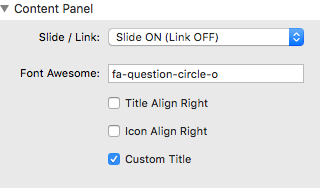
To see the full list of icons please go the Font Awesome Website Here. Simply find the icon you wish to use and type it’s name in the field located in the customization options for the Content Panel. Previous versions required a single icon given to all accordion tabs, but with this version you can choose a different icon for each individual tab. Simple select the Content Panel and the field can be found on the right in the customization options section, which will display “icon-plus” by default.
Change Icon (+) Location & Size
Altering the location and size of the rotating icon can be done using the following jQuery code, which must be placed in RapidWeaver’s Edit Mode in the Page Info > Header > JavaScript section. This option was not built in as the option would be confusing to majority of users, though it is still very handy in certain styled websites, particularly those that use very large fonts inside the cleanAccordion.
The following code demonstrates the stack’s default settings. ‘Top’ adjusts the distance from the top, ‘left’ adjusts the distance from the left, and ‘font-size’ adjusts the font-size of the icon. You can replace these values for pixel, percentage, em, and ex values. Note that if you increase the distance from the top you must include a value, such as px.
1 2 3 4 5 6 7 |
$(document).ready(function() {
     $('.plusIcon').css({
          'top' : '0',
          'left' : '12px',
          'font-size': '200%'
     });
});
|
Using the Custom/Blank Theme
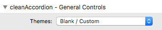
Setting the Theme to “Blank / Custom” will remove all of the styling for the accordion (title as well as the panel content). This will allow you to create your own custom design by using any content stacks (text, html, images, other 3rd-party stacks, etc…) and styling them. In order to use a custom title for the panel you will need to click on the Content Panel stack and enable the “Custom Title” option, otherwise it will only allow you to use un-styled text.
I want those cool dashed lines in the demo
- Navigate to your Page Inspector
- Go to Header » CSS
Insert this awesome code:
1 |
dl.accordion {border-style: dashed;}
|
Video Tutorial (v1.3.8)
This tutorial is for an older version of the stack but may still prove to be useful for some.