Setup
To get started, add the Index Cards stack to the editor.
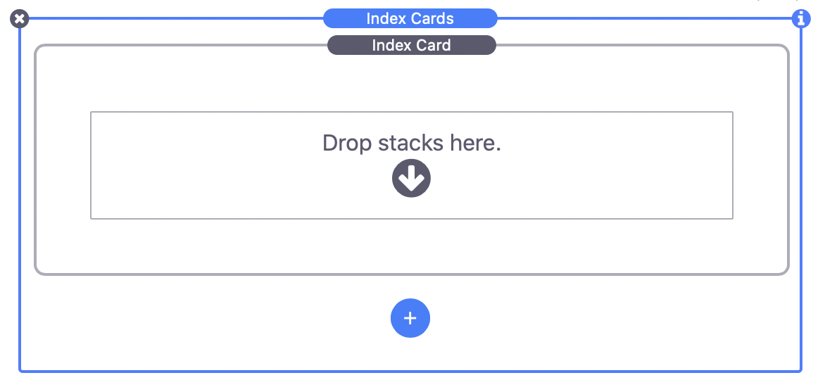
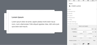
Initially, there are two elements. The main Index Cards stack wraps a single inner Index Card stack. The main stack is essentially a slider or slideshow with the inner stacks serving as the slides.
Click the blue add button to add as many slides (Index Card stacks) as you need. Next add your desired content to each of the slides. Just about any stack can be added as content to the slides.
The only thing left to do is to customize the appearance and functionality of the slider. Select the main Index Cards stack and open the inspector to see the customization settings.
Customization Settings
Index Settings
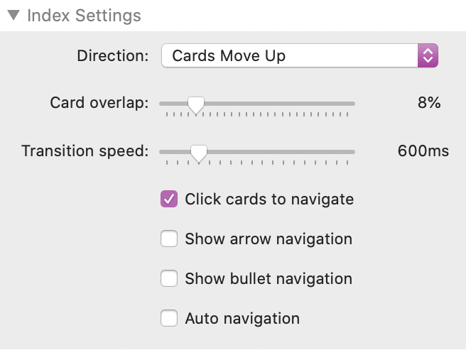
Direction
Select one of four different animation directions. When the slider moves to the next slide the current slide will move in the chosen direction. If the slider moves to the previous slide the animation will reverse.
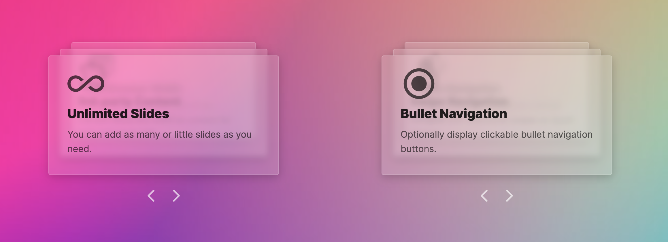
Card overlap
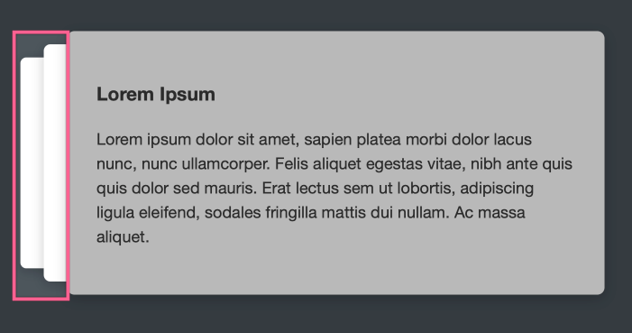
The edge of the next two slides will always be visible when using the Index Cards stack. This setting allows you to adjust how much of the next two slides is visible behind the current slide.
Transition Speed
This setting adjusts the speed it takes in milliseconds to animate between slides.
Click cards to navigate
When a slide is clicked the slider will navigate to the next slide. This option should be disabled if a slide has content that requires interaction (IE a link or button).
Show arrow navigation
This will display two arrows below the slider that can be clicked to move to the next or previous slide. Four color settings are provided for customizing the color of the arrows.
Show bullet navigation
When enabled, a bullet for every slide will appear below the slider. If any of the bullets are clicked the slider will automatically advance to the corresponding slide. Tow color settings are provided for customizing the color of the bullets.
Auto navigation
This option will automatically transition through all of the slides in an infinite loop. A navigation interval setting is provided to define how long the slider waits in-between transitions. Auto navigation will pause if it detects a mouse cursor over the slider.
Index Card Styles
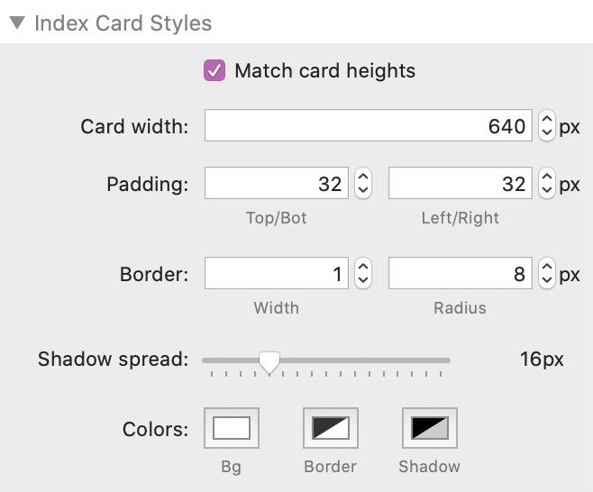
Match card heights
Enabled by default, this setting makes sure that each slide/card will be the same size. If you would rather your slides have varying heights you can disable this setting.
Card Width
This value controls the width of all of the slides. This effects the width of the entire slider and if the “Direction” setting is set to either left or right, the card overlap will take up a percentage of this defined size.
Padding
These values adjust the default padding on the inside of the slides. These values can be overwritten by individual slide/card stack padding settings.
Border
These values adjust the default border width and radius of the slides. These values can be overwritten by individual slide/card stack border settings.
Shadow spread
Use this slider to adjust the size of the shadow that appears around the edges of the slides. Moving the slider to the left most position will disable the shadow.
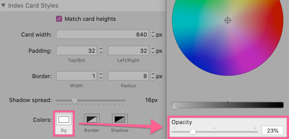
Colors
Bg: Defines the default background color for the slides. The background color can be overwritten by individual slide/card stack background color settings.
Border: Defines the default border color for the slides. The border color can be overwritten by individual slide/card stack border color settings.
Shadow: Defines the color of the shadow that appears around the edge of each of the slides.
Creating Transparent/Translucent Backgrounds
The background of each of the slides/cards can be made transparent or translucent. All you will need to do is adjust the opacity slider while selecting a color in the Index Card Styles > Color > Bg setting.
If a slide/card has a color with a reduced opacity a “frosted glass” or blur effect will be applied that allows the content behind the slide to be visible without effecting readability. This effect is supported in all major browser except Firefox. Firefox has partial support in that it can only blur the contents of the slides and not anything behind the slides (like a background image for example).
Creating Custom Navigation Buttons
There are two predefined class names that can be applied to any stack to allow it to function as a next or previous slide navigation button.
index-cards-next
index-cards-back
These class names can be added to the the stacks HTML > CSS classes field of any stack. The stack must be placed inside of slide/card stack to function.

If you are using a prior version of the Stacks plugin that does not include the CSS classes field you can contact 1LD support to receive a free wrapper stack that will allow you to add classes.