Diagrams
Edit Mode
Preview Mode
Setup
There are two options for starting a new project with a modular theme. 1) You can open the pre-setup starter file included when you download the product, or 2) you can follow the steps below to setup the project up yourself. The tutorial below is also good if you just want to set up a blank project using the modular theme (without the use of a Theme stack like “Splash”).
- Create a new RapidWeaver project and click the “Themes” button in the top left of the RapidWeaver window.
- Select the theme titled “1LD Modular”.
- Add a Stacks plugin page by clicking the plus icon in the top left of the RapidWeaver window.
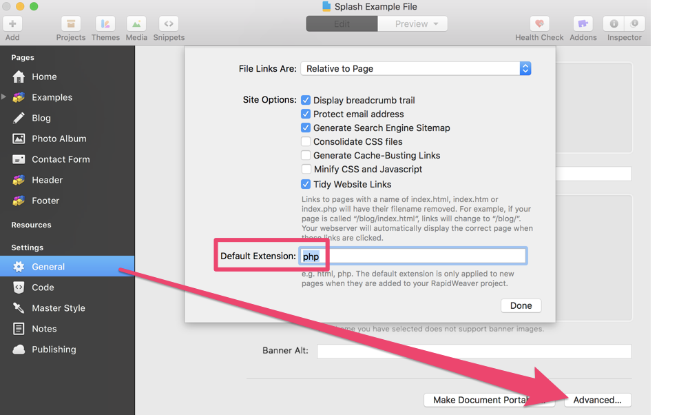
- The Modular theme uses PHP to create and display the header and footer modules, so PHP needs to be enabled on every page. In the left side of the RapidWeaver window, click to the right of the title “Settings” to show the more options below it then click the “General” option.
- In the General settings menu scroll to the bottom and click the button titled “Advanced…”.
- Change the “Default Extension” from “html” to “php”.
- Add 2 more Stacks plugin pages.
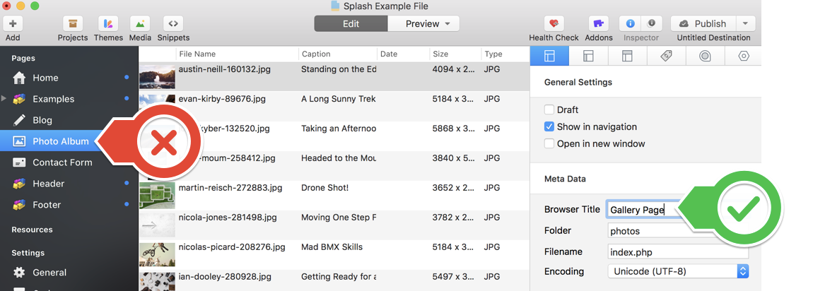
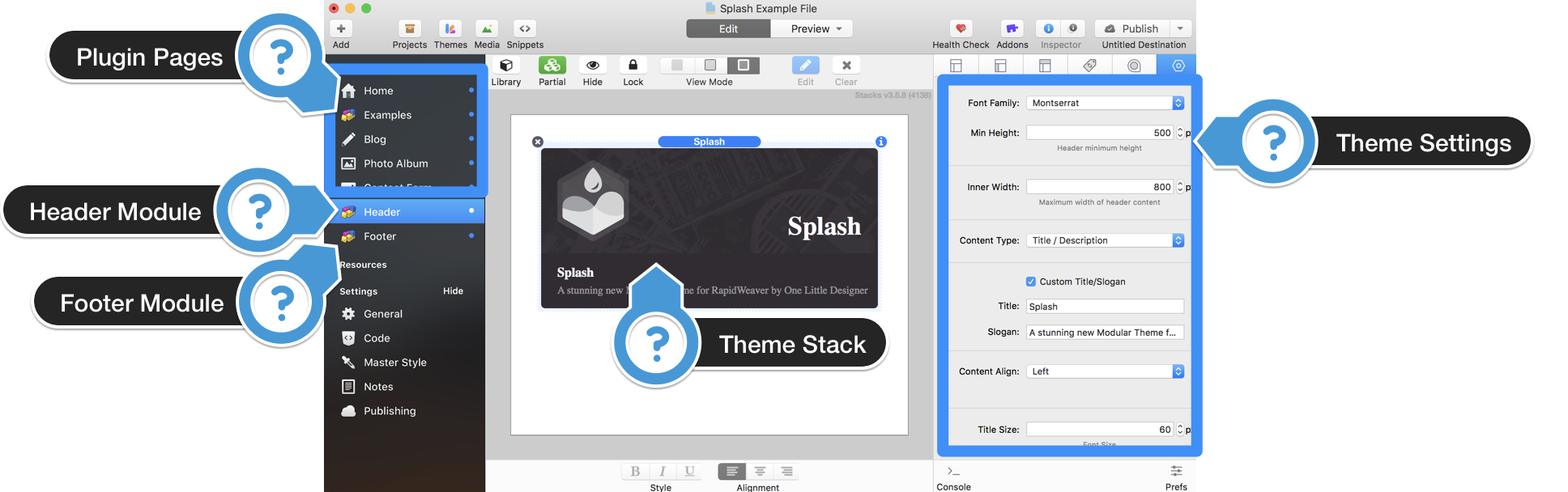
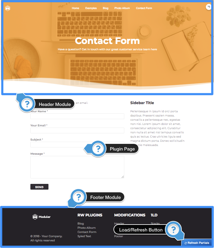
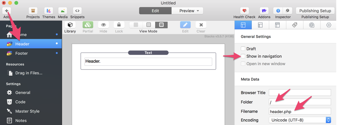
- Click on the second page in the left side of the RapidWeaver window under the heading “Pages”. This page is most likely called “Untitled Page 2” at this point. Rename it by clicking on the title once and typing in “Header”. This page, what we call a “Module”, will be like a partial that represents your header area and is where all of the theme design will be placed.
- Open the page inspector found in the top right of RapidWeaver, identified by a “i” icon. The general settings tab will be open by default.
- Uncheck the option “Show in Navigation”. This module is only a piece of your website and should not be linked to inside your navigation.
- This module should be located in the root of your website and should not have a folder path, to set that up, delete the text from the “Folder” field. RapidWeaver will give you a “Possible Page Conflict” warning, click “ok” as we will be removing the conflict in the next step.
- In the “Filename” field change the value from “index.html” to “header.php”.
- Open your Stacks library and add the “Splash Theme” Stack to the editor. You header is now set up and ready to be customized. Next we need to create the footer.
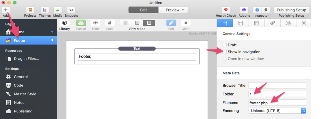
- Click on the third page in the left side of RapidWeaver under the heading “Pages”. This page is most likely called “Untitled Page 3” at this point. Rename it by clicking on the title once and typing in “Footer”.
- Open the page inspector.
- In the general setting stab uncheck the option “Show in Navigation”.
- Delete the text from the “Folder” field. RapidWeaver will give you a “Possible Page Conflict” warning again.
- In the “Filename” field change the value from “index.html” to “footer.php”.
Both of your modules are now properly set up. You can adjust the theme styles by navigating to the Header and clicking on the theme stack to see your options. The rest of your project will function just like a traditional theme.
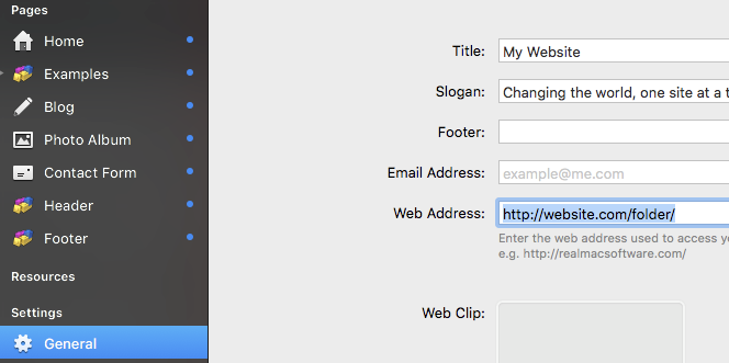
Important: If you are publishing your website/project into a sub-folder (e.g. website.com/folder), you will need to list your “Web Address” with the subfolder included when RapidWeaver prompts you add it. If you need to change your Web Address you can find it in the General Settings menu.
Refreshing/Loading the modules
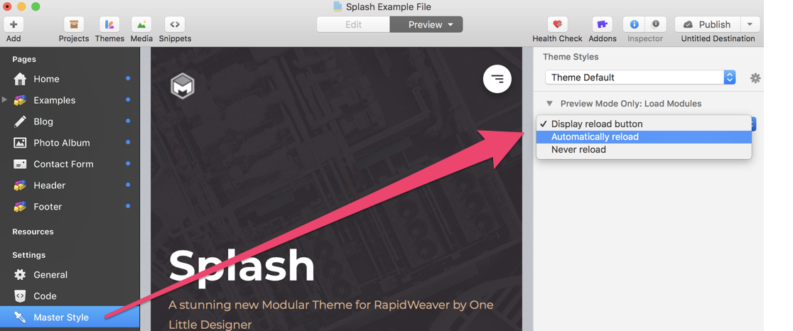
Preview mode does not load the header and footer modules automatically. When you first activate preview mode, you can click on the blue “Load Partials” button in the bottom right of the preview window to load them in. The do not need to be reloaded until you close the project and re-open it. However, when you make changes to the header and footer modules they will need to be refreshed to reflect the changes. To do this, click the blue “Refresh Partials” button in the bottom right of the preview window. Note this only needs to be done when previewing changes made to your header and footer and only in RapidWeaver’s preview mode.
There is also a setting to change this behavior in the Master Style > Page Inspector > Theme styles. Set it to “Automatically reload” to have it always reload the modules or set it to “Never reload” if you do not want the modules to load in preview mode.
Note: These options only effect the RapidWeaver Preview mode.
Theme Stack Settings
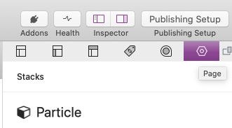
The theme settings are not where the traditional theme styles are. To locate them, in your header page select the Particle stack. In the Page Inspector open the Page settings tab to reveal the stack settings panel. All of the theme settings can be controlled through this stack.
Header Section
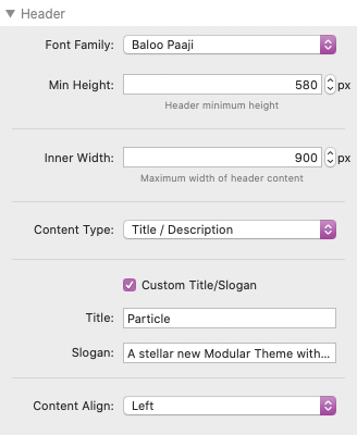
Font Family: You will see a dropdown where you can select from a list of provided fonts, or you can choose the “custom” option, which will allow you to provide a custom URL to a web font; you will also have to provide the name for the font that you would like to use (with spaces), for example: “Fredoka One”
Minimum Height: Here you can set a minimum height for the content of the header area, increase/decrease this option for bigger or smaller headers.
Content Type: Here you can choose the content type of the header area. It can either be set to a basic title/description, or custom stacks content. If you select title/description, you will see options for setting the title & description size, as well as their colors. By default the title and description text will be set to your websites title. You will also see a “Content align” option that will allow you to set the horizontal alignment of the title & description. If you would like to have a custom title and description for a specific page, simply check the “custom title/description” option, and you will see inputs appear for your custom text. If you select stacks content then you will see some color options appear for header tags and text. You can add any content that you would like, but this will help you to style it a bit.
Background: Here you can set the background for the header section of the page. It can be set to None, Color, Gradient, Image (with a cover overlay)
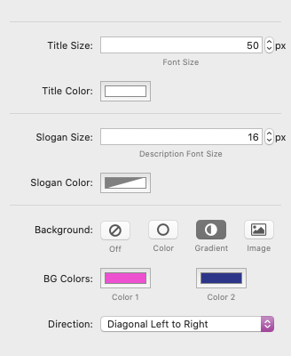
Particles Section
With the Particle theme, each header section contains moving particles that can be adjusted to your liking. This section contain the options for adjusting these particles.
Speed: This simply adjusts the speed of the particle, the lower the number, the lower the speed.
Size (Dot & Line): Particles consists of lines connected by small dots. These inputs allow you to increase the size of both the dots and the lines.
Opacity (Dot & Line): Here you can set how transparent the dots and the lines will be.
Particle Colors (Dot & Line): These color inputs simply allow you to select the colors of the particles.
Navbar Section
These setting options customize the navigation bar at the top of the header.
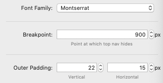
Font Family: You will see a dropdown where you can select from a list of provided fonts, or you can choose the “custom” option, which will allow you to provide a custom URL to a web font; you will also have to provide the name for the font that you would like to use (with spaces), for example: “Fredoka One”
Breakpoint: The breakpoint determines the point at which the dropdown style navbar is hidden, and the sidemenu style navigation appears.
Outer Padding: Here you can set the vertical & horizontal padding around the outer edge of the navigation bar.
Logo Image & Dimensions: Here you will find the settings for adding a logo image to the navigation bar. You can also set specific width and height dimensions for the image.
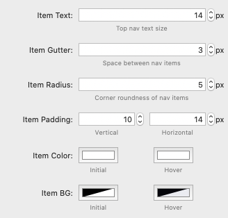
Item Text: This refers the to the text size of the top level navigation items.
Item Gutter: This refers to the horizontal space inbetween the top level navigation items.
Item Radius: This controls the corner roundness of the top level items. Note that it is only visible if a background is applied.
Item Padding: Here you can set the vertical and horizontal padding of the top level navigation items.
Item Color (Initial & Hover): This refers to the text color of the top level navigation items.
Background Color (Initial & Hover): This refers to the background color of the top level navigation items. These settings control the items within the dropdown menus that appear on hover.
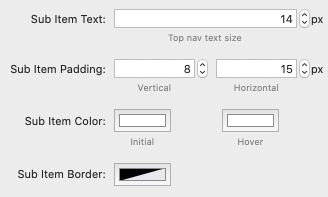
Sub Item Text: This controls the text size of the dropdown menu navigation items.
Sub Item Padding: Here you can set the vertical and horizontal padding of the dropdown navigation items.
Item Color (Initial & Hover): This refers to the text color of the dropdown navigation items.
Sub Item Border: This controls the color of the small divider between each dropdown navigation item.
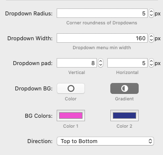
Dropdown Radius: Here you can control the corner roundness of the dropdown menus.
Dropdown Width: This input allows you to set a specific width for the dropdown menu items. Helpful for getting something that is just right for your site content.
Dropdown Padding: These inputs allows you to set the vertical & horizontal padding around the dropdown menus.
Dropdown BG: Here you can set the background of the dropdown menus. You can choose between Single Color & Gradient
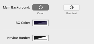
Main Background: Here you can set the background color of the navbar itself. You can choose from None, Color, Gradient, Image (With color overlay)
Side Navigation Section
On mobile devices, the top level navigation is hidden, and a side navigation (with a menu toggle) takes its’ place. Here you can adjust the sidemenu and toggle.
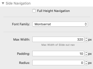
Max Width: Here you can set a maximum width for the side menu. Note that the menu will automatically shrink on mobile devices.
Padding: This controls the amount of padding around the outer edges of the side menu.
Radius: The controls the corner roundness of the side menu.
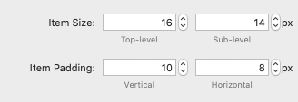
Item Size (Top-level & Sub-level): Here you can set the text-size of the top level and sub level navigation items in the side menu.
Item Padding (Vertical & Horizontal): Here you can set the amount of padding around all navigation items in the side menu.
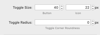
Toggle Radius: This input allows you to control the corner roundness of the toggle button.
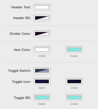
Header Text: This refers to the color of the “Menu” text in the navigation header.
Header BG: This refers to the background color of the header of the side navigation containing the “Menu” text, and the menu toggle.
Divider Color: This controls the color of the small divider between the side menu navigation items.
Toggle Switch: The Particle theme menu toggle has a unique switch style design, You will see a small switch-like background behind the toggle. You can control the color of this switch here.
Toggle Icon (Open & Close): This controls the color of the icon inside of the toggle button. You can set different colors for the open and close state.
Toggle Background (Open & Close): This controls the background color of the toggle button. You can set different colors for the open and close state.
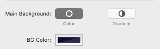
Main Background: This sets the background of the entire side navigaiton menu itself. It can be set to Color or Gradient
Content Section
Here you can control basic fonts and colors of the content area of the theme.
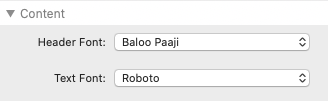
Header & Text Font: These two dropdowns allow to set the font-family for the header tags, and general text of the content area.
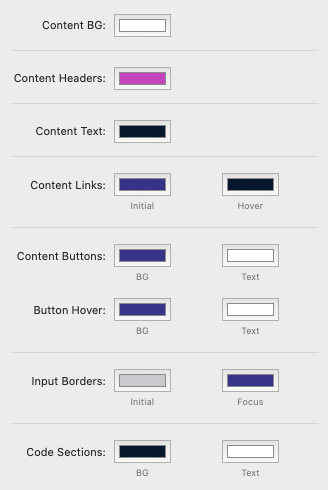
Content BG: Here you can set the background color of the content area.
Content Headers: This is the color of Header tags (h1, h2, etc.) in the content area
Content Text: This is the color of general text in the content area.
Content Links (Initial & Hover): Sets the initial and hover color of all links in the content area
Input Borders (Initial & Focus): Simply controls the border color of inputs. Focus colors apply when an input is currently selected.
Code Sections (Background & Text): Controls the background & text color of code tags in the content area.
Footer Section
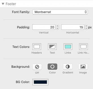
Font Family: This dropdown sets the font family of the footer content. It is the same as all other font-family options.
Text Colors: Here you can control the colors of text in the footer, including Header tags, General text, Links, Links on hover
Background: Here you can set the background of the footer
Creating Particle Content Sections
The modular theme comes with a unique stack called “Modular Section” which can be used to create full width content sections. The cool thing about this stack is that it also comes with custom options for each modular theme.
If you look at the “Theme specific options” section of the Modular Theme Section stack, you will see an option for the “Particle theme”, if you select this option, then you will see the same particle options appear for the content section! Use these options to add particles to any modular theme section, just like your particle header.
Section Stack
The Section Stack can be used to set custom content widths, custom colors, and allow you to insert full width content like images, sliders, and quotes. Typically it’s best to place all of your content into these Section Stacks. You may also use the “Extra” settings to add custom IDs or Classes for CSS and Javascript purposes.
- To change the content width select an option from the “Content width” setting. You can declare a custom width or set it to full width.
- To change the text colors select “Custom” in the “Colors” setting. This will allow you to change the Header text, paragraph text, and link colors.
Condition Stack
Anything you place in a header or footer module will appear on every page of your website. The Condition Stack allows you to set specific content to only display on one or more pages that you define. This Stack can only be used in the header and footer modules.
- After adding the Stack to your header or footer, place the content you want to display on a specific page inside it.
- In the Stack’s menu click on the “Show” setting to reveal 2 options.
- If you wish for the content to display on a single or multiple pages, select the option titled “Only on these pages”. Create a list of the pages you want the content to display on using commas to separate each title. The titles are not case sensitive but should be spelt just as they are in the left side menu of RapidWeaver under the “Pages” heading.
- Alternatively, If you wish to display the content on all but one or multiple pages, select the option titled “On all pages except these specific pages”. Create a list of pages you do not what the content to display on using commas to separate each title. The titles are not case sensitive but should be spelt just as they are in the left side menu of RapidWeaver under the “Pages” heading.
Important: If you have changed the “Browser Title” in the Page Inspector > General Settings tab, you will need to use that as the page title instead of what it is listed as under the “Pages” heading.