Setup
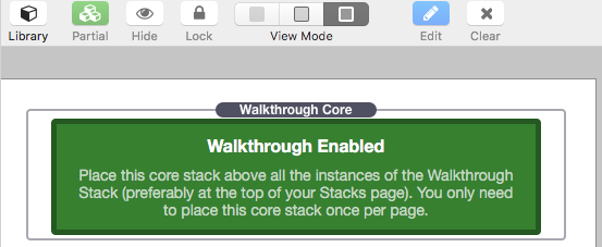
1. Before adding the Walkthrough Stack to your Stacks page you must add the Walkthrough Core Stack. This Stack will enable all the Walkthrough Stacks you add to your page. The Core stack must be placed above the other stacks and preferably at the top of your Stacks page.
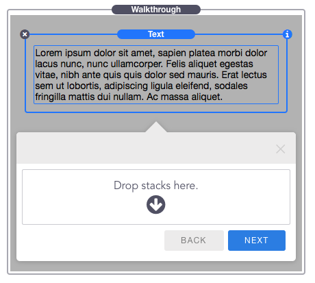
2. Drag Add drop a Walkthrough Stack above the Stack element you want to highlight. In this example I will be highlighting a “Text” stack.
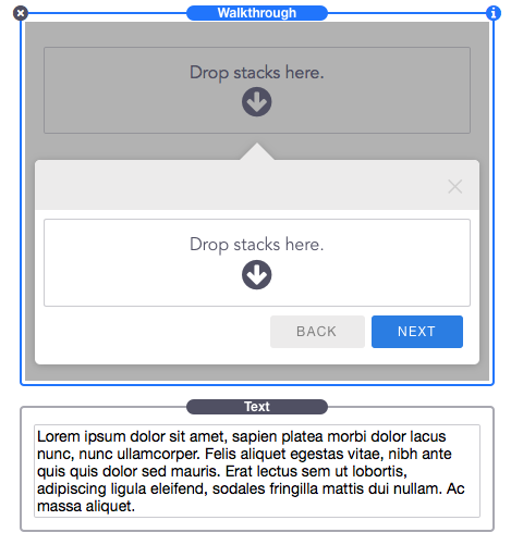
3. Now grab the Stack element you want to highlight ( “Text” stack in this example) and drop it into the top “Drop stacks here” section, above the chat bubble in the Walkthrough stack.
4. Repeat steps 2-3 until you have added as many steps as you want to display.
Note: After you are done with setup, select the first Walkthrough Stack you added and change it’s Secondary Button “Function” to “Close Steps” or “None”. If you leave the function as “Previous Step” there will not be a previous step to go back to.
Customization Options
Walkthrough Core Stack
The Walkthrough Core Stack is where you will find the global settings and color settings for all of the notice/alert chat bubbles.
Activate – Setting this to “On Load” will make Walkthrough automatically start when the page has been loaded. Setting this to “On Hover” will make Walkthrough start whenever the visitor hovers the mouse pointer over any of the Walkthrough elements, once the Walkthrough has been closed it will not re-initiate. Setting this to “On Click” will make Walkthrough start when any part of the Walkthrough elements have been clicked.
Delay – Set how long in seconds to delay initializing Walkthrough. This option is only available if the “On Load” Activate setting has been selected.
Width – This sets how wide all of the Walkthrough notice/alert chat bubble will be.
Show Header Close Icon – Enabling this will display an “X” icon in the top right of the Walkthrough chat bubbles.
Overlay & Transparency – These color settings allow you to place an overlay behind the active element to hide or fade the rest of the web page, bringing focus to the the active element. To remove the overlay just set the Transparency value to 0%.
Walkthrough Stack
Some options need to be set specifically per element. The Walkthrough Stack is where you find these specific options.
Scroll to Element – Enabling this will cause the browser to automatically jump to the location of the element when it is highlighted. If this is disabled, the chat bubble will still appear in the window and will attach to the element when it is scrolled into view.
Show Header – Enable this to show a colorable header to the chat bubble.
Header Title – Add a title to the Header of the chat bubble. This option is only available if “Show Header” is enabled.
Order – Set the order (in increasing numbers) that the steps will appear. Setting the value to “1” will make it appear before “2” and so on.
Position – Select where you would like the chat bubble to appear in relation to the highlighted element. You can also choose “Center in the Window” to display the chat bubble in the center without highlighting any element.
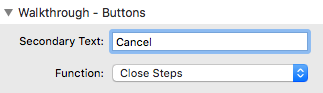
Secondary Text – Change the secondary button’s text
Secondary Button Function – Choose what the button will do when clicked. You can have it navigate to the previous step, close the Walkthrough, Navigate to a custom link, or you can remove the button.
Primary Text – Change the primary button’s text
Primary Button Function – Choose what the button will do when clicked. You can have it navigate to the next step, close the Walkthrough, Navigate to a custom link, or you can remove the button.