Setup
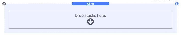
After adding the stack to your project’s Stacks page, simply place any content you want to cling to the window inside the “drop stacks here” section.
When the browser window reaches the content it will automatically cling to the window. See the Settings Panel sections below for more info on adjusting the position and styles of the content.
Note: There must be enough space beneath the content for the content to attach on scroll.
Sticky Settings
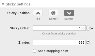
The Sticky Position options let you chose from one of the three positions: Top, Center, or Bottom. This defines the vertical position the content will attach to on the browser window.
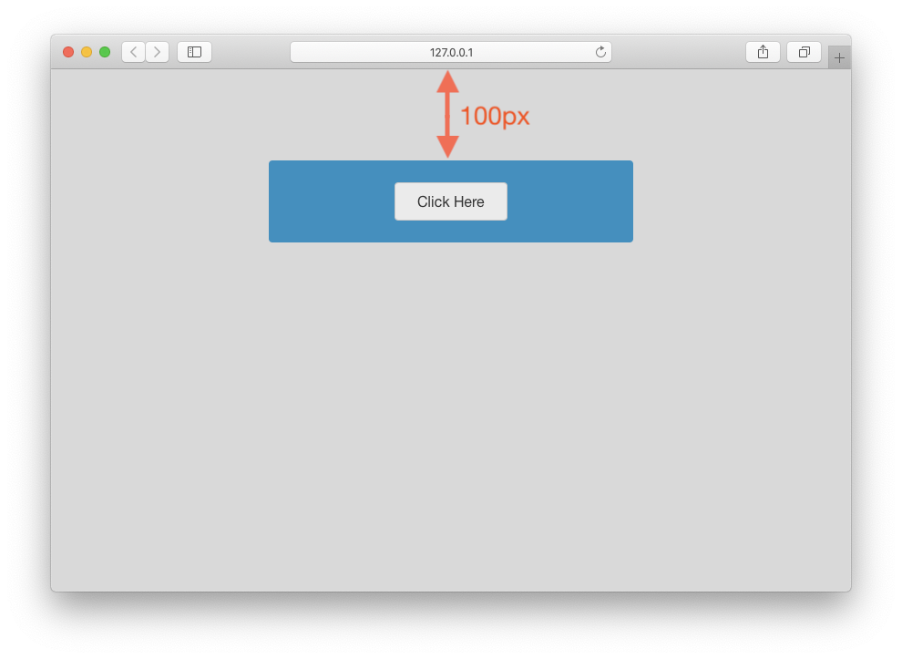
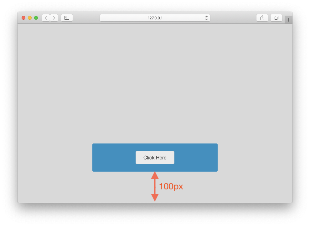
The Sticky Offset value adjusts the sticky position by a pixel value. For example, if the position is set to “Top” an offset value of 100px will make the content attach 100px from the top of the browser window.
The “Center” and “Bottom” position offset values adjust the distance in the opposite direction.
The Z-index value can be adjusted if another stack needs to be placed over top or below the stack in the z direction. The higher the number, the higher priority Cling will have. In most cases you will not need to adjust this value.
Enabling Set a stopping point will reveal a special class name in the Stacks editor. This class name can be added to any stack on the page to define a scroll location for the stack to stop following (detach from) the browser window.
Note: This option only reveals the class name and instructions for setting/marking a stopping point. It does not need to be enabled for the stopping point to apply.
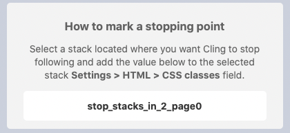
To add this special class to a stack, select the stack in the Stacks editor. In the Settings Panel > HTML section, add the full class name to the CSS classes field.
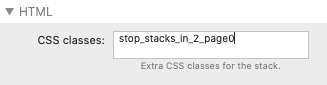
If the stack you selected does not have this field, you can simply add a blank “Column” stack to the location and add the class name to that. This column stack will not be visible outside of the Stacks editor.
Note: The CSS Classes field is only available in Stacks version 4+. If you are using a prior version of Stacks, please contact 1LD support to request a special class name stack.
Content Styles
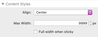
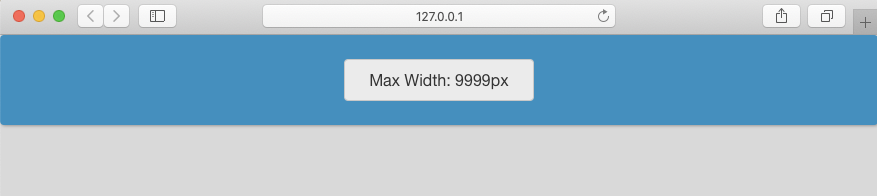
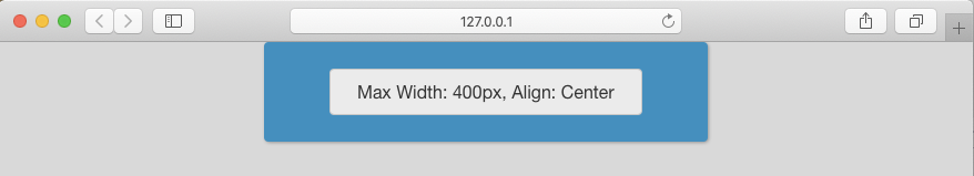
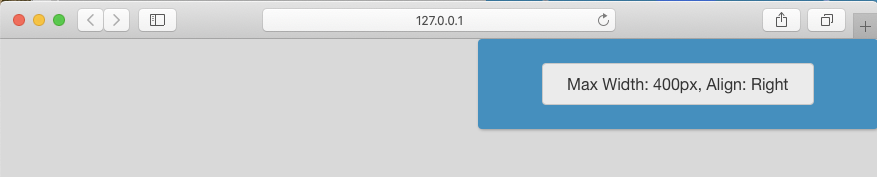
The Align setting will adjust the horizontal position of the Cling content within the available space. However, the Max Width defaults to a value of 9999px which is essentially equal to no max width. Without a max width the content will fill all available horizontal space and the the Align setting will not make a difference. If the Max Width is set to a lower value, the content will only fill up to that set width and the Align setting will apply.
Examples:
Enabling Full width when sticky will let the content expand to the edges of the browser window when it is attached. The full width setting is useful when you would like to attach the content to the edges of the browser but the theme or framework you are using does not give you access to that space.
Note: This setting expands the available horizontal space and will adjust the appearance of the content as it fills that extra space. The Max Width and Align settings are important for adjusting the content appearance accordingly.
Settings Panel > Content Styles (Continued)
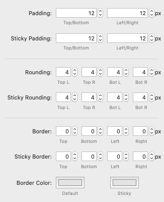
In the following styles you will notice there are two settings for each, one default and one “Sticky”. The default settings adjust the appearance of the content before it has attached to the browser window. The sticky settings adjust the appearance of the content after it has attached to the browser window. Some content needs to be condensed to save window space while others need to expand to take focus. The extra sticky settings allow you to expand, condense, or just change the look of the content as it transitions from static to sticky.
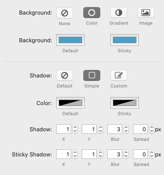
The Background setting has a few options for adding a background to your content. Only the Color option has a specific sticky color setting.
There are also Shadow options to apply a shadow or glow to the content. The Custom option allows you to define the shadow using CSS.
Note: If Full width when sticky is enabled the background and shadow will always stretch horizontally to the edges of the browser window, regardless of the Max Width value. The Max Width value only applies to the width of the content.
Mobile Sticky Settings
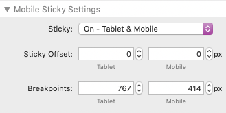
By default, Cling content will not attach to the window of a device less than 767px wide. This is because the page layout usually condenses below this width and sticky content can cover too much of the browser window. However, there is an option to enable it either for Tablet sized devices or for both Tablet and Mobile Sized devices.
Once enabled you are presented with a Sticky Offset setting for both device sizes. These may need to be adjusted to get a better fit.
You can also adjust the Breakpoints settings to define at what width each of the Sticky Offset values apply or to define the width at which the sticky feature no longer applies.
Using Show/Hide Classes
You can add special class names to stacks placed within the Cling stack to have them hide or show when the content attaches to the browser window. The two available class names are:
cling-hide
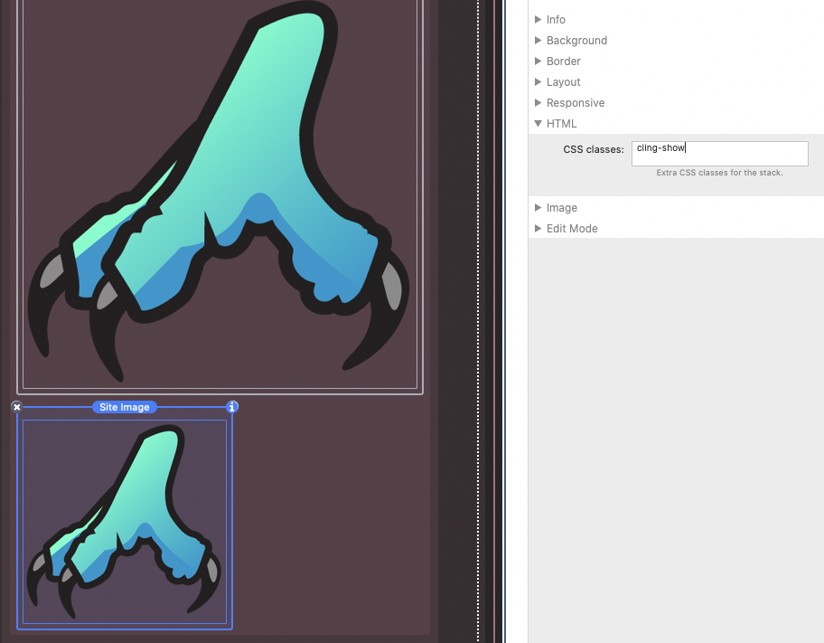
cling-show
To add a class to a stack, select the stack in the Stacks editor. In the Settings Panel > HTML section, add the class name to the CSS classes field.
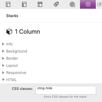
Hide (cling-hide)
Use this class when you need to remove stacks from the content. This is useful when you need to save space, but only when the content is attached to the browser window.
Show & Swap (cling-show)
Use this class when you need to add stacks to the content. This is useful when you are using the class in conjunction with the cling-hide class. For example, if you have an image that you want to be large when the content is static, but smaller when the content is attached to the browser window, you would add both the small and large image to the content. The cling-show class would be added to the large image and the cling-hide class to the small image. The large image will then swap with the smaller image when the content attaches to the browser window.