About
Layouts 2 is divided into two usable stacks each designed to serve a different purpose.
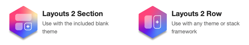
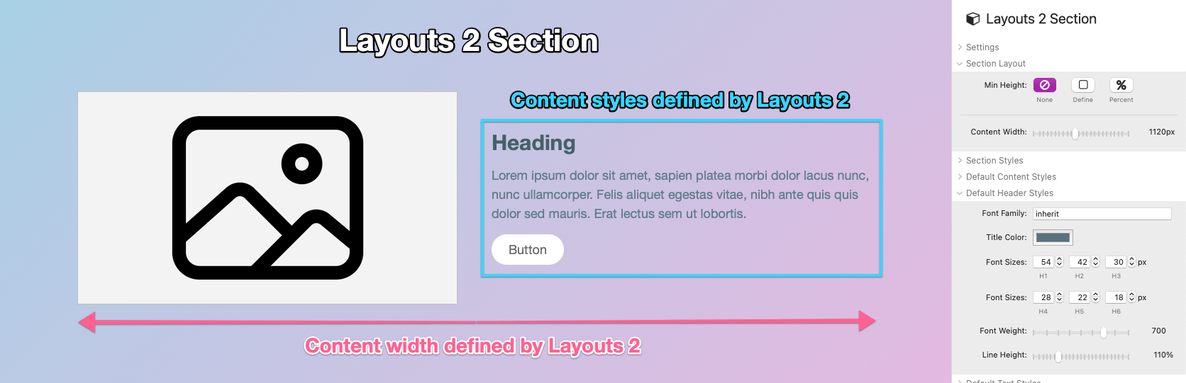
The Layouts 2 Section stack is designed as a barebones stack framework that can be used with a blank theme. Default content styles can be defined and the content width can also be defined section by section.
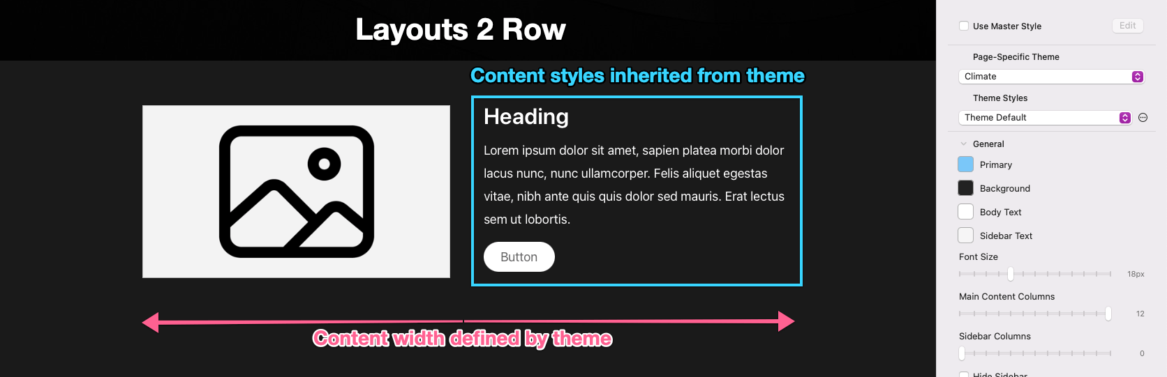
The Layouts 2 Row stack is designed to integrate with projects that use a theme or stack framework. It will inherit content styles and the content width from the theme or framework.
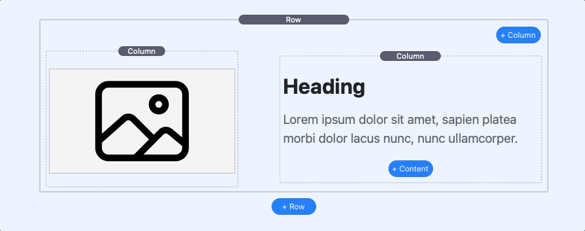
Row Stack: Adding & Removing Columns
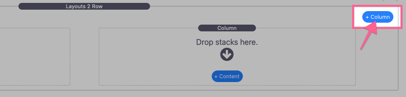
The Layouts 2 Row stack contains two Column stacks by default. To add more columns click the blue “+ Column” button found in the top right corner of the stack.
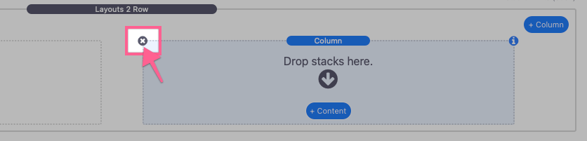
You can remove columns by selecting them and either pressing the delete key or clicking the “x” icon in the top left corner of the Column stack.
Row Stack: Editing Columns
Each Column stack can be adjusted and styled individually by selecting it and opening the Settings Panel.
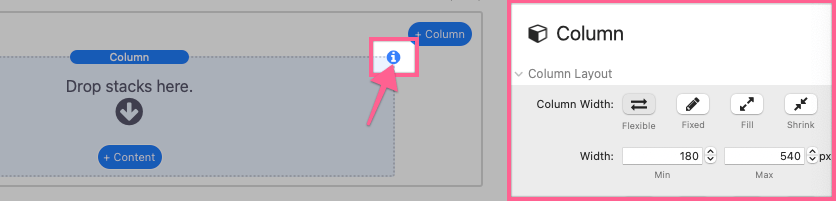
Column Width
The width of each column can be individually adjusted. There are four column width options to choose from: Flexible, Fixed, Fill, and Shrink.
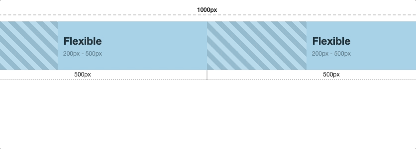
Flexible columns have a definable minimum and maximum Width setting. Each flexible column will match the minimum defined width plus any available space up to its maximum defined width.
In this example we have two flexible columns each with a 200px minimum and 500px maximum width. As the content width is reduced each column will shrink until the minimum width is reached for both columns, after which the second column will be forced to wrap to a new line.
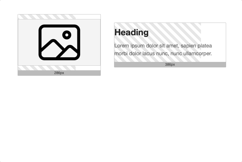
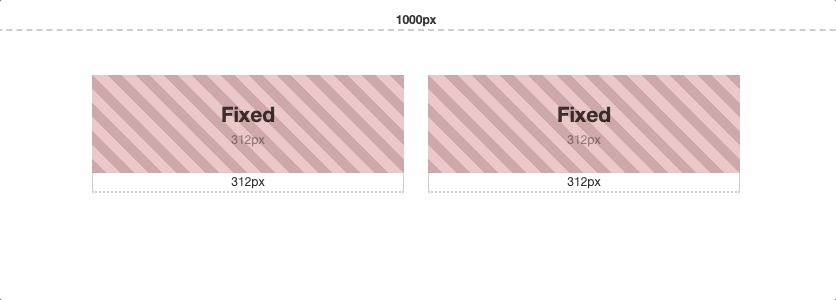
Fixed columns have a single definable Width setting. These columns will always remain at their defined width and will wrap to a new line when there is no longer enough space to fit the columns on a single line.
In this example we have two fixed columns each with a 312px defined width. The columns do not respond as the content width is reduced until they are forced to wrap to a new line.
Fill column width is determined automatically by filling all of the available space. A single fill column will fill the entire content width. As more fill columns are added the space is divided evenly between them.
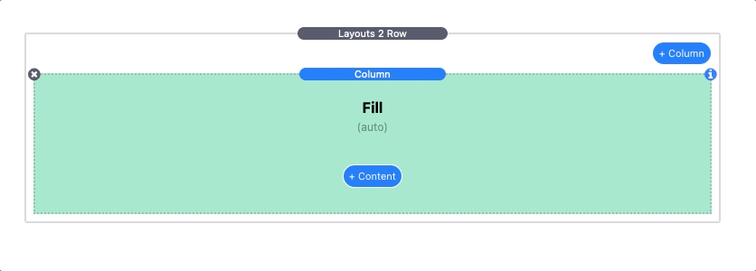
Fill columns are mostly only useful in 2 column layouts were the other column has a defined fixed width or is set to shrink.
Columns set to Shrink have their width determined automatically and behave like fixed width columns. They will take up as little horizontal space as possible without clipping any content that may be added to the column.
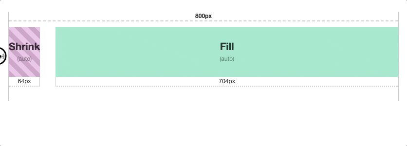
Shrink columns are only useful when you want the column width to match the content of the column itself. For example if you have a text title that you do not know the width of, you can use this option to match the width of that title.
Column Align
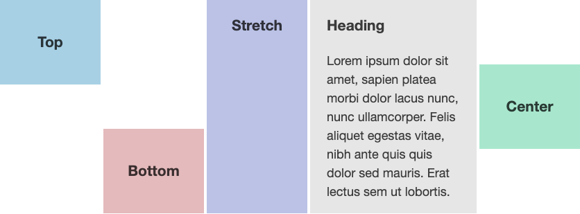
You can adjust how each individual column aligns vertically with the other columns in the row using the column align setting.
Stretch will match the height of the largest column in the row. The Top, Bottom, and Center options will all align accordingly.
Column Styles
Styles can optionally be defined for each individual column. The provided style settings should be straight forward and function intuitively.
Responsive Settings
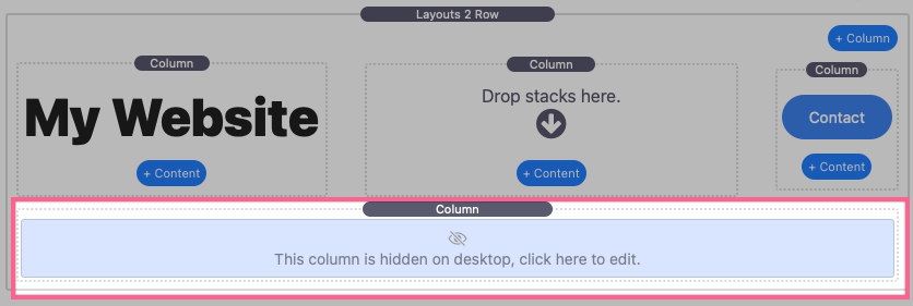
Columns can be shown or hidden based on device/browser width using the Hide This Stack setting. In the Stacks editor hidden columns will appear below the row of visible columns so that their contents may still be edited.
Use the provided Breakpoint fields to define the device/browser width at which the stacks will be shown or hidden.
Row Stack: Editing Rows
The Layouts 2 Row stack includes a few settings for adjusting column spacing and alignment. Select the stack and open the Settings Panel to make changes.
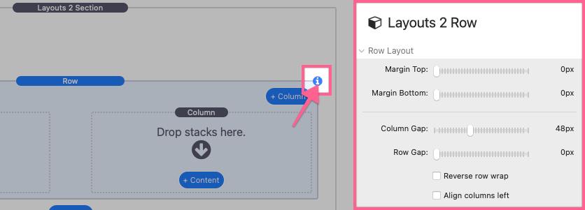
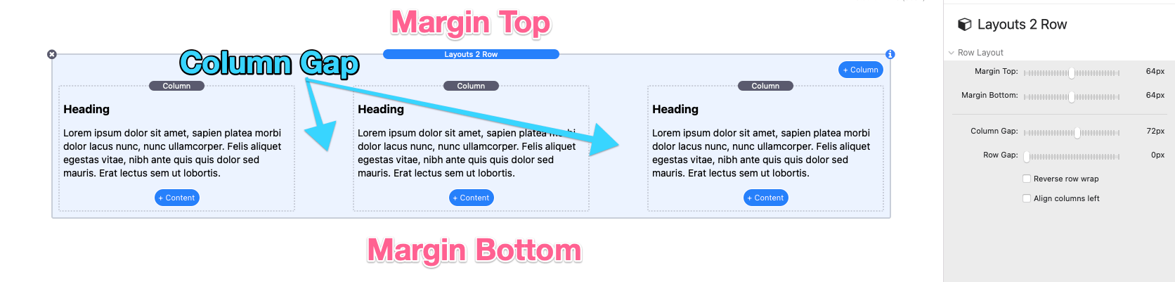
Row Layout
The Margin Top & Bottom settings adjust the space above and below the row. While the Column Gap adjusts the space between each column.
The Row Gap adjusts the space between the columns between lines.
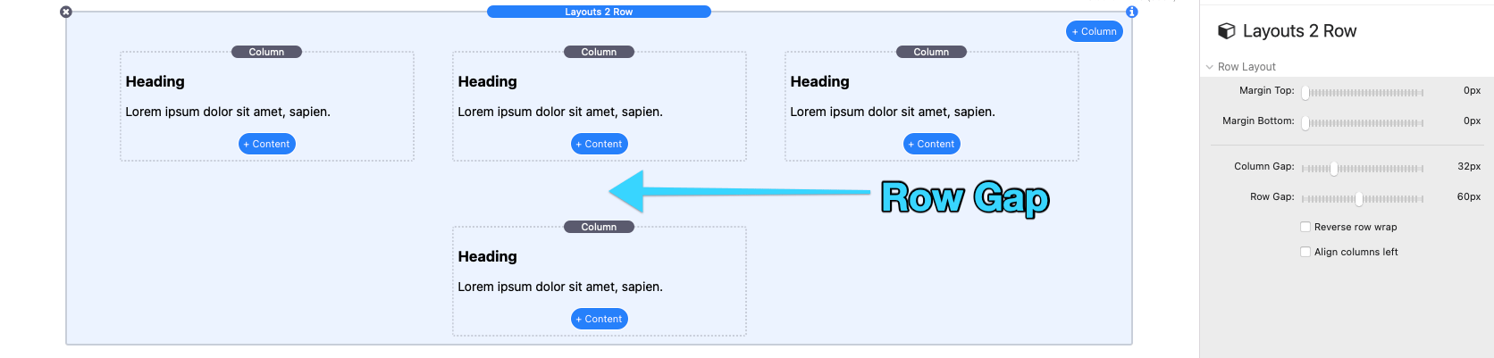
The Row Gap setting only applies when and if columns have wrapped to a new line.
Reverse row wrap can be enabled to force columns to wrap to a new line above the row instead of below the row. In two column layouts this can be used to change which column is displayed first on narrow device/browser widths.
In this example the image in the second column displays above the text in the first column instead of below it when wrapping to a new line.
The Reverse row wrap setting only applies when and if columns have wrapped to a new line.
By default, all columns that wrap to a new line and do not fill the entire width of the content will be centered horizontally. Enable the Align columns left setting to instead align wrapped columns to the left.
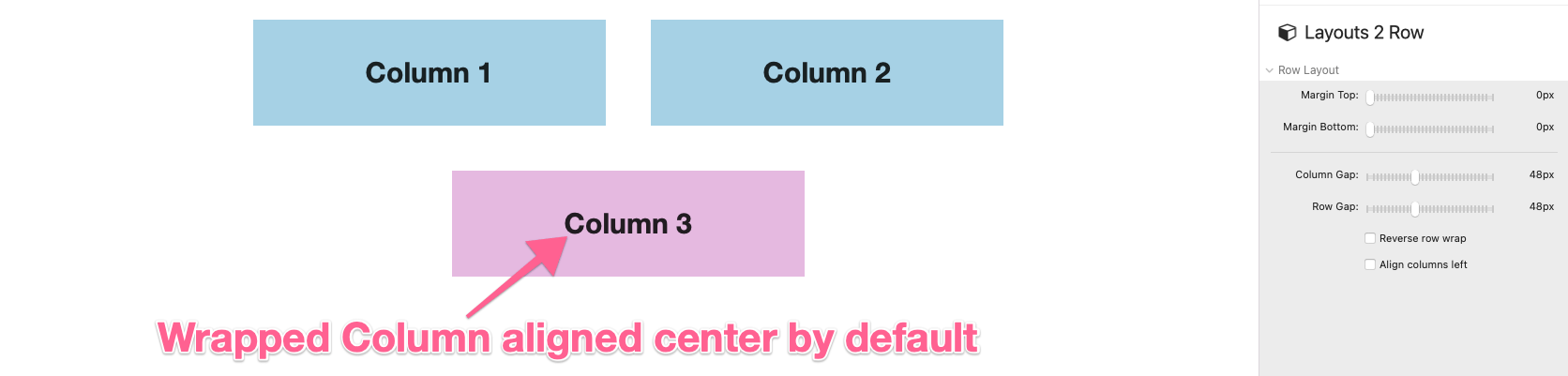
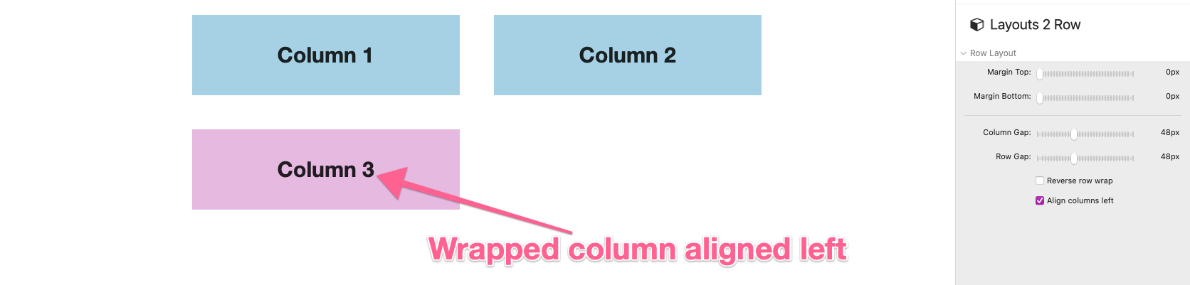
The Align columns left setting only applies when and if columns have wrapped to a new line or if the columns in the row do not fill the entire width of the content.
Adding Placeholder Content
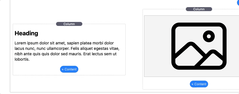
Each Column stack inside of Layouts 2 contains a blue “+ Content” button below the “Drop stacks here” zone. This button can be used to add optional placeholder content to the column. Placeholder content can be replaced with any other 3rd-party stack or converted to actual content. Double clicking the text will allow you to edit it.
There a four commonly used content types to choose from each with their own settings and features.
Heading
Heading content includes an Align setting to align the text left, center, or right. The Margin is inherited from the theme or framework styles but can be overwritten by clicking the “Define” option.
Text Styles are also inherited from the theme or framework styles but can be overwritten by clicking the “Simple” or “Detailed” options.
Text
Text content includes a special Icon Mode setting. When any of the font library options are selected the text will be replaced with an icon. To select a different icon, place the title of the icon you wish to use in the provided Icon Name field. To see a full list of usable icons for a given library, right-click/ctrl-click the URL at the bottom to reveal a popup menu and select “Open URL”.
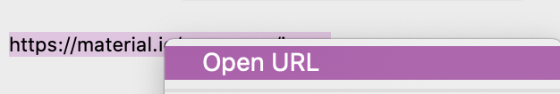
This will open a list of usable icons with their icon names.
Text content includes an Align setting to align the text left, center, or right. The Margin is inherited from the theme or framework styles but can be overwritten by clicking the “Define” option.
Text Styles are also inherited from the theme or framework styles but can be overwritten by clicking the “Simple” or “Detailed” options.
Button
Buttons include a special Icon Mode setting. When any of the font library options are selected an icon will be placed inside the button next to the button text. To change an icon place the title of the icon you wish to use in the provided Icon Name field.
The Link setting will define where the button will navigate to when clicked.
Buttons include an Align setting to align the button to the left, center, or right. The Margin is inherited from the theme or framework styles but can be overwritten by clicking the “Define” option.
Buttons Styles are not inherited and must be manually defined using the provided style settings.
Text Styles of the text inside the button are inherited from the theme or framework styles but can be overwritten by clicking the “Simple” or “Detailed” options.
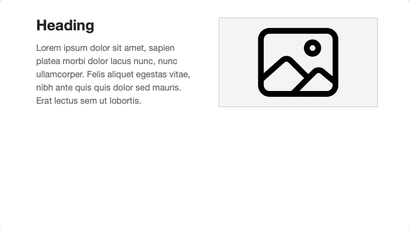
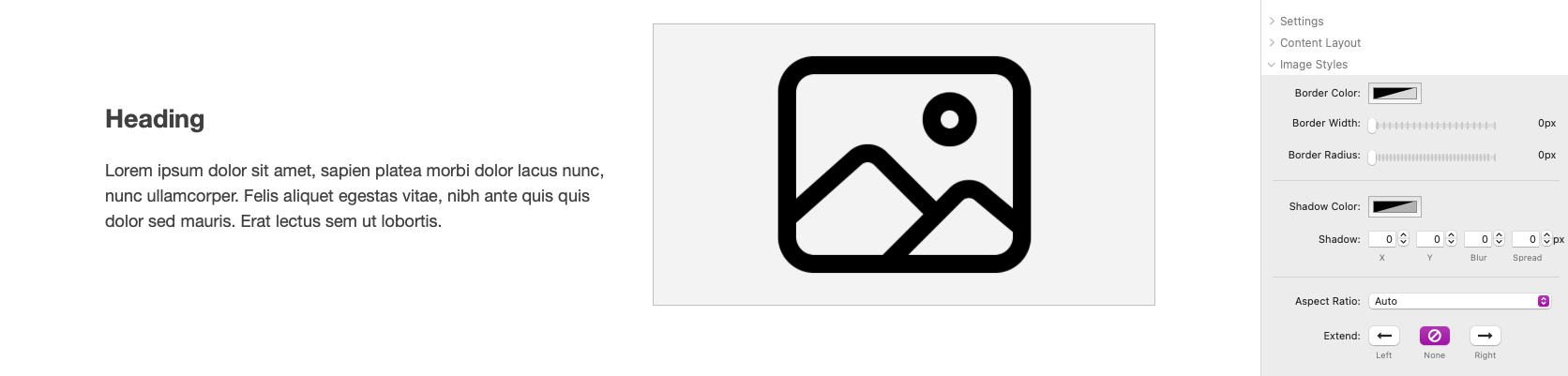
Image
By default, a placeholder image is provided to fill in the open space. To use your own image, add it to the Image field or use the Image URL field to link to a warehoused image.
If the Max Width of the image is less than then column width the image, the Align setting will align the image to the left, center, or right. The Margin is inherited from the theme or framework styles but can be overwritten by clicking the “Define” option.
Image Styles are not inherited and must be manually defined using the provided style settings. An Aspect Ratio setting is provided to crop the image into a specific aspect ratio.
The Extend setting lets you optionally force the image to extend by a percentage outside of the column it is placed inside of. Allowing the image to appear outside of the content width set by the framework or theme.
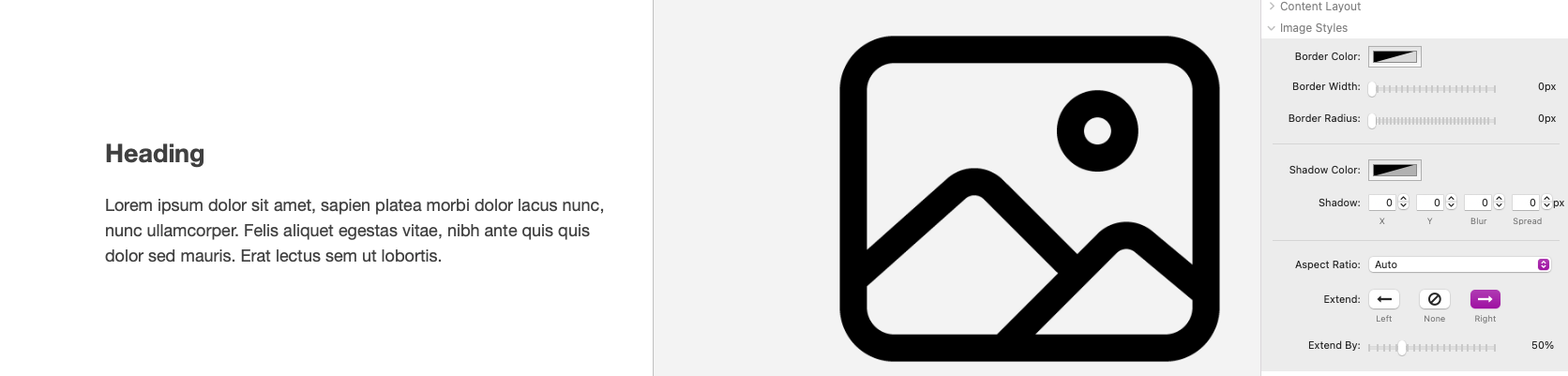
The extended images may be cropped by certain themes and frameworks and is only guaranteed to work when using a blank theme along with the Layouts 2 Section stack.
Text Styles do not apply to images.
Section Stack: Adding & Removing Rows
The Layouts 2 Section stack contains a single Row stack by default. Row stacks are identical in function to the Layouts 2 Row stack. To add more rows click the blue “+ Row” button found at the bottom of the stack.
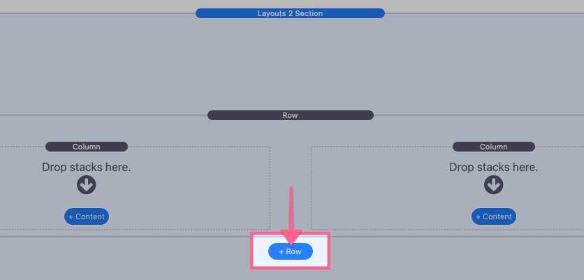
You can remove rows by selecting them and either pressing the delete key or clicking the “x” icon in the top left corner of the Row stack.

Section Stack: Editing Sections
Open the stack settings panel to edit the section spacing and style settings.
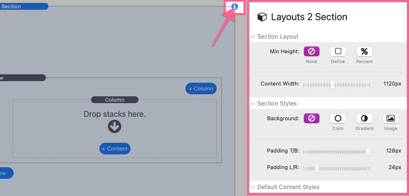
Section Layout
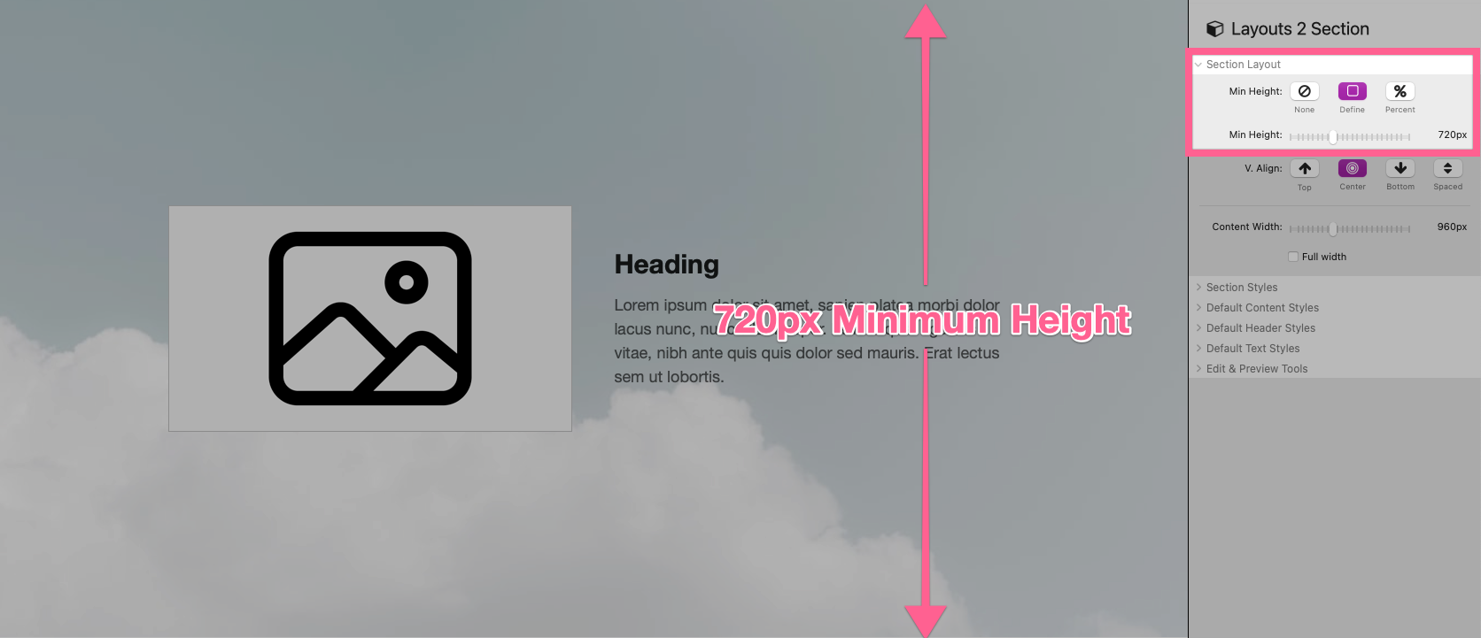
Each section may have an optionally defined Min Height.
Use the Define option to set a minimum pixel height for the section.
Use the Percent option to define a minimum height by percentage of the height of the browser window. This option allows the height to adjust according to the size of the browser or device.
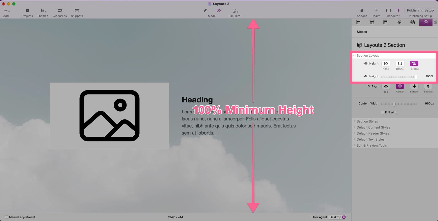
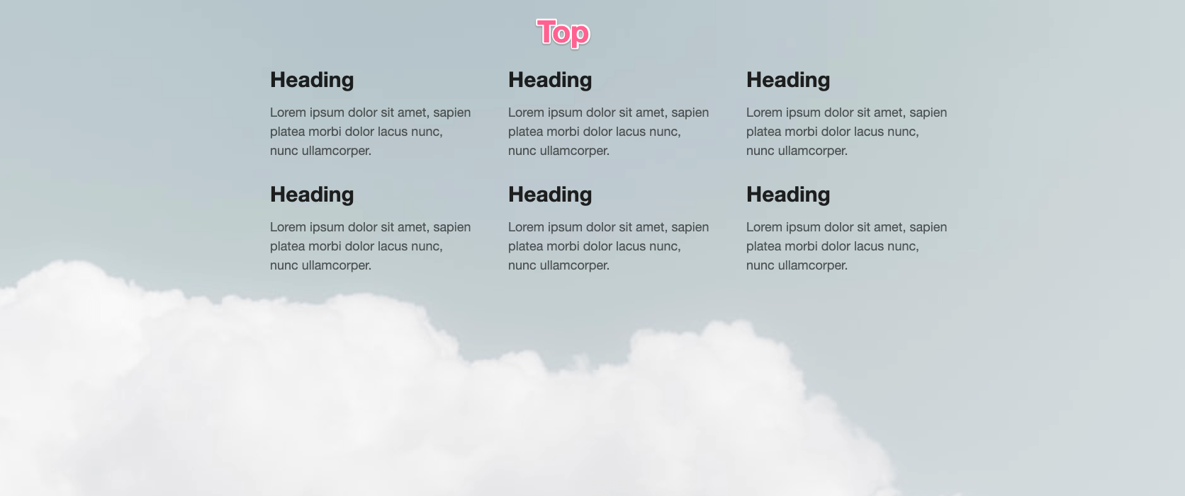
If a minimum height is defined, a V. Align setting is provided for aligning the rows vertically inside of the defined height.
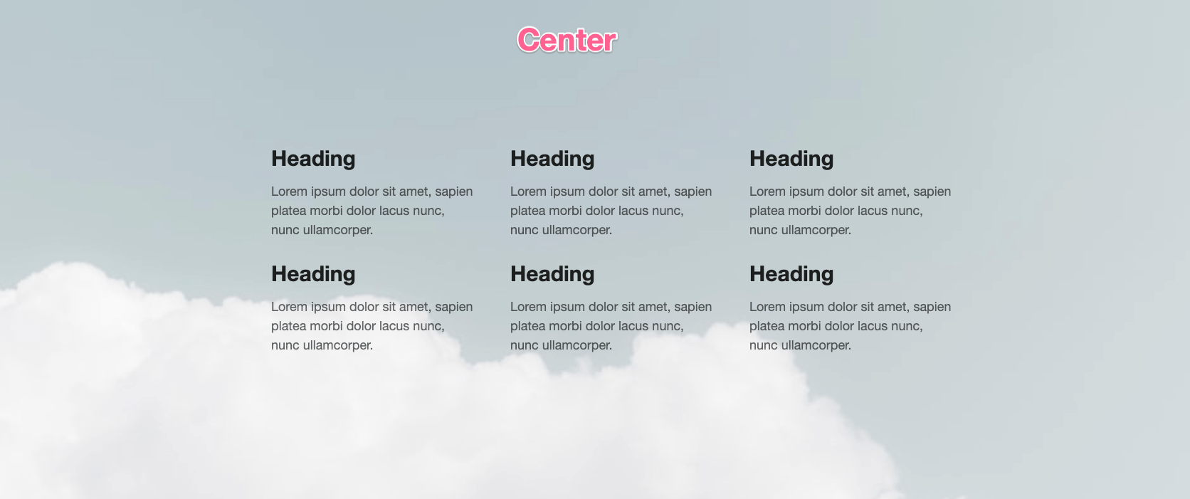
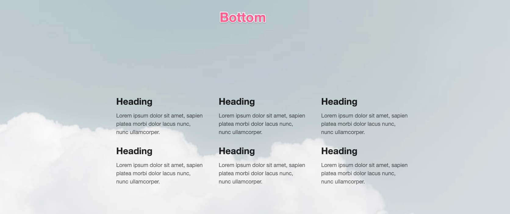
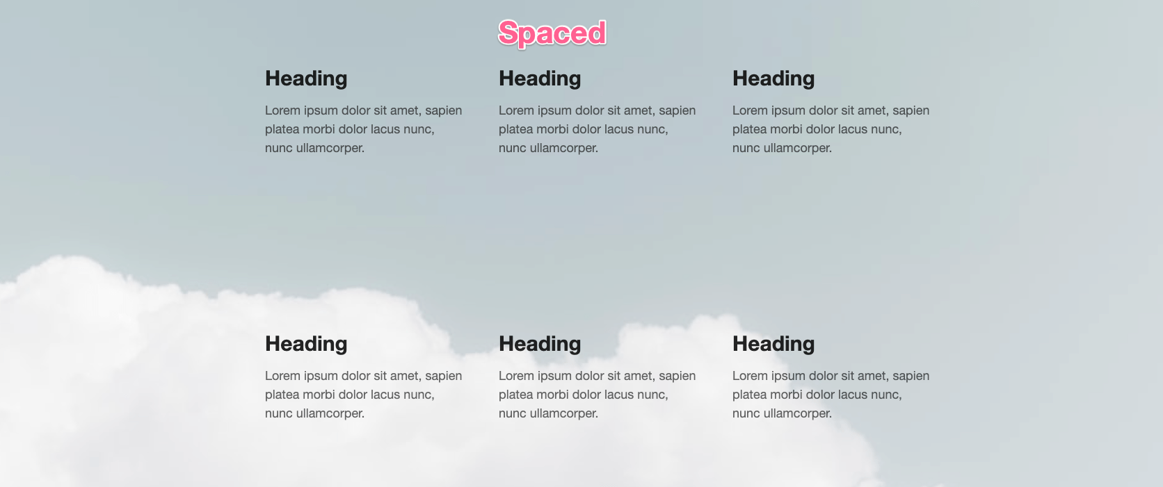
The spaced option only applies if more than one row has been added to the section.
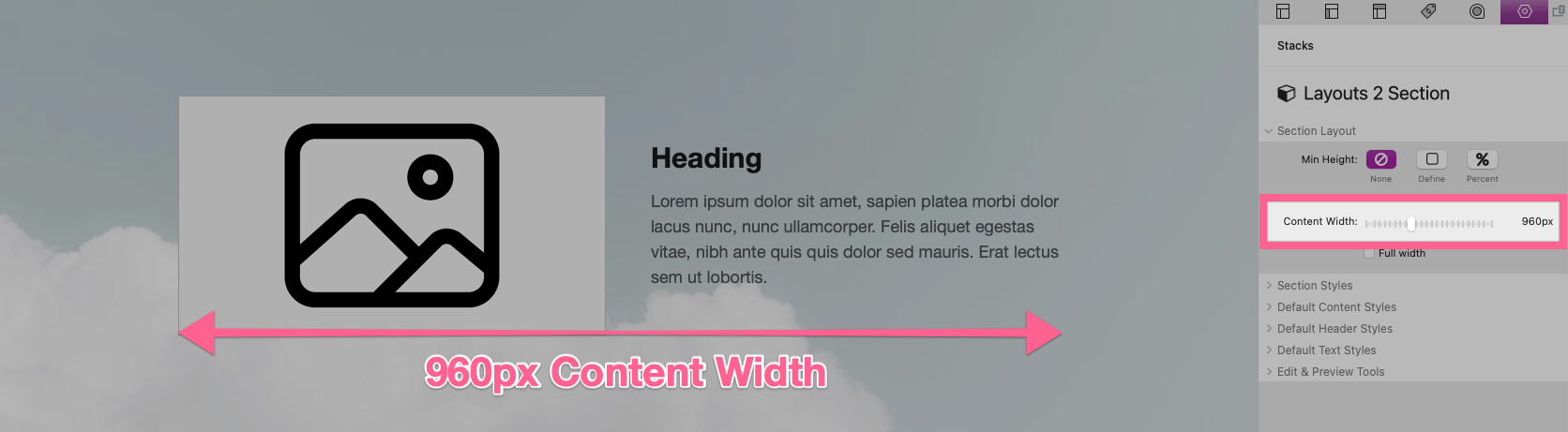
The Content Width slider adjusts the maximum pixel width of the content placed inside of each row.
Enable Full Width to allow the content to extend to the edges of the browser window.
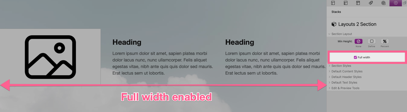
The Layouts 2 Section stack is intended to be used with a blank theme and may not have predictable results when used with a theme or stack framework that does not allow content to extend to the edges of the browser window.
Section Styles
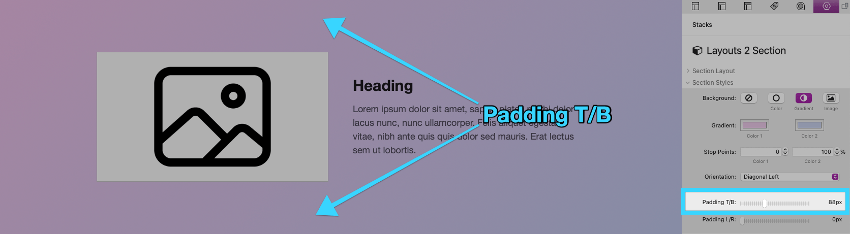
A color, gradient, or image may optionally be applied behind the section content using the Background setting.
Padding T/B adjusts the space above and below the row. Background styles will apply to this space.
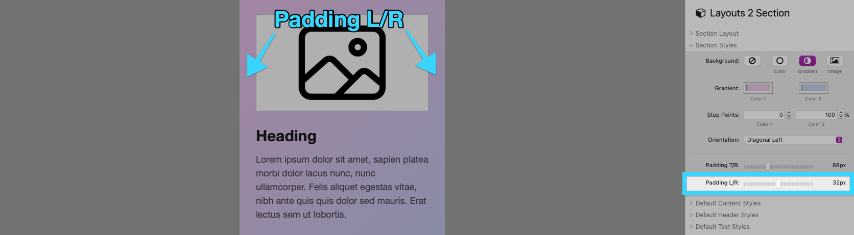
Padding L/R adjusts the space to the left and right of the row content when the device/browser width is less than the defined content width.
Default Content Styles
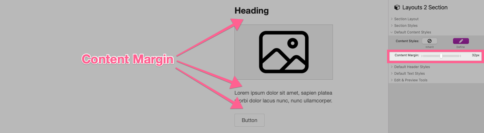
Default styles can be defined for header and text content by selecting the Content Styles “Define” option.
Use the Content Margin slider to adjust the default margin in-between headers, text, buttons, and images.
The remaining style settings are mostly self explanatory and define default styles for the text content found inside of any Layouts 2 Section on the same Stacks page.
Default styles only need to be defined once per Stacks page using a single Layouts 2 Section stack.
Edit & Preview Tools
A special “Show flexible columns space” setting is provided that can be enabled to highlight the non-flexible space of each column in edit mode.
This space will also be highlighted in preview mode along with each column’s current pixel width. These details can be used to assist in testing how the columns respond to narrowing window widths.