Initializing & Dismissing The Popup
Initialize
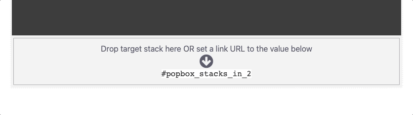
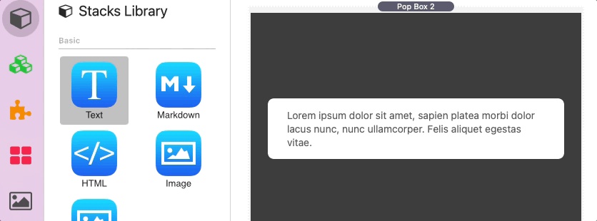
There are three ways to initialize the popup. The first is by adding any stack into the “drop stacks here” section found at the bottom of the stack in the editor.
When this “target” stack is clicked in preview mode or when published it will initialize the popup.
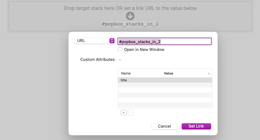
The second method allows you to use any link to initialize the popup. This can be done by copying the hash value found at the bottom of the stack in the editor and adding to the link URL/href field.
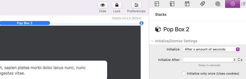
The last method will initialize the popup after a set number of seconds after the page has loaded. To use this method open the Pop Box 2 Settings panel and change the Initialize setting to “After x amount of seconds”. Then define a length in seconds in the Initialize After field.
If you would like the popup to only appear to a page visitor on their first visit to the page, enable the Initialize only once option. This will prevent the popup from showing to the same visitor after it has been dismissed on any return visit to the page.
The popup will show anytime a target or link is clicked, allowing page visitors to re-open the popup after closing it. When using “After x amount of seconds”, the popup will no longer be available after it has been dismissed.
In & Out Animations
You can optionally add an in and out animation to the popup by selecting an option from the In/Out Animation setting. Use the Duration field to define the length/speed of the animation in milliseconds.
Dismiss
There are four toggle options to allow the popup to be dismissed. Content links dismiss Pop Box will close the popup when any added link has been clicked.

Click overlay to dismiss Pop Box will close the popup when the overlay behind the it is clicked.

Click content to dismiss Pop Box will close the popup when any part of the content is clicked.

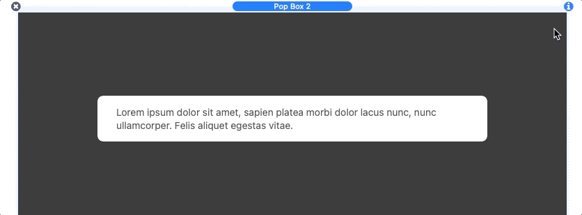
Show dismiss X icon will add a close icon to the top right corner of the popup that will close the popup when clicked.

If the Click overlay to dismiss Pop Box option is disabled the popup will perform a shake animation to let page visitor know they must use one of the other methods to close the popup.
Editing Content
Any stack may be dragged and dropped into the content.
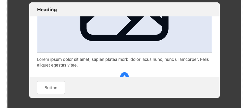
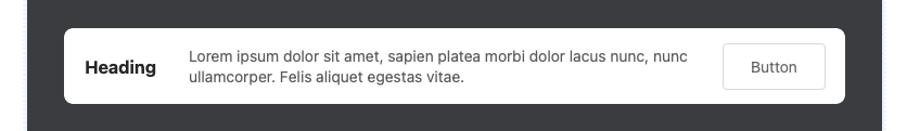
You can also use the built-in Pop Box 2 Content stack to add headers, paragraphs, icons, buttons, and images by clicking the blue add button that appears when editing or when the content is empty.
The Pop Box 2 Content stack has four commonly used content types to swap between, each with their own settings and features.
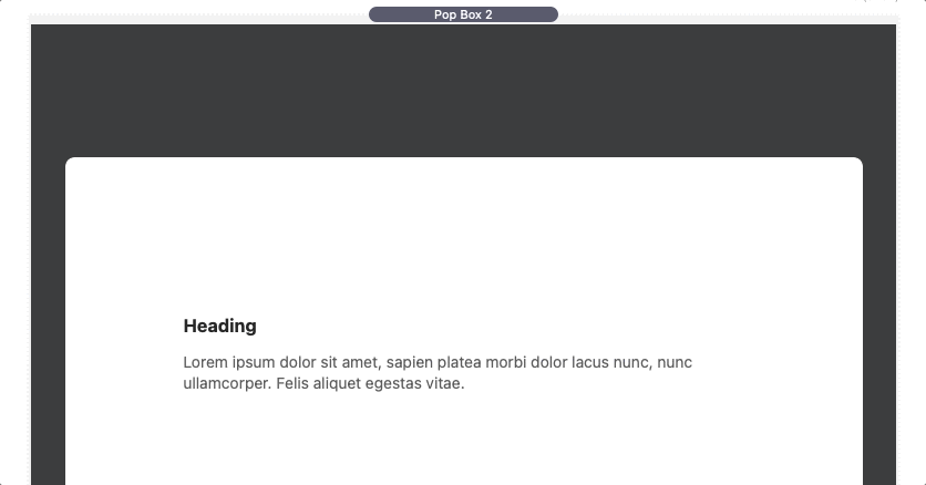
Heading
Heading content includes an Align setting to align the text left, center, or right. The Margin is inherited from theme or framework styles but can be overwritten by clicking the “Define” option.
Text Styles are also inherited from the theme or framework styles but can be overwritten by clicking the “Simple” or “Detailed” options.
Text
Text content includes a special Icon Mode setting. When any of the font library options are selected the text will be replaced with an icon. To select a different icon, place the title of the icon you wish to use in the provided Icon Name field. To see a full list of usable icons for a given library, right-click/ctrl-click the URL at the bottom to reveal a popup menu and select “Open URL”.
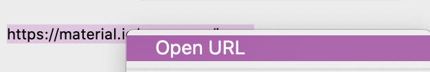
This will open a list of usable icons with their icon names.
Text content includes an Align setting to align the text left, center, or right. The Margin is inherited from the theme or framework styles but can be overwritten by clicking the “Define” option.
Text Styles are also inherited from the theme or framework styles but can be overwritten by clicking the “Simple” or “Detailed” options.
Button
Buttons include a special Icon Mode setting. When any of the font library options are selected an icon will be placed inside the button next to the button text. To change an icon place the title of the icon you wish to use in the provided Icon Name field.
The Link setting will define where the button will navigate to when clicked.
Buttons include an Align setting to align the button to the left, center, or right. The Margin is inherited from theme or framework styles but can be overwritten by clicking the “Define” option.
Buttons Styles are not inherited and must be manually defined using the provided style settings.
Text Styles of the text inside the button are inherited from theme or framework styles but can be overwritten by clicking the “Simple” or “Detailed” options.
Image
By default, a placeholder image is provided to fill in the open space. To use your own image, add it to the Image field or use the Image URL field to link to a warehoused image.
If the Max Width of the image is less than then column width the image, the Align setting will align the image to the left, center, or right. The Margin is inherited from the theme or framework styles but can be overwritten by clicking the “Define” option.
Image Styles are not inherited and must be manually defined using the provided style settings. An Aspect Ratio setting is provided to crop the image into a specific aspect ratio if needed.
Text in the heading, text, and button content types can be edited by double clicking the text in the editor.
Modifying The Layout
The Pop Box 2 settings panel Layout setting has 6 options to choose from. Each layout option has an Align (horizontal) and V. Align (vertical) setting to change the position of the popup.
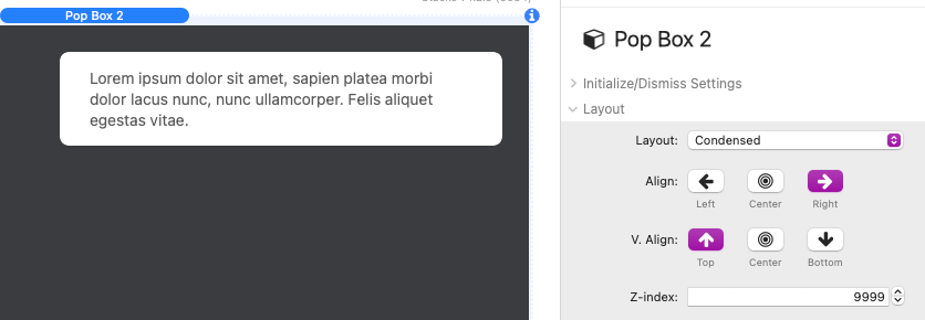
Each layout also includes a Z-index field that can be adjusted to a higher or lower value if you have issues with theme or stack and the popup is displaying below or above something it should not be.
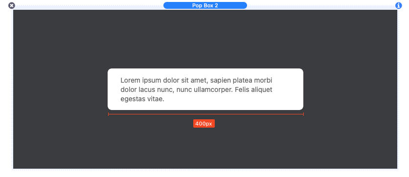
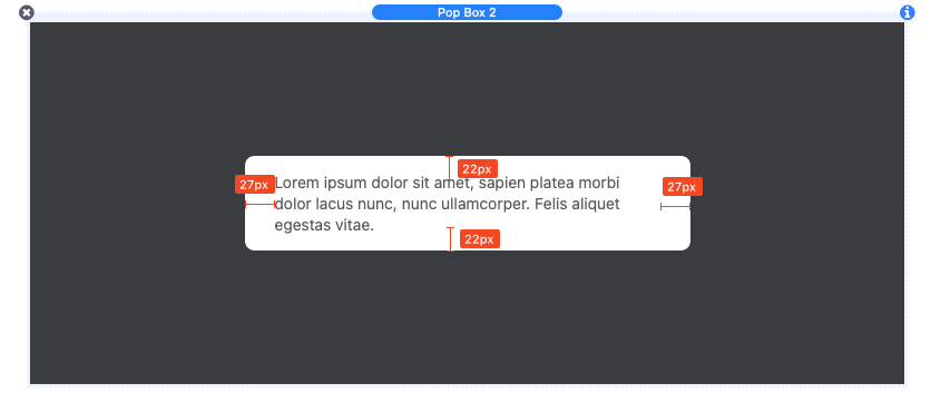
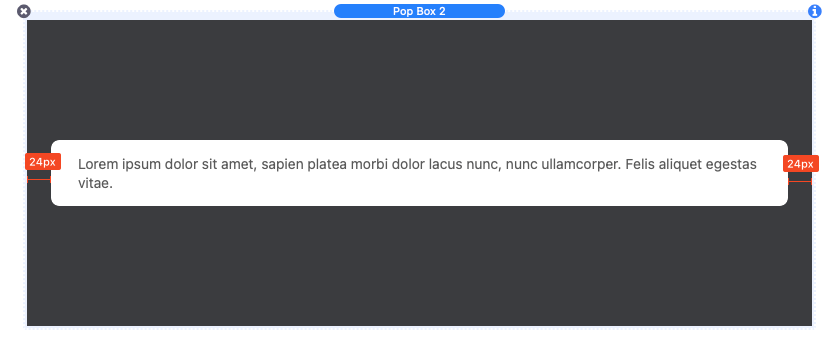
Condensed Layout
The “Condensed” layout option will tightly wrap the content with minimal padding space.

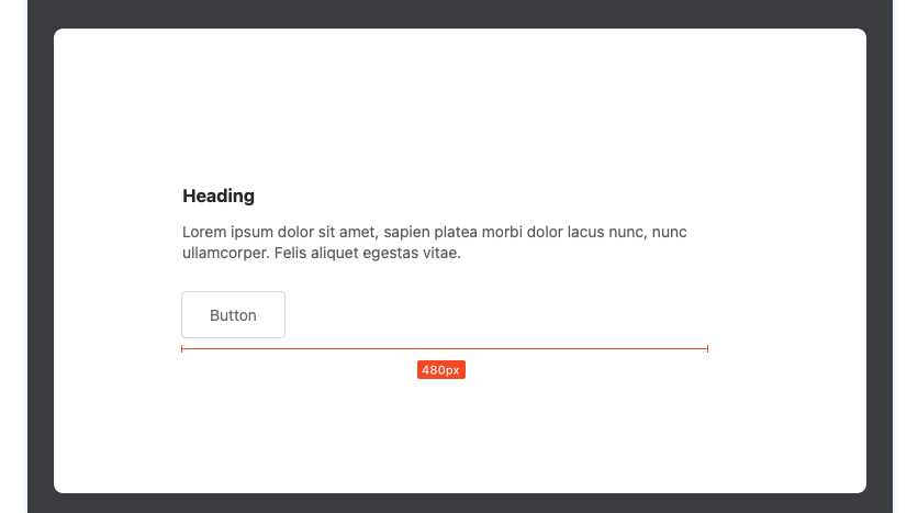
The Pop Box Width slider can be used to adjust the overall width of the popup.
The Padding sliders adjust the amount space at the top/bottom (T/B) and the left/right (L/R) of the content.
The Margin sliders adjust the gap between the popup and the browser edges at narrower browser widths.
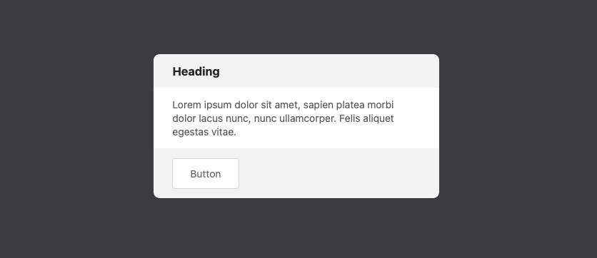
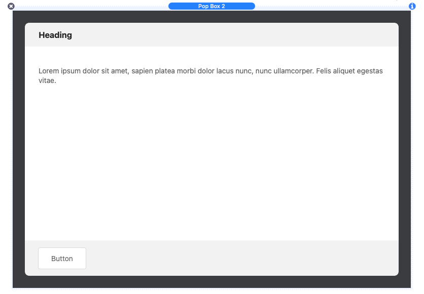
Condensed + Header & Footer Layout
The “Condensed + Header & Footer” layout option will tightly wrap the content and includes a header and footer content section.
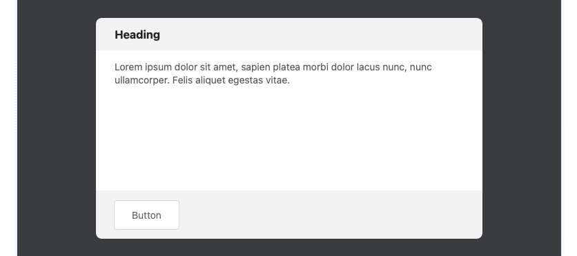
An additional Pop Box Height slider is provided to adjust the overall height of the popup.
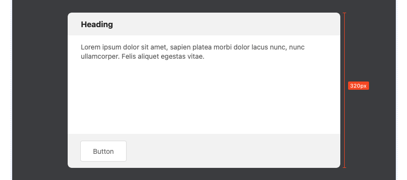
Enabling the Auto height option will treat the Pop Box Height value as a maximum height, reducing the height to match the content unless the content would exceed that value.
A scrollbar will be added to the main content if the height would exceed the defined Pop Box Height.
Additional fields to adjust the header and footer padding are provided with this layout.
Condensed Row Layout
The “Condensed Row” layout option will create a 3-column layout with the outer columns shrinking to the width of their content and the center column filling all remaining space.
This layout works best with a header or icon placed in the left most column and a button placed in the right most column.
Expanded Layout
The “Expanded” layout option adds more padding around the content creating a popup that fills more of the screen.
An additional Content Width slider is provided to adjust the width of the content inside the popup.
Fullscreen Layout
The “Fullscreen” layout option will fill the entire browser window leaving only the defined margin around the popup.
The Pop Box Width slider is replaced with a Content Width slider to adjust the width of the content inside the popup. Enable Full content width to allow the content to fill the entire width of the popup.
The align settings will adjust the content position instead of the popup position when using this layout.
Fullscreen + Header & Footer Layout
The “Fullscreen” layout option will fill the entire browser window and includes a header and footer content section.
Additional fields to adjust the header and footer padding are provided with this layout.
Adjusting Styles
The Pop Box 2 settings panel Background setting has 3 options to choose from:
Color – Define a sold color for the animation and content background.
Gradient – Define a 2 color gradient that applies across the animation and content background.
Image – Add an image that applies across the animation and content background. This option includes optional settings to define a Background Color, add a transparent Overlay Color, and apply a Blur effect to the image.
Special background and border animations can be added to the popup using the Background FX setting. There are 7 effects to choose from each with their own color controls.
The Background FX animation will only animate while the Pop Box 2 stack is selected in the Stacks editor so that it does not negatively impact performance.