Content Setup
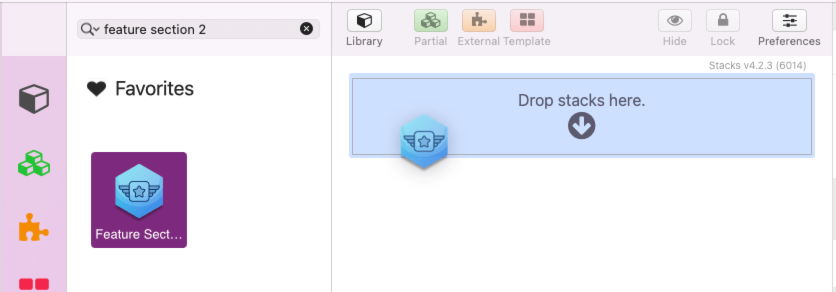
To get started, add the Feature Section 2 stack to the editor.
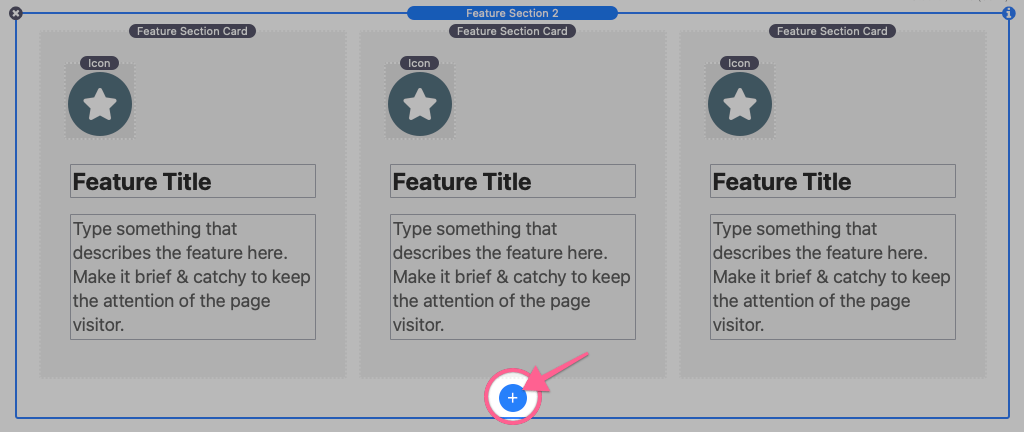
Initially, the Feature Section 2 stack contains three Feature Section Card stacks. Use the blue add button to add as many cards as needed.
Next, replace the card titles and descriptions with relevant feature text.
Lastly, you can customize each of the card icons by selecting them inside of the stacks editor. Open the settings panel to find a few adjustable options.
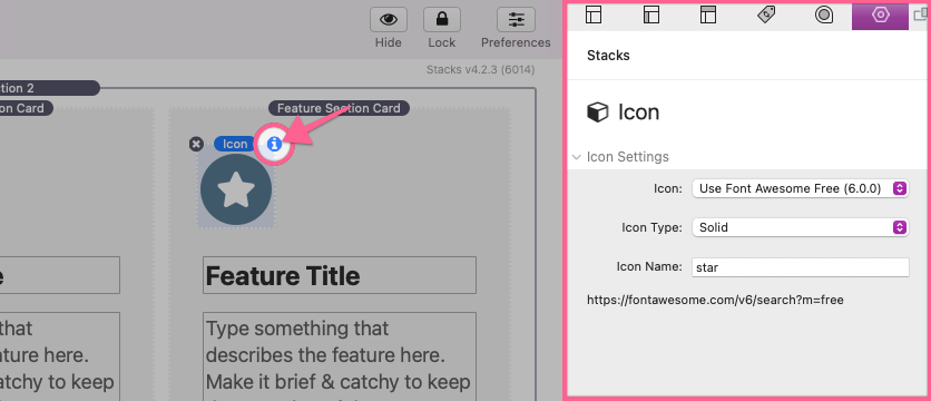
Icon Settings
Icon
Select from 3 icon libraries or use a custom icon image.
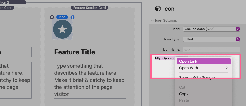
Icon Type
Select the display type of the icon. Each icon library has different available options. The “Ionicons” and “Material Icons” libraries also have a special “Two Tone” option. When this option is selected the icon will display in two shades (outline and background).
Icon Name
Type the name of an available icon into this field. To get a usable icon name for a selected icon library, right click (or CTRL + Click) the url found beneath the Icon Name field and click “Open Link”.
A page with a list of available icons while open in your default browser.
Font Awesome 6 Free Icon names are found beneath the icons. ?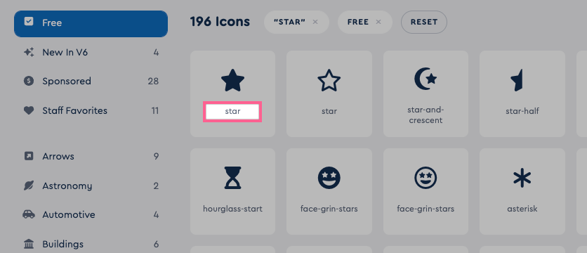
Note: Only icons designated as “free” are supported.
Ionicons icon names are found when using the “filled” tab. The icon name will display in the bottom left after clicking on any icon.
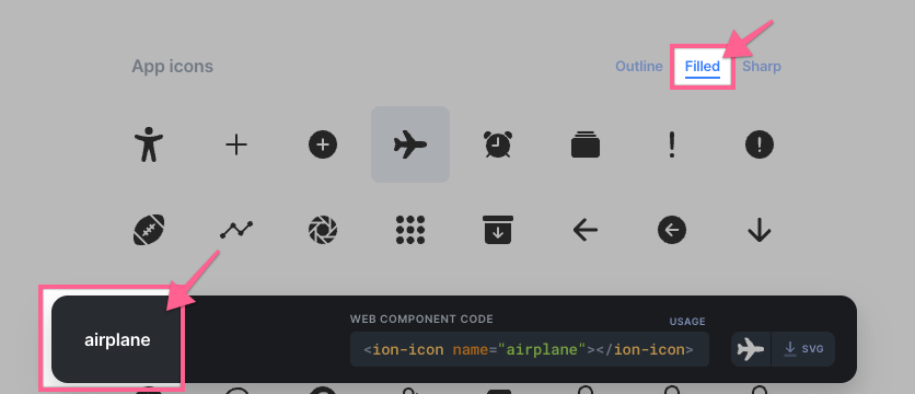
Note: When using the “Outline” and “Sharp” tabs you must remove the “-outline” or “-sharp” text from the title. These designations are handled by the Icon Type field in the settings panel.
Material Icon icon names are found by clicking on any icon. You can copy the icon name from the popup side menu. ?
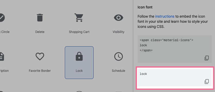
Note: You must use the icon title found in the side menu and not the title listed below the icons.
After customizing all of the card content you can now move on to adjusting the display settings.
Display Settings
To adjust the display settings, select the Feature Section 2 stack in the Stacks editor and open the settings panel.
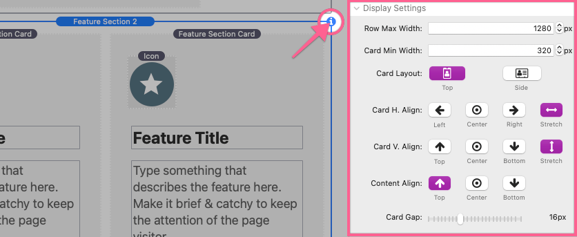
Row Max Width
Define the maximum width of the row of cards. Cards will fill the available space and wrap to a new row when necessary. This width is usually determined by the container stack where the Feature Section 2 stack is placed, so for most themes and frameworks this value will not need to be adjusted.
Card Width
Define the width of all of the feature cards.
Card Layout
Choose between two icon placement options for all of the feature cards.
Card H. Align
Choose a horizontal alignment option for the cards. The “Stretch” option will force the cards to always fill all available horizontal space. The “Stretch” option will use the Card Width value as a minimum width instead, which is used to determine when a card should wrap to a new row. The “Stretch” option enables an additional Content H. Align setting used to horizontally align the icon, title, and description inside of the card.
Card V. Align
Choose a vertical alignment option for the cards. The “Stretch” option will force the cards to always match the height of the tallest card in a row. The “Stretch” option enables an additional Content V. Align setting used to vertically align the icon, title, and description inside of the card.
Card Gap
Define a distance in pixels between each of the cards.
Global Feature Card Styling
To adjust the global feature card styles, select the Feature Section 2 stack in the Stacks editor and open the settings panel.
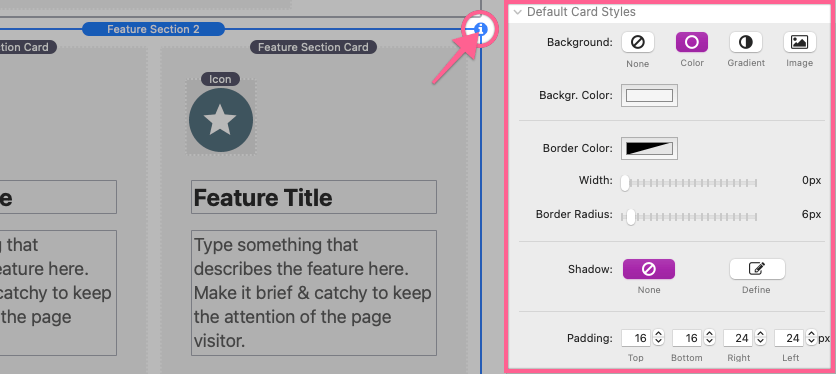
Default Card Styles
The style settings found in this section function just like they do with any built-in stack. Each setting applies to all feature cards unless overwritten by an individual card’s style settings.
Default Card Content Styles
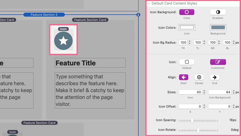
Icon Background
Choose between a solid color or gradient color for the icon background.
Icon Bg Radius
Define the corner rounding of the icon background. TR = Top right corner, TL = Top left corner, BR = Bottom right corner, BL = Bottom left corner.
—
Icon
Optionally adjust Icon formatting and sizing by selecting the “Customize” option.
Align (customize enabled)
Choose a horizontal alignment option for the card icon.
Sizes (customize enabled)
Define the size of the icon and the icon background in pixels.
Icon Offset (customize enabled)
Define an offset for the icon and icon background. A positive “X” value will move the icon right while a negative value will move it left. A positive “Y” value will move the icon downward while a negative value will move it upward.
Icon Spacing (customize enabled)
Define a distance in pixels between the icon and the heading/description of the card.
Icon Rotate (customize enabled)
Define an optional rotation in degrees for the card icon.
—
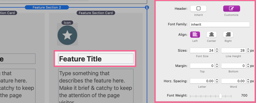
Header
Optionally adjust header text formatting and sizing by selecting the “Customize” option.
Font Family (customize enabled)
Optionally define a font family by name for the header text to use.
Align (customize enabled)
Choose a horizontal text alignment for the header.
Sizes (customize enabled)
Define the font size and line height for the header text.
Margin (customize enabled)
Define distances in pixels above and below the header text.
Horz. Spacing (customize enabled)
Define distances in pixels between letters and words in the header text.
Font Weight (customize enabled)
Adjust the weight/thickness of the header text. The values supported are determined by the font used.
—
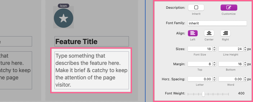
Description
Optionally adjust description text formatting and sizing by selecting the “Customize” option.
Font Family (customize enabled)
Optionally define a font family by name for the description text to use.
Align (customize enabled)
Choose a horizontal text alignment for the description.
Sizes (customize enabled)
Define the font size and line height for the description text.
Margin (customize enabled)
Define distances in pixels above and below the description text.
Horz. Spacing (customize enabled)
Define distances in pixels between letters and words in the description text.
Font Weight (customize enabled)
Adjust the weight/thickness of the description text. The values supported are determined by the font used.
Adding & Adjusting Hover Effects
To add feature card hover effects, select the Feature Section 2 stack in the Stacks editor and open the settings panel.
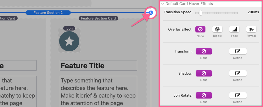
Transition Speed
Adjust the time in milliseconds it takes to animate animate any applied hover effects.
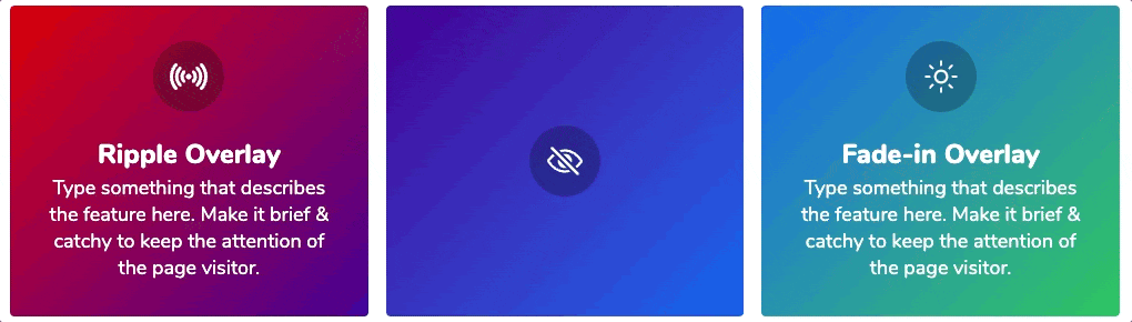
Overlay Effect
Choose from 3 special overlay effects or none at all. Overlay effects allow you to define hover colors for the overlay, icon, icon background, header, & description. The “Ripple” option also enables a Ripple Origin setting where you can select a position for the ripple animation to animate from.
Transform
Optionally define move up, scale, and rotation values for the card in a hovered state.
Shadow
Optionally define a casted shadow for the card in a hovered state.
Icon Rotate
Optionally adjust the rotation in degrees for the icon when the card is in a hovered state.
Customizing Styles & Effects Per Card
To customize the styles & effects of a single feature card, select that Feature Section Card stack in the Stacks editor and open the settings panel.
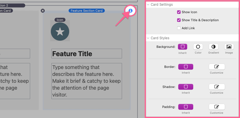
Card Settings
Show Icon
Optionally remove the Icon from the selected feature card by disabling this option.
Show Title & Description
Optionally remove the Title & Description from the selected feature card by disabling this option. A empty “Drop stacks here” section will be provided where you can place 3rd-party stacks content.
Add Link
Optionally add a link to the entire card.
Card Styles / Card Content Styles / Card Hover Effects
By default all settings are set to “inherit”. This means the relevant styles and settings will be inherited from the default settings defined in the Feature Section 2 stack settings panel. Select “customize” on any setting that you would like to overwrite for the selected feature card.