Documentation
Getting Started
Overview
1LD RapidWeaver projects are built with 8 included Deluxe stacks. They consist of 1 main stack, 3 component stacks, and 4 supplemental stacks.
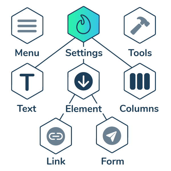
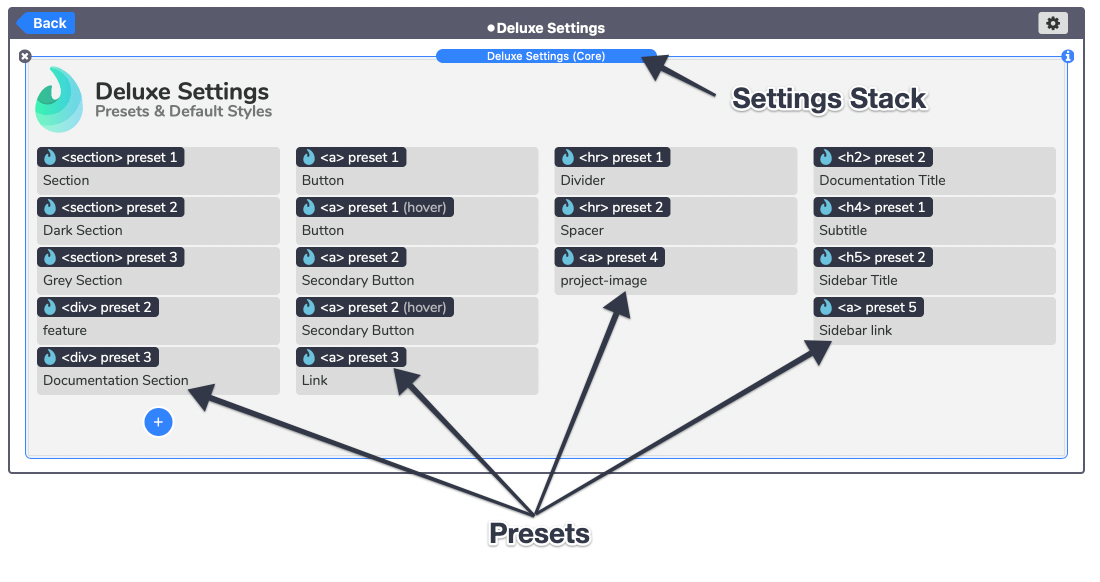
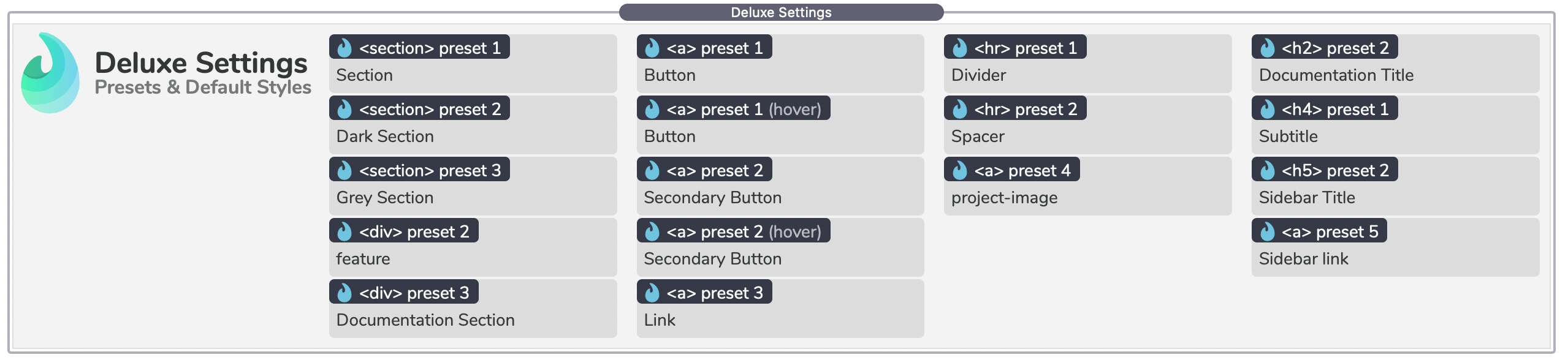
The main or "core" stack is the Settings stack, which can be found at the top of every Stacks page. It is placed inside of a partial so that changes made to it apply to every page. Inside of the Settings stack are predefined style stacks referred to as "Presets". This is were you can control the default styles of specific elements across the entire project.
The 3 main component stacks are Element, Columns, and Text.
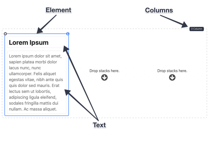
These 3 components are the building blocks for the website design. They function similarly to the built-in Column and Text stacks but provide more in-depth style control. The Link Element and Form Element stacks are extensions of the Element stack and function nearly identically to it. The last stack is the Menu stack which provides a style-able navigation menu to the project.
Getting Started
Adjusting Default Styles
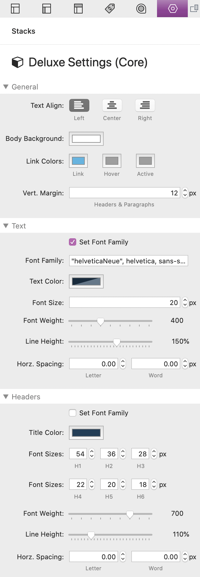
You can access the styles by clicking on the main Settings stack found at the top of each page. The Deluxe Settings stack is placed inside of a Stacks plugin partial. If you are unfamiliar with partials you can learn about them at https://yourhead.com/partials/
In the settings panel are the default settings for the entire project. These settings can be overridden by presets, classes, and by any styles applied directly to any stack. Most of the settings are straight forward with a few exceptions:
Vert. Margin
Adjusts the vertical (top and bottom) margin of all Heading and Paragraph Text stacks.
Set Font Family
Enable to define a custom font for the entire site. Here you can add the name of a font you want to use that you have loaded through a font stack like Webfont Helper. There is also a second setting in the "Headers" section if you would like to declare a separate font for the headings.
Line Height
Adjusts the distance between lines of text by percentage. This is most useful for paragraphs or titles that cover more than just a single row of text.
Horz. Spacing
Adjusts the horizontal spacing between the text letters and the space between each individual word. In most cases these values should be left at 0.
Element Stacks
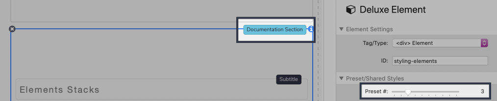
Styling Elements
The Element stack is the equivalent of the Stacks plugin 1 Column stack. Each Element stack is simply a style-able stacks container that allows you to select an element type.
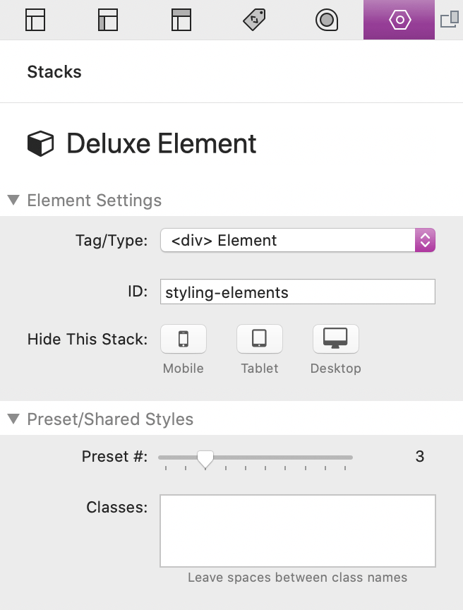
Every Element stack (Including Link & Form Elements) can also be styled individually through the the settings panel after selecting the stack in the editor. The settings are categorized into a few different sections.
Element Settings
Here is where you can select an element type. Each of these types will function the same way with each option having different pool of preset styles to choose from.
There is also and optional "ID" field where you can define a unique value. This is useful if you need to create a link to the element somewhere else on the page that you want to scroll to. See the Creating "Scroll To" Links tutorial for more info.
Lastly, there is an option to hide the entire element at deferent devices sizes.
Preset/Shared Styles
This section is for selecting a preset style for the element tag/type. The presets can be found in the main Settings stack at the top of each Stacks page. Only certain elements will have presets and when a preset number that has a definition is selected, the description title will show at the top right of the stack inside the editor.
Classes
There is also a field were you can add multiple class names to have any styles associated with those classes apply to this element. You can learn more about classes in the Creating & Using Classes tutorial.
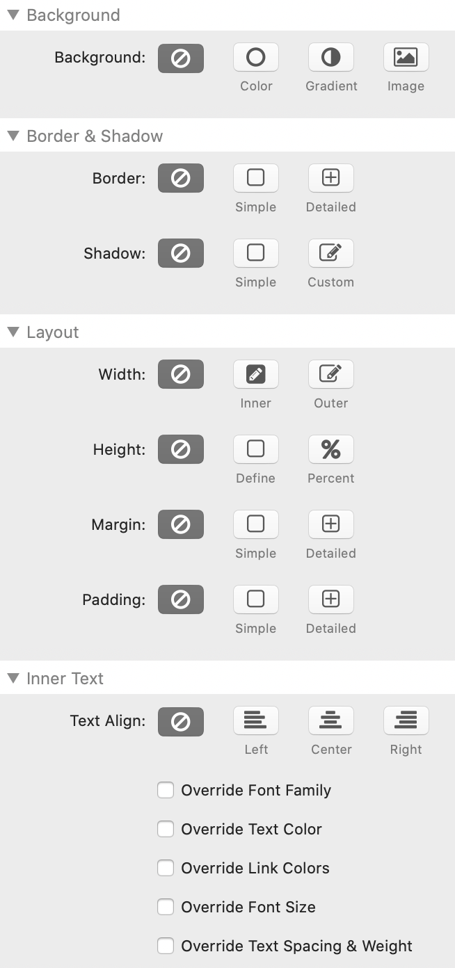
Style Sections
There are 4 style sections: Background, Border & Shadow, Layout, and Inner Text. By default, all of the styles are disabled and only styles inherited from presets or classes will apply. If you enable a style, the inherited styles will then be overridden. This is useful when you want to make a change to a singular element or if you would rather style your elements one by one.
Most of the style options function just like they do with the built-in Stacks. However 2 exceptions are the Width and Height settings, which will be gone over in the next 2 documentation sections.
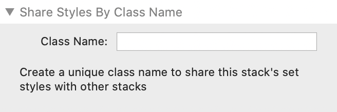
Share Styles By Class Name
This section allows you to define a unique class name that can be shared with other stacks to inherit any styles you have defined. You can learn more about classes in the Creating & Using Classes tutorial.
Element Stacks
Defining Widths
By default, all Element stacks (Element, Link, Form) will fill the entire width of the container of which they are placed inside. You can optionally enable one of two width options for advanced layout functionality.
Inner
Select this option to define the max width of the inner content of the Element stack. This option is most useful for defining a content width for you entire project.
Outer
Select this option to define the max width of the entire outer element.
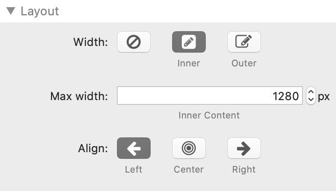
These values define a max-width and not a width. This means the width will shrink below the defined value if it is greater than the width of the browser/device window. This will keep the content from overflowing out of view.
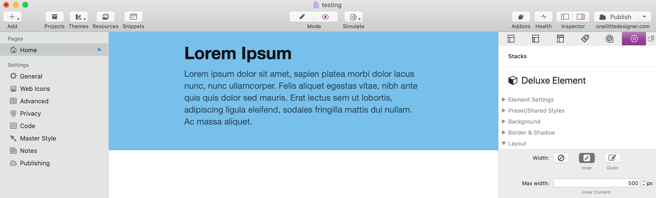
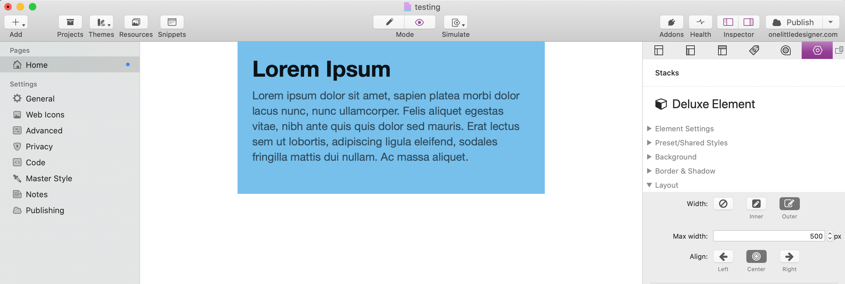
Here is a visual example of how the 2 option differ from one another:
This element does not have a defined width so it fills the entire width of the container, in this case the root body element. The background has been colored blue and padding has been applied.
This element has a defined "Inner" width of 500px and is aligned to the center.
This element has a defined "Outer" width of 500px and is aligned to the center. This time you will notice that the background color does not fill the entire width of the page. The entire element width is affected with this option enabled.
Element Stacks
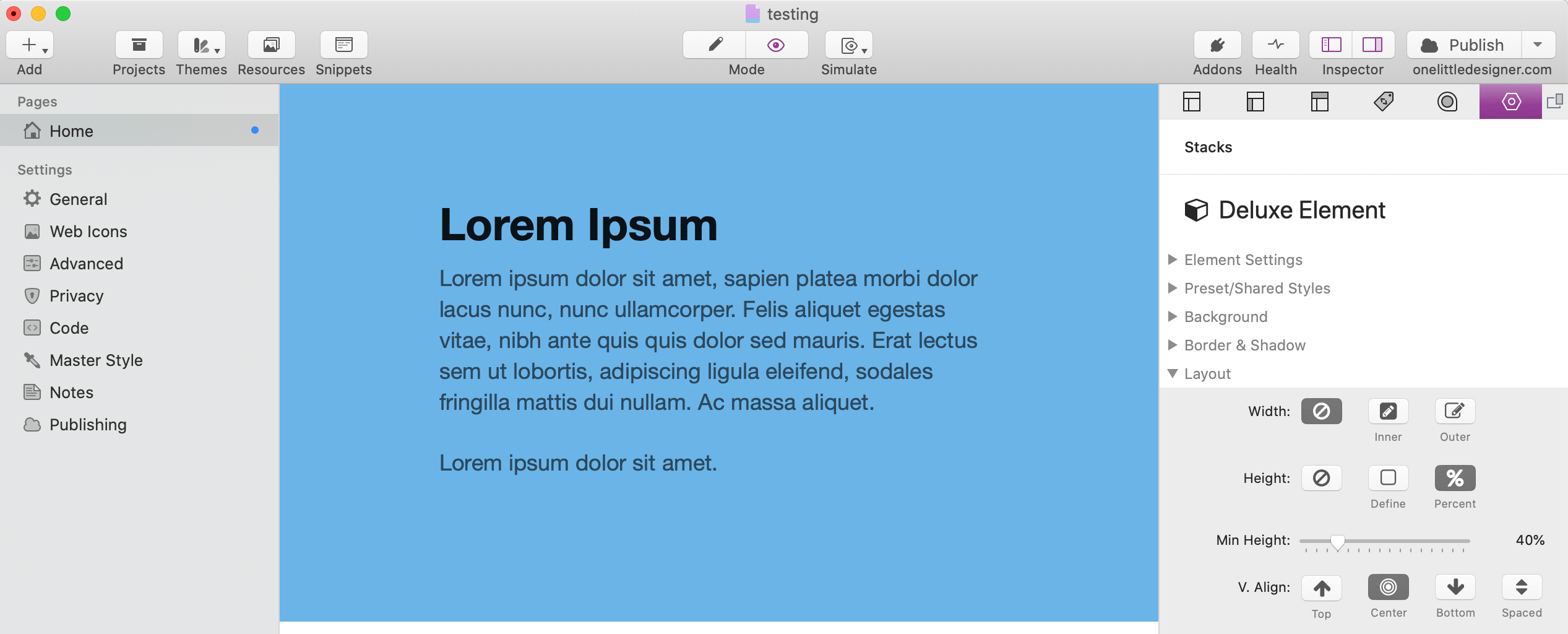
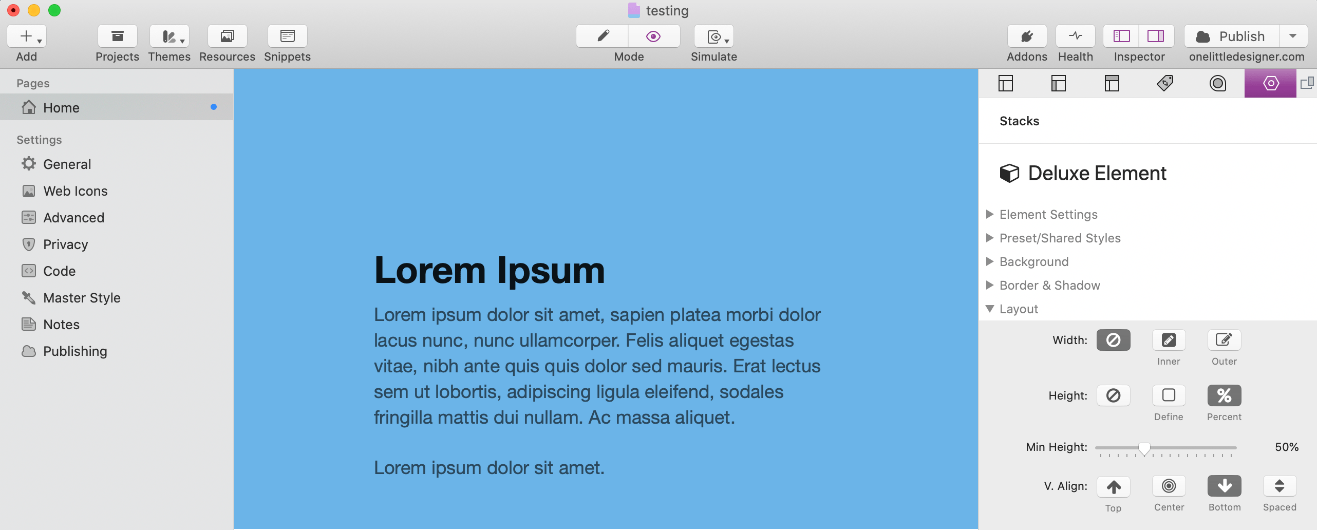
Defining Heights
The Element stacks (Element, Link, Form) have two height options for advanced layout functionality.
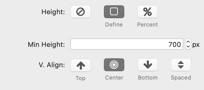
Define
Select this option to define a specific min height of the Element stack. There are also 3 options for aligning the content vertically and a single option for spacing adding space between the inner stacks.
Percent
Select this option to define a min height by percentage of the height of the browser window. This option allows the height to adjust according to the size of the browser or device. This option is great for when you want to create content sections that fill the entire browser window regardless of how much content there is.
These values define a min-height and not a height. This means the height will expand beyond the defined value if it the content cannot fit. This will keep the content from overflowing outside of the element.
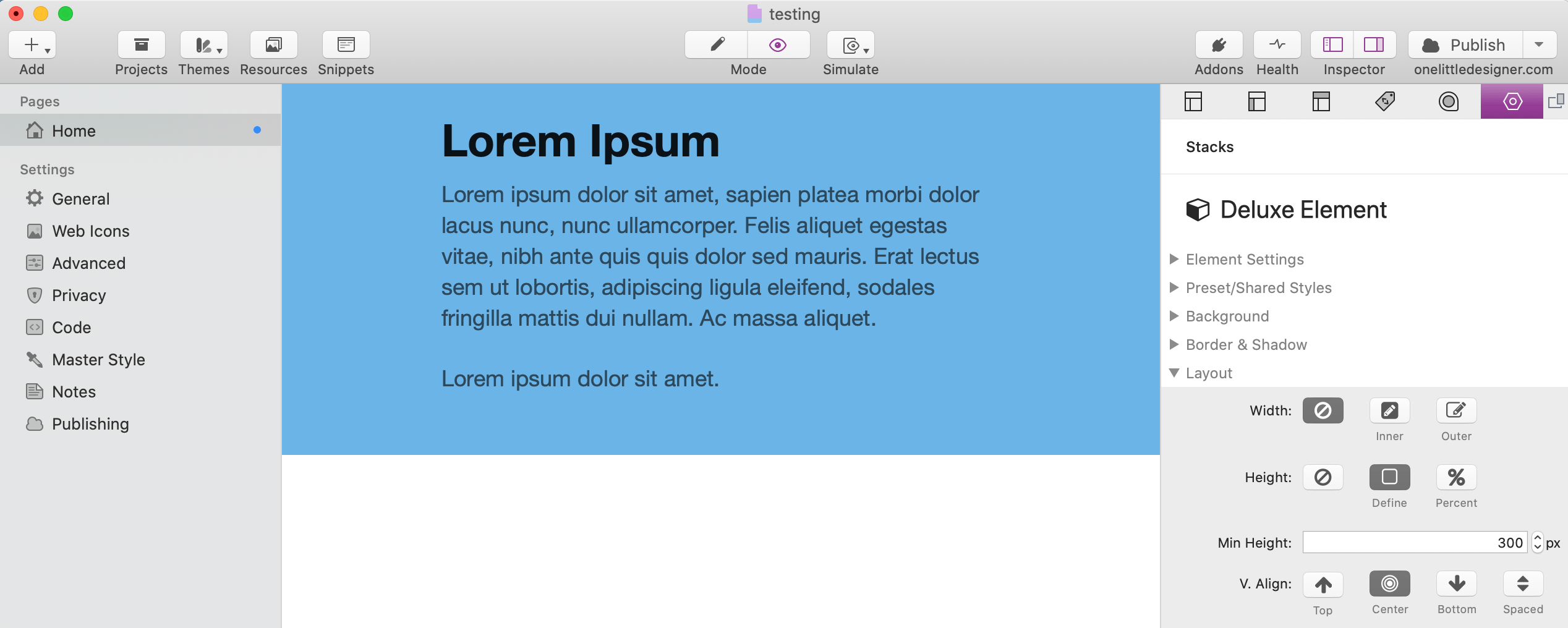
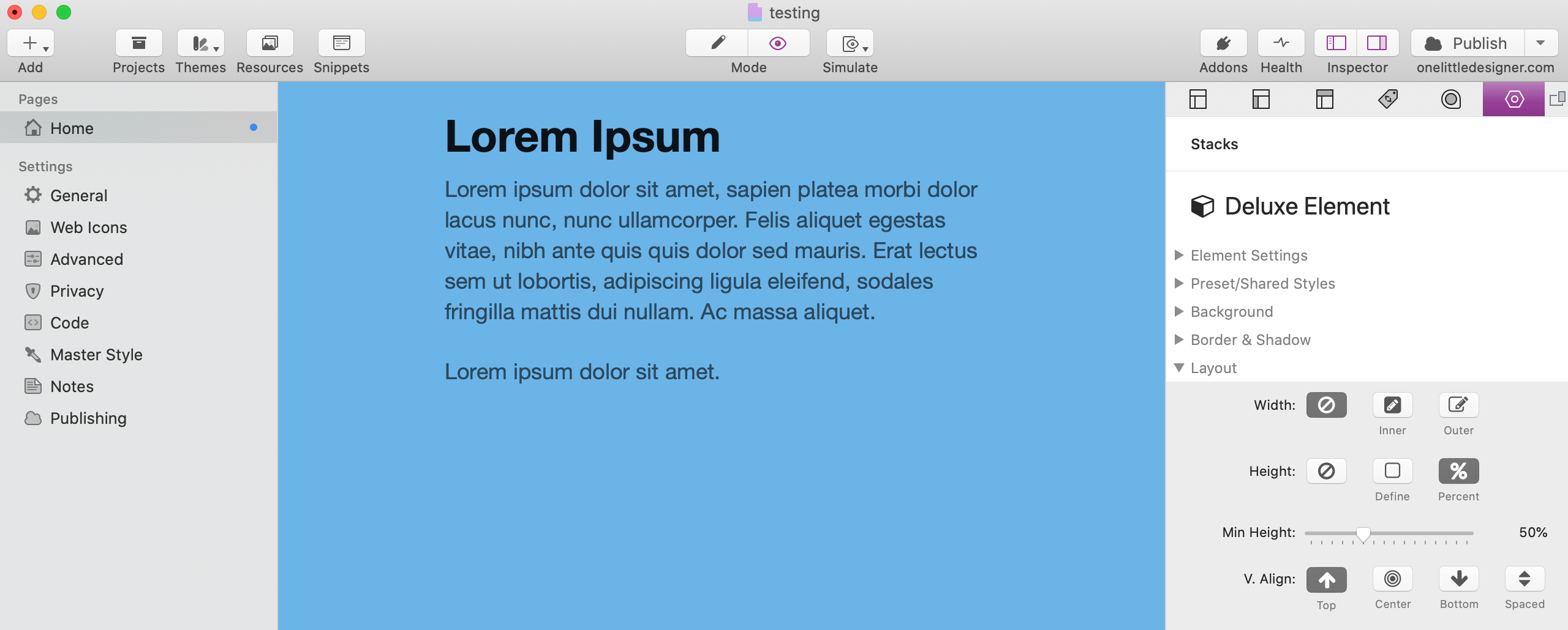
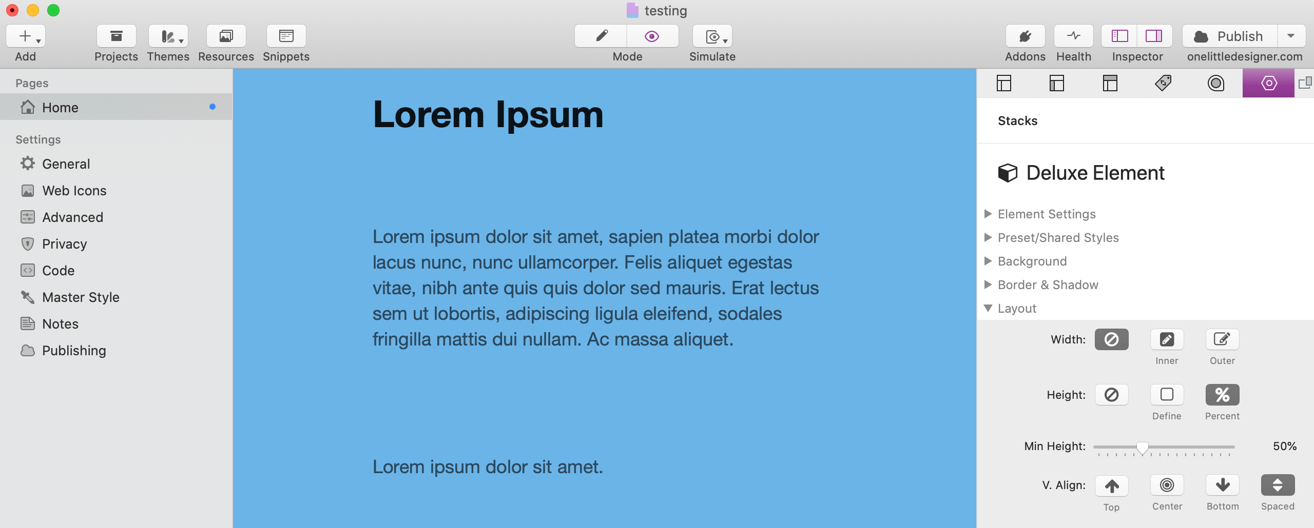
Here is a visual example of how the 2 option differ from one another:
This element uses the "Define" option with a min height of 300px and center vertical alignment. The background has been colored blue and padding has been applied.
This element uses the "Percent" option with a min height of 60% and is aligned to the center.
Here is the same element with a different vertical alignments.
And lastly, the same element with "Spaced" vertical alignment.
Element Stacks
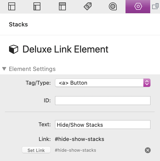
Using The Link Element
The Link Element stack is an extension of the Element stack and it functions identically to it. There are a few differences related to creating links. The first is that there are only 2 "Tag/Type" element options.
<a> Button
This element type does not have a "Drop stacks here" content section and instead has a special field for you to define the link's text or title. There is also an option to set where the link navigates.
<a> Element
This element type allows you to add other stacks to the link content. This is useful for adding icons, columns and other stacks.
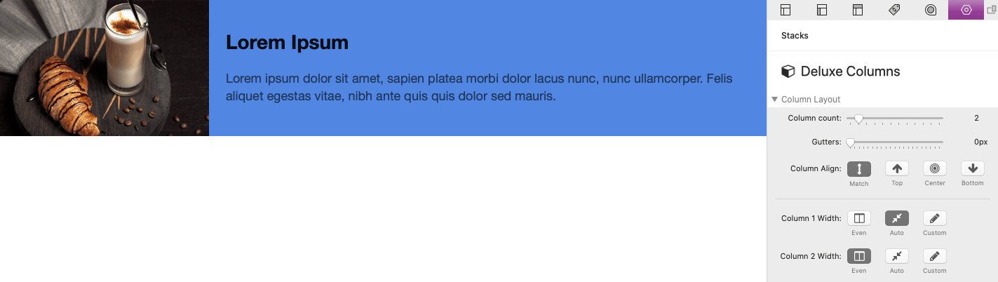
Columns Stack
Creating/Modifying Layouts
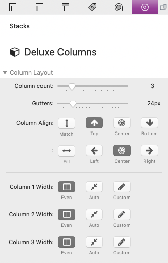
The Columns stack is the equivalent of the Stacks plugin 2-5 Column stacks. This stack allows you to make up to 12 columns and has a few additional settings for achieving more advanced layouts.
Column Count
Set how many columns you want to use

Gutters
Adjust the spacing between each column

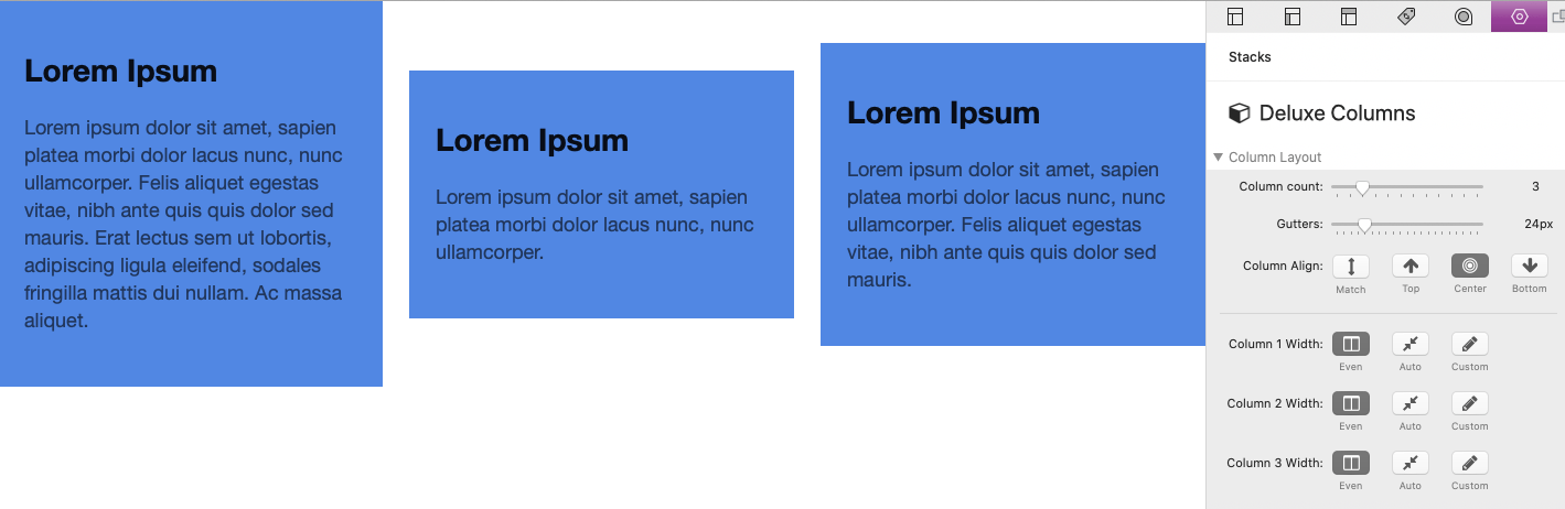
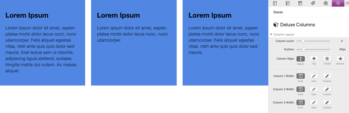
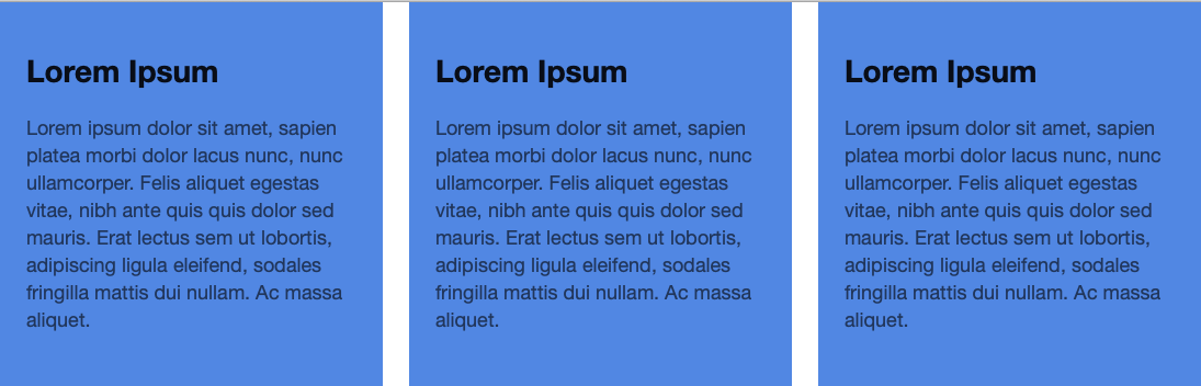
Column Align
Will allow you to change how the columns align vertically & horizontally with each other.
The horizontal Column Align options only apply if none of the columns are set to an "Even" width.
Top:
Center:
Bottom:
Match:
The "Match" option does not make a visible difference from "Top" unless the content in the column is wrapped in an Element stack with a background applied.
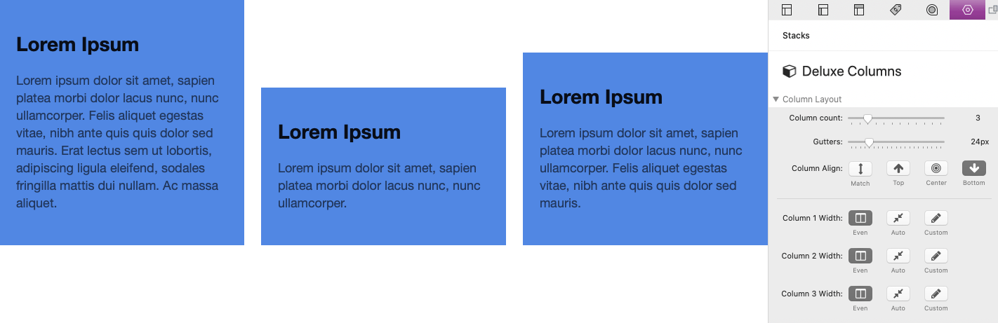
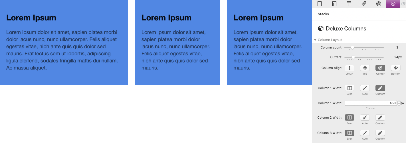
Column Widths
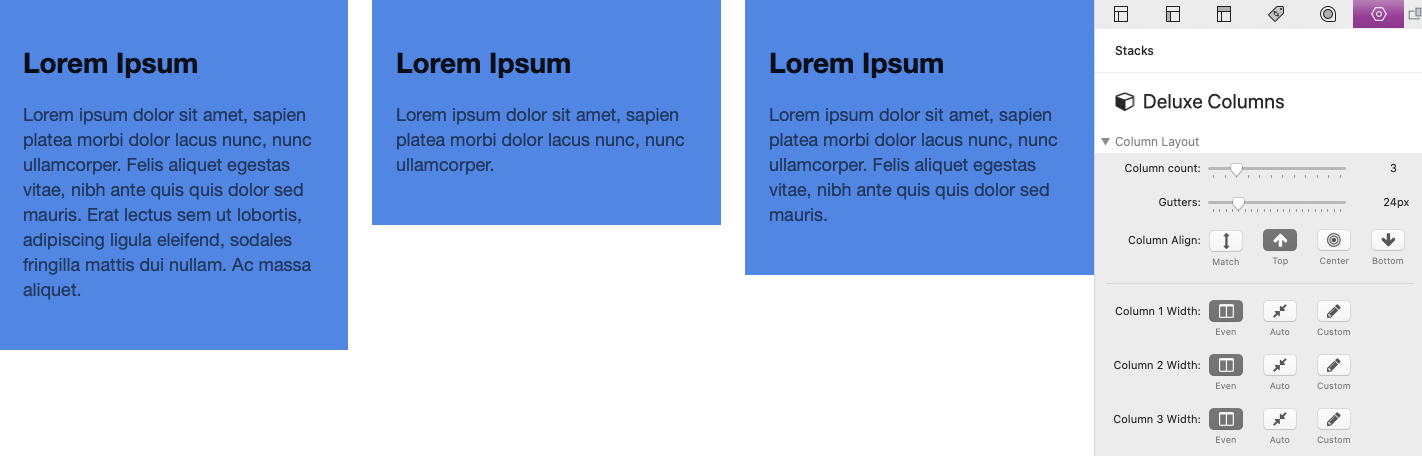
Each column has its own Column Width setting. By default, the "Even" option is enabled which divides the horizontal space evenly between all other columns that are also set to "Even".
The "Custom" option will allow you to set a specific width for a column. All remaining columns set to "Even" will display at equal widths in the remaining available space.
The "Auto" option will cause a column to automatically shrink to its lowest possible width. All remaining columns set to "Even" will display at equal widths in the remaining available space. In the example below, the first column has an image that is 300px wide.
Columns Stack
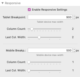
Adjusting Responsive Behavior
By default columns will not collapse for mobile devices and narrow browser windows, you must enable Responsive Settings. When enabled, you can define two device widths that have corresponding Column Count settings. Each value represents how many columns can display on a single row with the left over columns breaking to the next row/s.

Last Col. Width
There is also a setting that allows you to set the width of the last column. This allows you to fill any remaining horizontal space.
Hiding/Showing Stacks
The breakpoints values will change the size at which the stacks hide or show when using the "Hide This Stack" option on Element stacks inside the columns stack.
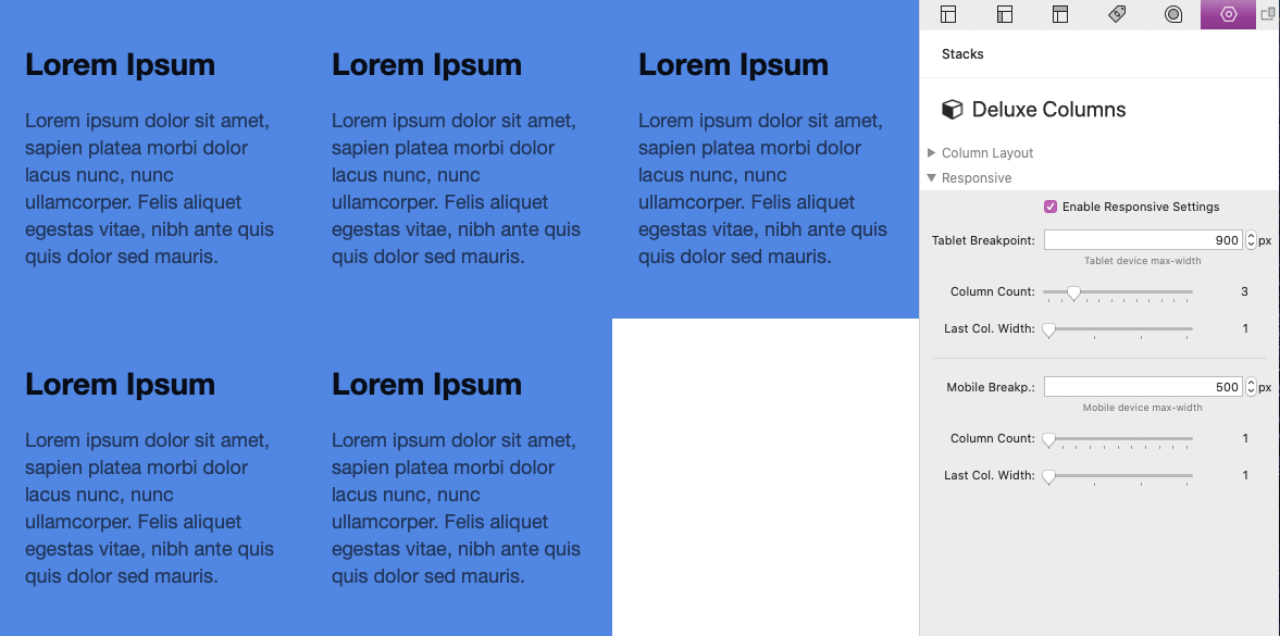
In this example we are using a 5 columns. The "Tablet Breakpoint" is set to 900px with a column count of 3. The last column width is left at the default value 1, which leaves open space in the second row.
When we set the last column width to 2, the column will fill the space of 2 columns filling in the open space.
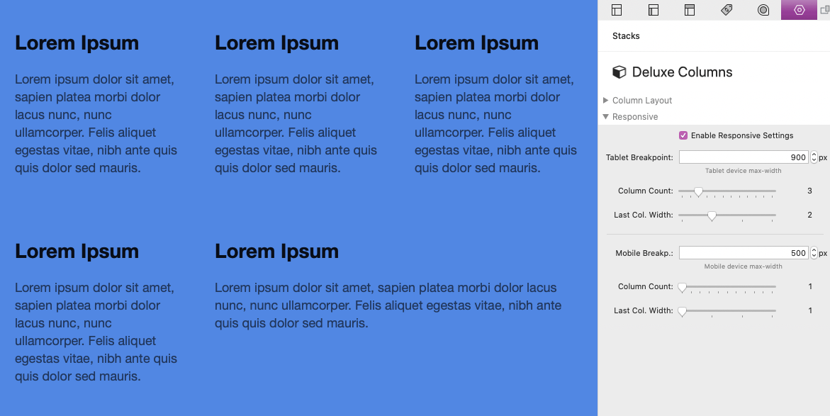
Table & Mobile Column Order
There are also some predefined class names that you can add to stacks inside of the columns to change responsive behavior. See the Using Predefined Classes tutorial for more info.
Tools Stack
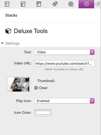
Video
This tool allows you to add responsive YouTube or Vimeo videos to your pages.
After adding the Deluxe Tools stack to the editor, select the "Video" tool in the stack settings menu. Then add the URL of the video you want to use.
Thumbnail
Optionally add an image to this field to display a static image before the video is played.
Play Icon
When this is enabled, it will display an icon above the video thumbnail to prompt users to play the video.
Tools Stack
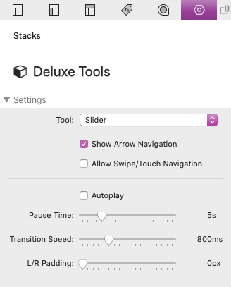
Slider
This tool allows you to add content slideshows to your projects.
After adding the Deluxe Tools stack to the editor, select the "Slider" tool in the stack settings menu. In the editor you will see a single slide (Element stack), a blue add slide button, and a section to add custom navigation arrows.
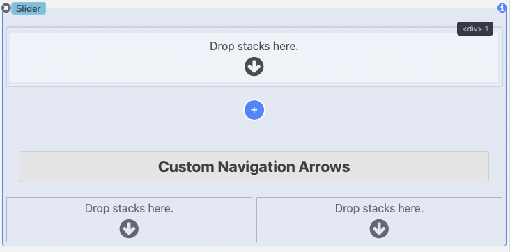
The Custom Navigation Arrows are optional and if none are provided default icons will be used.
Any stacks content can be added to each slide (Image, Text, or other 3rd-party stacks). In preview or when published, each slide will display one at a time filling all available space to the left and right. The settings menu provides a few different options for defining how the slider navigates.
Show Arrow Navigation
Enables left and right arrows that users can use to navigate through the slides.
Allow Swipe/Touch Navigation
Enables the ability to click and drag or swipe the slides to navigate.
Autoplay
Enables automatic timed slide navigation. Autoplay will stop while the mouse cursor is over the slider.
Pause Time
Define how long the slides remain stationary when autoplay is enabled.
Transition Speed
Define how fast in milliseconds the slide transitions to the next when navigating or during autoplay.
L/R Padding
Optionally define left and right padding for the slider. Slides will not fill in this padded area but the arrow navigation will if it is enabled.
Tools Stack
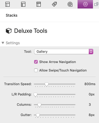
Gallery
This tool allows you to add image galleries to your projects. All images in a gallery will open in a full screen lightbox that allows users to navigate through each of the images in the gallery. The lightbox gallery works exactly like the Slider tool defined above.
After adding the Deluxe Tools stack to the editor, select the "Gallery" tool in the stack settings menu. In the editor you will see a single slide (Element stack), a blue add slide button, and a section to add custom navigation arrows.
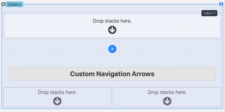
The Custom Navigation Arrows are optional and if none are provided default icons will be used.
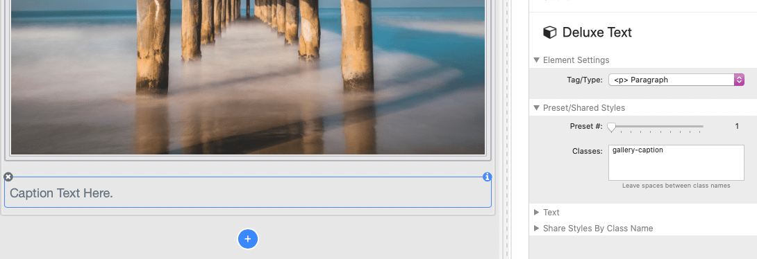
Images can be added to each slide by using the Stacks plugin built-in Image or Site Image stack. You can also simply drag and drop an image from your desktop or from a folder directly into the slide.
Optionally create captions by adding a Text stack below each image inside of the slide. To make the caption only visible when the gallery lightbox is open, add the class
gallery-caption
to the Text stack.
The settings menu provides a few different options for defining how the slider navigates when the gallery lightbox is open as well as how the gallery displays.
Show Arrow Navigation
Enables left and right arrows that users can use to navigate through the slides.
Allow Swipe/Touch Navigation
Enables the ability to click and drag or swipe the slides to navigate.
Transition Speed
Define how fast in milliseconds the slide transitions to the next when navigating.
L/R Padding
Optionally define left and right padding for the slider. Slides will not fill in this padded area but the arrow navigation will if it is enabled.
Columns
Number of columns displayed before the lightbox gallery is launched. If more than 2 columns is defined mobile size device/browser windows will display a maximum of 2 columns.
Gutter
The space between each image in the columns.
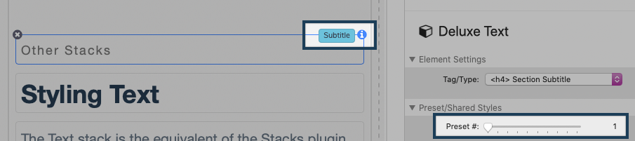
Other Stacks
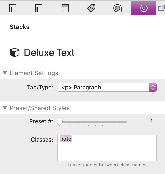
Styling Text
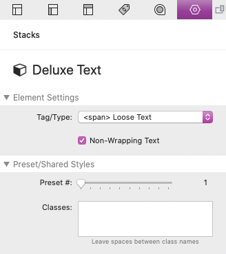
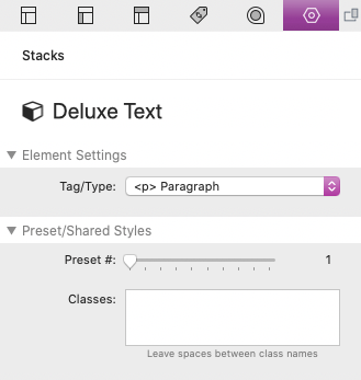
The Text stack is the equivalent of the Stacks plugin stack with the same name. This stack is similar in function to the Element stack. The major differences are that the content is instead a “styled text” container and the style settings are limited to things that are relevant to text.
Element Settings
Here is where you can select an element type. Each of these types will function the same way with each option having a different pool of preset styles to choose from. The only exception is "<span> Loose Text" which includes one additional setting:
Non-Wrapping Text
When this is enabled the text will not wrap to a new line unless explicitly defined by a line break. This is usually for visual purposes and is useful for preventing things like large text from breaking to multiple lines when the browser narrows.
Wrapping Text Example:

Non-Wrapping Text Example:
Preset/Shared Styles
This section is for selecting a preset style for the element tag/type. The presets can be found in the main Settings stack at the top of each Stacks page. Only certain elements will have presets and when a preset number that has a definition is selected, the description title will show at the top right of the stack inside the editor.
There is also a field were you can add multiple class names to have any styles associated with those classes apply to this element. You can learn more about classes in the Creating & Using Classes tutorial.
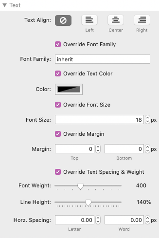
Text
By default, all of the styles are disabled and only styles inherited from presets or classes will apply. If you enable a style, the inherited styles will then be overridden. This is useful when you want to make a change to a singular element or if you would rather style your elements one by one. Most of the style options function just like they do with the built-in Stacks with a few exceptions:
Override Font Family
Enable to define a custom font this Text stack. Here you can add the name of a font you want to use that you have loaded through a font stack like Webfont Helper.
Override Margin
Adjusts the vertical (top and bottom) margin of this Text stack.
Override Text Spacing & Weight: Line Height
Adjusts the distance between lines of text by percentage. This is most useful for paragraphs or titles that cover more than just a single row of text.
Override Text Spacing & Weight: Horz. Spacing
Adjusts the horizontal spacing between the text letters and the space between each individual word. This is mostly useful for styling headings.
Share Styles By Class Name
This section allows you to define a unique class name that can be shared with other stacks to inherit any styles you have defined. You can learn more about classes in the Creating & Using Classes tutorial.
Other Stacks
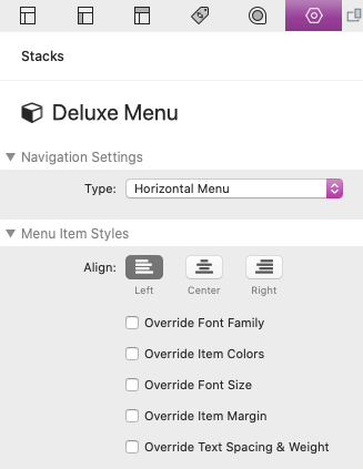
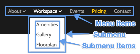
Menu Settings & Styles
Each project includes a simple navigation/menu stack. This stack is designed to give the project essential functionality and it can be replaced by your preferred menu stack.
Navigation Settings
There are 2 main menu types for the Deluxe Menu stack. The horizontal menu serves as the main responsive menu for the project while the vertical menu serves as an optional full list of page links that can be displayed in a sidebar or footer.
A new "One Page" option was added with the release of the Alex Solus Project. To learn more about how to use this menu see the Using the One Page Menu tutorial.
A new "Off Canvas" option was added with the release of the Forma Project. To learn more about how to use this menu see the Using an Off Canvas Menu tutorial.
Menu Item Settings
This section of styles functions similarly to the Text stack styles. By default, all styles are inherited from he main Settings stack.
Override Font Family
Enable to define a custom font the menu items. Here you can add the name of a font you want to use that you have loaded through a font stack like Webfont Helper.
Override Margin
Adjusts the margin around each individual menu item.
Override Text Spacing & Weight: Horz. Spacing
Adjusts the horizontal spacing between the text letters and the space between each individual word.
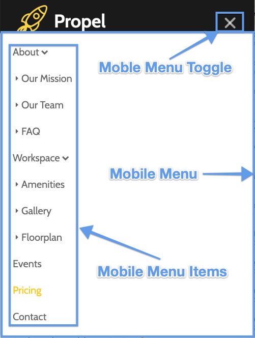
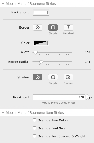
Mobile / Submenu Styles
These settings modify the appearance of the dropdown menus as well as the appearance of the entire mobile dropdown menu.
Breakpoint
Define the device/browser width at which the mobile menu toggle displays instead of the menu items.
Mobile / Submenu Item Styles
These settings control the appearance of the link text in the dropdown menus as well as the entire mobile dropdown menu.
Other Stacks
Using Webfont Helper
The Webfont Helper Stack includes 45 Google Fonts to choose from. When a font is added to a project, it loads the font files locally instead of from Google's servers.
Fonts
Select a font from this section to get started. You can then enable "Test Font" to get an idea of how the font will look across different elements.
After you have selected a font, simply drag and drop the font in the editor outside of the the Webfont Helper stack. You will then need to delete the Webfont Helper stack from the editor to prevent the stack from uploading all 45 font files to your website.
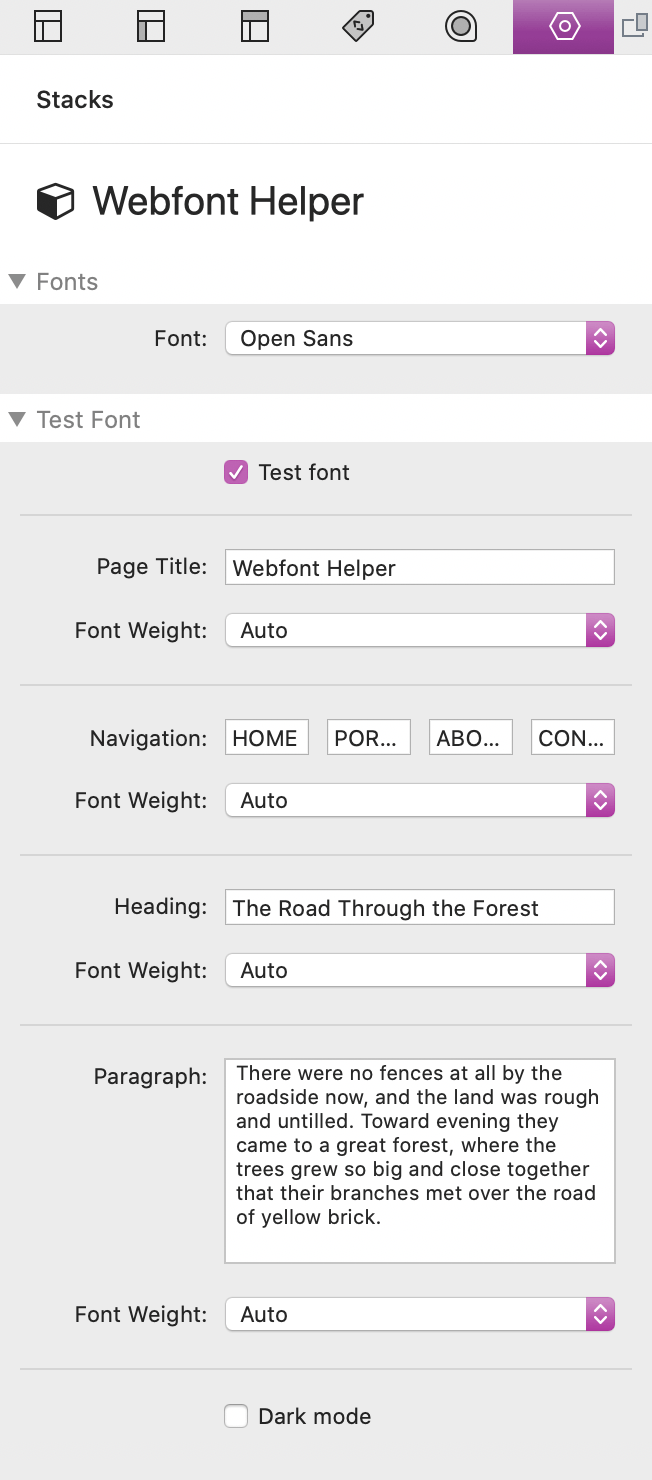
Be sure to delete the Webfont Helper stack from the editor to prevent the stack from uploading all 45 font files to your website. This will prevent long publishing wait times.
Other Stacks
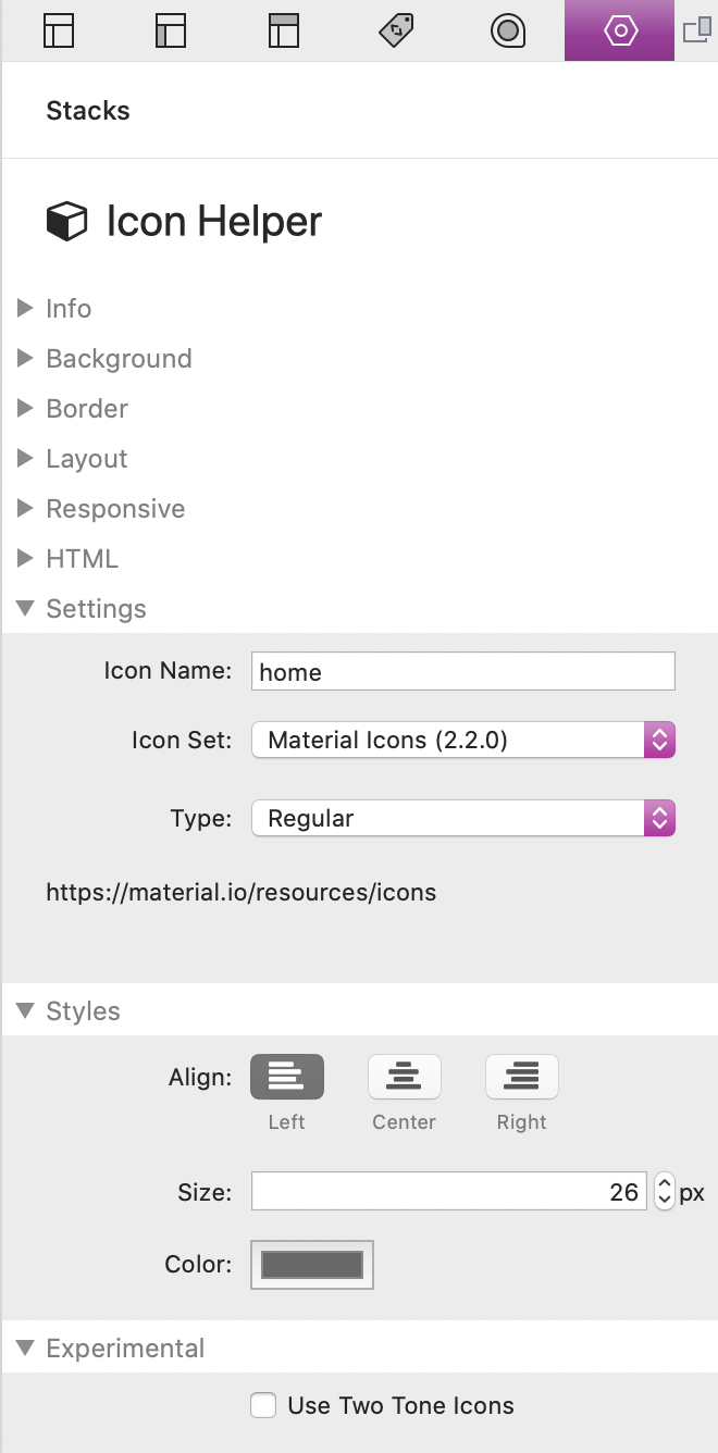
Using Icon Helper
The Icon Helper stack is a useful tool that give you access to 3 icon libraries: Material Icons, Ionicons 5, and Font Awesome 5 (Free version).
Setup
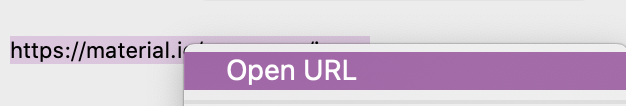
First select an icon library from the "Icon Set" dropdown. At the bottom of the Settings section is a URL that you can right-click/ctrl-click to reveal a menu. In that menu select "Open URL".
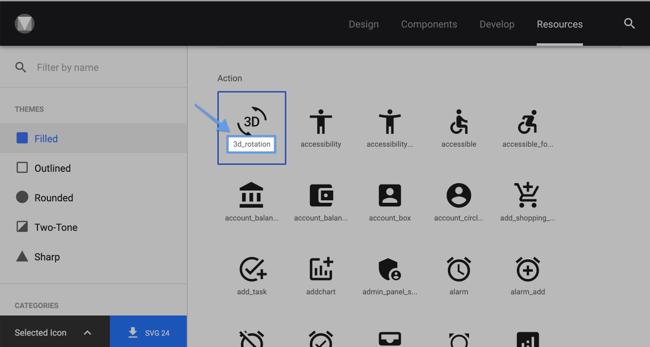
This will open a list of usable icons with their icon names. Add the name of the icon you want to use to the "Icon Name" field. If you are using Material icons the icon names are found beneath the icons.
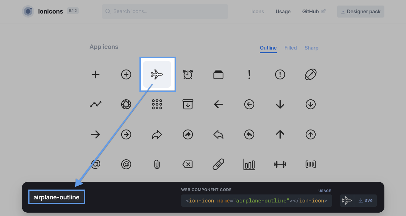
If you are using Ionicons 5 the icon names are found in the bottom right of the browser window after selecting an icon. You can omit the "-outline" or "-sharp" part of the name as the stack has a built in select option that will add it for you.
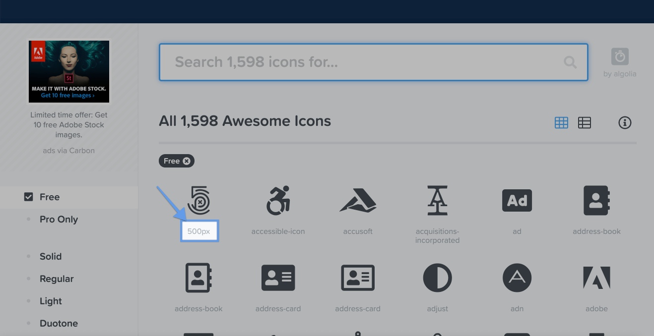
If you are using Font Awesome 5 the icon names are found beneath the icons.
Tutorials
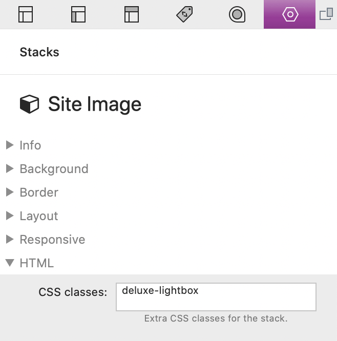
Adding Lightbox To Images
You can allow any stacks image to open in a window overlay that appears on top of the page, this is referred to as a lightbox popup. All you will need to do is to add the following class name to the image stack:
deluxe-lightbox
Tutorials
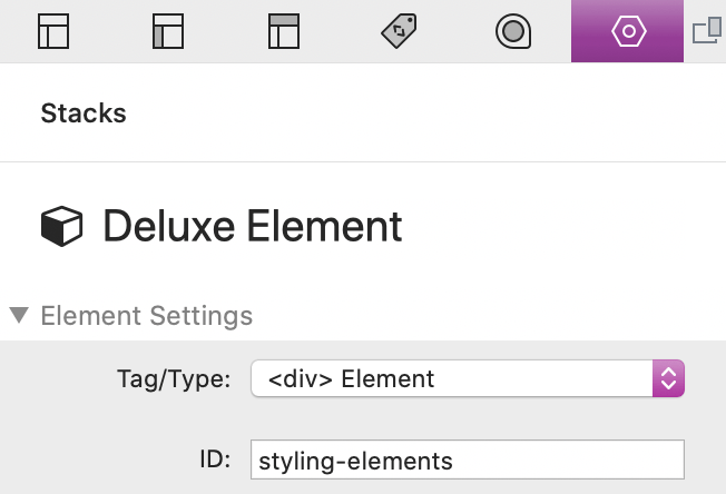
Creating "Scroll To" Links
To create a link that scrolls to an element first give the element (to be scrolled to) a unique ID. When creating the link, open the link settings dialog and in the link URL field add a # symbol followed by the ID.
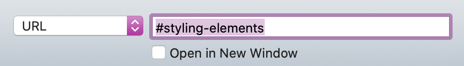
When the link is clicked, the browser will automatically scroll to the location of the element.
Tutorials
Creating & Modifying Presets
Every project file comes with predefined presets for you to use and modify. However if you would like to create your own you can do that by clicking the blue add button in the main Settings stack.
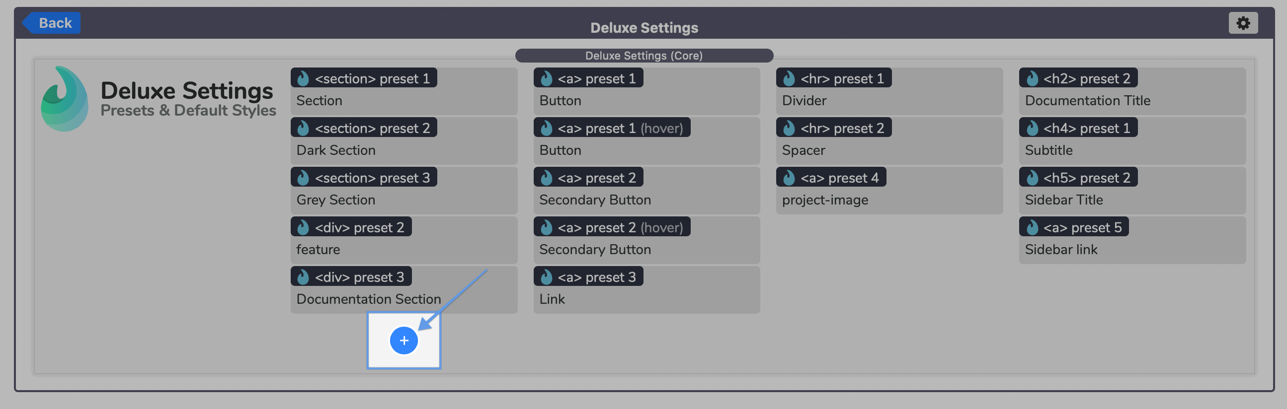
This will add a new preset to the first column of the Settings stack. Click on the preset and open the settings menu.
Preset Settings
Select the "Tag/Type" of element you want to create a new preset for. Then select a preset number (1-10) to assign the styles to. Be sure to choose a number that has not already been defined by another Preset stack of the same "Tag/Type" (Each "Tag/Type" can have up to 10 presets defined).
Next, create a custom title/description for the preset in the "Description" field. This title only applies to the Stacks Editor to help identify what preset is currently selected by an Element stack.
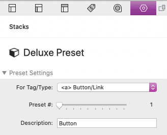
Now all you will need to do is adjust the styles using the remaining settings fields. The settings are identical to the ones you find in the Element stacks. Any changes you make will automatically be inherited by any Element stack of the same type and preset number.
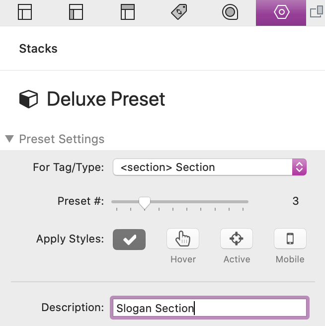
Apply Styles
In the Advanced section you can optionally select a condition for when the styles apply. By default (the checkmark icon) the styles will always apply. You can change it so that the styles only apply on:
Hover = when a mouse cursor is above the element
Active = when the element is being clicked (or is in focus for form elements)
Mobile = when the browser/mobile device window is below a certain breakpoint width
Presets with conditionally applied styles can and should be assigned to preset numbers that have already been defined without a condition. You do not need to redefine any styles that have already been defined by the non-conditional preset. For example, if you define styles for the Button/Link preset #1, you could then create another one for Button/Link preset #1 with "Apply Styles" set to "Hover". In this conditional preset you only need to define what you would like to change when the Button/Link preset is hovered, like a background color for instance.
Preset styles override the default styles defined in the main Settings stack. However, preset styles can be overridden by individual Element stack settings. The style hierarchy is as follows:
Individual Element/Text Stack styles > Class styles > Preset styles > Deluxe Settings (Core) styles
Tutorials
Creating & Using Classes
In the Element stacks and Text stack settings menu is a section titled "Share Styles By Class Name". Here you can define a class name that can be use to apply the styles defined in the stack to other stacks. This is mostly useful for controlling the styles of multiple stacks from a single location instead of manually selecting and adjusting each corresponding stack.
Class Name
Here you can create a unique class name. The class name cannot contain spaces, cannot start with a number, and cannot use special characters other than dashes - and underscores _.
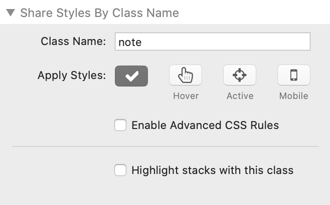
Apply Styles
Here you can select the condition on which the styles will apply. By default (the checkmark icon) the styles will always apply. You can optionally change it so that the styles only apply on:
Hover = when a mouse cursor is above the element
Active = when the element is being clicked (or is in focus for form elements)
Mobile = when the browser/mobile device window is below a certain breakpoint width
Enabling any condition other then default will cause the element to collapse. When using the Hover, Active, or Mobile apply conditions the stack will be in definition mode only.
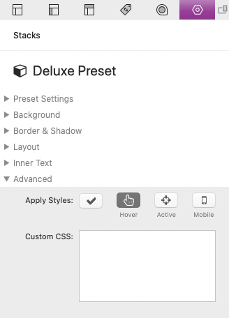
Enable Advanced CSS Rules
When enabled, a text field will appear where you can define custom CSS rules.
Highlight stacks with this class
This option only applies to the Stacks editor. It is simply a tool that allows you to highlight all elements that have the defined class applied to them to help you locate and keep them visually separated.
Applying the styles to another element
To apply the defined style to other elements simply add that class name to the "Classes" field.
Class styles override the default styles defined in the main Settings stack. However, class styles can be overridden by individual Element stack settings. The style hierarchy is as follows:
Individual Element/Text Stack styles > Class styles > Preset styles > Deluxe Settings (Core) styles
Tutorials
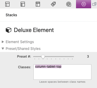
Using Predefined Classes
Deluxe has a few predefined class names that you can use by simply adding them to the "Classes" field of an element stack. See below for a list of usable class names and descriptions.
Predefined Classes
deluxe-lightbox
Applies to image stacks only. Allows the image to open up inside of a lightbox on click.
column-tablet-top
Applies to the Deluxe Columns stack in a 2 column layout only. Allows the right column to appear above the left column rather than below it in tablet sized screens. This class should be applied to any stack located in the right column of the Deluxe Columns stack.
column-mobile-top
Applies to the Deluxe Columns stack in a 2 column layout only. Allows the right column to appear above the left column rather than below it in mobile sized screens. This class should be applied to any stack located in the right column of the Deluxe Columns stack. The class may be applied to any Element stack placed inside of the column you wish to effect.
column-sticky
Applies to the Deluxe Columns stacks with 2 or more columns only. Allows the column to stick to the browser/device window when the column content is scrolled. One of the columns must have content longer than the browser/device window height to allow scrolling. The class may be applied to any Element stack placed inside of the column you wish to effect.
If you are applying this class to an element in a project that uses the One Page Menu like the one found in the Alex Solus project file, you will need to set the Column stack vertical alignment to "Top" to prevent the element from trying to center itself while it is sticky.
You can see examples of how to use the "column-sticky" class in the Forma Project.
Tutorials
Contact Form Setup
This php mailer is provided for essential functionality. It can be removed and replaced with your preferred mailer stack or one that fits the needs of your project.
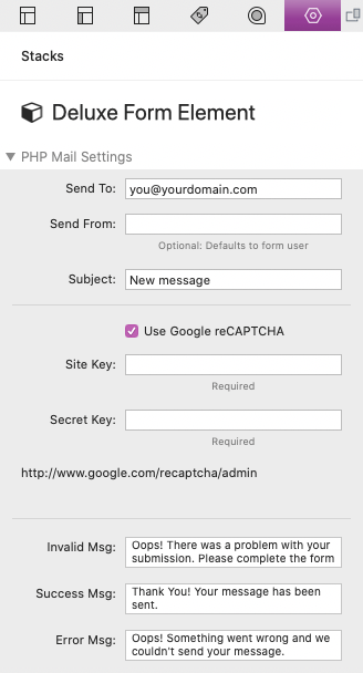
In each project, you will find a php mail form made with the Deluxe Form stack. Select the outer stack to access the form settings.
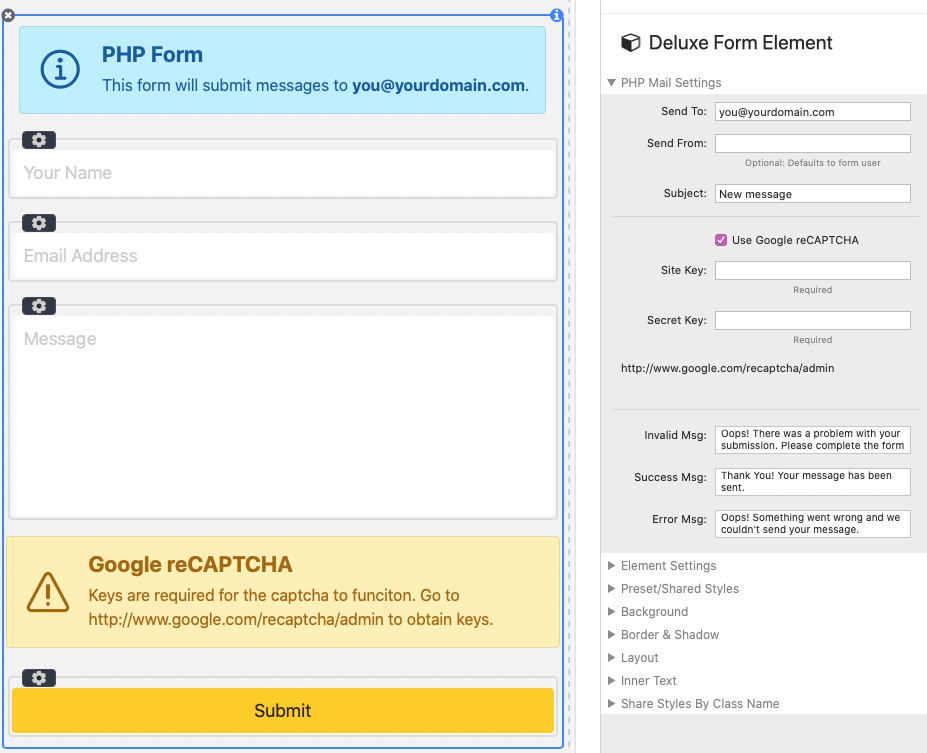
Send To
This value needs to be changed to the email address you want the form messages to be sent to. If you would like to send to multiple addresses you can simply add more and separate them with commas.
Send From
If your Webhost requires that the messages be sent from an address associated with your domain, you must place a domain email address in this field, otherwise leave this field blank.
Subject
Controls the title or subject of each message sent from the form.
Use Google reCAPTCHA
Optionally enable Google reCAPTCHA to prevent spam messages. You must obtain keys for the captcha to work correctly. You can find your keys at http://www.google.com/recaptcha/admin.
Reserved Input Field Names
You are able to add your own input fields to the form, though only text inputs and textarea fields are supported at this time. There are three reserved Name values.
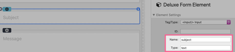
Description
subject
text
Whatever value the form user adds to this field will be appended to the subject field of the message.
name
text
Whatever value the form user adds to this field will display as their name. An input with this Name value is required for the php mail form to function correctly.
Whatever value the form user adds to this field will be used as the "Reply-to" field. When replying to the received message the reply will be sent to this address. An input with this Name value is required for the php mail form to function correctly.
Tutorials
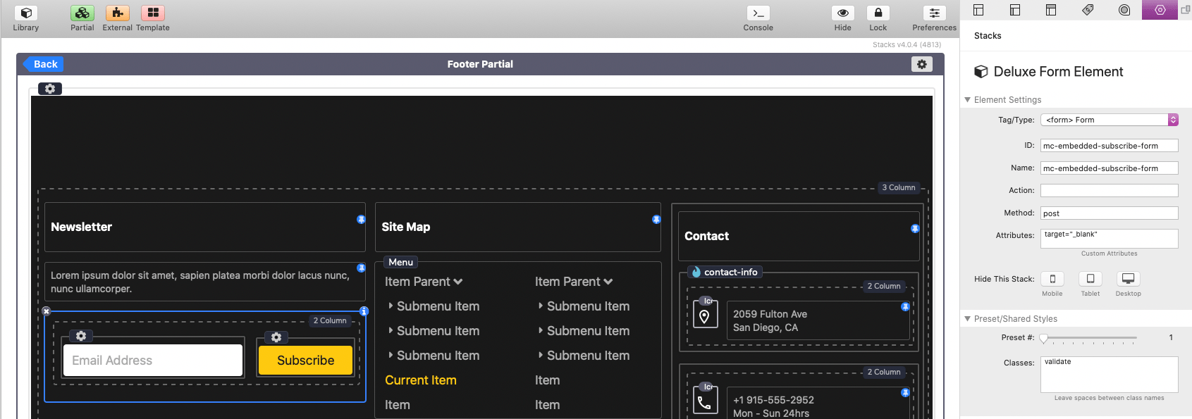
Newsletter Form Setup
This newsletter form can be removed or replaced by an embedded form from the newsletter service of your choice.
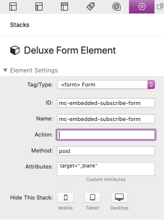
In some projects, you will find a newsletter sign up form in the footer. This is a MailChimp embedded form that you can use simply by changing the "Action" field value in the form settings menu.
Setup
Once you have logged into MailChip.com, select the "Audience" dropdown menu followed by the "Signup forms" option.
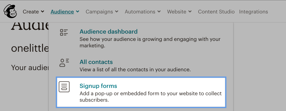
On the Signup forms page select "Embedded forms".
On the Embedded forms page scroll to the section labeled "Copy/paste onto your site" and find the form "action" value. Copy the value found in-between the quotation marks.
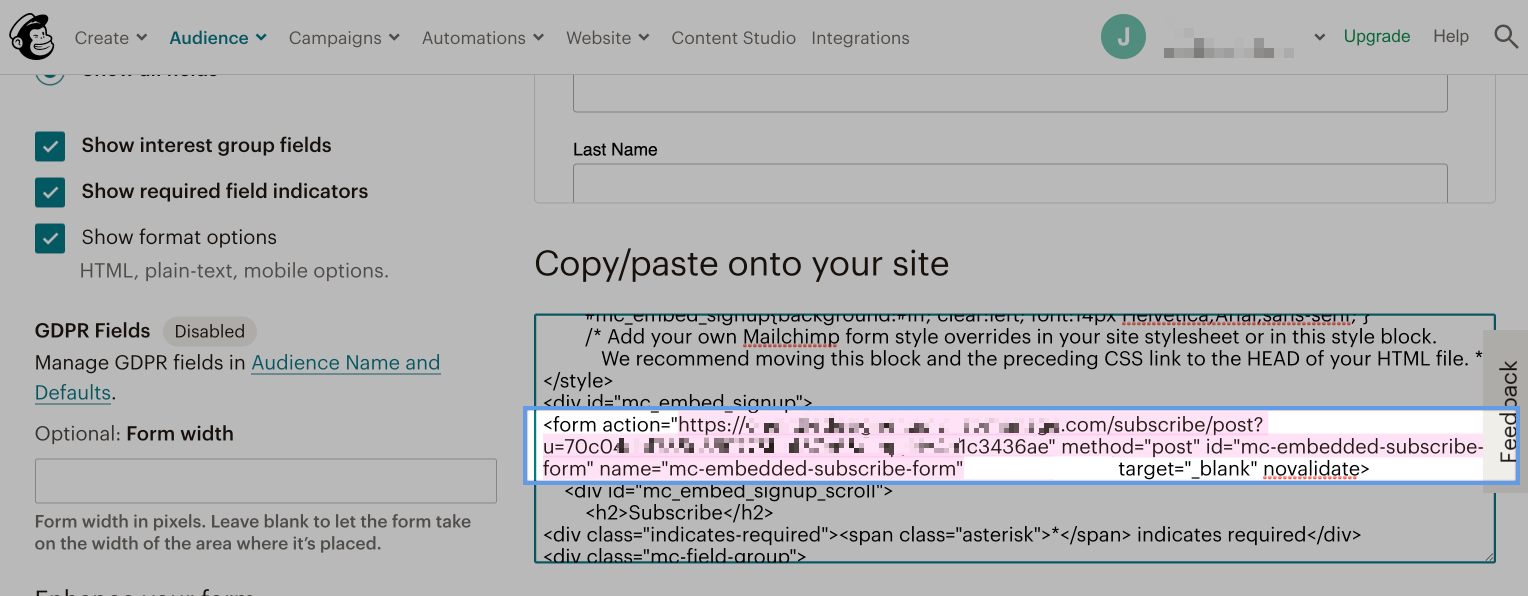
Lastly, paste the copied value it into the form stack's "Action" field.
Tutorials
Using The One Page Menu
You can see an example of how to use one page menu in the Alex Solus Project.
Deluxe Menu includes a "One Page Menu" type that you can select to get access to the "All Page Settings" and "Page Settings" stacks.
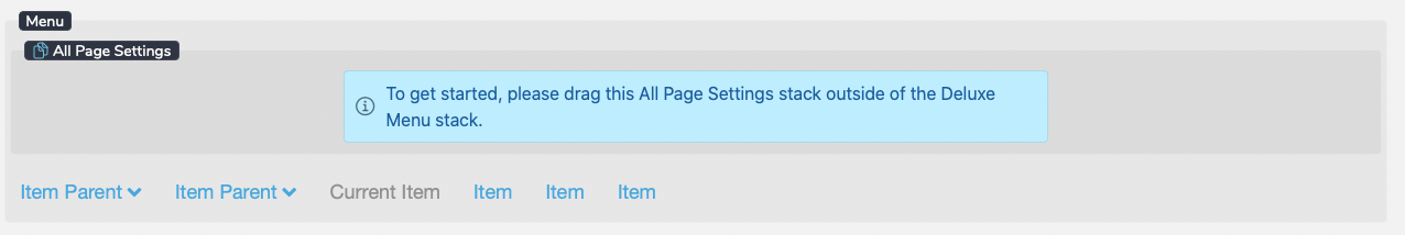
Before continuing, you must first drag the elements outside of the Deluxe Menu stack. This is so that you can place your menu away from the "pages" (sections of the one page website).
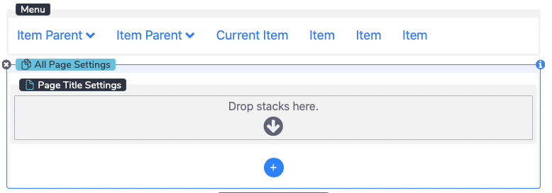
Once the All Page Settings stack has been placed outside of the Deluxe Menu stack a blue add button will appear that allows you to add new "pages".
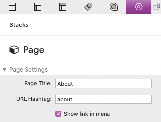
Each Page Settings stack will have its own settings where you can define the page title and url hashtag.
Page Title
This is the title of the page as it will display in the menu list.
URL Hashtag
Each page needs to have a unique URL Hashtag. This value is used when creating links to the page (IE www.yourwebsite.com/#about) and for displaying the page in the browser address bar. Do not add a # (hashtag symbol) before the value. The value cannot contain any spaces or special characters other than - (dashes) and _ (underscores).
Show link in menu
Optionally disable the page from showing inside the menu list.
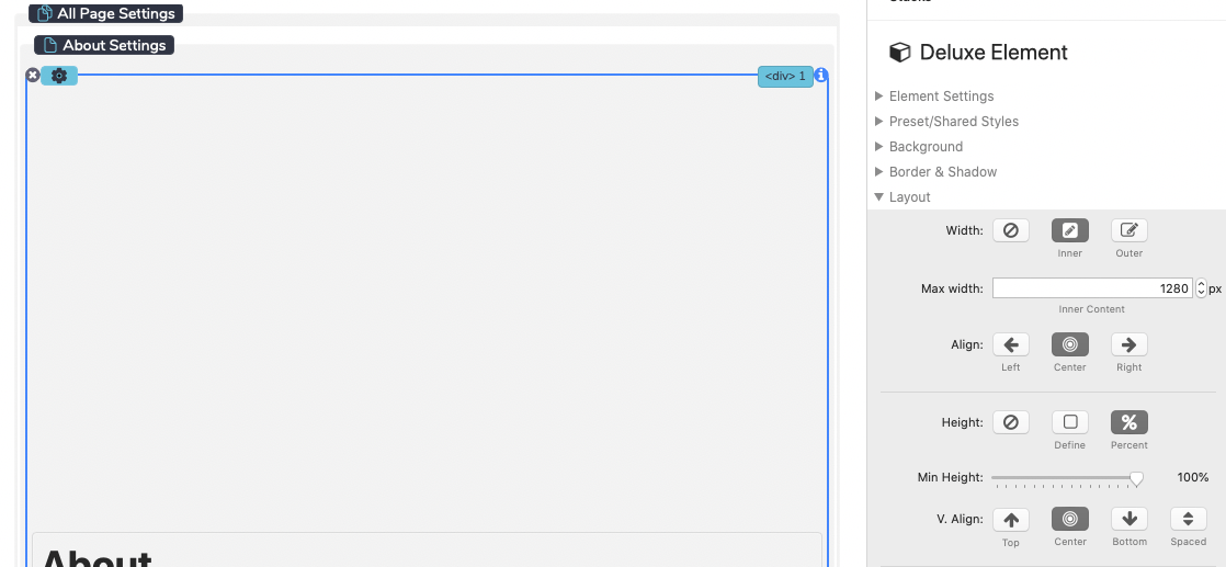
As you begin editing each page, it is recommended that you place a Deluxe Element stack directly inside of each Page Settings stack. Then set the element stack's height to 100% so that the page fills the browser window even if the content is not long enough.
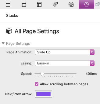
After you have finished adding new pages and adding content to those pages, you can select the All Page Settings stack to change the navigation behavior between the pages.
Page Animation
Select a transition animation that runs whenever a user scrolls away from the current page or clicks a navigation link to another page.
Easing
This option effects how the animation moves over time.
Speed
Set the page transition animation speed in milliseconds.
Allow scrolling between pages
By default, users will need to use the menu list to navigate between pages. Enable this option to allow navigating through all the pages simply by scrolling through them.
Pages that require scrollbars due to long content will prompt users with a next or previous arrow to prevent accidental navigation.
Any pages added to the RapidWeaver project will also show in the Deluxe Menu list. You must disable "Show in navigation" on any page that you do not want to show in the menu list.
Tutorials
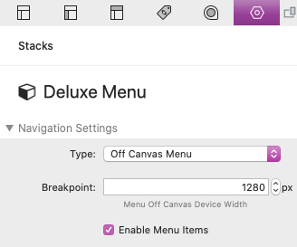
Using An Off Canvas Menu
You can see an example of how to use the off canvas menu in the Forma Project.
Deluxe Menu includes a "Off Canvas" menu type that you can select to create a column of content that can hide to the left or right of the browser window below a defined breakpoint.
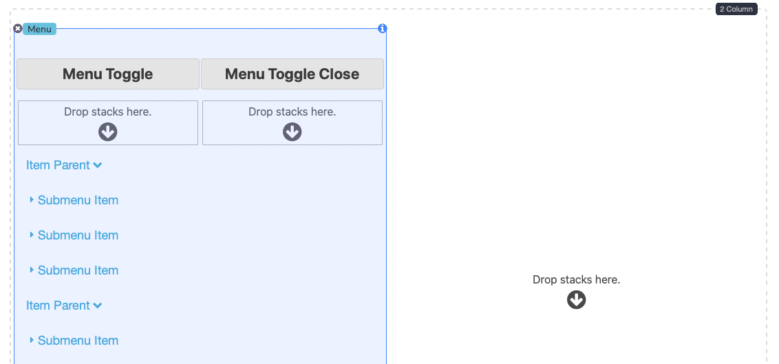
To set up the Off Canvas menu some things need to be put into specific places. First, the Off Canvas menu only works when paired with a Column stack. The column where the menu is placed should have an Element stack inside of it with the Menu stack being placed inside of that Element stack. Only the left most and right most columns can be used for off canvas menus.
In the following example the we have placed a Column stack into the editor. In the left column with have placed an Element stack with the Menu stack nested inside of it.
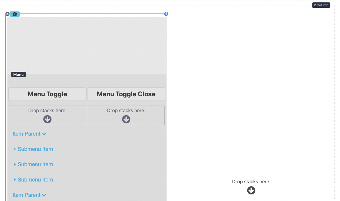
The Element stack is where we can define a height and a background color for the off canvas menu. It's important to define a background color to prevent the menu from being transparent. It's also recommend that the Height: Percent: Min-Height be set to 100% to keep the menu the same size as the browser or device window.
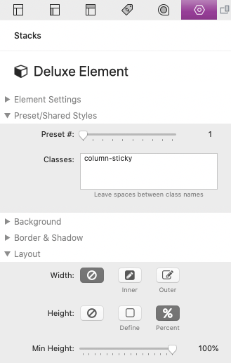
You can also optionally add the "column-sticky" predefined class to the Element stack so that the menu and menu toggle is always visible when the column content is scrolled. You can find more info about the "column-sticky" class here.
At the top of the Menu stack is an area where you can add custom menu toggles. These are optional and if none are provided default icons will be used.
Any content can be added above and below the Menu stack. The menu will only move off canvas in browser/device widths below the Breakpoint value defined in the Menu stack settings. You can also disable "Enable Menu Items" if you want to create an off canvas section that does not include a menu.