Basic Setup
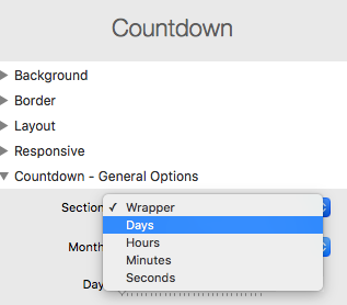
Countdown Clock comes built as 5 functioning pieces that integrate with each other: Wrapper, Days, Hours, Minutes, and Seconds.
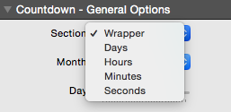
The first option in the settings panel titled “Section” is where you choose what function the stack will serve.
After you drag and drop the first Countdown Clock stack into the editor it will automatically be set to “wrapper”. You will then need to place a column stack and the 4 inner elements stacks inside the wrapper under the heading “Time Elements”. First place the 4 column stack, then drag and drop 4 additional Countdown stacks (one into each column) and set each “Section” to the corresponding value: Days, Hours, Minutes, and Seconds.

More information on each element below.
Wrapper
The wrapper controls a majority of the settings and all the time elements (days, hours, minutes and seconds) must be contained inside of it.
A majority of these controls in the General Options section are very straight forward. You first set up the date that the clock will countdown to.
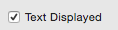
Text is displayed by default, but can be turned off. This is the text that will display underneath the individual clock numbers (i.e. Days, Hours, Minutes, Seconds). Note that the language for these can be changed in the individual time elements.
Global colors & sizes for the numbers and text can be controlled, but note that you can override these in the individual time elements if you like.
Font declarations can be made, but these require you to import your own fonts. You can do this manually or you can use various tools such as our Font Importer in our Typography stack suite. If you make no font declarations here and make the fields blank then fonts will be declared by your theme.
Symbols can be placed after Days, Hours & Minutes, such as the common colon symbol :
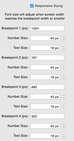
Responsive sizing is off by default and may not be necessary if you are using responsive columns. Regardless, if you turn it on you can control sizes for the numbers and text at various screen sizes. The sizes will only adjust when they reach the screen size or below and for no errors to occur please keep these in order from largest to smallest… largest screen size at the very top and smallest at the very bottom.
There are four, but if you wish to have less then simply duplicate, but still keep in order from largest to smallest. Example: 767px, 767px, 480px, 480px. That would adjust sizes only at 767px screen width and 480 screen width, but does assume you also set the number and text size to be the same in each relative screen width.
Adding Time Elements (Days, Hours, Minutes, Seconds)
As mentioned before, Countdown Clock comes built as 5 functioning pieces that integrate with each other (all found inside the “Section” option). Now that we have explained the wrapper we need to set up the Days, Hours, Minutes, and Seconds which we will refer to as “Time Elements”.
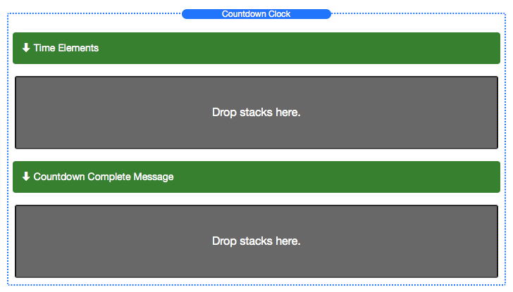
The basic setup shows where to place the time elements in the green alerts. Time Elements are at the top and the completion message at the bottom.
Time Elements in Columns
Though not necessary, it is highly recommended that the time elements be placed in columns for most basic setups. You can use a responsive columns stack, such as Responsive Grids, or the free built-in columns that come with Stacks.
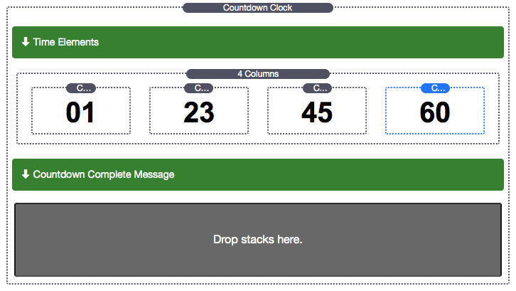
After doing this your setup should appear something like this. Note that the numbers do not represent the actual numbers for your clock as this is controlled through JavaScript, which does not run in edit mode.
In the section below “Countdown Complete Message” you can place whatever you would like to display once the clock has finished. This can be any other stack content including text, images, other media and even other stacks.
Time Element Controls
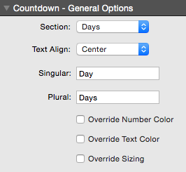
Each time element can align the numbers & text left, right and center. Additionally, you can control the text that is displayed (text display must be turned on in the wrapper). You can control the text for both singular & plural – singular will only be shown when the number 1 is reached in the clock.
Finally, you can override colors and sizing for each individual time element, which will override the colors and sizing set in the wrapper.
Overlay Mode
Overlay Mode allows you to cover an entire page instead of just a section of a page. Once the Countdown Clock has finished the page will be exposed – for added security there is also a Redirect to URL option that will instead send the user to a new URL once the clock has finished.
Controls for this section are very straight forward and all content will automatically center both vertically and horizontally in this mode.
Below the Time Elements there is an Optional Content Area, which allows you to place text, images, media and other stacks. This section will disappear when the clock has finished and so is only added so you can give viewers some added information, such as what will be displayed when the clock is finished. Note that everything will be auto-centered, so it is recommended that you do not add too much to this section.
Version 1.0.2+ Close Overlay option
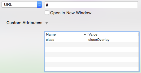
A close overlay link can be placed in version 1.0.2 that will close the overlay and reveal the page behind it. Simple assign the class of “pageOverlay” to a link.
Themes
There are currently 3 themes and their effects can be seen in both edit and preview mode. The “Wireframe” theme will automatically adjust to the color of the background of Overlay if you have turned Overlay On. We plan to add more themes in the future as well, so please feel free to send us requests.