Setup
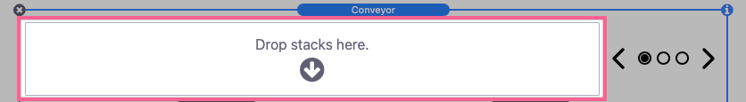
To get started, add the Conveyor stack to the editor.
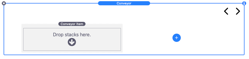
The main Conveyor stack wraps a single Conveyor Item stack. Add Stacks content to the first Conveyor Item stack. If you will be using images instead you can skip this step.
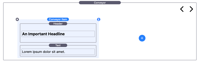
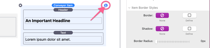
Open the stack settings panel to reveal customizable styles and settings for this item.
Conveyor Item Settings Panel: Image Settings & Styles
These settings allow you to optionally add image headers or image backgrounds to each of your Conveyor items.
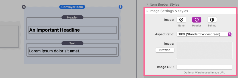
Image
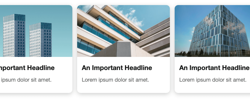
By default the Image setting is set to “None”. Select “Header” to display a custom image above any stacks content you have added to an item.
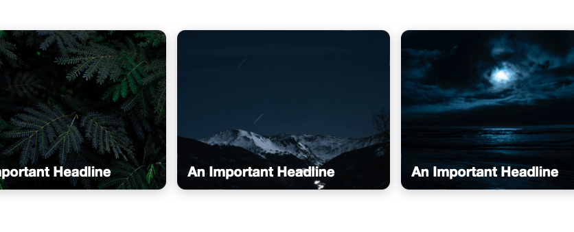
Select “Behind” to instead display that image behind any stacks content you have added to an item. If your items do not have any stacks content, this option can be used to display the image alone.
Aspect Ratio
The Aspect Ratio setting is used to crop your image to a certain shape. This needs to be done to keep each item image uniform in size without the need to manually crop each image to match.
Image URL
An optional input field is provided in case you would like to reference a “warehoused” or an externally stored image.
Conveyor Item Settings Panel: Border Styles
The style settings found in this section are pretty straight forward and function just like they do with any built-in stack.
Conveyor Item Settings Panel: Content Styles
Most of the style settings found in this section are pretty straight forward and function just like they do with any built-in stack.
Vertical Align
If you have set the Image option to “Behind”, the Vertical Align setting will be available. Use this to align the item content to the top, bottom, or center of the image.
Link
This setting allows you to optionally treat the entire Conveyor Item stack as a clickable link.
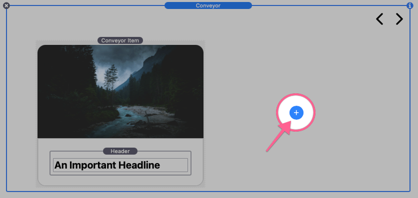
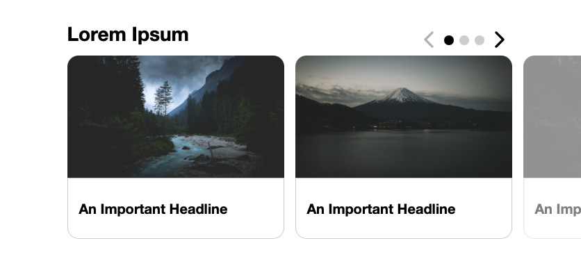
Adding More Conveyor Items
After you finish styling your first item, you can either copy and paste that stack to create duplicate styled items or use the blue add button to add more blank items to the Conveyor stack.
Adjust or add content to your remaining Conveyor Item stacks. Lastly, we will need to adjust the main Conveyor stack settings.
Conveyor Settings Panel: Conveyor Item Settings
Select the main Conveyor stack and open the settings panel.
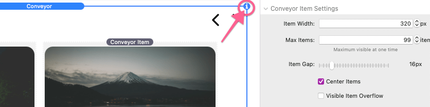
In the Conveyor Item Settings section you can define a width for all items added to the Conveyor stack.
Item Width
This value defines the width of each of the items in the Conveyor stack. The number of items displayed at a time is automatically determined by how much horizontal space is available and how many items are able to fit in that space. Horizontal space is determined by the browser window width or the content width of the RapidWeaver project theme or framework.
Max Items
This value defines the maximum number of items that are allowed to display at a time. For example, if the horizontal space would allow for 5 items to fit, but Max Items is set to 3, only 3 items will be visible.
Items Gap
This value defines the space in between each slide.
Center Items
When this option is enabled, the Conveyor items will display centered in the available horizontal space. If this option is disabled, the items will instead align to the right .
Visible Item Overflow
When this option is enabled items that do not fit fully or are over the maximum allowed items will still be visible.
Enabling this option also enable two additional settings. Align Navigation With Max Items will align navigation elements to the active slides instead of just filling all available horizontal space. Overflow Opacity allows you adjust the transparency of the overflow items. In the above image, Align Navigation With Max Items is enabled and Overflow Opacity is set to 50%.
Conveyor Settings Panel: Navigation Settings
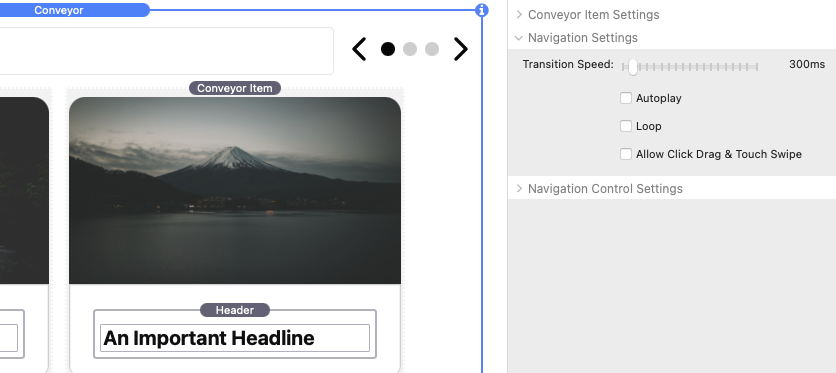
Transition Speed
This value defines the time in milliseconds it take for the items to slide into the next position. Items will slide by the number of currently visible slides.
Autoplay
When this option is enabled, Conveyor will automatically navigate through the slides. A Pause Duration setting is provided to define the length in milliseconds to wait before each navigation. If Loop is not enabled, autoplay will stop once it has reached the end of the items.
Loop
When this option is enabled the items will loop if navigation as reach the start or end of the items. If Visible Item Overflow is enabled, the items will overflow in both directions.
Allow Click Drag & Touch Swipe
When this option is enabled, page visitors may navigate though the items by clicking and dragging or by touching and swiping. If Autoplay is enabled, it will stop automatically navigating through the slides on click or touch.
Conveyor Settings Panel: Navigation Control Settings
The settings found in this section only apply and are only visible if the Controls setting is not set to “None”.
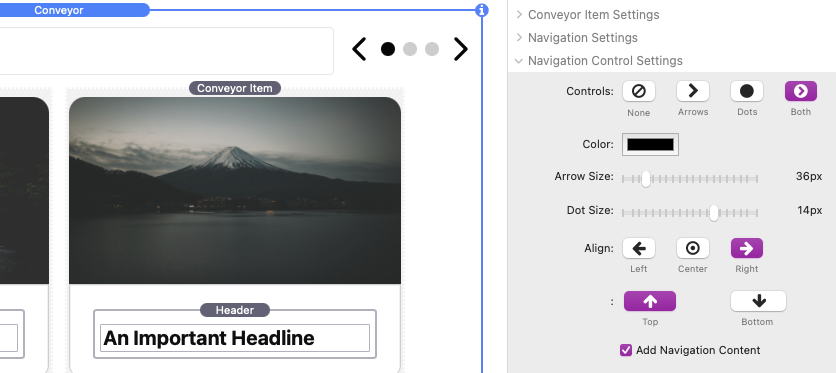
Controls
Select an option to display navigation controls for the Conveyor stack. When the “Arrows”, “Dots”, or “Both” options are used, style settings will be made available to customize the controls.
Arrow & Dot Size
These values define the size of the navigation controls. The Dot Size has three display types based on the size defined. Sizes above 14px will display as radio buttons:
Sizes from 5px to 15px display as dots:
Sizes below 5px display as dashes:
Add Navigation Content
When this option is enabled extra stack content space is added to the navigation controls allowing you to add titles to the open space.