Setup
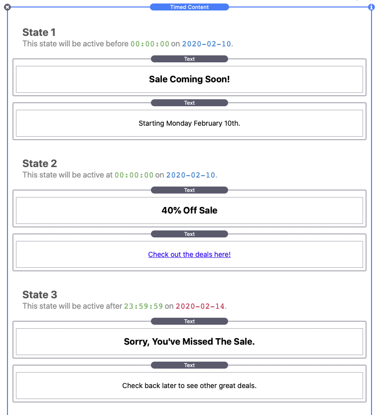
After adding the Timed Content stack to the editor you will see three “Drop stacks here” sections. 
Each one is referred to as a “State”. Stacks placed in State 1 will display before the defined date and time range, i.e. “sale coming soon” content. Stacks placed in State 2 will display between the defined date and time range, i.e. the active “sale” content. Lastly, stacks placed in State 3 will display after the defined date and time range, i.e. “sale has ended” content.
Each section has a short description of when the content will be active with all times given in a 24 hour format. Times will display in green with the start of the date/time range in blue and the end of the date/time range in red.
Now that we have an understanding of the layout we can begin setup. In this example we will be creating a 5 day long discount sale. We will add appropriate stacks content to each of the states in the editor.
Date & Time
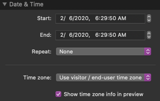
Using the Start and End fields we can define the exact date and time of the sale. In our example the sale will begin 2/10/2020 at 12:00:00 AM. 12AM means the sale will start at midnight leading into the 10th. Our sale will end on 2/14/2020 at 11:59:59 PM. We use 11:59:59 PM so that the sale ends at midnight on the 14th.
This is a one time sale so we will leave the Repeat setting on None. More information on this setting can be found in the “Create Repeating Intervals” tutorial.
The Time zone setting defaults to using the time zone of the page visitor. In this example we will not need to define a specific time zone. More information on this setting can be found in the “Define A Time Zone” tutorial.
The last setting, Show time zone info in preview is a checkbox that is enabled by default. This will display time zone information that is useful for testing time zone values. The info is only visible when switching to preview mode and will not display on your live site even when enabled.
Countdown
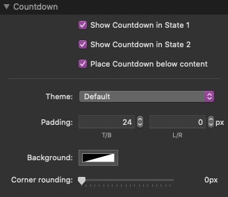
We will keep Show countdown in State 1 and Show countdown in State 2 enabled. The countdown in state 1 will display a clock that counts down till the start of our sale. The countdown in state 2 will display a clock that counts down till the end of our sale. The countdown clocks are optional and you can disable them if you do not need or want to use them.
At this point the Stack is completely setup. See the Style Settings section below for more info on the remaining countdown style settings.
Style Settings
Countdown
Place countdown below content
If you want the countdown clock to display below your content keep this setting enabled. If this setting is disabled the countdown clock will display above the content.
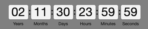
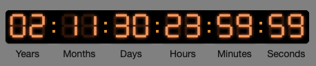
Theme
This setting has 7 options that change the visual appearance of the countdown clock. The 8th option titled “Inline Text (shortcode only)” is unique allows you to place a text countdown anywhere inside the content. You can find out more about this option in the “Using An Inline Text Countdown” tutorial.
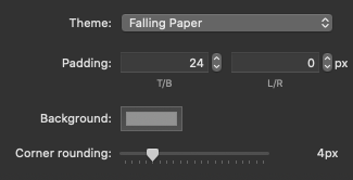
Padding
Adjust the space above/below and left/right of the countdown clock.
Background
By default, the background color is set to transparent. This setting changes the color of the background behind the countdown time elements.
Corner rounding
This setting adds corner rounding to the background behind the countdown time elements. It only applies if the background color is not transparent.
Countdown Elements

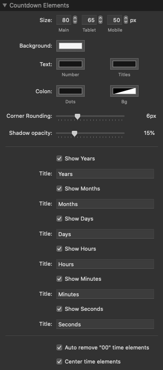
Size
Adjust the width in pixels of each of the countdown time elements. Each of the three values apply to different screen sizes.
Background
Change the background color of the countdown time elements.
Text: Number & Titles
Change the color of the number and the titles beneath the time elements.
Colon: Dots & Bg (Background)
Change the color of the “:” and the background behind it. The background option is transparent by default, the only reason you would want to change this color is if you would like to connect the time elements visually when using the “Default” or “Digital” countdown Theme.
Corner rounding
This setting adds corner rounding to the countdown time elements.
Shadow Opacity
By default each of the countdown time elements have a shadow around them. Use this setting to adjust the intensity of the shadows.
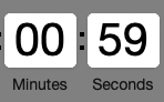
Show: Years, Months, Days, Hours, Minutes, & Seconds
Choose which countdown time elements you want to display, each with a customizable title. If an element that would contain a value is removed, its time will be applied to the next available element. For example, if there are 2 hours 0 minutes and 0 seconds remaining, and only the minutes and seconds are showing, the countdown clock would read 120 minutes and 0 seconds.
Auto remove “00” time elements
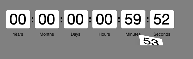
When enabled any countdown time element that has a value of “00” will automatically be removed. For example, if the clock reads 2 minutes 0 seconds, it will then count down to 59 seconds instead of showing 00 minutes 59 seconds.
Disabled:
Enabled:

Center time elements
Enabled by default, this setting keeps the time elements together in the center of the available space. Disable this setting if you would rather the time elements align the the left.
Create Repeating Intervals
Using the Date & Time > Repeat setting will change the functionality of the stack slightly. We will refer to State 2 as the “Sale” (though it can represent anything you need it to).
Here is a refresher on the what the 3 states represent when Repeat is set to its default option “none”:
State 1 = Before the “Sale”, countdown till the sale starts
State 2 = During the “Sale”, countdown till the sale is over
State 3 = After the “Sale”, no countdown, the sale is over and will no longer display
The Repeat options loop back and forth between State 1 and State 2 until the defined End date.
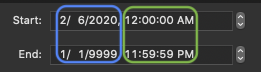
Note that the Start and End fields contain both a date “2/6/2020” and a time “12:00:00 AM” separated by a comma. By default and when Repeat is set to “None” the date and time are combined to define the exact start and end date and time. When any other option is chosen, these two values are no longer combined, The date range (circled in blue) is used to define the start and end date of the entire repeating process. The time range (circled in green) is used to define the start and end of each individual loop in a single day. Below we will give an example of how this works for each of the different Repeat options.
Here are the changes to the states when using a Repeat option:
State 1 = Before the “Sale” date range or outside of the sale time range, countdown till the sale starts or starts again.
State 2 = During the “Sale” time range, countdown till the sale time range is over
State 3 = After the “Sale” date range, no countdown, the sale is over and will no longer display (no change)
Every day
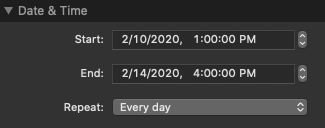
In this example, State 2 will be active every day between 1PM and 4PM. Any time outside of those hours State 1 will be active instead. The repeat loop will begin on the date 2/10/2020, and until that date arrives State 1 will be active. On the date 2/14/2020 the final loop will happen and after it finishes, State 3 will always be active.
If we wanted the repeat loop to begin right away we would only need to set the Start date to the current date or before. If we would like the repeat loop to continue for the foreseeable future we can change the End date to a very distant year, i.e. 9999.
Every week
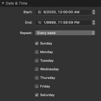
In this example, State 2 will only be active on the weekends. State 1 will be active during the weekdays. Because we have set the start time to 12AM and the end time to 11:59:59 PM, State 2 will be active all day Saturday and Sunday. We could define a time range if we only wanted State 2 to be active during a certain time of the day on Saturday and Sunday. At least one day of the week should be enabled for this repeat loop to work. The date range has been set to start immediately and end indefinitely. This essentially means State 3 will never be active and the stack will loop between States 1 and 2.
Every nth weekday of every month
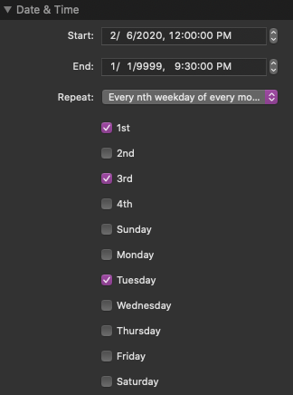
In this example, State 2 will be active every 1st and 3rd Tuesday of every month between 12PM and 930PM. State 1 will be active outside those hours and on all of the remaining days of the month. This example is also set to loop indefinitely like the previous example. State 3 will never be active.
Every Month
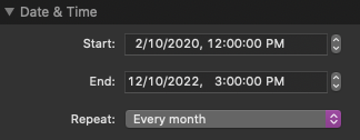
In this example, State 2 will be active on the 10th day of every month between 12PM and 3PM. The repeat will start immediately and will repeat for the last time on December 10th, 2022. The date range is defined only by the month and year of the date. The “Every month” setting is useful when you have a specific day each month you want the “Sale” to be active. Note: The “Every nth weekday of every month” also loops by month and is more useful for those who want the “Sale” to last multiple days according to the day of the week.
Every Year
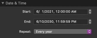
In this example, State 2 will be active every year on the first day of June till Midnight on June 10th. Because the Start date range begins in 2021, the loop will not begin until then. The final “Sale” will happen in the year 2030. After that State 1 and State 2 will no longer activate and State 3 will be shown. The date range is defined only by the year value in the date.
Define A Time Zone

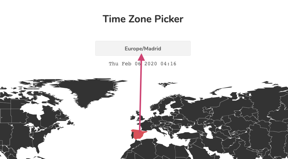
You can define a custom time zone if you want activate the states at the same date and time across the entire globe. These time zones must be defined in a specific way. You can find the value for your time zone using the map on the page linked below. Select your time zone or country and copy the value that appears at the top of the map into the Time zone value field.
https://onelittledesigner.com/rapidweaver-stack/timed-content/#timezonepicker
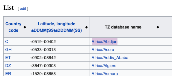
Alternatively, if you want to use a timezone not based on a country, find the timezone in the Wikipedia article linked below and use the value in the “TZ database name” column.
https://en.wikipedia.org/wiki/List_of_tz_database_time_zones
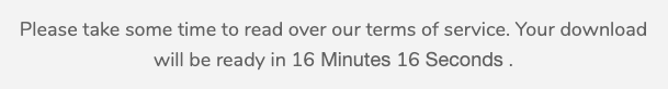
Using An Inline Text Countdown
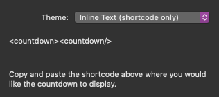
The Date & Time > Theme setting has a special option titled “Inline text”. When this option is selected the visual countdown clock is removed, as well as the settings relating to its style. This inline countdown will display simply as numbers and text.
2 Years 3 Months 5 Days 18 Hours 23 Minutes 41 Seconds
You must copy the shortcode (HTML element):
<countdown><countdown/>
and place it inside of text stack. The text countdown will replace the shortcode when the page is loaded. You can still decide which countdown time elements are used and customize their titles. The shortcode must be placed inside of the State 1 or State 2 content and the respective “Show Countdown in State #” setting needs to be enabled.
Advanced: Use Delay/Time Only
Timed content has an advanced setting titled “Use time only”. When enabled the Date & Time > Start, End, and Repeat settings are ignored. Instead you can define in seconds how long you want to delay the activation of State 2 in the field titled Delay Time. State 1 will be active on page load and display until the delay time runs out. State 3 will activate after State 2 when the defined Active Time has run out.
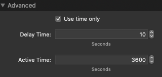
In this example, State 1 will show for 10 seconds followed by State 2 for 3600 seconds (1 hour). After 1 hour State 3 will then show.
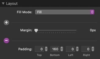
Troubleshooting: Prevent Animation Clipping
Some of the countdown clock themes have animations that move outside of the contained area. The Stacks plugin by default prevents stacks from overflowing into or over other stacks content. This can sometimes cause the animations to clip or suddenly disappear. This can be remedied by adding padding to the bottom or top of the Timed Content Stack. This will ensure that there is enough space for the animation to move without overlapping other content.