Parallax Slider Application
Step 1:
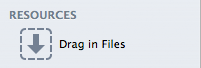
Export your desired images on the Resources section of RapidWeaver. Resources is located on the leftmost side of the application. The slider corresponds to the images exported on this section, so take heed to this when applying them.
Step 2:
Copy the Phaleg Slider snippet:
<div class="main">
<div class="tint"></div>
<div class="page_container">
<a href="#" class="is-prev">«</a>
<a href="#" class="is-next">»</a>
<div id="siteTitle">
<h1>%site_title%</h1>
<h2>%site_slogan%</h2>
</div>
<div id="immersive_slider">
<div class="slide" style="background-image: url('%resource(file-name-here.jpg)%')" data-start="background-position:0px -100px;" data-1000="background-position:0px 500px;"></div>
<div class="slide" style="background-image: url('%resource(file-name-here.jpg)%')" data-start="background-position:0px -100px;" data-1000="background-position:0px 500px;"></div>
<div class="slide" style="background-image: url('%resource(file-name-here.jpg)%')" data-start="background-position:0px -100px;" data-1000="background-position:0px 500px;"></div>
</div>
</div>
</div>
Step 3:
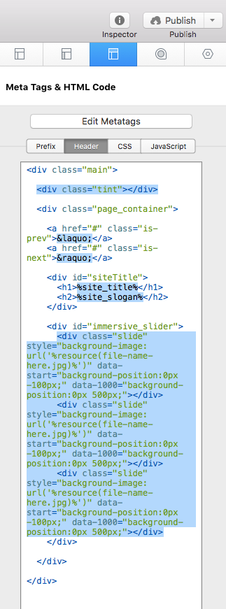
Paste the snippet into the Header of the HTML section of the Page Inspector. Refer to the image above for reference. Areas highlighted require special attention (from top to bottom):
- Tint: This regulates the tint option for the image slider. You may delete from the snippet should you decide to omit the tint.
- Slider Navigation: Unicode-based, navigational interface. To adjust, refer to the Unicode Chart to view the full list.
- Slider Text: Input your title, slogan, miscellaneous text, etc. here. “%site_title%” translates to your site title edited on RapidWeaver, while “%site_slogan%” refers to your site slogan.
- Add Image/Parallax Effect: This is where the images are attached from the Resources section. This is also where the parallax calculation is determined. Because images differ from size, each parallax effect in each slide has to be manually adjusted using the data attributes:data-start: Starting point of parallax. Determined by X/Y axes of the background position.
data-1000: Finishing point of parallax. Determined by X/Y axes of the background position.On the example image above, “data-start” of the slider starts at a background-position of 0px/-100px, meaning that the image starts at a Y-axis of -100px, while “data-1000” ends at 0px/500px, which is where the parallax effect ends after scrolling down 1000px (hence data-1000). Ideally, the Y-axis should be the only adjustment.
At this point, your slider is active and ready for previewing.
Extra Content Stack
*Applies to Stack page only.
Step 1:
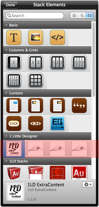
Locate the Extra Content stack within your Stack Elements page. Apply the stack anywhere on the page.
Step 2:
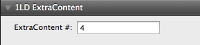
Input the number value on the Extra Content stack’s option area. The number value dictates where the Extra Content stack will be placed:
- 1 = Post-Header
- 2 = Top Pre-Stack (Before Stacks)
- 3 = Middle Pre-Stack (Before Stacks)
- 4 = Bottom Pre-Stack (Before Stacks)
- 5 = Top Post-Stack (After Stacks)
- 6 = Middle Post-Stack (After Stacks)
- 7 = Bottom Post-Stack (After Stacks)
General Options
General options dictate the overall styling of the RapidWeaver page.
GENERAL: Enable Page Titles
Enable page titles & descriptions (Applies to Page Specific areas).
GENERAL: Navigation Arrows (Ascended)
Determine the lightness or darkness of the navigational arrows before the header snaps to the top of the page.
GENERAL: Navigation Arrows Hover (Ascended)
Determine the lightness or darkness of the navigational arrow hover effect before the header snaps to the top of the page.
GENERAL: Navigation Arrows (Descended)
Determine the lightness or darkness of the navigational arrows after the header snaps to the top of the page.
GENERAL: Navigation Arrows Hover (Descended)
Determine the lightness or darkness of the navigational arrow hover effect after the header snaps to the top of the page.
GENERAL: Header Shadows
Determine the lightness or darkness of the header shadow.
GENERAL: Container Shadows
Determine the lightness or darkness of the content container shadow.
GENERAL: Sidebar
Enable sidebar.
GENERAL: Colours
Set general colours for the following:
- General Background
- Body Background
- Image Slider Tint
- Header Background (Ascended)
- Header Background (Descended)
- Navigation Background (Ascended)
- Navigation Background (Descended)
- Navigation Background Hover
- Mobile Navigation Background
- Footer Background
- Sidebar Content Background
- Sidebar Title Background
Page Specific Options
Page specific options dictate styling specific to a particular RapidWeaver page.
PAGE SPECIFIC: Enable Masonry Gallery
Alternate between traditional grid-style or Masonry galleries (Applies to Photo Gallery & Movie Album).
PAGE SPECIFIC: Lightbox Background
Determine the lightness or darkness of the lightbox (Applies to Photo Gallery & Movie Album).
PAGE SPECIFIC: Lightbox Navigation
Determine the lightness or darkness of the lightbox navigation (Applies to Photo Gallery & Movie Album).
PAGE SPECIFIC: Colours
Set page specific colours for the following:
- Thumbnail Caption Background
- Blog Background
- Form Field Background
- Reset Button Background
- Submit Button Background
- File Share Title Background
- File Share Description Background
Text Options
Text options dictate styling for text.
TEXT: Fonts
Phaleg provides 16 different fonts:
- Crimson
- Forum
- Garamond
- Medio
- Ovo
- Trykker
- Aileron
- Basic
- Dekar
- Helvetica
- Spinnaker
- Vegur
- Archive
- Code Pro
- Eunomia
- Gent
TEXT: Font Types
Determine the type of font for the following:
- General Font
- Heading Font
- Site Title Font
- Site Slogan Font
- Page Title Font
- Gallery Font
- Blog Title Font
- Description Font
TEXT: Colours
Set text colours for the following:
- Body Text
- Site Title Text
- Page Title Text
- Page Description Text
- Image Slider Text
- Navigation Text (Ascended)
- Navigation Text (Descended)
- Navigation Text Hover
- Mobile Navigation Text
- Footer Text
- Sidebar Content Text
- Sidebar Title Text
- Thumbnail Caption Text
- Blog Text
- Blog Title Text
- Blog Link Text
- Form Field Text
- Reset Button Text
- Submit Button Text
- Description Text
- File Share Title Text
Image Slider Options
Image slider options dictate overall styling of the slider.
IMAGE SLIDER: Slider Height
Adjust the height of the image slider.
IMAGE SLIDER: Slider Tint Opacity
Adjust the opacity of the image slider tint.
Extra Content Options
Extra Content options dictate styling for the Extra Content Stack.
EXTRA CONTENT: Colours
Set extra content colours for the following:
- EC 1 (Post-Header)
- EC 2 (Top Pre-Stack)
- EC 3 (Middle Pre-Stack)
- EC 4 (Bottom Pre-Stack)
- EC 5 (Top Post-Stack)
- EC 6 (Middle Post-Stack)
- EC 7 (Bottom Post-Stack)