Basic Setup
Step 1: Drag & drop the Carousel Complete stack into the stacks editor.
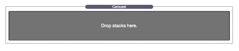
Step 2: If you wish to use an image or a video you can Drag & drop the Clean Carousel Slide stack into the “Drop stacks here” section of Carousel Complete. Otherwise you can instead add a text stack or another 3rd-party stack (Some 3rd-party stacks may not be compatible).
 or
or  or
or  (Some other 3rd party stack)
Step 3: Add stacks to the carousel until you have the amount of slides you would like to use by dragging in each one underneath the previous one before it. Make sure all the stacks are contained inside of the Carousel Complete stack.
Note: Carousel Complete requires at least two slides to function.
Video Setup
Step 1: Select the video option in the Carousel Complete Slide stack.
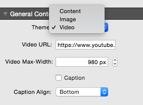
Step 2: Add the video’s URL to the “Video Url” field. The Carousel Complete Slide stack supports YouTube or Vimeo URLs.

Carousel Complete General Controls
Slider Type
Slide In Effect – Determines what animation the incoming slide transitions with.
Slide Out Effect – Determines what animation the out going slide transitions with.
Add Fade Effect – Adds a fade effect to both the incoming and out going slide for a smoother transition. (Some effects already have fades added to them)
Caption Effect – Determines what animation the caption transitions in with.
Carousel Type
Wide Desktop, Desktop, Tablet, Mobile – These numbers set the amount of slides to display at once.
Wide Desktop – Effects browser windows that are greater than 1200px wide.
Desktop – Effects browser windows that are less than 1200px wide but greater than 900px wide.
Tablet – Effects browser windows that are less than 900px wide but greater than 600px wide.
Mobile – Effects browser windows that are less than 600px wide.
Slide By – The amount of slide to transition by.
Center Slides – If enabled, the slide in the middle of the carousel will be the focused slide and will always remain centered on all browser widths.
Mouse Drag – If enabled, visitors can click and drag the slides left and right to navigate through them.
General Controls
Autoplay – If enabled, the slider or carousel will automatically transition on set intervals.
Autoplay Speed – Sets the speed at which autoplay transitions from slide to slide. (Only visible if Autoplay has been enabled)
Pause On Hover – If enabled, the slider or carousel will pause Autoplay while the cursor is hovering over the slider.
Video Autoplay – If enabled, any videos inside the slider or carousel will automatically start playing when the slide is visible. (Only visible if Autoplay has been disabled)
Auto Height – If enabled, the slider will automatically adjust to the height of the focused slide.
Wide, Desktop, Tablet, Mobile Height – Sets the height of the slider or carousel at the respective browser window sizes. (Only visible if Auto Height has been disabled)
Styles
Slide L/R Padding – Increasing this value will add space in-between the left and right of each slide.
Arrows – If enabled, navigation arrows will display at the right and left of the slider and carousel.
Pagination – If enabled, pagination dots will appear below the slider. Users can click on the dots to navigate through the slider or carousel.
Background Color – If enabled, allows you to set a background color for the slider or carousel.
Edit Mode Help
Slide Width – This option only effects how Carousel Complete looks in edit mode. Reduce the percentage to allow the slides to appear left to right to save space inside of the stacks editor.