Setup
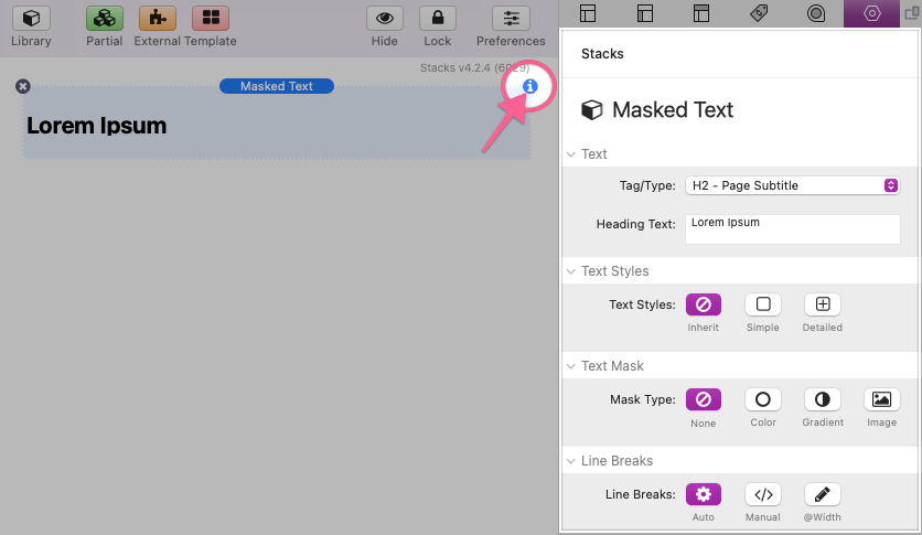
After adding the stack to the editor, select the stack and open the Settings Panel.
Settings Panel: Text
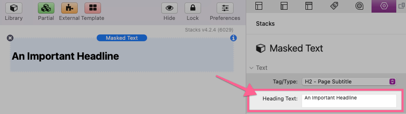
Use the Tag/Type setting to choose a text element type for the text.
The displayed text can be edited through the Settings Panel in the Heading/Paragraph Text field.
Settings Panel: Text Styles
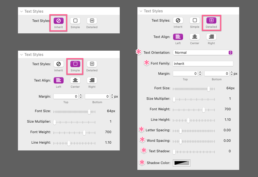
By default, the text styles will automatically be inherited from your theme or framework styles according to the selected Tag/Type. Use the “Simple” option to get access to some common text style settings. The “Detailed” option will add a few more style settings for more in-depth control over the appearance of the text.
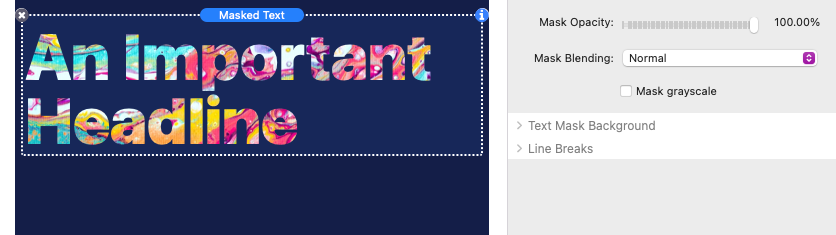
Settings Panel: Text Mask
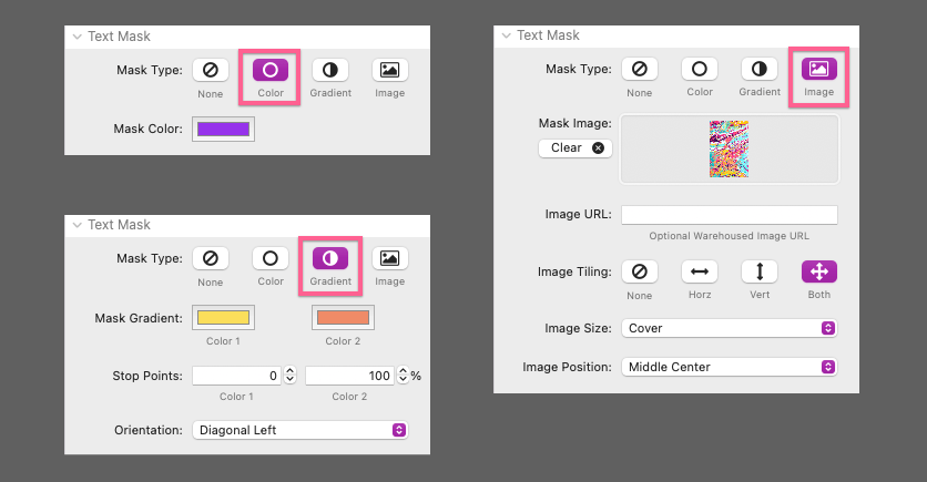
There are four Mask Type options to choose from. “None” is enabled by default and is provided in case you want to use the stack for the text style settings alone. The color of the text will be inherited from theme or stack framework. The “Color” option will simply allow you to define a color for the text. The “Gradient” option provides settings to define a two color gradient and the “Image” option is used to apply an image mask over the text.
“Color”, “Gradient”, and “Image” options include special settings that can optionally be used to blend the text appearance with the background of the parent element.
The Mask Opacity adjusts the transparency of the text. The background behind the text will be visible through the text as the opacity is decreased.
The Mask Blending setting allows you to select from a list of options that adjust how the text appearance blends with the background of the parent element. How each option applies will vary depending on the color of the parent element’s background and the content of the Mask Image. It is best to cycle through the options to find a good fit.
Use the Mask grayscale option to remove color from your Mask Image or text. This can sometimes help accent the Mask Blending option you have selected.
Settings Panel: Text Mask Background
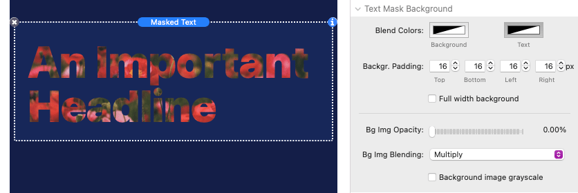
If you have selected the “Image” Mask Type, there are some optional background settings provided.
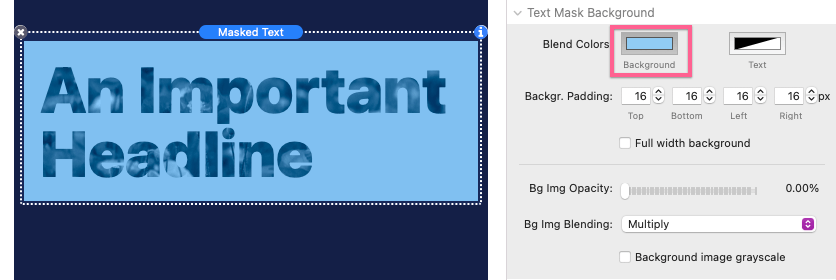
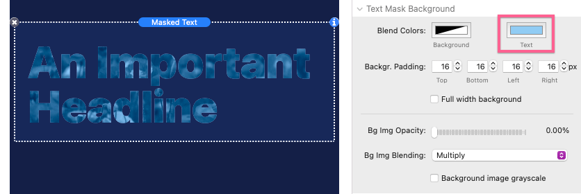
The Blend Colors allow you to optionally define a color for the background behind the text. By default these options are set to transparent to allow the text to blend with the background of the parent element.
The “Background” blend color will apply color behind the text. The amount of space around the text can be adjusted using the Background Padding settings.
The “Text” blend color will only apply a color behind the text. Any blending options applied to the Mask Image or text will blend with this defined color instead of the background blend color or the parent element background.
There are also three identical blending options for Text Mask Background just like those found in the Text Mask section. If the Background Image Opacity is greater than 0% the rest of the masked image will be visible behind the text. These blending options apply to this background image instead of the the text.
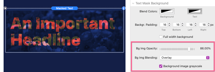
The Background Image Opacity must be greater than 0% for the Background Image Blending and Background image grayscale options to have any effect.
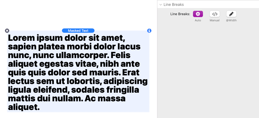
Settings Panel: Line Breaks
You can optionally change how new lines are formed in the text using the Line Break options.
“Auto” will use the default text behavior and which will wrap text to new lines as necessary to fill horizontal space.
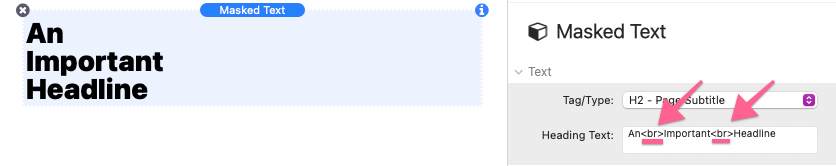
“Manual” will not allow text to wrap to a new line, even if this means the text goes beyond the available horizontal space.
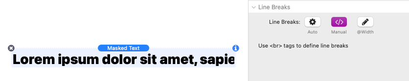
Line breaks are instead defined manually by placing <br> tags into the Heading/Paragraph Text field in the settings panel.
When using the “Manual” Line Break option, text will automatically scale to prevent the text from overflowing when previewing the page or after publishing.

The “@Width” option will allow you define a Wrap Width. This is the width at which the text will break to new lines. An Align option is provided to adjust the position of the text in the available horizontal space (not to be confused with the Text Align setting).
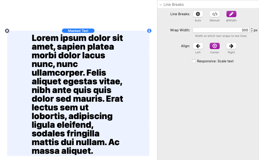
There is also a Responsive: Scale text option that can be enabled to allow the text to scale if the available horizontal space is less the the defined Wrap Width. This option is useful if the text needs to maintain a certain aspect ratio.
Responsive: Scale text off:

Responsive: Scale text on: