Panel Settings
There are three display options for the panel background. Each one includes additional settings related to how the display option functions. First we will go over the “Color” option and later cover the settings specific to the the other two options.
By default the background color can be changed using the Color setting. This color applies to both the background and the color of the individual panels.
Switch to preview mode in RapidWeaver to preview an animation.
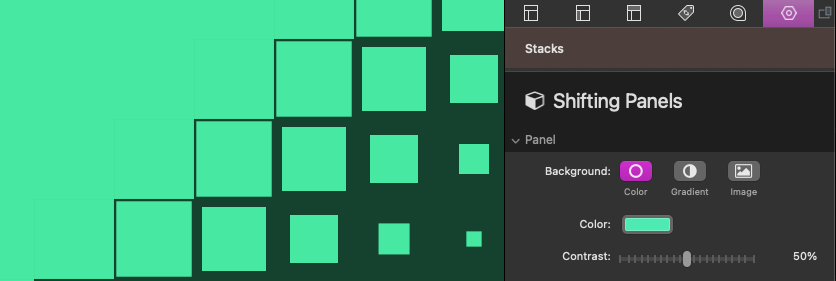
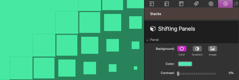
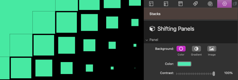
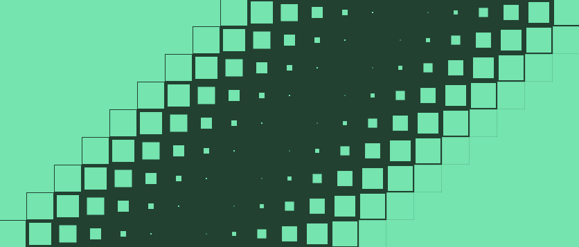
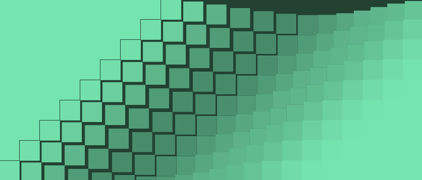
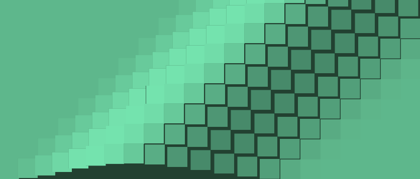
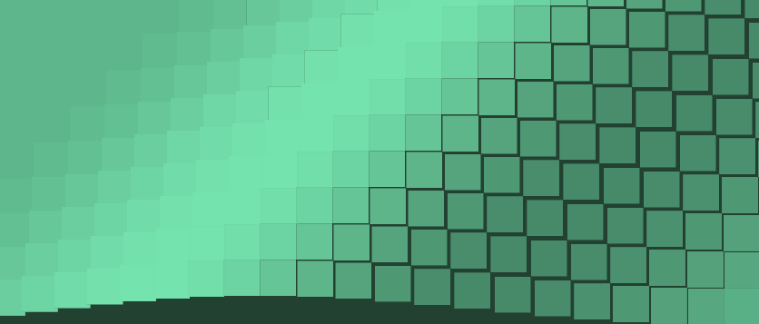
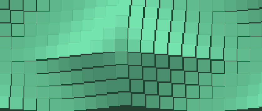
Use the Contrast slider to adjust the darkness of the color beneath the panels. This layer beneath the panels is only visible between panel gaps or when the panels are animating.
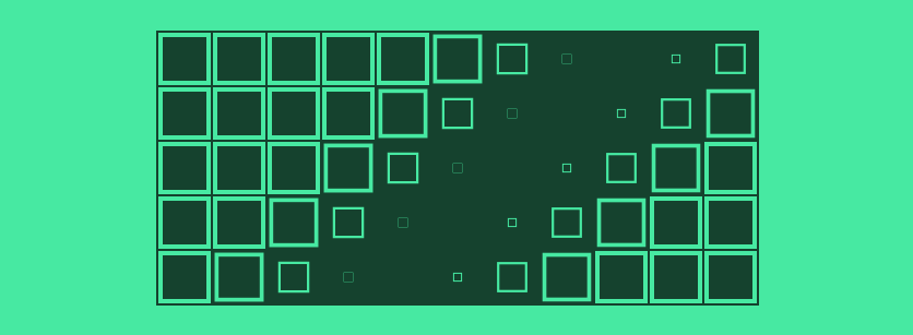
Contrast at 0%:
Contrast at 100%:
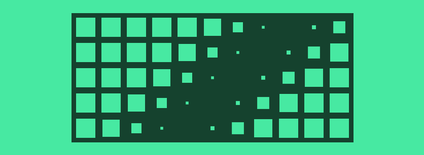
By default the Panel Scaling is set to “none”. This means the panels will not scale to cover or shrink to fit inside the background. This may result in empty space around the panels.
The “Cover” option will scale the panels up to cover the background without leaving any empty space. Any panels that would not otherwise fit into the background will be cropped.
The “Fill” option will also scale the panels up to cover the background. However this option will also scale the panels down to fit inside of smaller spaces without cropping any of the panels.
Use the Panel Count slider to define how many panels are displayed.
The Panel Width and Panel Height sliders define the size of the individual panels.
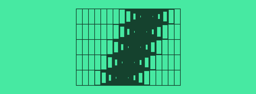
Use the Panel Radius slider to add corner rounding to the panels.
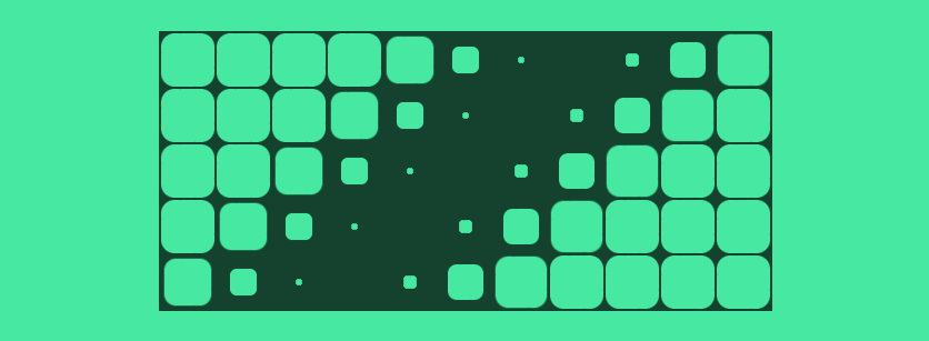
Use the Panel Gap slider to adjust the space between each of the panels.
Enable Frame mode to remove the panel background and instead use a border frame. The thickness of the frame can be adjusted using the provided Frame Thickness slider.
Background Gradient
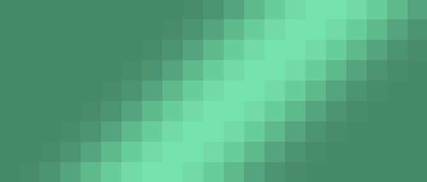
The background color gradient can be defined using the provided Gradient Color, Stop Point, and Orientation settings. In addition to the Contrast slider mentioned previously, there is also a Blending setting that modifies how the gradient applies to the panels vs the layer beneath them. In most cases the default “Overlay” option will work best with the other options being useful when the background as a whole needs to be darkened or lightened.
Background Image
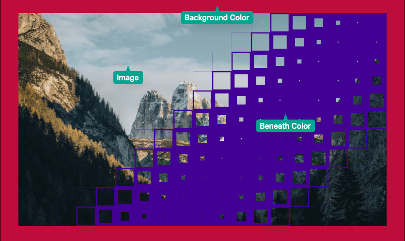
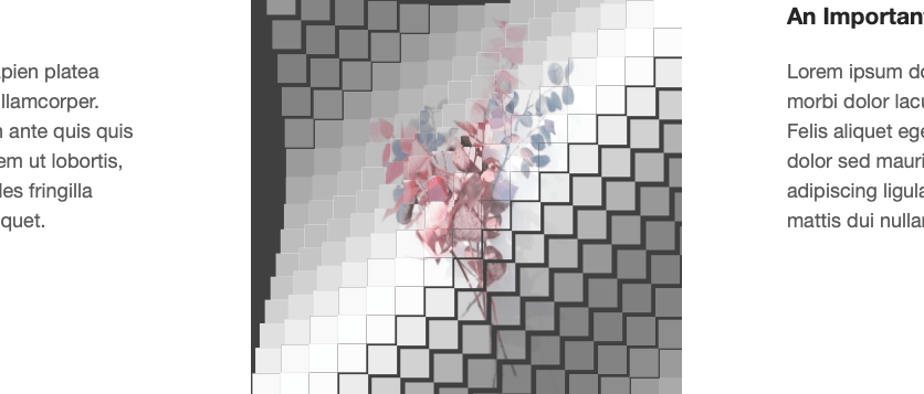
Similar to the other background options, the background color can be changed using the Background color setting. In place of the contrast slider, the provided Beneath color directly controls the color of the layer below the panels. When an image is added to the Image field, it will stretch across all of the individual panels to create a single image. Refer to the image below to get an idea of what each setting applies to.
To make sure the panels match the dimensions of the provided image you must define an Aspect Ratio. If the aspect ratio does not match the image the image will stretch and distort.
The Align options can be used to align the image if it would not otherwise cover the entire background.
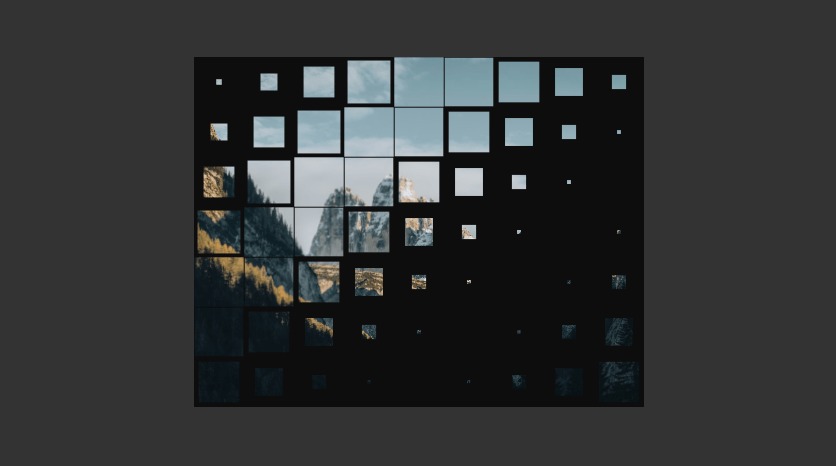
The Panel Scaling setting has a few extra options when using a background image. By default it is set to “none”. This means the panels and image will not scale to cover or shrink to fit inside the background. This may result in empty space around the panels and image.
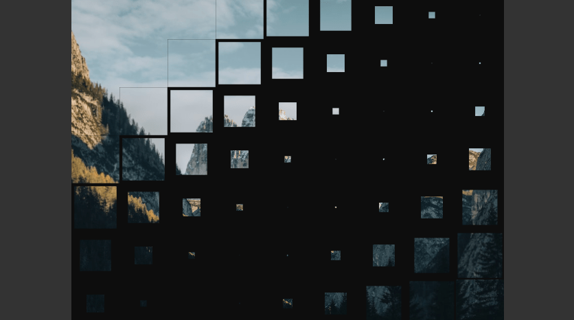
The “Contain” option will scale the panels and image to be as large as possible within the background without cropping or stretching the image.
Use the “Cover” option to allow the panels and image to scale up to cover the available background space. Any parts of the image that overflow will be cropped.

The “Match Height” option will scale the panels and image to be as large as possible to fill the height of the background. This may result in cropping or empty space if the proportions of the background differ from the image.
Use the “Match Width” option will scale the panels and image to be as large as possible to fill the width of the background. This may result in cropping or empty space if the proportions of the background differ from the image.
Animation Settings
There are 8 different Animation options to choose from. Each option has a Direction setting that changes where the panel animations start and end.
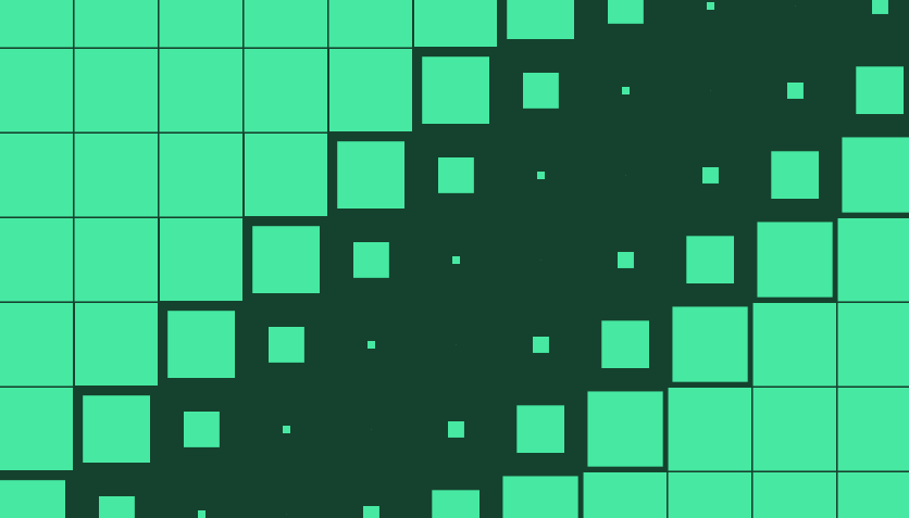
The “2D: Scale Down” option animates by alternating the size of the panels between 100% and a percentage defined using the Scale To slider. The “2D: Scale Up” option works the same way in the opposite scaling direction.
The “2D: Shine” option animates by alternating the brightness of the panels between 100% and a percentage defined using the Lightness slider.
The “2D: Slide” option animates by alternating the position of the panels by a pixel distance defined using the Slide By slider.
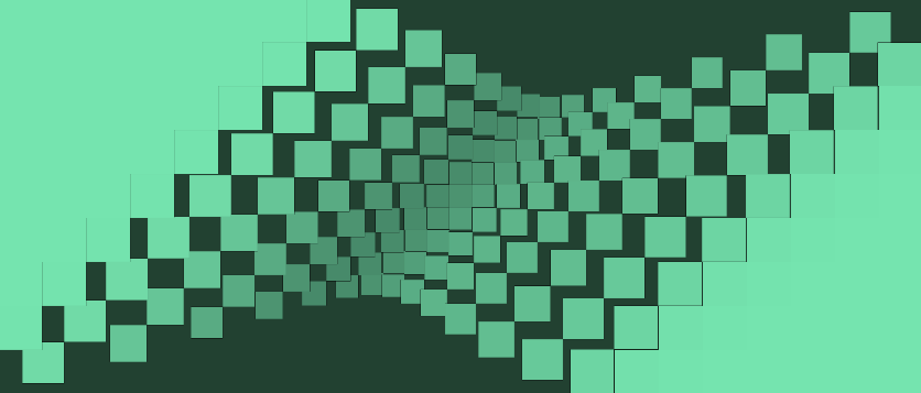
The “3D: Rotate” option animates by rotating the panels 360 degrees on the Y axis.
The “3D: Wave In” option animates by alternating the position panels by a pixel distance to create an inset wave in effect. The pixel distance can be defined using the Shift By slider.
The “3D: Wave Out” option animates by alternating the position panels by a pixel distance to create an raised wave effect. The pixel distance can be defined using the Shift By slider.
The “3D: Zoom” option animates by alternating the position panels by a pixel distance on the Z axis to create a 3D zoom-in zoom-out effect. The pixel distance can be defined using the Zoom Distance slider.
The Duration slider adjust the speed of each individual panel animation. This is the time in seconds it takes a single panel to complete an animation before starting over.
A pause is included in between each panel animation equal to 40% of the defined duration. This pause can be removed using the Pause between animations option.
The Stagger slider adjust the delay between each panel animation from a value between 10% and 100%. This percentage applies to the duration of the animation. A value of 100% means the last panel will not start animating until a 100% of the duration has elapsed. This results in the wave effect appearing more narrow.
A value of 30% means the last panel will start animating after 30% of the duration has elapsed. This results in a widened wave effect.
The Pause between animations option can be disabled to remove the pause between each individual panel animation. Every panel will constantly be in motion when this option is disabled.
The Rounded wave can be enabled to modify the overall wave animation to create a rounded wave effect.
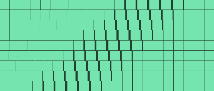
Rounded wave disabled:
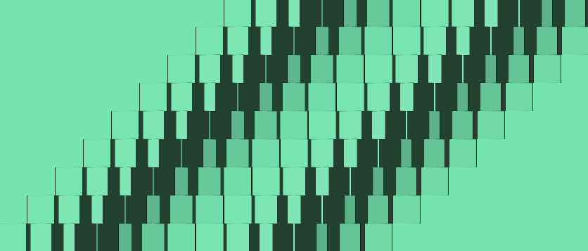
Rounded wave enabled:
Content Layout Settings
By default the Content Width is set to “Fill” and any content placed inside of the stack will fill the width of the stack. Changing the setting to the “Custom” option will allow you to set a max width for that content. The content will automatically be centered in the available space if the browser width is greater than the defined max width.
The Max Width slider will define the max width for the content in pixels.
The Mobile Spacing slider will define the space the the left and right of the content when the browser width is smaller than the defined max width.
The “None” option will remove the content all together. This is useful for using the stack as a standalone animating image element rather than a container with a background animation.
Padding is automatically added above and beside the content when using the “Auto” option. Use the “Simple” and “Detailed” options to define custom padding values for the content.
The Content Width and Padding settings only affect content placed inside of the stack and have no affect on the panels.