Setup
Add Vivid Tiles: Start by adding Vivid Tiles to the editor. Take a moment to observe the layout:
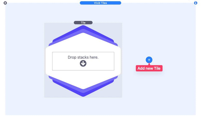
- The main Vivid Tiles element contains a single Tile element by default.
- A blue add button can be used to add more Tile elements.
Adding Tiles and Content: Use the add button to add as many tiles as needed. Each tile has a section where just about any type of content can be added. There are also two additional custom content sections available for each tile that are only available when certain individual tile style options have been selected. We will go over those styles a little later.
Adjust General Styles: To adjust the style settings that apply to all the added tiles, select the main Vivid Tiles element and open the settings panel.
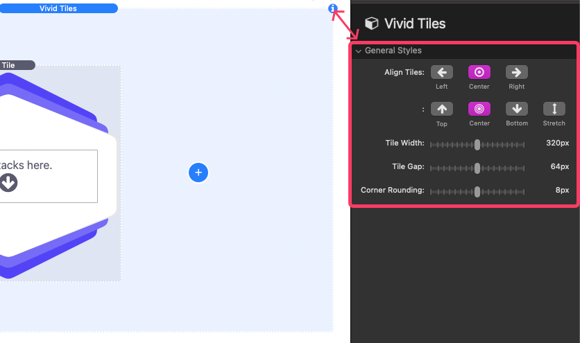
You’ll find four general styles settings. Let’s explore each one:
- Align Tiles: As new tiles are added they will automatically display in a column layout. Use these options to define how the tiles align in the available horizontal and vertical space. The additional “Stretch” vertical alignment option will force all tiles in a single row to be the same height.
- Tile Width: Define a width that applies to all tiles.
- Tile Gap: Adjust the space between each tile. If there is not enough available space for the tiles to fit in a single row the tiles will wrap to a new row. When this happens the value will also apply to the space between rows.
- Corner Rounding: Adjust the corner shape of the outer edges of all tiles.
Style Individual Tiles: To adjust the style of a single tile, select the Tile element and open the settings panel.
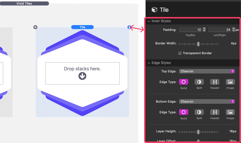
You’ll find three sections to adjust the appearance of the selected tile. Let’s explore each the style settings:
Inner Styles:
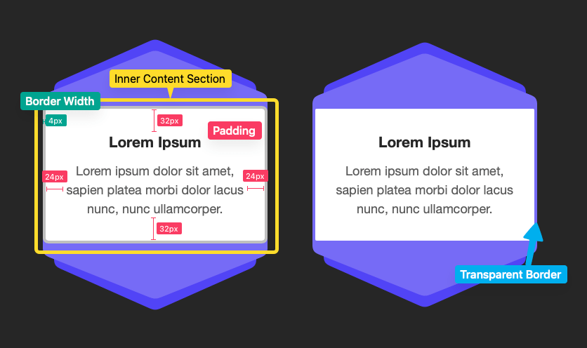
- Padding: Control the space around any content added to the tile.
- Border Width: Adjust the thickness of the border around the inner content section.
- Transparent Border: Enable to remove the border color. The border will still take up space revealing the edges of any layers that are behind the inner content section.
Edge Styles:
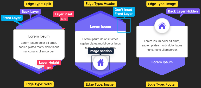
- Top/Bottom Edge: Choose the shape and design of the top edge of the tile.
- Edge Type: Select from four available options (visible when Top Edge is not set to “None”).
- Solid: The inner content background extends into the shape.
- Split: The inner content background is separated from the the shape.
- Header/Footer: The inner content background is separated from the shape and custom content can be added to the shape.
- Image: A special layout is applied to the shape allowing for an image or icon to be added.
- Image: Optionally add an image that displays as the background of the image section. An optional “warehoused” image URL field is provided to forgo uploading a new image. (Both are visible when Edge Type is set to “Image”).
- Image Height: Adjust the height of the image section (visible when Edge Type is set to “Image”).
- Image Width: Adjust the width of the image section (visible when Edge Type is set to “Image”).
- Border Width: Adjust the thickness of the border around the image section (visible when Edge Type is set to “Image”).
- Circular Image Background: Disable to give a squared appearance to the image section (visible when Edge Type is set to “Image”).
- Image Shadow: Disable to remove the shadow that display around the image section (visible when Edge Type is set to “Image”).
- Flip Angle: Enable to flip the shape horizontally (visible when Top/Bottom Edge is set to “Angle” or “Angle Alt”).
- Layer Height: Adjust the extending height of the two shape layers behind the inner content section.
- Layer Inset: Adjust the horizontal inset of the two shape layers behind the inner content section.
- Animate In View: Enable to apply a subtle animation to the tile layers anytime it comes into view of the browser window.
- Don’t Inset Front Layer: Enable to remove the Layer Inset from the front layer so that only the back layer is inset.
- Hide Front Layer: Enable to remove the front layer.
- Hide Back Layer: Enable to remove the back layer.
Colors: Use the color fields to customize the colors of inner content section, image section, and the front and back layers.