Page Settings
Learn how to customize settings that effect your entire page here
- Colors
- Content Text
- Content Background
- Accent (Buttons, Links, etc.)
- Accent Text (Button text colors)
- Toggle
- Sticky Menu Button
- Transparent Navigation Background
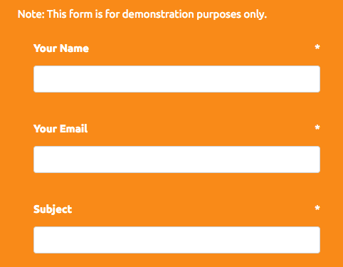
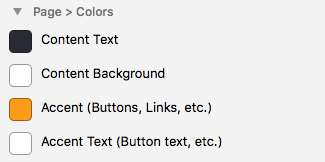
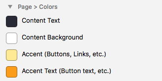
Page > Colors
There are 4 different colors that you can customize, which will affect your entire page.
- Content Text
- Content Background
- Accent
- Accent Text
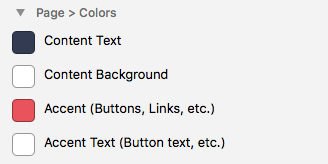
Content Text
This option will simply change the color of the text in the content area of the page. It will not affect the color of links.
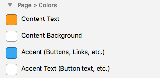
Content Background
This option changes the background color of the content area, underneath the header, like so:
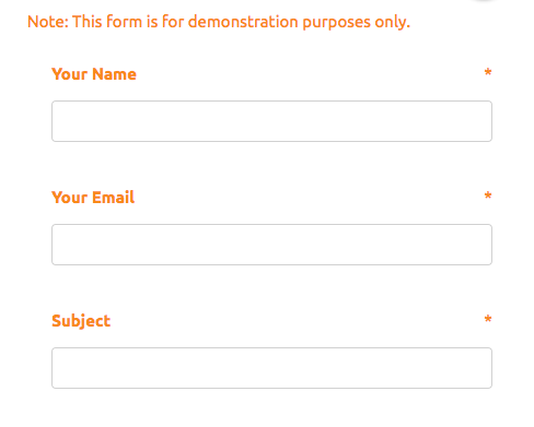
Accent
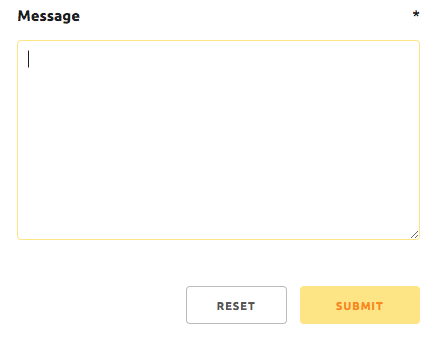
Th Accent color option will change the color of Links, Buttons, Input Highlights, and other generally stylistic accents on the page.
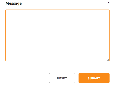
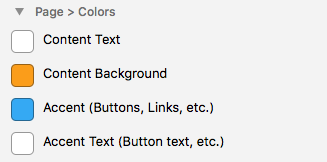
Accent Text
The Accent text color option is used to change the text color of accented elements on the page like buttons. For example, if you change your Accent Color to a light color like violet, then you would want to change the Accent Text color to something darker, so that it will be easier to see.
Page > Font Family
This option changes the font family for the entire page, including the Title, Slogan, and all text within the content area.
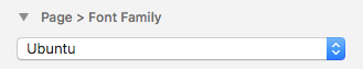
We made a single option for all of these areas to keep your site looking great aesthetically. It’s considered bad practice to use multiple fonts on a single page, as it can make it hard for the users eyes to read.
There are 10 Font Family presets that you can choose from:
- Raleway
- Open Sans
- Abril Fatface
- Arvo
- Josefin Slab
- Lato
- Old Standard TT
- Playfair display
- Ubuntu
- Vollkorn
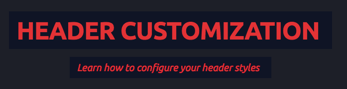
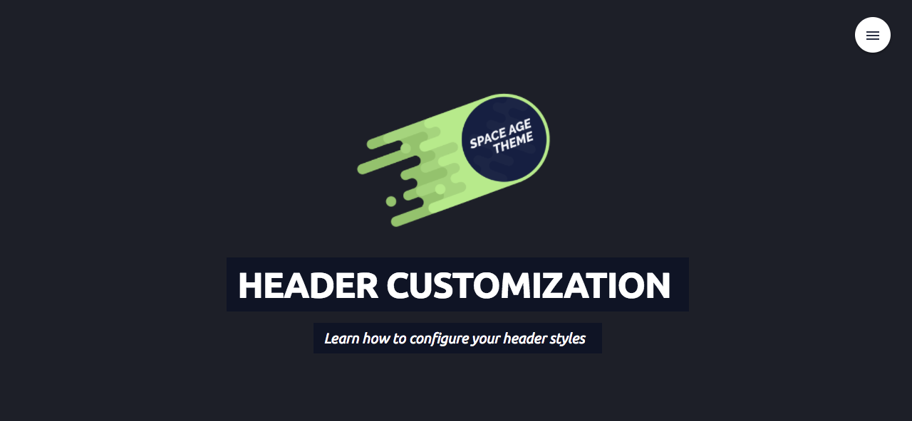
Header Settings
Learn how to configure your header styles
Customization Options
- Toggles
- Colors
- Background
- Text Alignment
- Logo
- Size
- Animation
Header > Toggles
The Header > Toggles section will allow you to hide/show certain items in the header area of your page. There are currently three options:
- Hide Logo
- Hide Title
- Hide Slogan
You can simply check an option to hide the specified element on the page. This is for users who may not want to display certain elements like their logo, or slogan, etc.
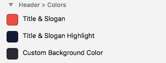
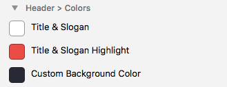
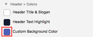
Header > Colors
There are only a few color options that you can change for your header. We tried to keep it simple to make sure that your theme looks great no matter what. The color options that you can change are:
- Title & Slogan
- Title & Slogan Highlight
- Custom Background Color
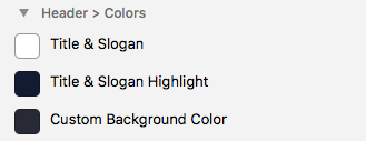
You can ignore the third option, Custom Background Color as we will cover this in the next section of the tutorial.
For now lets focus on the first two options, Title & Slogan and Title & Slogan Highlight:
Title & Slogan
This color option will simple change the text color of your Title and your Slogan. We’ve kept them both the same color for aesthetic correllation.
Title & Slogan Highlight
This color option will the rectangular area that is highlighting the Title and the Slogan.
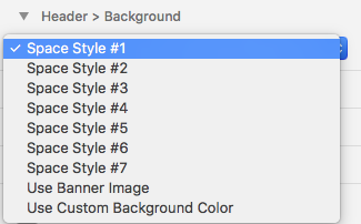
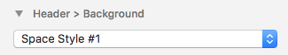
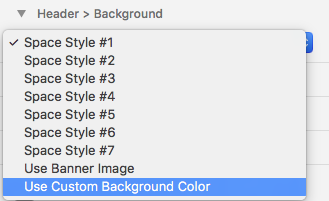
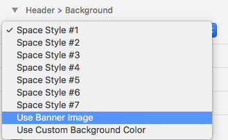
Header > Background
This option will allow you to change the background of the header section on your page. There are three specific options to choose from:
- Choose between 1 of 7 included space-style presents
- Use a custom background color
- Use Rapid Weavers’ banner image feature
…
Using one of the space-style presets
Using the included presets are extremely simple. All you have to do click on the Header > Background dropdown and choose one of the included options labeled “Space Preset”
…
Using a Custom Background Color
If you’d like to use a custom background color, first click on the Header > Background dropdown and choose the option labeled “Use Custom Background Color”
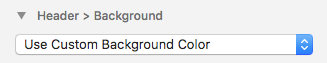
Next, you can choose the color that you would like to use by clicking on the color picker under the Header > Colors section.
Now you will see that your page’s header has changed to the custom background that you’ve selected. Awesome!
…
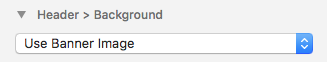
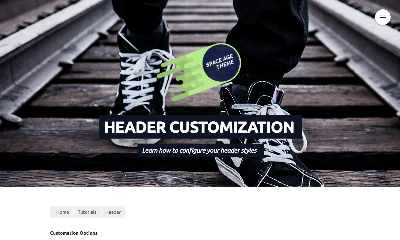
Using a Rapid Weavers Banner Image Feature
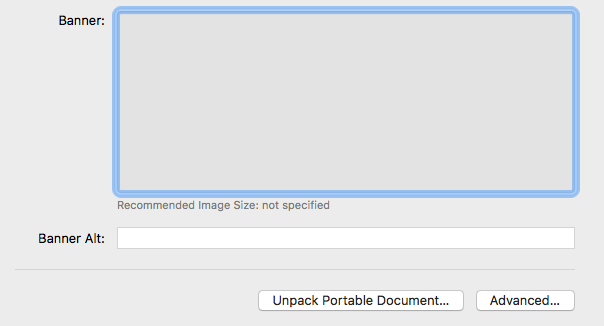
If you’d like to use a custom banner image through Rapid Weaver, first go to the General area under Settings.
From here you can click on the area that says Banner Image:
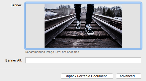
Once you have an image selected, it will look like this:
After this, you can go to your page, click on the Header > Background dropdown menu, and change it to the User Banner Image option.
!!! Note it is very important to set your banner image in Rapid Weaver before changing the option to User Banner Image on your page.
Alas, you should see your custom banner image as the background of your page header:
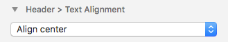
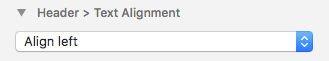
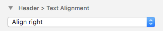
Header > Text Alignment
This option is allows you to choose the alignment of your header Logo, Title, and Slogan all at once. By default they are aligned to the center of the page, but you can also choose to align them to the left or the right.
Align Center
Align Left
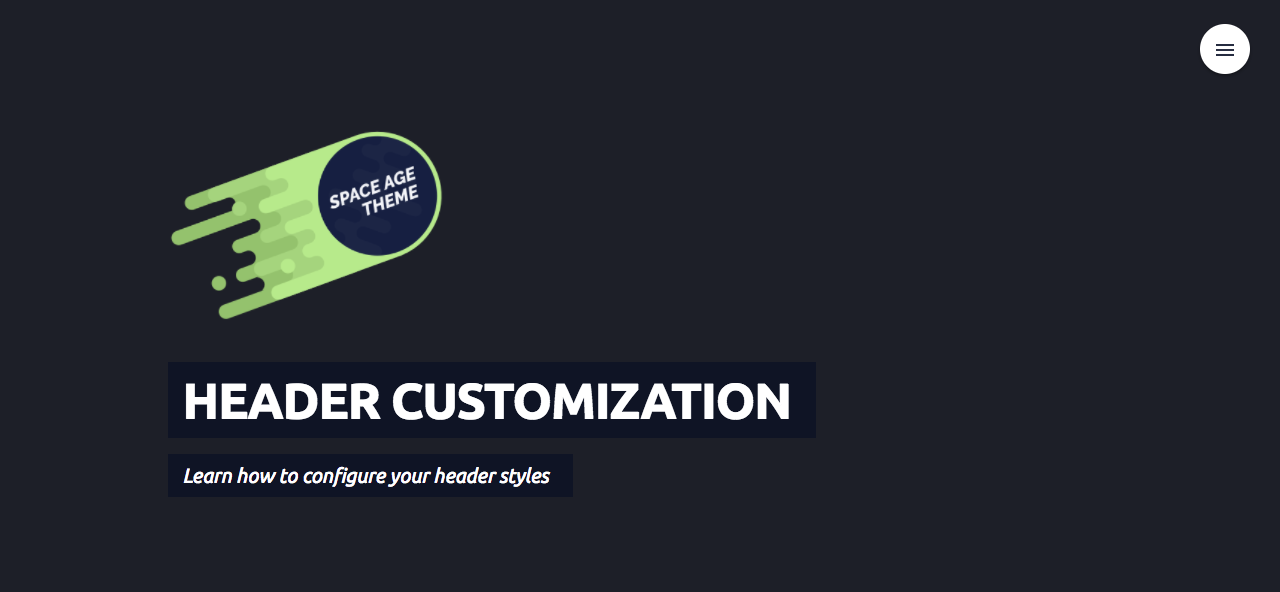
Align Right
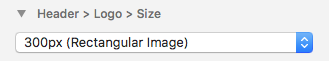
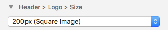
Header > Logo > Size
This option is used to specificy whether your header will have a Rectangular logo image, or a Square one. This allows your page to have the best fit for your logo.
You can set your sites logo image in the General section of Rapid Weaver, similar to how you set up your banner image.
Next, you can go to your page and click on the Header > Logo > Size dropdown, to choose the proper size.
There are only two options, so simply choose the option that best fits your logo images shape.
Rectangular
Square
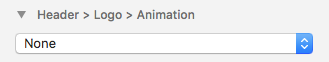
Header > Logo > Animation
This option will allow you to add a special animation to the logo image in your page’s header. There are 10 option to choose from:
- Bounce
- Flash
- Jello
- Pulse
- Rubber Band
- Shake
- Swing
- Tada
- Wobble
You can select the animation by clicking on the Header > Logo > Animation dropdown, and choosing the animation that you’d like.
By default the animation is set to none
If you’d like to choose an animation, change this to one of the specified animation names.
THE END
Congrats! If you’ve made it this far, you should fully understand how to customize your page’s header. Easy eh?
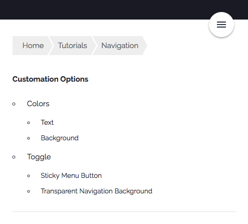
Navigation Settings
Learn how to customize your navgiation styles here
Customization Options
- Colors
- Text
- Background
- Toggle
- Sticky Menu Button
- Transparent Navigation Background
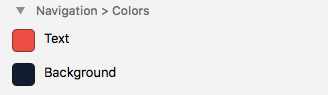
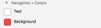
Navigation > Colors
There are two color options that you can specify for your navigation. Changing this two colors can give your page and your navigation a whole new look.
The colors you can change are:
- Text
- Background
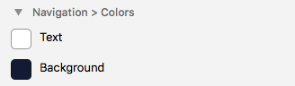
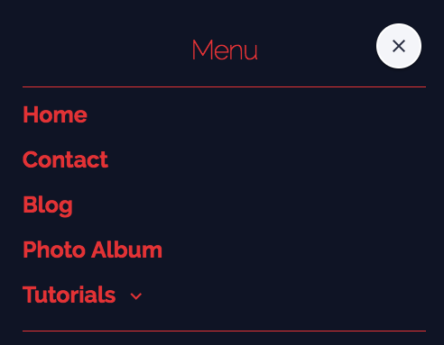
Text
Changing the text will change the color of all text within your navigation menu.
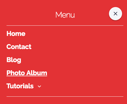
Background
Changing this option simply changes the background of your navigation to whichever color you choose.
Navigation > Toggles
There are two options that you can toggle for the navigation:
- Sticky Menu Button
- Transparent Navigation Background
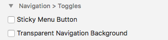
Sticky Menu Button
This option allows you to choose whether or not your navigations menu button will be fixed to the top of the page, or whether it will follow the user as they scroll down the page. By default, the menu button is set to follow the page as it scrolls.
- (Checked) Menu Button follows the user as they scroll
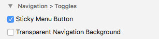
- (Unchecked) Menu Button Stays at the top corner of the page, even on scroll
…
Transparent Navigation Background
This option allows you to choose whether the background of your nivagation will be see-through or not.
- (Checked) Navigation background is transparent allowing you to see the page contents underneath
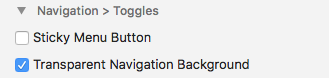
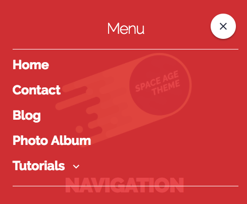
- (Unchecked) Navigation background is completely opaque
THE END
Great job! You now know how to customize your navigation menu and make it awesome.
Menu Button Settings
Learn how to customize our Menu Button Styles here
Customization Options
- Colors
- Text
- Border
- Background
- Icon
- 3 Bars
- 3 Bars Left
- 3 Bars Centered
- Plus
- Plus Circle
- Plus Circle Outline
- Grid
- Dots Horizontal
- Dots Vertical
- Cog
- Shape
- Circle
- Square
- Rounded Square
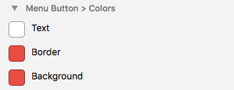
Menu Button > Colors
There are 3 specific color options that you can customization with the menu button:
- Menu Button text color
- Menu Button border color
- Menu Button background color
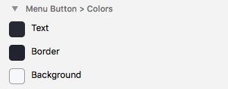
Text
The text color option will change the color of the icon inside of the menu button.
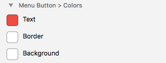

Border
This will change the color of the border around the Menu Button.
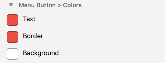

Background
This will change the background color of the Menu Button, like so:

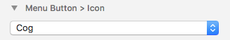
Menu Button > Icon
This dropdown menu allows you to choose which icon you would like to show up inside of your Menu Button. We’ve included 10 different icon presets to choose from.
menu 3 Bars
sort 3 Bars Left
filter 3 Bars Centered
add Plus
add_circle Plus Circle
add_circle_outline Plus Circle Outline
apps Grid
more_horiz Dots Horizontal
more_vert Dots Vertical
settings Cog
You can change the icons using the Menu Button > Icon dropdown menu like so:
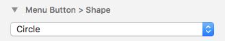
Menu Button > Shape
This option is used to set the desired shape of the Menu Button, There are 3 options:
Circle

Square

Rounded Square

These options can be changed with the Menu Button > Shape dropdown menu.
THE END
You’re amazing. Now you’re an expert at customizing your pages Menu Button~~ ^_^
BLOG SETUP
Learn how to make your blog page look great with the Space Age theme
Setting up your blog page to look just right
Out of the box, Space Age works perfectly with Rapid Weavers Blog plugin, though there are a few recommended tweaks that can be made in order to make your blog page look even better with this theme.
Recommended Changes
- Tags
- Dates
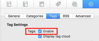
Tags
If you decide that you want to enable tags for your blog page in Rapid Weaver
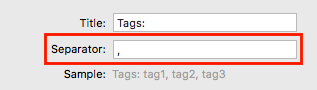
Then you will find that the default separate will be set as a comma ( , ) like so:
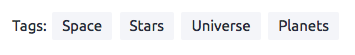
Which will cause the tags on your blog page to look like this:
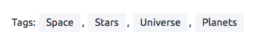
This is fine, but stylistically it doesn’t look that great.
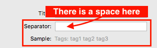
We recommend change the default separator of your tags from a comma ( , ) to a single space, like so:
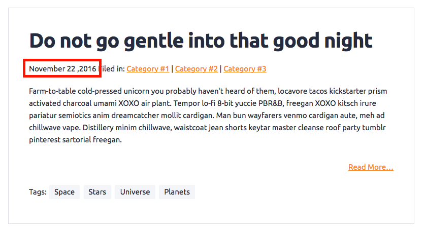
Which will create a much more appealing and simple look on your blog, like so:
This is not absolutely necessary, but we think it adds a more clean look to the blog page, rather than the default value in Rapid Weaver.
Dates
The default date style in Rapid Weaver is also not that appealing stylistically. We recommend the follow Date formate for your blog page:
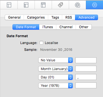
Which would end up looking something like this:
This is a subtle change, but we think it makes all the difference in making your page look cohesive and stylish.
THE END
PHOTO ALBUM SETUP
Here you will learn how to setup your photo album to make it look amazing
Setting up your Photo Album to look like our example page
Out of the box, the default photo album settings for Rapid Weavers Photo Album plugin will not make your album look like our example page. Luckily, you’ll only need to change a few settings to get it looking amazing, like ours.
Recommended Changes
- Change Slideshow to Gallery
- Sizes and Captions
- Change the Album Title Color (for light header backgrounds only)
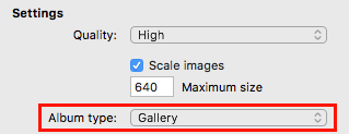
Change Slidedshow to Gallery
By default the album type option for RW’s Photo Album plugin will be set to “slideshow”, which isn’t that impressive.
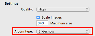
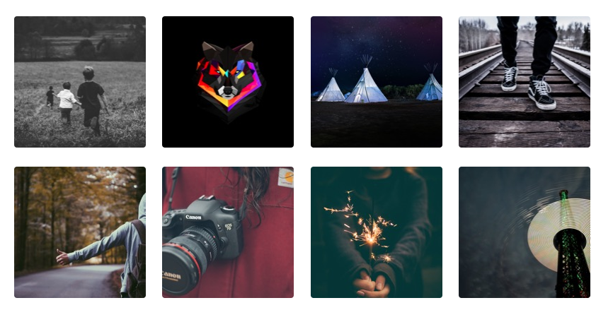
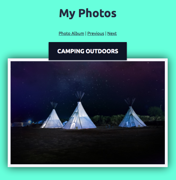
We recommend changing this to “Gallery” which will make your page display a gallery of photos like on our example page:
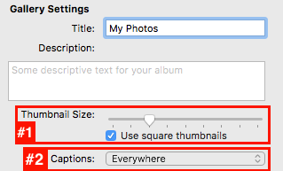
Sizes and Captions
We also recommend 2 more customizations.
- we recommend customizing the “Thumbnail Size” to a size that suits your needs, and checking the “Use Squre Thumbnails” option.
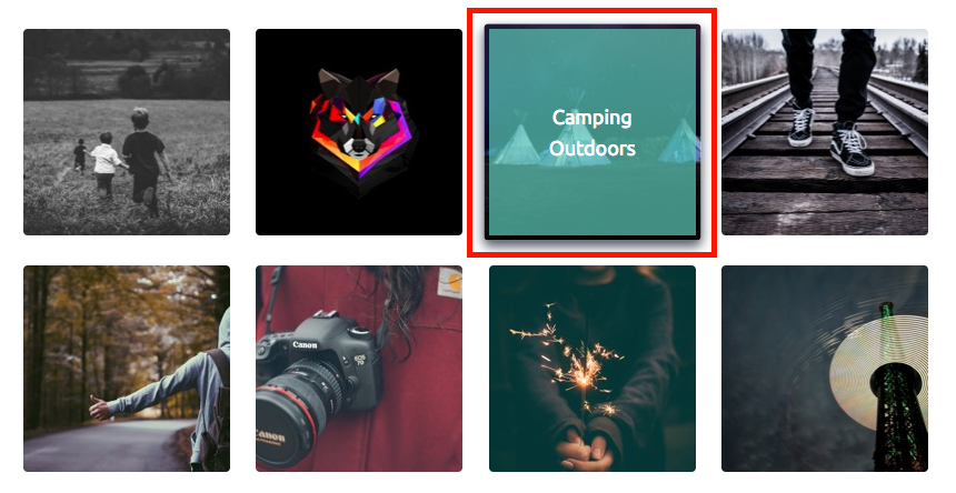
- We recommend that you change the “Captions” option to “Everywhere”, which will make it so that you can have the cool caption popups in our example photo album.
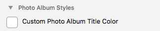
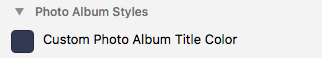
Change the Album Title Color
ONLY NECESSARY FOR LIGHT HEADER BACKGROUNDS
This last tweak is only for those who are using the Custom Header Background option for your photo album page.
The default album title color for Space Age’s photo album is white, if you choose to use a lighter background color for your photo albums header, then you might find that the white colored text does not show up very well.
For this case, we’ve provided a color option in the Photo Album Styles section of your pages theme settings.
If you decide that you want to use a very light custom background color for your photo albums header, then we suggest setting this color option to something darker, in order to make the text more visible, like so:
THE END
That’s it! Your photo album page should be looking super stylish, just like our example page.