HTML Element Settings
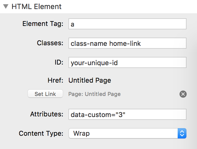
Element Tag – This field is where you will declare what type of HTML element to use. Accepts any valid HTML element (div, section, article, a, input, img, etc). Note: The element that is created will not be wrapped in Stacks’ standard div elements.
Classes – Optionally declare an unlimited amount of CSS classes. Each class should be separated by a space. This field does not accept special characters (# ” ? $ . etc) and is case sensitive.
ID – Optionally declare a single ID for the element. Your ID should be unique and not contain any spaces. This field does not accept special characters (# ” ? $ . etc) and is case sensitive.
Href/Src – Use RapidWeaver’s link window to set a link to a page or resource. This field is only visible if the element has been set to “a” or “img” element.
Attributes – Optionally add any custom attribute. The attribute should be added in the following format with the equal sign and quotation marks added: attribute-name=”attribute-value”
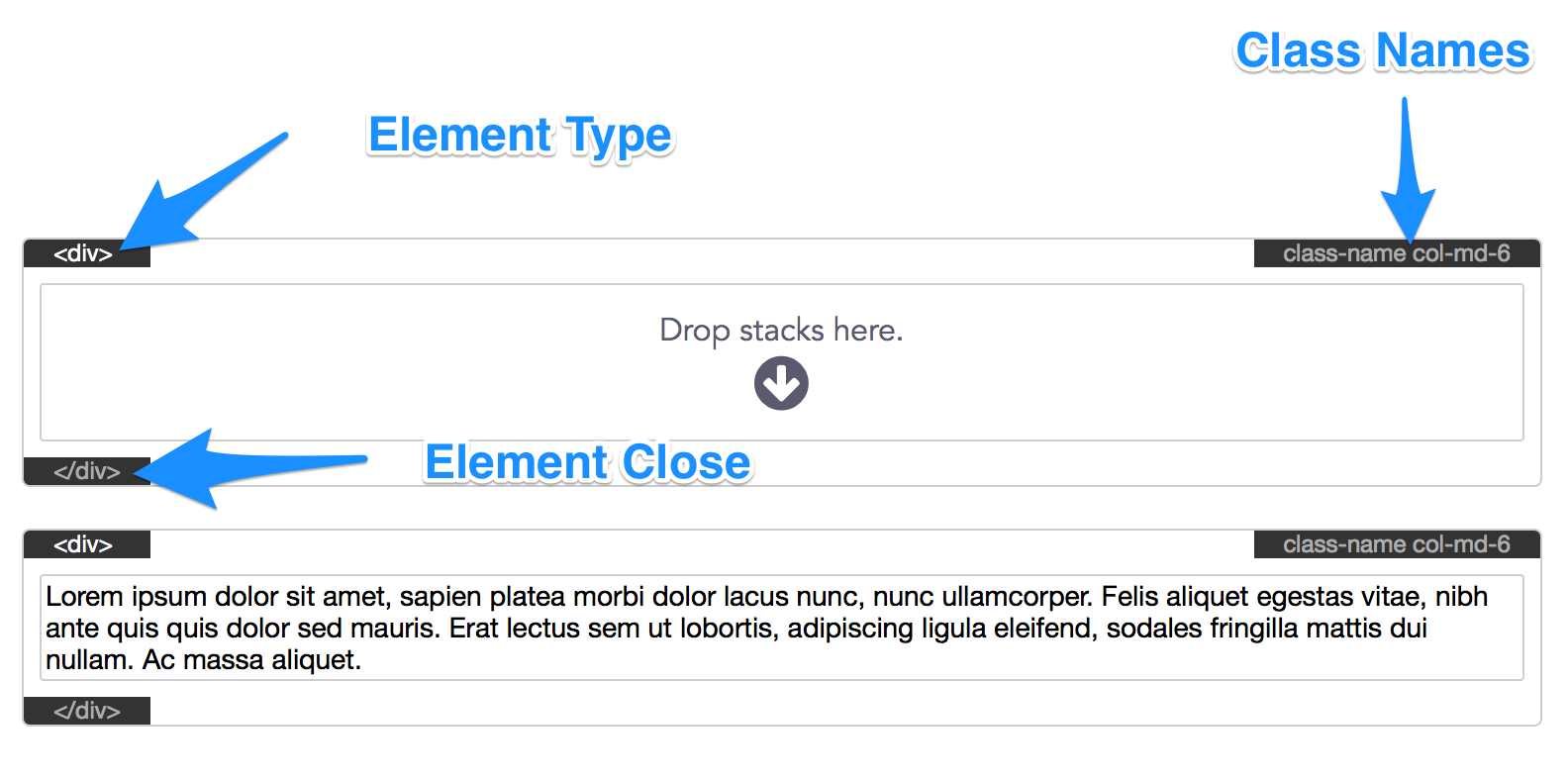
Content Type – “Wrap” will allow you to nest other HTML elements and stacks inside this element. “HTML text” will allow you to type in text, which is useful if your element is a header or paragraph tag. In the image below, the top element is set to “Wrap” while the bottom is set to “HTML text”. The element type will display in the Stacks’ editor as well as the assigned class names to help with organization.
CSS Settings
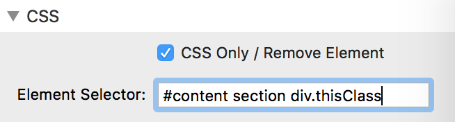
CSS Only / Remove Element – Enable this option if you do not wish to create a new HTML element but declare a CSS Rule instead. Once enabled the HTML element will be removed and the CSS Selector Title will display in the Stacks’ editor. This title will only display in edit mode and wont add anything to the actual published HTML. All of the declared CSS will be added the the current page’s Stacks CSS file.
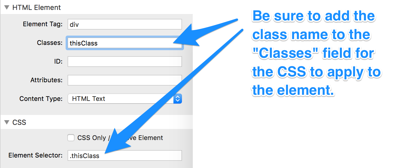
Element Selector – By default this field is set to “[this]”. This value will automatically apply a random generic classname to the element and apply all of the non-default CSS to this element only. To apply the non-default CSS to elements with a specific class you can create a unique classname.
To create a classname type a period ( . ) into the “Element Selector” field, this period stands for “class”. Follow the period by typing any unique name. The name must begin with a letter (a–z) and accepts more letters, numbers, hyphens ( – ), and underscores ( _ ) with no spaces in-between. The name must also be at least 2 characters long.
Good Examples:
.myClass
.my-class
.my_class
.myclass2
Incorrect Examples:
.my class (has a space)
.2myClass (begins with a number)
.&my-class (contains unsupported "&" character)
You can then add this classname to any HTML element’s “Classes” field to have the CSS apply to it. Since this field is specific to classnames you will not need to add the class symbol (or period symbol) to the name when entering it into this field. Each classname you add should be separated by a space.
Note: If you leave the “Element Selector” field blank none of the CSS rules will be applied.
Single class example:
An advanced selector example with IDs and element selectors:
CSS Rules – An explanation of every CSS rule will not be detailed in this tutorial. We recommend checking out w3schools for a property by property explanation.
Custom Rules and Media Queries
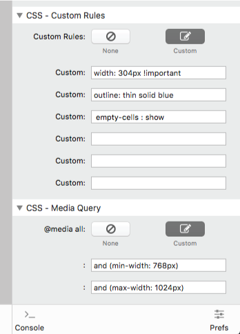
If there is a rare CSS rule that is not listed in the settings panel you can add it to the “Custom Rules” fields. Additionally if you need to add an “!important” tag to a specific field you can declare it here as well. To do so, list the rule title followed by a colon (:) and then the value. You will not need to add a semi-colon(;) to the end unless you wish to declare a second rule in the same field (good for copy and pasting large amounts of CSS rules).
Media queries can be declared for responsive purposes. To add a media query size declaration first type in “and” followed by the rule encased in parenthesis. You can add multiple size declarations in a single field as long as each is prefixed by the word “and”. For example, “and (max-width: 1000px) and (min-width: 600px)” can be typed into the same field as opposed to one in each of the two fields.