Setup & Settings Panel Breakdown
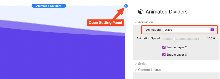
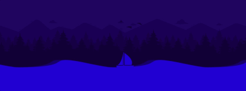
Setup is mostly straight forward. After adding the stack to the editor, simply select one of the Animation options from the Settings Panel > Animation section.
Animation Settings
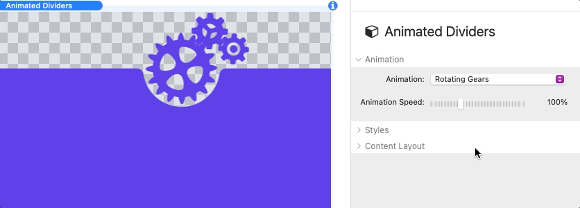
Each option has an Animation Speed setting to adjust how fast the design animates.
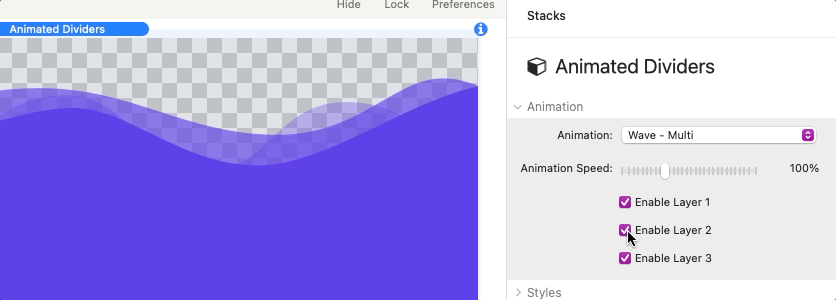
Some of the available options have multiple layers that can be toggled off and on with the provided checkbox enable settings.
Styles
There are three background options to choose from:
Color – Define a sold color for the animation and content background.
Gradient – Define a 2 color gradient that applies across the animation and content background.
Image – Add an image that applies across the animation and content background. This option includes optional settings to define a Background Color, add a transparent Overlay Color, and apply a Blur effect to the image.
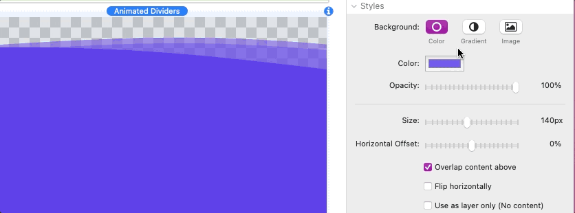
Us the Opacity slider to adjust the transparency of the animation and background.
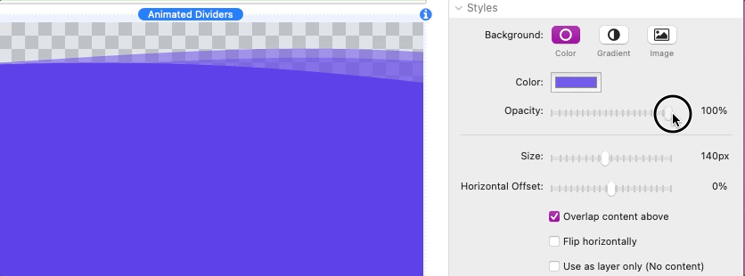
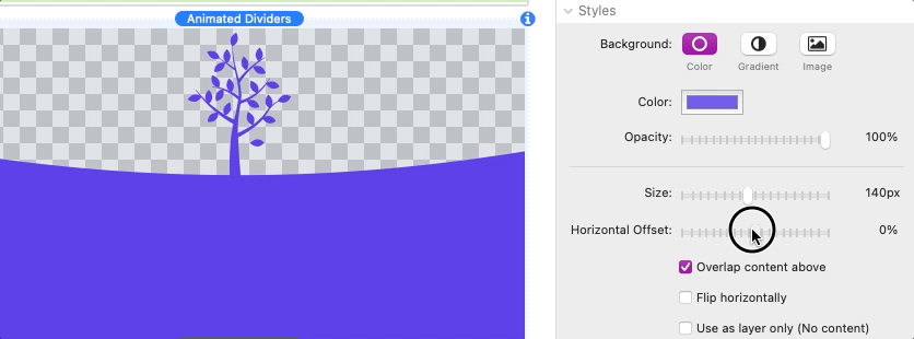
The size of the overall animation design can be controlled using the Size slider. An optional Horizontal Offset setting is provided to allow you to adjust the horizontal position of the design.
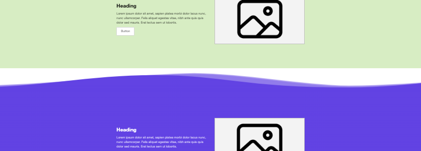
Enable the Overlap content above checkbox to allow the design to overlap any content above the Animated Dividers stack. This is useful when the content above has a defined background color or image. In the following example image a white gap can be seen between Animated Dividers stack and the section above it.
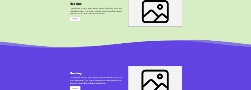
With the overlap enabled the design will display over top of the section above it hiding the gap.
Enable the Flip horizontally checkbox to optionally reverse the animation direction or mirror the design.
Enable the Use as layer only checkbox to remove the content section and use the stack as a standalone layer. This layer can be placed above another Animation Dividers stack to serve as a background layer. You can adjust the vertical distance between the layers by increasing or decreasing the provided Gap slider. When this setting is enabled the stack will automatically overlap any content placed above it.
Content Layout
Changing the Content Width setting to the “Define” option will allow you to set a max width for the content. The content will automatically be centered in the available space. There are two associated settings:
Max Width – Define the max width for the content in pixels.
Mobile Spacing – Define the space the the left and right of the content when the browser window is smaller than the defined max width.
The Padding above and beside the content is defined automatically by default. Use the “Simple” and “Default” options to define custom padding values for the content.