Note, this video uses cleanResponse, which has sense been replaced by Responsive Grids.
Basic Setup
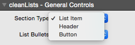
cleanLists is built with 3 different types available that are common in lists and pricing tables. By default it is set to list items (headers and buttons are available commonly placed at the top or bottom of a pricing chart).
If ‘List Item’ is selected you can then proceed to use RapidWeaver’s built-in list item tool.

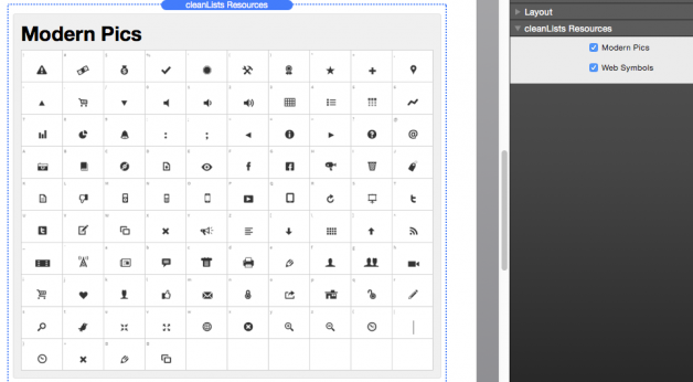
Modern Pics & Web Symbols are stored as a separate stack in cleanLists 2.0+. Simply drag and drop it to the top of the page and these fonts are made available – this is to reduce load time for cleanLists by placing only a single instance of the font files.

Font Awesome is another stack packaged separately that is not part of cleanLists Resources simply because it is used in so many other stacks of mine. Use of Font Awesome is the same – simply drag and drop to the top of your stacks page.
Terminology
General Controls
- Section Type: List item, header, button.List items (default) are for individual list points that receive most of the styling options and color options – most significantly the bullets.
- List Bullets: Square, Circle, Modern Pics, Web Symbols, Off, Inherit. These are bullet list-item choices and will only work for list item section types. Squares & Circles are small container objects with borders that display them as either a square or circle. Modern Pics & Web Symbols are font-based icons and controlled below by the “Web Font Symbol” section.
- Web Font Symbol: this field is used to control the web font symbol and works only in list item section types, and the list bullets “Modern pics” and “web symbols.” Simply type the character shown on the “Glyphs” tab to match with the symbol. You can match these web symbols using the cleanLists Resources stack (comes package in version 2.0+).
- Bullet Size (px) controls the pixel size of bullets. When used on the Square or Circle List Bullet note that there is a 1px border around, so if set to 10px size it would be 12px width and 12px height.
- Font Size (px) controls the size of fonts in the list item and button section types.
- Header Size (px) controls the size of the header section type (note that the Header Tag below controls the HTML wrapping).
- Button URL: Place button URL / links in this field – do not place them by highlighting the text and using the link icon in the top left.
- Button Themes: Off, Simple, Soft. This section controls pre-set styling (aka themes) of the button section. Soft is a minimal setting and will not receive all the button color controls, where the Simple button will.
- Header Tag controls the HTML heading tag, i.e. <h1>.
- Padding Top & Padding Bottom control the padding below and above the line and can be used to make all section types larger. This option is also built into stacks, though I added it here as well for quicker use.
- Text Padding Left controls the distance of the text from the left side (side of bullet icon)
- List Icon Top & Left control the distance of the bullet icon from the side. By default they have been set for smaller fonts (12-14px) and may need to be adjusted for larger fonts. Increasing Top will move the bullet down, increasing Left will move the bullet to the right.
- Header Center centers the text in header section types. Uncheck and header will move left.
- Pointer (Hand) causes the mouse to be a pointer (hand) when hovering the section.
Color Controls
- Background On creates a background color for the section. Unchecking will turn the background off, thus the background behind the table will be visible.
- Background controls the color of the background.
- Alt Bg On turns on the alternating background color for list item section types.
- Alt Bg Odd sets the alternating background color to occur every other line item. Unchecking the box will set the alternating background color to even.
- Bg Alternate controls the color of alternating backgrounds, assuming it is turned on.
- Bg Hover On allows for the hovering background color for list item section types.
- Bg Hover controls the color of the hover in list item section types.
- Text & Text Hover controls the colors and hover colors for all basic text in that section.
- Links & Links Hover control the colors and hover colors for all links in that section.
- Bullets & Bullets Hovers controls the colors for bullet icons in list item section types.
- Button Bg & Bg Hover control the background and background hover colors for button section types (does not work for Soft buttons).
- Button Border & Border Hover control the border and border hover colors for the simple button types.
cleanLists Resources (2.0 +)

To better assist in development ease and speed version 2.0+ comes with an optional additional stack to assist and show the icons associated with some of the built-in icons. These are also separated so that they only need to be loaded once instead of over and over again with each instance of the stack.
Increasing Distance from Icons & Text
The built-in “Text Padding Left” slider can increase/decrease this distance, though the max is 50 pixels. If you would like to increase this distance you can you can manually increase this by adding code in the Page Info > Header > CSS section.
1 |
.cleanLists li {padding-left: 100px !important;}
|
Adjust the 100px to whatever value you wish to use.
Remove Underlines from List Items
In some themes an error is occurring causing list items text to have underlines. Fortunately, you can remove this simply by inserting the following code in the Page Info > Header > CSS section.
1 2 3 |
.cleanLists ul a li, .cleanLists a, .cleanLists ul a li:hover, .cleanLists a:hover {
     text-decoration: none !important;
}
|