Getting Started
Using The Built-in Menu
Setup is a breeze if you want to use the built in RapidWeaver project menu. Just drag and drop the stack into the Stacks editor. Then refer to the Settings section to learn how to customize the appearance.
Creating A Custom Menu
Enable “Use Custom List” in the stack’s General Settings.
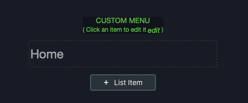
Adding List Items
You will see that a new stacks list item has appeared in the Stacks editor, followed by a [ + List Item ] button for adding additional items to your list.
Editing List Items
Click on a list item to edit it’s settings.
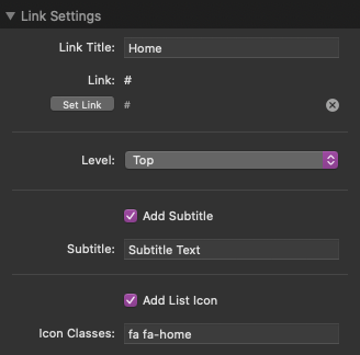
Item Link
Here you will find a “set link” button that will allow you to choose where you want the list item to link to. It uses stacks link creation window, so you can easily link to a page on your RapidWeaver site, or link to an external site.
Link Title
Use this setting to define what text displays in the menu item.
Link
Define where the link navigates to.
Level
Select what level the menu item will appear on. Use this setting to create dropdown menus of multiple levels. By default, added links will be set to “Top Level”, meaning the list item will be always be shown. You can create a dropdown menu by placing a new list item directly underneath a Top Level element, and then changing the level to Sub Level 1, like so:
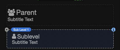
Doing so will create a dropdown menu with the Sub Level 1 item underneath the preceding Top Level item.
You can create more sub levels by following the same rules. For example, create a third level of list items by placing some Sub Level 2 items directly underneath a Sub Level 1 item. You can create up to 5 levels deep. This should be plenty, we’ve chosen this amount because having more than 5 levels of items is way too confusing for a user. We recommend going no more than 2 or 3 levels deep, unless absolutely necessary.
Add Subtitle
Enable this to define a subtitle.
Add List Icon
Enable this to define an icon to display next to the title. Ionicons and Font Awesome icons are built-in to the stack.
To use an icon add the appropriate class names defined just like in the examples below.
Ionicon Example:
icon ion-ios-home
Font-Awesome Example:
fa fa-home
See full list of usable Font Awesome icons
See full list of usable Ionicons icons
Completion
Continue adding list items and editing the settings to complete your custom menu.
Settings
General Settings
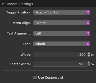
Toggle Position
Select where in the window you want to place the toggle. “Fixed” options will scroll with the page. “Inline” options will not scroll but instead display wherever you have placed the stack.
Menu Align (New in version 2.0.0)
Select the horizontal position of the menu.
NOTE: When using the “Left” and “Right” options the footer content will display in the center as opposed to below the menu.
Text Alignment
Select the horizontal alignment of the menu text.
Font
By default, the menu will inherit whatever font is being used by the RapidWeaver project. Select “Custom / Webfont Helper” to use a custom font. In the input fields you can declare a font name (case sensitive) of a font you have loaded or the name of a Google Font you have added with the included Webfont Helper stack.
Width
Define how wide you want the menu to be.
Footer Width
Define how wide you want the footer content to be.
Use Custom List
By default the Overlay Menu stack will use your RapidWeaver site menu.
This option can be used if you do not want to use your RapidWeaver project menu and instead want to create your own custom menu with your own links.
Overlay
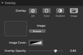
Overlay Background
This is where you can set the background of the screen when the menu is active. The Options are fairly standard and easy to setup.
One thing to note is that the IMAGE BACKGROUND has a special image cover, for images that might make text harder to read. This image cover is simply a color option with the ability to change the opacity. Increase or decrease the opacity depending on your image, and how visible your menu text is.
Overlay Opacity
Here you can set the opacity of your Overlay Menu’s background. Set it to 1.0 to make the menu fully opaque, or set it to a lower value to make it transparent.
Menu Toggle
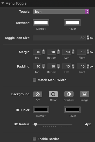
Toggle
Select what to display inside the toggle. by default the built-in menu icon will display. You have the option to add custom text, a custom icon, or remove the toggle contents all together.
When selecting a “Custom Icon” option a “drop stacks here” section will display in the Stacks editor. Here you can drag and drop a custom image or add an HTML stack to declare an Ionicon or Font Awesome icon.
See full list of usable Font Awesome icons
See full list of usable Ionicons icons
Ionicon Example:
<i class="icon ion-ios-menu"/></i>
Font-Awesome Example:
<i class="fa fa-bars"/></i>
Match Menu Width
Enable this to make the toggle stretch to match the width defined for the menu in the General Settings.
More Settings
The remaining options are very straight forward. I recommend playing around with them to see what happens. If you change them, the menu preview with update too, so you can easily tweak your menu and see the changes right away.
Menu Items
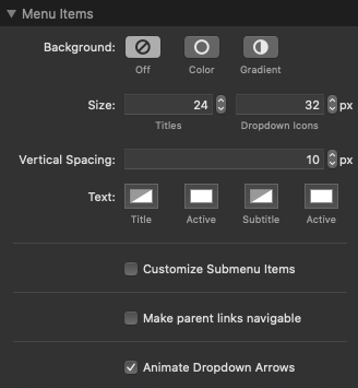
Background
This is where you can set the background of the menu items. The Options are fairly standard and easy to setup. If a background color is enabled options to adjust the item padding and corner radius will appear.
Customize Submenu Items
By default, submenu items will match the appearance of the top level items. Enable this to set different background and text colors for the submenu items.
Make Parent Items Navigable
By default, parent item will not direct the user to a link, but instead open the dropdown to view sub level items.
In some cases, you might need parent items to link to pages as well. For these cases you can enable this setting to have parent items link to pages. The dropdown menu can still be opened by clicking the dropdown icon on the right.
Animate Dropdown Arrows
Enabled by default, this will animate the rotation of the dropdown icons when a parent item has been clicked.
Advanced
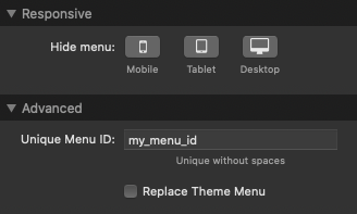
Unique Menu ID
Define custom ID that you can add to links to enable them to open up your Overlay Menu. This value is case sensitive and should not include any spaces or special characters other than dashes (-) and underscores (_).
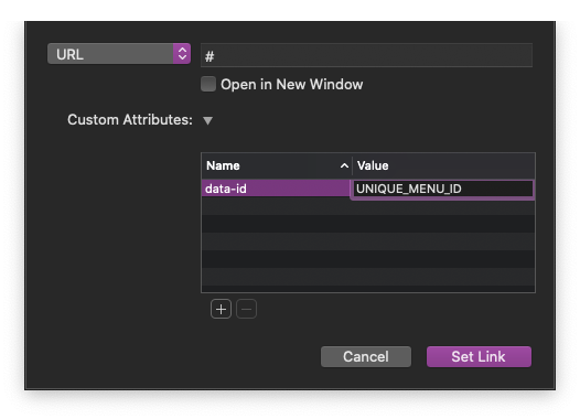
When creating a link, add a “data-id” attribute just like in the image below. Replace the UNIQUE_MENU_ID portion with your Overlay Menu’s Unique ID value.
HTML examples:
<a href="#" data-id="UNIQUE_MENU_ID"> Open my menu </a>
<button data-id="UNIQUE_MENU_ID"> Open my menu </button>
NOTE: If you are using more than one Overlay Menu on a single page, this value must be different among each of the stacks.
Replace Theme Menu
Enable this to remove a built-in theme menu to use Overlay Menu as your main menu.
NOTE: This feature may not work with all themes.
Extra Menu Toggle Stack
Some users may want to have multiple toggles for a single Overlay Menu. Of course, each Overlay Menu has a default toggle already included, but we’ve also included a sub-stack called the Overlay Menu Extra Toggle, that will allow you to easily create more toggles.
The only setup required is to add your Overlay Menus Unique Menu ID to the Connected ID setting of the Extra Toggle stack. You’ll see it at the very top of the settings panel, in the General Section.
Paste your Overlay Menus Unique ID here, and voila! You now have an extra toggle that will open your menu.
The settings for the Extra Menu Toggle sub-stack are extactly the same as the Menu Toggle settings for the Overlay Menu stack.
You can customize:
- colors
- backgrounds
- borders
- shadows
- padding
- sizes
- icons
- position
- alignment