Setup
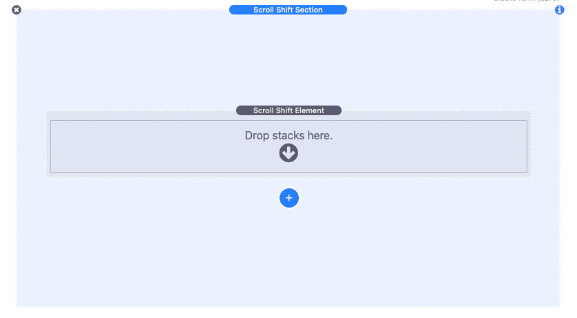
1. Begin by adding the Scroll Shift stack to your page. This stack consists of two main components: an outer section named “Scroll Shift Section” and an element stack called “Scroll Shift Element.” You’ll notice a blue add button below the element stack, which allows you to add more element stacks if needed.
Before adding any content, take a moment to customize the section’s styles.
Customizing Section Styles
2. Select the outer section stack and open the settings panel to access various customization options. Here, you can add a background color, gradient, or image, and adjust the padding within the section to align with your design preferences.
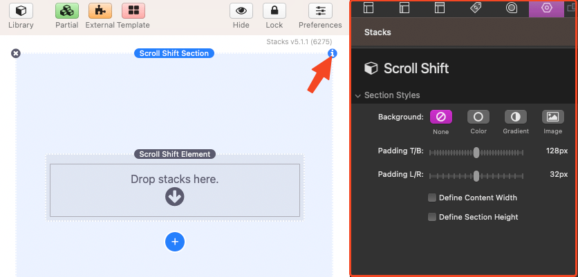
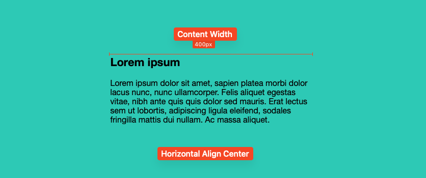
3. The settings panel also includes two checkbox options. The Define Content Width checkbox allows you to define a width for any content placed inside the section, enabling horizontal alignment of the content.
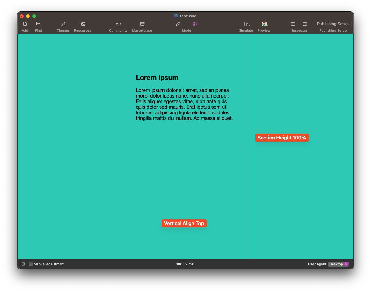
4. The Define Section Height checkbox lets you define a height for the section as a percentage of the browser window height. This allows for vertical alignment of the content.
All the provided section style settings are optional, and if desired, you can remove the padding to place the Scroll Shift Section stack as a child of another stack.
Adding Section Content
5. The outer section stack can accept any other stacks as content. You can simply drag and drop them above or below the element stack. For example, you can use a 2-column stack with an image in the right column and some text in the left column.
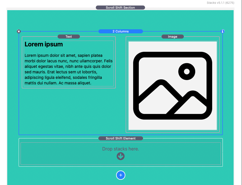
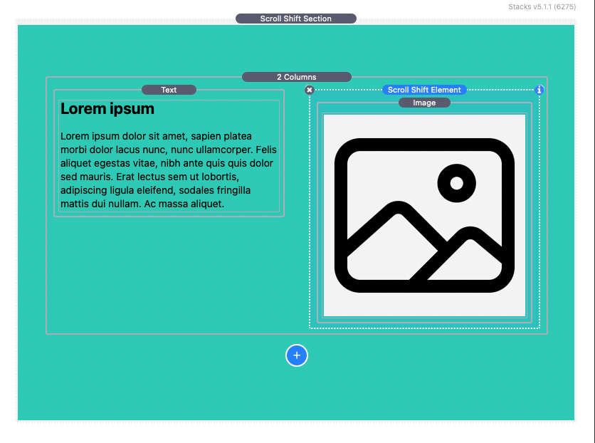
6. If your objective is to update the position of the image based on the browser window scroll, you need to move the image inside the element stack. Then, move the element stack to the location where the image was previously placed. In our case, this means moving the element stack to the right column of the 2-column stack.
Customizing Element Scroll Behavior
7. Select the element stack and open the settings panel to define the scroll behavior for the image. Let’s start by discussing the “Scroll Behavior” section.
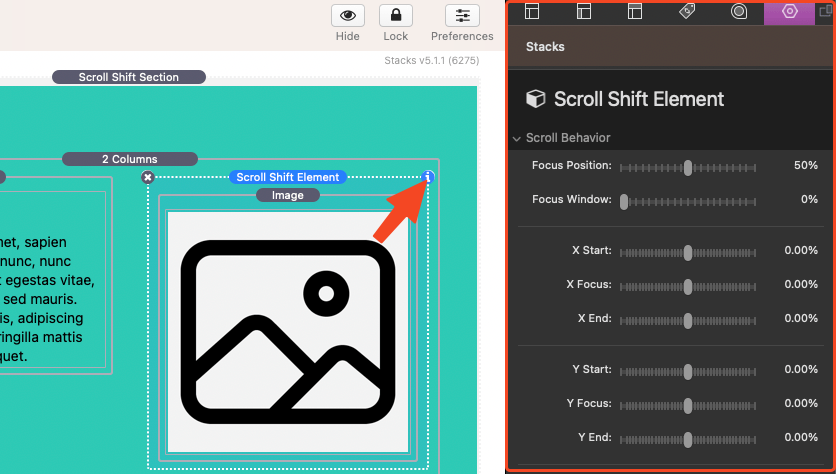
8. The “Scroll Behavior” section allows you to adjust four different styles based on the scroll position: X position, Y position, Scale, and Opacity. Each style has three adjustable states: Start, Focus, and End.
The percentage values for the X states represent a percentage movement based on the width of the outer section stack. Negative values move the element to the left, while positive values move it to the right. The percentage values for the Y states represent a percentage movement based on the height of the outer section stack. Negative values move the element up, while positive values move it down.

9. The “Start” styles apply to the element when the outer section stack is not yet in view of the browser window. As the user scrolls the page and brings the outer section stack into view, the styles will transition to the defined “Focus” styles.
10. By default, the element is considered in focus when the outer section stack is in the center of the browser window. Once this position (referred to as the Focus Position) is reached, the styles will start transitioning to the defined “End” styles as the user continues to scroll. Once the outer section is no longer in view, the styles will no longer transition, and the element stack will remain in the “End” state. It’s important to note that as the user scrolls back to the top of the page, the states will transition in the opposite order.

The page must have enough content to allow scrolling for any transitions to take effect.
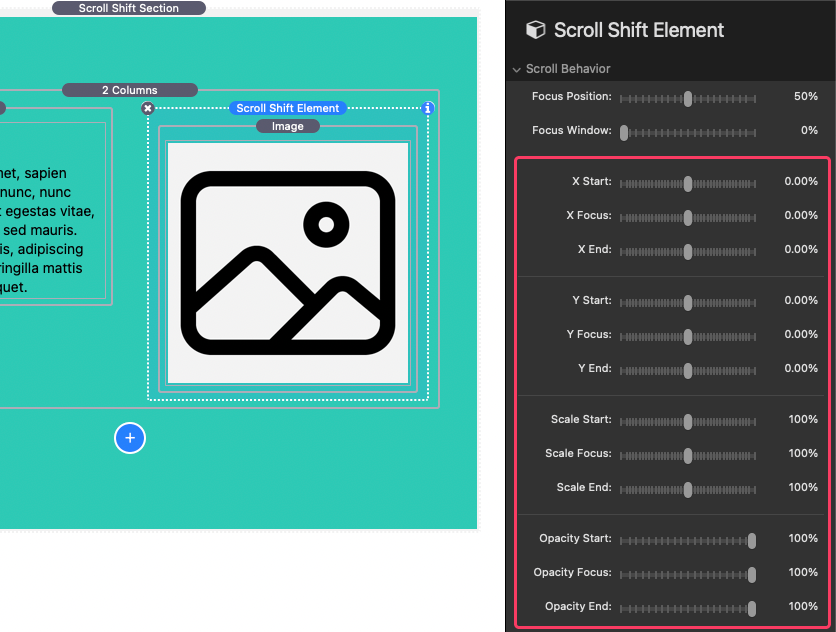
11. In our example, we want the element stack to fade in from the right. To achieve this, we will adjust the X Start value to 25% and the Opacity Start value to 0%. We will leave the Focus styles unchanged and adjust the Y End value to 25% to have the element stack follow the browser window slightly after passing the Focus Position.
Adjusting the Focus Position
12. The Focus Position can be adjusted using the slider setting with the same name. The percentage value represents the position from the top of the browser window. For instance, 50% would be the center of the window, 0% would be the top, and 100% would be the bottom.
You can see some examples of different Focus Positions here: https://onelittledesigner.com/rapidweaver-stack/scroll-shift/focus-position.html
Extending the Focus Window
13. The last adjustable setting in the “Scroll Behavior” section is the Focus Window. This percentage value can be adjusted to extend or freeze the element in the focused state. The percentage refers to a percentage of the browser window height. The element will remain in focus for the duration of the scroll equal to the defined value. In our example, we have set the “Focus Window” to 30%.

You can see some examples of different Focus Window values here: https://onelittledesigner.com/rapidweaver-stack/scroll-shift/focus-window.html
With these steps, the setup for our example is complete. You can add as many Scroll Shift Element stacks as you need within a single outer section stack. However, please note that all the Scroll Shift Element stacks must be placed as children of a single Scroll Shift Element Stack.
Advanced Settings
Here is an explanation of the advanced settings available for each Scroll Shift Element stack:
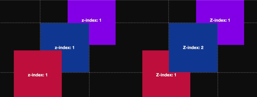
Z-index
Adjust the vertical stacking order of Scroll Shift Elements. By default, elements are stacked based on their order on the stacks page. You can modify the z-index value to change this order and control which elements appear in front of or behind others. Higher values will appear in front.
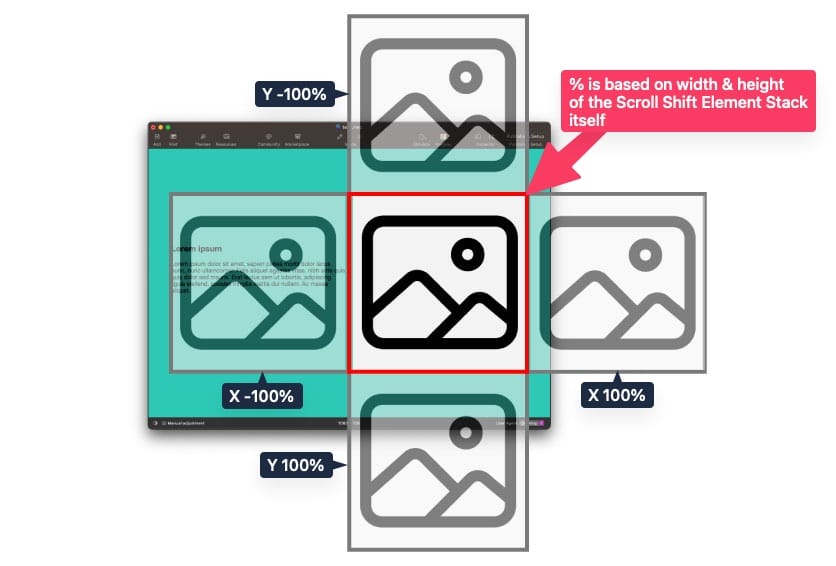
X & Y Movement
By default the defined X & Y positions are based on the width & height of the outer Scroll Shift Section Stack.
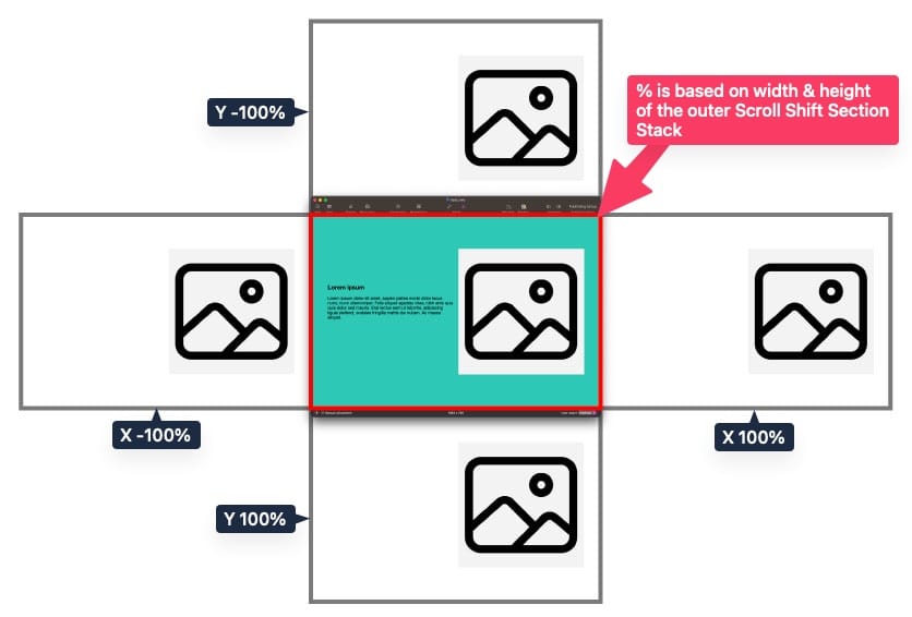
This works well for elements that need to move long distances across the screen or need to move out of view when not in focus. However, this means short position transition can vary greatly across different devices as the section dimensions respond to the available window space. For more consistent positioning in these cases you can use the “% based on Scroll Shift Element” option. When this option is enabled the X & Y positions will instead be based on the Scroll Shift Element itself.
Easing
Easing determines the smoothness of the transition between each of the states.
By default, easing is set to “Linear,” providing a constant speed transition between states.
The “Ease in & out of focus” option will slow the transition as it reaches the Focus state and gradually accelerate as it leaves the Focus state.
The “Ease in & out of start & end” option will gradually accelerate as it leaves the Start state and slow only after passing the Focus state and reaching the End state.
The “Ease in & out of start, focus & end” option will gradually accelerate as it leaves the Start state, slow as it reaches the Focus state, accelerate again after leaving the Focus state, and finally slow again when reaching the End state.
If an “Ease” option is selected, a second easing option is provided to define a type. “Sine” is enabled by default, with each consecutive option roughly having a more intense acceleration and slow transition.
You can see a demonstration of the available options and their effects by visiting this link: https://onelittledesigner.com/rapidweaver-stack/scroll-shift/easing.html
Define In & Out Windows
When you haven’t defined the In & Out Windows, the Start to Focus transition starts before the outer section is fully visible, and the Focus to End transition continues until the outer section is no longer in view. This means that the element will keep moving throughout its visibility on the page, except when there are no style changes between two states.
To customize the durations of these transitions, you can enable the “Define In & Out Windows” option. The “In Window” refers to the duration of the transition between the Start and Focus states, while the “Out Window” refers to the transition between the Focus and End states. Similar to the “Focus Window” value, the percentage refers to a portion of the browser window height. The element will transition between states for the duration of the scroll as defined.
By reducing the “In Window,” you can delay the start of the first state transition until after the outer section is fully visible. Similarly, reducing the “Out Window” allows the last state transition to complete before the section goes out of view. These options allow you to fine-tune the timing of your transitions according to your needs.
You can see a demonstration of the different effects these values have by visiting this link: https://onelittledesigner.com/rapidweaver-stack/scroll-shift/in-out-windows.html
Forward Movement Only
Enabling this option prevents the states from transitioning in reverse when scrolling upward. It ensures that the transitions continue to the End state regardless of the scroll direction once the transitions have started.

Show Scroll Details on Click
This setting is intended to assist during setup up and it is not recommended to leave it enabled when publishing your project.
This feature allows you to easily access detailed information about an element, which proves helpful when adjusting the scroll behavior during setup. By enabling this setting, simply clicking on the element in preview or when the page is published triggers the display of real-time details.
Here’s what you can expect from this feature:
Element Details
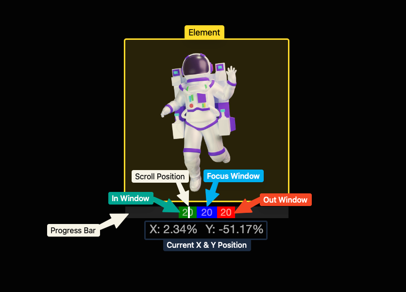
Beneath the element, a progress bar appears, featuring a white indicator that represents the current scroll position. The progress bar is divided into three windows:
“In Window” (Green): This window indicates the transition from the start state to the focused state.
“Focus Window” (Blue): It represents the duration of time the element remains in the focused state.
“Out Window” (Red): This window signifies the transition from the focused state to the end state.
Additionally, the the current X and Y position values appear below the progress bar.
Scrollbar Indicator
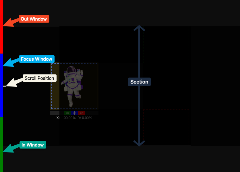
A scrollbar indicator appears on the left side of the window, reflecting the current scroll position. It includes colored sections to indicate which window the selected element is currently located in. The section is also darkened to help you determine when it is fully visible or not.
Position Outlines
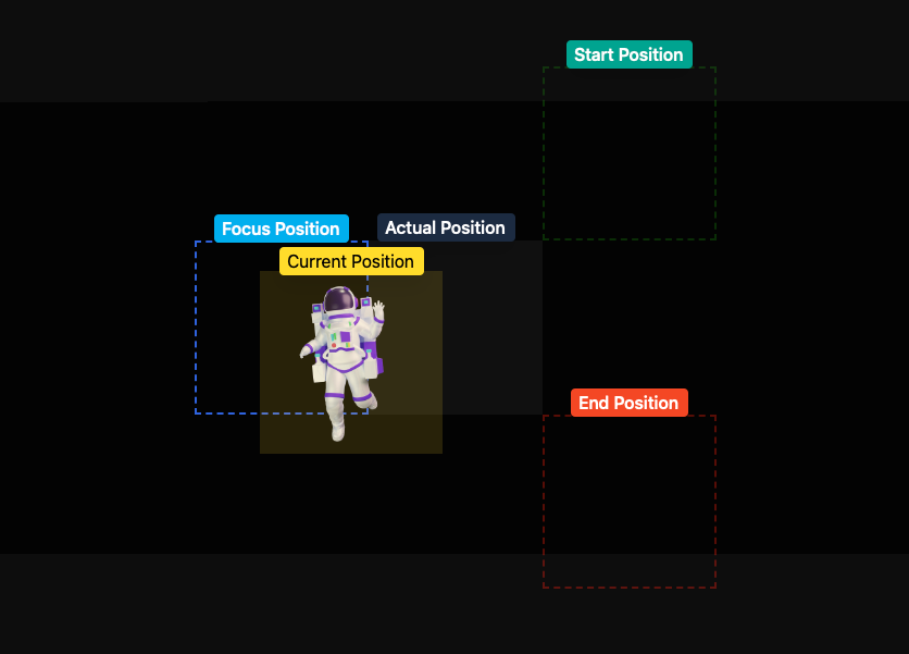
Outlines are provided to clearly depict the positions of the element at the defined start, focus, and end states. The element itself is highlighted in yellow, and if it occupies space in the content flow, its actual position will also be highlighted.
Position Linking
By default, every Scroll Shift Element will be positioned exactly in the location it is placed in the stacks content. Changes in the X & Y position of the element only affects the visual placement of the element and will not affect the flow of the content around it.
There may be situations where you want one element to overlap another during a specific state or for all states. By linking a Scroll Shift Element to another it can automatically calculate the position based on the position of the element it is linked to.
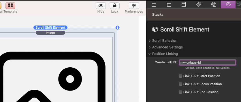
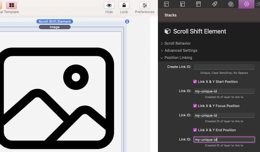
Before an element can be linked to, it must have a defined Link ID. This ID is case-sensitive, must be unique, and should not contain any spaces or special characters other than dashes and underscores. Defining a Link ID has no effect on the Scroll Shift Element itself and only serves as a reference for other elements to link to its position.
Elements can be linked to an element with a defined Link ID by enabling the “Link X & Y Start/Focus/End Position” checkboxes.
If an element has all of its states linked to another element it will no longer take up space in the content flow. It will instead display overtop or underneath, depending on the z-index value, of the stack to which it is linked.
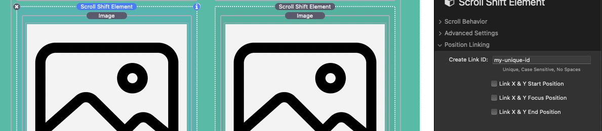
For example, let’s say we have a two column layout with a title, image, and some text in both columns. Each image is wrapped with a Scroll Shift Element Stack.
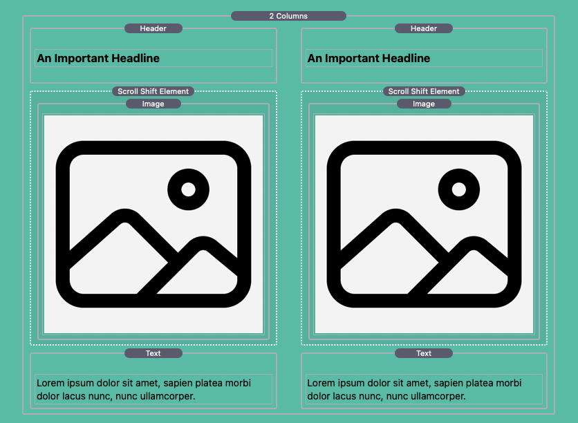
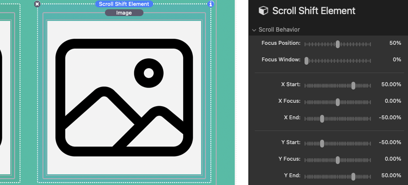
We then modify the scroll behavior of the image in the right column with the following settings:
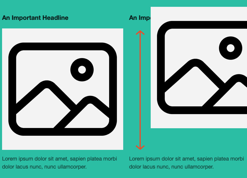
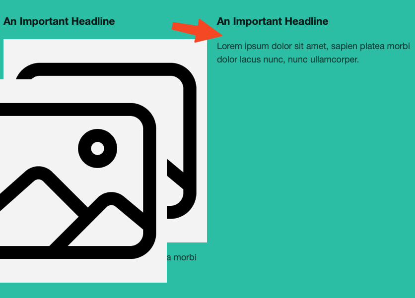
When the page is scrolled the element transitions as expected.

Note that even though the element’s position is changing, there is still space displacing the title and text in that column at the original position of the element in the content flow.
If we then define a Link ID for the element in the left column:
And then use that ID to link the Start, Focus, and End Positions of the element in the right column:
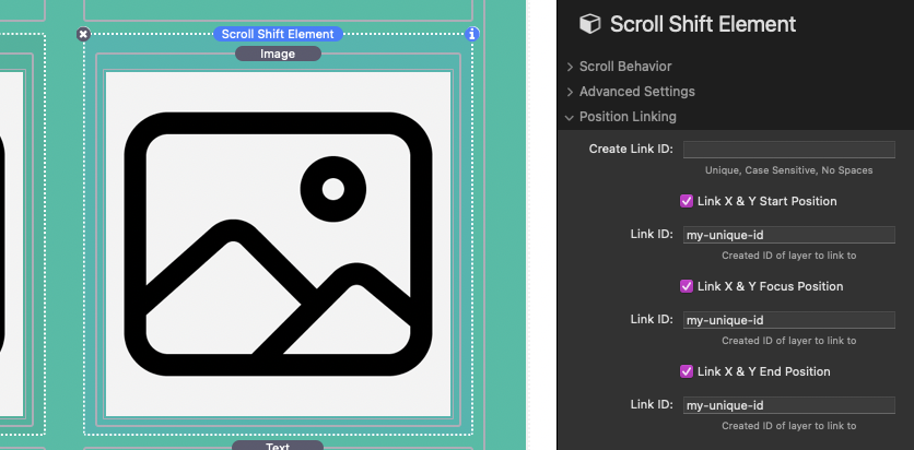
The right element will now transition as if it were in the same exact space as the element in the left column.

When all of the states of one element are linked to another element, it no longer displaces content.
You can see a demonstration of the different effects you can achieve using position linking here: https://onelittledesigner.com/rapidweaver-stack/scroll-shift/position-linking.html