Setup
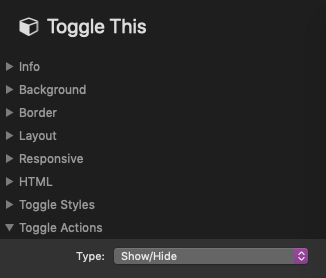
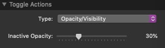
After adding the stack to the editor, select it and in the Toggle Actions > Type setting select either the “Show / Hide” or “Opacity / Visibility” option.
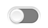
Note that the stack has two possible states. The first and default state is “Disabled”. This is the active state when the toggle is set to the left.
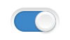
The second state is “Enabled”. This is the active state when the toggle is set to the right.
In the editor you will see two “Drop stacks here” sections. Each sections is controlled by an opposite state.
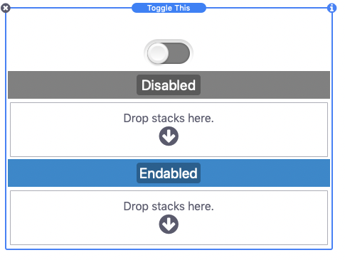
When using the Show / Hide action: Anything placed into the “Disabled” section will only be visible when the toggle is in the disabled state. Likewise, anything placed into the “Enabled” section will only be visible when the toggle is in the enabled state. If you only wish to display content when the toggle is in the enabled state, do not place any stack content into the “Disabled” section.
When using the Opacity / Visibility action: Anything placed into the “Disabled” section will be visible when the toggle is disabled and anything in the “Enabled” section will only be partially visible. When the toggle is enabled the opposite will be true. The opacity of the inactive state can be set in the Toggle Actions > Opacity setting. If you only wish to change the opacity of a single section of content, do not place any stack content into the “Disabled” section.
By default the toggle will be in the disabled state when the page is loaded. You can choose to have the toggle in the enabled state by turning on the Toggle Styles > Start enabled option.
For information about styling the toggle see the Toggle Styles section below.
Toggle Styles
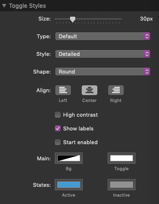
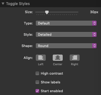
Size: This setting adjust the over all size of the toggle graphic.
Type: Choose from 5 different toggle types. Each type functions the same and this setting only adjust the appearance of the toggle.
Style: Choose from 3 different styles. Each style modifies the appearance of the toggle based on the selected toggle type.
Shape: Adjust the rounding of the toggle.
Align: Change the alignment of the toggle based on the available space to the left and right.
High contrast: Turn this on to adjust the contrast of the shadows. This should be enabled if you are using a dark color background or dark color toggle background. This setting is only available when using the “Detailed” Style option.
Show labels: Turn this on to add text labels or images to the left and right of the toggle.
Start enabled: Turn this on to change the default state of the toggle to enabled.
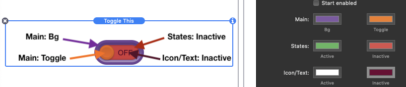
Colors:
Actions by Class
The Toggle Actions > Type setting’s “Show / Hide” and “Opacity / Visibility” options are an easy way setup up content that is directly below the toggle. If you want to place the toggle somewhere away from the content use the “Show / Hide by Class” or “Opacity / Visibility by Class” options.
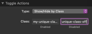
When these options are selected there will not be any sections for you to add the disabled and enabled content to. Instead you will need to define the content by adding classes. In the Toggle Actions > Class setting you can define a custom class name for both the enable and disabled states. These class names should be unique and cannot contain any spaces or special characters other than dashes and underscores.
Examples of usable class names:
my-unique-class-on
my-unique-class-off

my_unique_class_on
my_unique_class_off

myUniqueClassOn
myUniqueClassOff
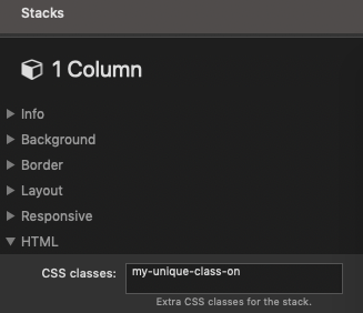
After creating a class name for each state you can then add them to relevant stacks content. If you are using Stacks 4, select any stack you want to apply the toggle action to and add the class name to the HTML > CSS classes setting.
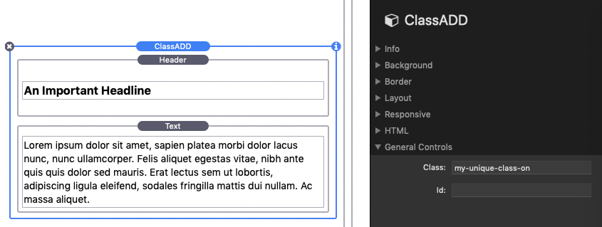
Alternatively, you can download this free class stack that will allow you to define a class name to any stacks content placed inside of it.
When using the Show / Hide by Class action: Any stack or element with the defined “Enabled” class (my-unique-class-on in this example) will only show when the toggle is in the enabled state. Likewise, Any stack or element with the defined “Disabled” class (my-unique-class-off in this example) will only show when the toggle is in the disabled state.
When using the Opacity / Visibility by Class action: Any stack or element with the defined “Enabled” class (my-unique-class-on in this example) will be visible when the toggle is disabled and any stack or element with the defined “Disabled” class (my-unique-class-off in this example) will only be partially visible. When the toggle is enabled the opposite will be true.
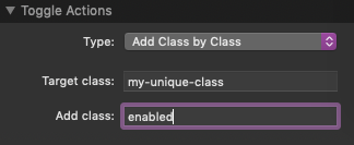
Adding a Class by Class
The Toggle Actions > Type setting “Adding a Class by Class” option will allow you to use the toggle to modify the appearance of any element on your stacks page. This setting is useful for those who are familiar with CSS and want to define custom styles, animations, or effects based on the toggle state.
In the Toggle Actions > Target class field you will need to add the class name of the stacks or elements you want to apply the style, animation, or effect to. Below that in the Add class field you will need to define the class name to be added to those target stacks or elements. This class will be added based on the current state of the toggle. In the enabled state the class will be added and in the disabled state the class will be removed.
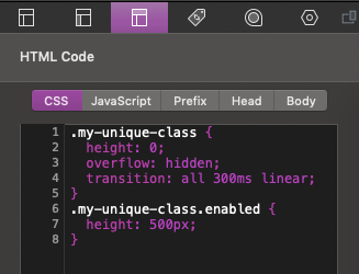
.my-unique-class {
  height: 0;
  overflow: hidden;
  transition: all 300ms linear;
}
.my-unique-class.enabled {
  height: 500px;
}
Adding the CSS above to the Page Inspector > HTML > CSS section will make any element with the class name “my-unique-class” collapse or expand into view based on the toggle state.
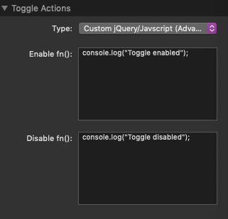
Custom jQuery/Javascript (Advanced)
The Toggle Actions > Type setting “Custom jQuery/Javascript” option is only meant for users who are familiar with jQuery or Javascript. There are two definable functions that are executed when the toggle is enabled or disabled. When the page is loaded the function related to the default state will execute.