Here is a customer review/tutorial on Ice Box by William Winter
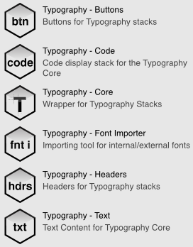 Typography is a stack suite comprised of 6 stacks
- Core
- Font Import
- Headers
- Texts
- Buttons
- Code
CORE
 The core is intended to assist many of the stacks within, though is primarily built to support Headers, Text & Font Importing. It is not necessary in all cases, but will often assist with stronger CSS that may assist in overriding conflicting theme styles.
In addition, and perhaps more importantly, the Core allows you to set global sizing and color controls to effect other Typography stacks that are placed within it. This saves you the time of re-styling in many cases and also allows for much easier responsive controls where you can set both the responsive breakpoints and the effects they have on font sizes.
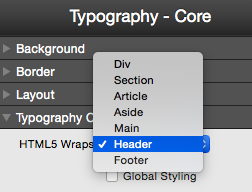
By default the Core will not override anything allowing your theme defaults to be the standard and any styles that you make in Typography’s inner stacks (the other 5). You do have to choose from a list of HTML/HTML5 wrappers. The ‘Div’ is the default and is a basic wrap that typically inherits no particular styles from themes without a specific ID or Class being assigned to it.
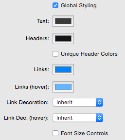
Selecting the “Global Styling” checkbox opens styles that can be applied to the inner Typography stacks. The color controls are very straight forward and selecting the “Unique Header Colors” allows you to assign colors to the specific <h1> – <h6> tags.
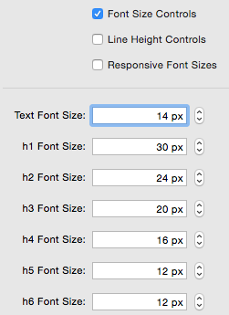
Selecting Font Size controls gives you global control over all your text and header font sizes. Additionally you can alter the line-heights if you wish, which is the height of the line that the text takes up, though by default this will typically be managed well without adjusting.
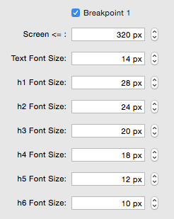
By selecting Responsive Font Sizes you are given 5 breakpoints, which by default will progress in the following order:
- 320px (iPhone portrait)
- 480px (iPhone 5 Landscape)
- 768px (iPad)
- 1024px (laptop)
- 1224px (desktop)
These do not effect the exact measurements, but rather everything at their size and below – once the screen width is reduced to the set with is when the font sizes will adjust. For example, at 800px the adjustments for 768px will not occur, but rather the adjustments for 1024px.
Font Importing
 The Font Import stack is meant to assist/guide in the process of importing fonts, whether they are custom fonts or Google’s Web Fonts. We’ll cover the process of both here.
Google Fonts
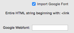
When selecting Google Web Fonts some basic instructions are given in the customization options.
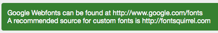
Additional tips are given in the edit section in a green alert box. These give a couple recommendations of where to find your fonts.
- Google Web Fonts
- Font Squirrel (for custom fonts, though you can use other sources as well)
To import a google web font I’ll give the following example, which is the basic process for importing all Google Web Fonts.
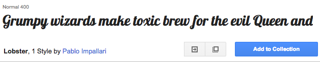
1. Find the font you want
2. Select the font with the Arrow button
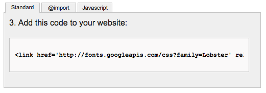
3. Select the <link…> code for the font – single clicking will force a select of the whole line of code. Hit CMD+C to copy, then to paste into the field in RapidWeaver hit CMD+V
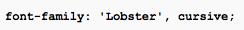
NOTE, this has only imported the font, but you still have to copy the name of the font and paste it into any Text, Header, or Button fields for the custom font to apply. This saves valuable load time by importing the font only a single time and allows you to use the font as few or many times as you like without slowing anything down.
From the example above, the only part of the font-family name you need to copy would be ‘Lobster’ and that includes the apostrophe before and after the title. Optionally, you can place a comma and type in the fallback font, which can be the recommended one or any you choose (this is the font that will display if the custom one does not load or is not supported).
Custom Fonts
Importing a custom font is a little more complicated and requires a few additional steps – this is simply because the font is not being stored on a separate server, but is going to run off of yours.
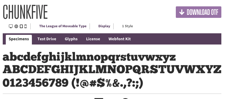
Here I’ve gone to FontSquirrel.com and chosen a popular font called ChunkFive. Click the “Download OTF” button. After downloading you will need to unzip and the .otf file will be inside, which is a font type.
Most of the fonts on this website are intended to have licenses friendly to designers, but it is recommended that you briefly review the licensing to ensure you can use the font for your intended purposes.
When you’re ready to proceed hit the “Webfont Generator button in the top menu.
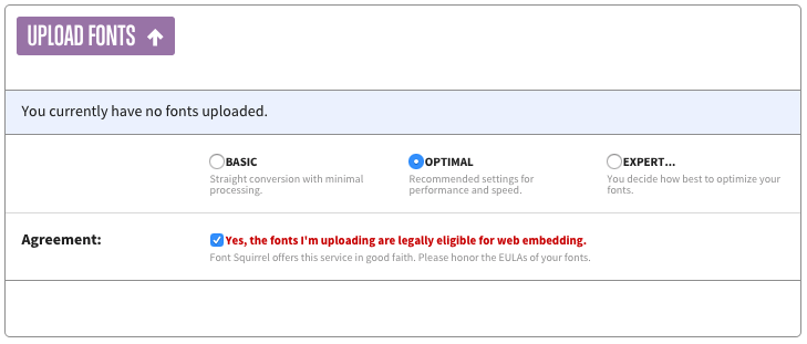
From here you’ll hit the “Upload Fonts” button and navigate to your .otf file, select the Agreement (assuming you agree to any licensing attached to the font) and download and a “Download Your Kit” button will appear in the bottom right.
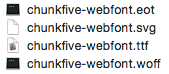
Unzip the folder and drag these files into the Resource folder in your RapidWeaver site.
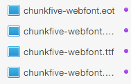
You should see them appear like this in your Resources section.
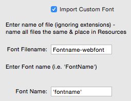
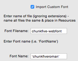
Now look back over to the right of the Font Importer. In this example the file names end in the -webfont as shown in the example. Also note the instructions to ignore the exentions (.otf, woff, svg, ttf) – that will be taken care of automatically for you.
In this example we would rename the Font Filename to the following: chunkfive-webfont
Return to the folder with the font files in them and locate a file named stylesheet.css
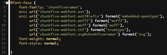
Open this with any text editor and locate the file name, which will proceed immediately after the font-family:
In this example it is ‘chunkfiveroman’ and you must include the apostrophe symbols.
This is what will replace the ‘fontname’
For this example your final result would look like this.
Text, Headers, Buttons & Code
Fluid. This means that the text or header’s size will automatically adjust it’s font size according to it’s parent container’s width. Note that these do have maximum and minimum font sizes as well, so the adjustment will become more or less apparent depending on what those are set to.
Drop Cap. A Text feature that automatically makes the first letter of a section larger (common in articles). There is allowed unique customization of this letter including changing the font, sizing, coloring, and more.
Important! Note that if you use some of RW’s built-in editors that it will wrap the text in a span, making a bracket the first letter – to avoid this you can simply highlight the first letter and hit CMD + .
Marquee. A typing like effect where text animates from left to write with controllable animation speeds and a limitless amount of lines. Note that you will need to drag in Typography’s Marquee snippet to ensure RW’s built-in auto-formatting does not break this effect.
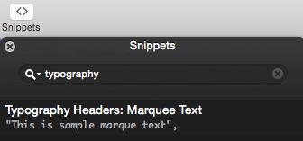
Important! For the Marquee text to work you must use the Snippet that is included. Drag it into the Typography – Headers section and then highlight all the text and hit Command + .
This turns off auto-formatting, which will otherwise turn the quotation markets in to different quotation marks that will not work with the code. You can add as many lines of text as you like, but they must all be separated by a comma as shown in the example (the last line should not have a comma).
Note that you will likely have trouble if you attempt to type this text in without the snippet due to the auto-formatting in RW.