Creating “Inner” list item sections
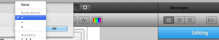
Simple use RapidWeaver’s built-in list item tool.
Create a basic unordered list.
When using the “Slide Open” theme you should create a single line of text prior to creating your unordered list. This gives the user something to click on to open the unordered list. If you create the unordered list first and then the single line of text RapidWeaver’s auto-formatting will wrap the text in an additional and unnecessary unordered list tag that will create visual problems… in other words you must create the line of text first before the unordered list or you’ll simply have to start over.
Creating Links
Couldn’t be easier – just use RapidWeaver’s built-in link maker/breaker (middle icon makes, right button breaks).
Definition of Terms
General Controls
Theme : Choose between 2 built-in themes (Tooltips or Slide Open).
Animation On : Only available for the “Slide Open” theme, this option can disable the sliding open animation effect. If disabled the text next to the Font Awesome icon will be displayed an open regardless of hovering or clicking.
Right Side : Selecting this option will display the navigation section on the right hand side (left by default).
Move to Bottom: Selecting this option will display the navigation section to the bottom (top by default).
Open on Click : By default the navigation menu will open on hover, but selecting this will require a click instead.
Inner on Click : This option is only available for the “Slide Open” theme and is selected by default. Disabling will not require the user to click to see the 2nd tier navigation section, but will activate on hover instead.
Text align : Set to “Center” by default, this can be changed to Left, Right, or Justify. Changing the alignment is ideal at times depending on if your menu is on the left or right hand side. Additional padding may be useful in a span tag as well depending on whether or not certain icons have less or more width to them. You can wrap your text like this as an example:
1 |
<span style="padding-left: 2px;">Your Text</span> |
Pop Out Width : Width of the text section that pops out after the icons are hovered/clicked.
Distance : Distance of the stack from the top/bottom of the page.
Animation Speed : Millisecond speed of animation on click/hover.
Inner Anim Speed : Millisecond speed of animation for the inner lists on click/hover.
Border Radius : The roundness of the edges.
B Radius Inner : The roundness of the edges for the inner sections (if they are added).
Font Size : Pixel size of the font (includes Font Awesome icons).
Vertical Padding : List item padding from top & bottom.
Horiz. Padding : Left & Right padding of the icon.
Text Icon Padding : Distance of text from the Font Awesome icon.
Color Controls
Background : Background color of the main section where icons are located.
Bg (hover) : Background color that appears on hovering over each icon section.
Border : Color of the border of the main section.
Icon : Color of the Font Awesome icons.
Icon (hover) : Color of the Font Awesome icons upon hover.
Text : Color of the text.
Text (hover) : Color of the text upon mouse hover.
Pop Out Bg : Background color of pop out sections for Theme 1 (not available/visible for Theme 2).
Pop Out Inner : Background color for each line item in inner sections.
PO Inner Hover : Background color for each line item in the inner sections upon hover events.
Middle Borders : Off by default, checking it will create borders between the Font Awesome icons. You can control the color for the top and the bottom colors.
Border Inner On : This will wrap inner list item sections with a border, which you can control the color of.
Mid Borders Inner : Like the ‘Middle Borders’ option, this does the same, only for the Inner List Item Sections.
Advanced
Z-index : You can manually adjust the z-index plane in the chance that the amount is not enough or if you have something else that you wish to have pop up over the fixed navs (i.e. Lightboxes), in which case you can reduce the z-index. Z-index is an arbitrary number that simply is place above or below by numerical weight, so higher numbers are above lower numbers.
Cursor Hand (text only) : Selecting this option is only useful if you uncheck the next option and will only turn the mouse into a cursor if they hover over the text, which includes the Font Awesome icons. Links are only attached to text sections, so this basically would make the text and icons have the cursor over them.
Cursor Hand (all) : This is selected by default and places the hand over everything in the stack, which does make some since as everything has an effect if hovered over or clicked on, assuming you have placed links in the text… I’m guessing that’s safe to assume since that’s the entire purpose of the stack :P.
Sticky Nav Menu Items (Inner Section)
Font Awesome : set to fa-gear by default, this input field can be changed to any Font Awesome icon – full list here:
http://fortawesome.github.io/Font-Awesome/icons/
Arrow Top % : Percentage Distance from top for the arrow icon (Theme “Tooltips” only). Centered (50%) by default, which may not be as appropriate if inner sections are created.
Padding Top, Bottom, Left, Right : The padding distance of the text from the relevant sections.