Basic Setup: Getting Started
Add Step 2: Start by adding Step 2 to the editor. Take a moment to observe the layout:
- The main Step 2 element contains a single Step 2 Item.
- Inside the Step 2 Item, you’ll see a visual representation of the layout.
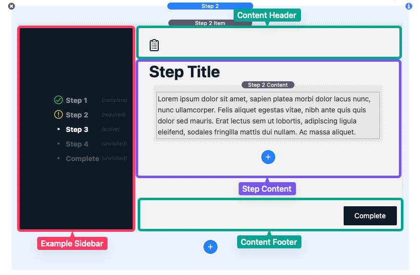
Sidebar and Step Content:
- On the left is the sidebar with step navigation links. It may collapse if there’s limited horizontal space.
- Next to the sidebar is the step content.
- The content includes a header with a sidebar toggle icon at the top and next/previous step buttons in the footer at the bottom.
Default Content: Inside the step content, there’s a default Step 2 Content element. It’s useful for adding headings and paragraphs.
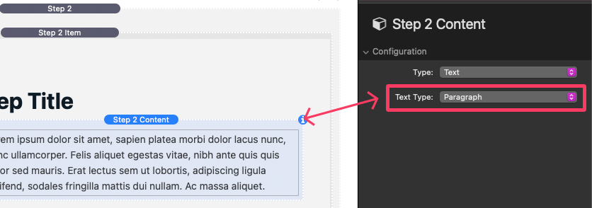
You can also add special input fields by changing the “Type” setting. These can be ignored for now and are explained in the “Adding Required Input” tutorial. Feel free to replace Step 2 Content elements with your custom content.
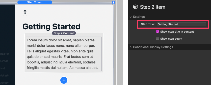
Customizing Step Titles: To set a step’s title, select the Step 2 Item and open the settings panel. In the “Settings” section:
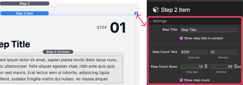
- Define the Step Title, visible in the sidebar menu.
- Optionally, show/hide the title in the step content.
- Enable the “Show step count” option to add a step count indicator.
Conditional Display Settings: Ignore these settings for now; we’ll cover them in the “Configuring Conditionally Displayed Steps” tutorial.
Adding More Steps: After creating your first step, add more by clicking the blue “Add” button below the Step 2 Item.

Finalizing Setup: When you’ve added all your steps, select the main Step 2 element and open the settings panel.
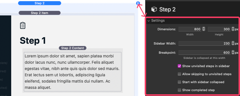
- In the “Settings” section:
- Use the Dimensions fields to set width and height for the entire Step 2 element.
- Specify the Sidebar Width, which occupies part of the defined width.
- Use the Breakpoint field to set the browser width at which the sidebar collapses.
- Configure four checkbox settings:
- “Show unvisited steps in the sidebar”: Displays all step links in the sidebar menu. Disable to show only the active step and previous steps.
- “Allow skipping to unvisited steps”: Enables users to jump to any step via the sidebar menu. Disable to require sequential navigation.
- “Start with sidebar collapsed”: Hides the sidebar by default. Users can open it with the sidebar toggle icon.
- “Show completed step”: Shows a customizable splash screen when all steps are completed.
Completion: Once you’ve adjusted these settings, your basic setup is complete. For further style customization, refer to the “Style Settings” tutorial.
Style Settings
In your Step 2 element settings panel, you’ll find six sections to tweak the appearance. Let’s explore each one and their options:
Outer Styles:
- Margin: Control the space above and below the Step 2 element.
- Corner Rounding: Adjust the corner shape of the Step 2 element.
Sidebar Styles:
- Background: Choose the sidebar’s background style from options like Single Color, Gradients, or an Image.
- Color Fields: Customize the colors of various sidebar elements.
- Link Text Font: Optionally, add a custom font for sidebar menu links.
- Link Text Size: Change the text size of sidebar menu links.
- Link Text Spacing: Adjust the vertical spacing between menu links.
- Bold link text: Make menu links bold.
- Show complete & required icons: Display icon indicators next to menu links, signaling step completion or incompleteness.
Step Styles:
- Background: Choose the step content background style used for each step.
- Color Fields: Customize the colors of different step content elements.
- Padding: Control the space around the step content (excluding the header and footer).
- Step Title Font: Optionally, use a custom font for step titles within the content.
- Step Text Font: Optionally, apply a custom font to all non-title elements in the step content.
- Step Title Size: Change the text size of step titles in the content.
- Step Text Size: Adjust the default text size for step content.
- Inherit text styles: Enable to inherit text formatting settings.
- Center align content vertically: Center the step content vertically when it doesn’t fill the Step 2 element’s height.
Header Styles:
- Color Fields: Customize the colors of header elements.
Footer Styles:
- Color Fields: Customize the colors of footer elements.
- Button Text: Define text for next/previous buttons.
- Button Complete: Specify text for the final step’s next button (visible when “Show completed step” is enabled).
- Button Padding: Control the space around the button text.
- Button Size: Change the text size within the next/previous buttons.
- Button Rounding: Adjust the corner shape of the next/previous buttons.
Completed Step Styles:
- Background: Choose a background style for the completed splash screen.
- Color Fields: Customize the colors of different elements in the completed screen.
- Title: Set a title for the completed screen.
- Description: Add a text description beneath the title.
- Completed Icon: Resize the checkmark icon on the completed screen.
- Title Size: Adjust the text size of the completed screen’s title.
- Desc. Size: Modify the text size of the description.
- Show restart button: Display a restart button in the completed screen, allowing users to start over.
Adding Required Input
In any Step 2 Content element settings panel, you’ll find a “Type” setting that allows you to add input fields. In this tutorial we’ll focus on using the “Checkbox Field” to prevent the completed splash screen from appearing. Other field types for directing users based on their input will be covered in the “Configuring Conditionally Displayed Steps” tutorial.
Getting Started:
- Select a Step 2 Item: Choose where you want to add a required checkbox field.
- Add a New Step 2 Content Element: Click the blue add button to create a new Step 2 Content element.
- Configure the Checkbox Field:
- Select the newly added Step 2 Content element and open the settings panel.
- In the “Configuration” section, change the “Type” setting to “Checkbox Field.” This will reveal additional settings.
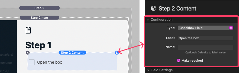
Checkbox Field Settings:
- Label: Provide a text label that appears next to the checkbox.
- Name: Define a name for the field, which can be used in conditional logic for Step 2 Items. Leaving it blank defaults to the label value (skip this for now).
- Make required: Enable this setting to make it mandatory for users to check the checkbox to complete the last step and reveal the completed splash screen. (For this example, enable this setting)
Expanding the Checklist:
- You can add more checkbox fields in the same way to create a checklist for users.
- Add as many checkbox fields as needed across multiple steps.
- These checkboxes now serve as a task checklist for users. If a user leaves a checkbox unchecked, Step 2 will automatically guide them back to the step with the incomplete checkbox if they attempt to complete the last step.
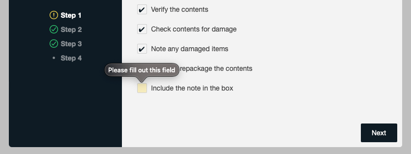
- When the “Show complete & required icons” setting is enabled in the main Step 2 element settings panel, an incomplete icon indicator will be displayed in the sidebar menu next to any step that has an unchecked checkbox.
By using checkbox fields in this way, you can ensure that users complete required tasks before reaching the completed splash screen.
Configuring Conditionally Displayed Steps: Guiding Users Based on Input
You can make any Step 2 Item show or hide based on user input from prior steps. This feature directs users to relevant steps and allows them to revisit previous ones to adjust their input.
Setting Up Input Fields:
Before we dive into conditional logic, let’s start by adding a field to gather user input. In this tutorial, we’ll use the “Button Field” to create different branches based on user choices. Other field types follow a similar logic and are covered in the “Input Field Settings” tutorial.
- In your first Step 2 Item, click the blue “Add” button to create a new Step 2 Content element.
- Select the new Step 2 Content element and open the settings panel.
- In the “Configuration” section, change the “Type” setting to “Button Field.” This will reveal additional settings.
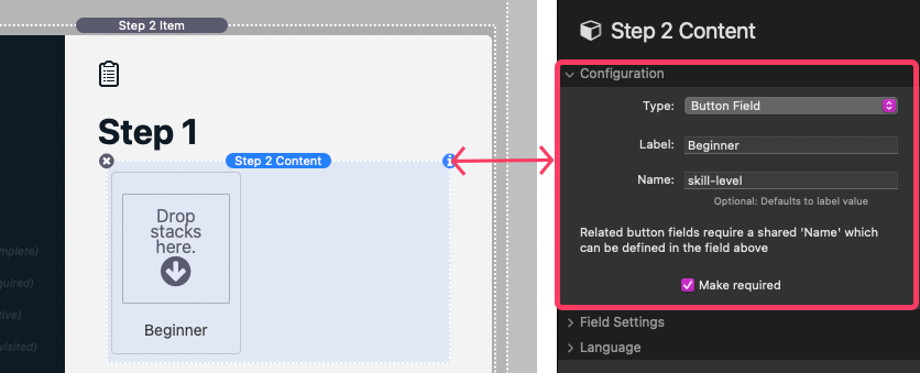
Button Field Settings:
- Label: Provide a label for the button (e.g., “Beginner”).
- Name: Define a name for the field (e.g., “skill-level”) for conditional logic.
- Make required: Enable this setting to require user input to reveal the completed splash screen and display a incomplete step icon indicator if the field has no user input (for this example, enable it).
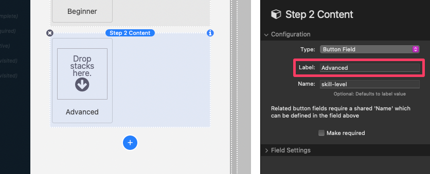
- Now, let’s repeat the process to create one more button field. For our example, the second step “Condition 1a” setting should have the same “Name” (e.g., “skill-level”) while the “Value” should instead be “Advanced”. Only one button field in the group needs the “Make required” setting enabled.
Creating Conditional Steps:
- Add a new step by clicking the blue “Add” button below the first Step 2 Item.
- Select the newly created Step 2 Item and open the settings panel.
- In the “Settings” section, give your step a title (e.g., “Getting Started”).
Conditional Display Settings:
- In the “Conditional Display Settings” section, you’ll see nine “Condition” settings grouped into three sets of three. Each setting starts as “Off” and can be adjusted to show or hide the step based on conditions.
- While most of the available options are straightforward in logic, the “Field is empty” and “Field is not empty” options apply differently to fields with enabled/disabled states (e.g., checkboxes, radio buttons, and buttons) which are considered empty if they are not enabled and not empty if they are enabled.
- For our example, let’s set “Condition 1a” to “Field is equal to: ==”.
- Below the field, provide the “Field Name” as “skill-level” (the button group name) and the “Value” as “Beginner” (case-sensitive).
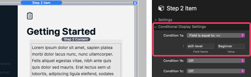
- This step will now display if the user selected “Beginner”. You can use “Condition 1b” and “Condition 1c” for additional logic. All enabled “Condition 1[a,b,c]” settings must be true for the step to display.
- Two more sets of settings, “Condition [2,3][a,b,c]”, work as “OR” logic. This means if all of the enabled “Condition 1[a,b,c]” settings do not evaluate true, but all of the enabled “Condition 2[a,b,c]” or “Condition 3[a,b,c]” settings do, then the step will still display.
Adding Content:
- After you finish defining step display logic, add instructions to the step content tailored to beginner users.
Repeat for “Advanced” Step:
- Repeat the entire process for the “Advanced” step. Set “Condition 1a” fields to “skill-level” and “Advanced”. Adjust step instructions for advanced users.
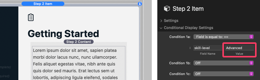
The ”Title” for the step should be the same as the beginner step in order for each step to display as a singular item in the sidebar menu. In our example that title is “Getting Started”. If the steps have different titles, they will not be associated and display in the sidebar menu as separate items.
Continue Branching:
- You can create as many steps as needed for each branch.
- After you finish, switch to preview mode to make sure the steps display as intended. Double check your Conditional Display Settings for typos if certain steps display or hide when they should not.
By following these steps, you can effectively guide users through your steps based on their input choices.
Input Field Settings
In the Step 2 Content settings panel, each “Field” type comes with specific settings to tailor functionality. The “Configuration” settings are common across all input types while there are field-specific settings for each. Let’s delve into these options:
Common Configuration Settings:
- Label: Provide a text label above the field (for checkboxes and radio fields, it appears to the right; for buttons, the label goes inside the button).
- Name: Define a name for the field, used in conditional logic for hiding or showing steps. Leaving it blank defaults to the label value. For radio and button fields, use the same name to group them together.
- Make required: Enable this setting to make user input mandatory to complete the last step and reveal the completed splash screen. This also applies to any step using the input in its conditional display logic. If no input is given, users are redirected to the step containing the required input. An incomplete icon appears next to the step’s title in the sidebar menu if they advance past a step with an incomplete required field.
Field-Specific Settings:
Checkbox Field:
- True Value: Define the value when the checkbox is checked.
- False Value: Define the value when the checkbox is unchecked.
- Enabled by default: Enable to set the checkbox as checked by default.
Radio Field:
- True Value: Define the value when the radio is enabled. If part of a named group, they act as a single field with the enabled option being the value. If no option is enabled, the field returns empty.
- Enabled by default: Enable to set the radio as enabled by default.
Button Field:
- Button Width: Adjust the button’s width.
- True Value: Define the value when the button is selected. Leaving it blank defaults to the label value. If part of a named group, they act as a single field with the selected button being the value. If no option is selected, the field returns empty.
- Enabled by default: Enable to set the button as selected by default.
- Additional Details: Buttons may also support content like images or icons added through the editor.
Select Field:
- Placeholder: Define text displayed inside the field when no option is selected.
- Default Value: The value provided when no option is selected. If it matches one of the options, that value is selected by default.
- Additional Details: Define field options in the editor, separating each with a comma.
Number Field:
- Default Value: Set the default numeric value in the field.
- Min Value: Define the minimum accepted input.
- Max Value: Define the maximum accepted input.
- Step: Set the interval for the plus and minus number stepper.
Text Field:
- Placeholder: Define text displayed in the field when empty.
- Default Value: Set the default text in the field.
- Character Limit (Maximum): Define the maximum character count allowed in the field.
- Character Limit (Minimum): Set the minimum character count for a valid input.
- Disable Autocomplete: Enable to prevent browser autocomplete features.
Common Field Settings:
- Add note text below field: Enable to add a custom text message below the field.