cleanTips is a great tool for displaying small notes, information, and links next to information that a visitor might have questions about.
Basic Setup
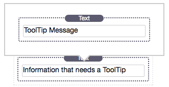
cleanTips has two sections in the edit area. In this example the top is the ToolTip message that will appear when the bottom section is hovered over by the mouse arrow. Note that both sections will accept any other stacks: text, images, media, videos, and other stacks.
After you have placed content inside of both sections select a theme: currently there are two themes “Default” and “Outlined.”
Next select a direction for the ToolTip: Top, Bottom, Left, or Right.
Size of ToolTips & Padding is Important!
Important! cleanTips is intended for small amounts of data by design, though it is not limited to it. The larger the toolTip becomes the more you must adjust the container’s padding to account for it’s size. In addition, depending on the direction the ToolTip is appearing, you may need to adjust the ToolTip’s distance from the message it hovers next to.
Important! There are so many influencing factors to the exact positioning of the ToolTips that the alignment of the ToolTip shown in Edit mode will most often vary from the exact position shown in Preview mode. Fine tuning usually isn’t too hard, but will take a few often take a few tries to get perfect.
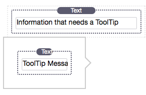
Positioning Left & Right
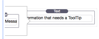
When positioning to the left and right the ToolTip will appear outside of the box and can even bun unable to edit at times.
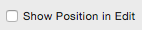
For this reason I created the option to turn off the actual position so that it’s easier to edit.
This makes the ToolTip much easier to edit. So why is this even an option? To help you place the ToolTip horizontally & vertically as it will more closely appear in it’s actual position when in Preview.
Sizing & Positioning
Many of the customization options are very straightforward and lack a need of explanation in most circumstances. For that reason I will be focusing more on the ones that seem the most important.
Position. This option is set to make the ToolTip centered by default, though can be adjusted (the arrow can also be adjusted in another option).
Distance. This option refers to the distance of the ToolTip from the message it appears next to. Negative amounts will distance the ToolTip away from the message where positive amounts will bring the ToolTip closer to the message.
Inherit Width. This is an option available for the Top & Bottom positions as it did not make as much sense for Left & Right. It will set the ToolTip to be the same width as the Message section that it appears next to. This can be turned off and a manual width set.
Padding Exceed Width. This option lets you decide if the padding will increase the size of the ToolTip or if it will not (then pushing the content inside rather than growing the size of the ToolTip.
Arrow On & Arrow Position. These refer to the small triangle that appears next to the ToolTip, which is On by default. You can turn it off and also position it in other areas (centered by default).