Setup
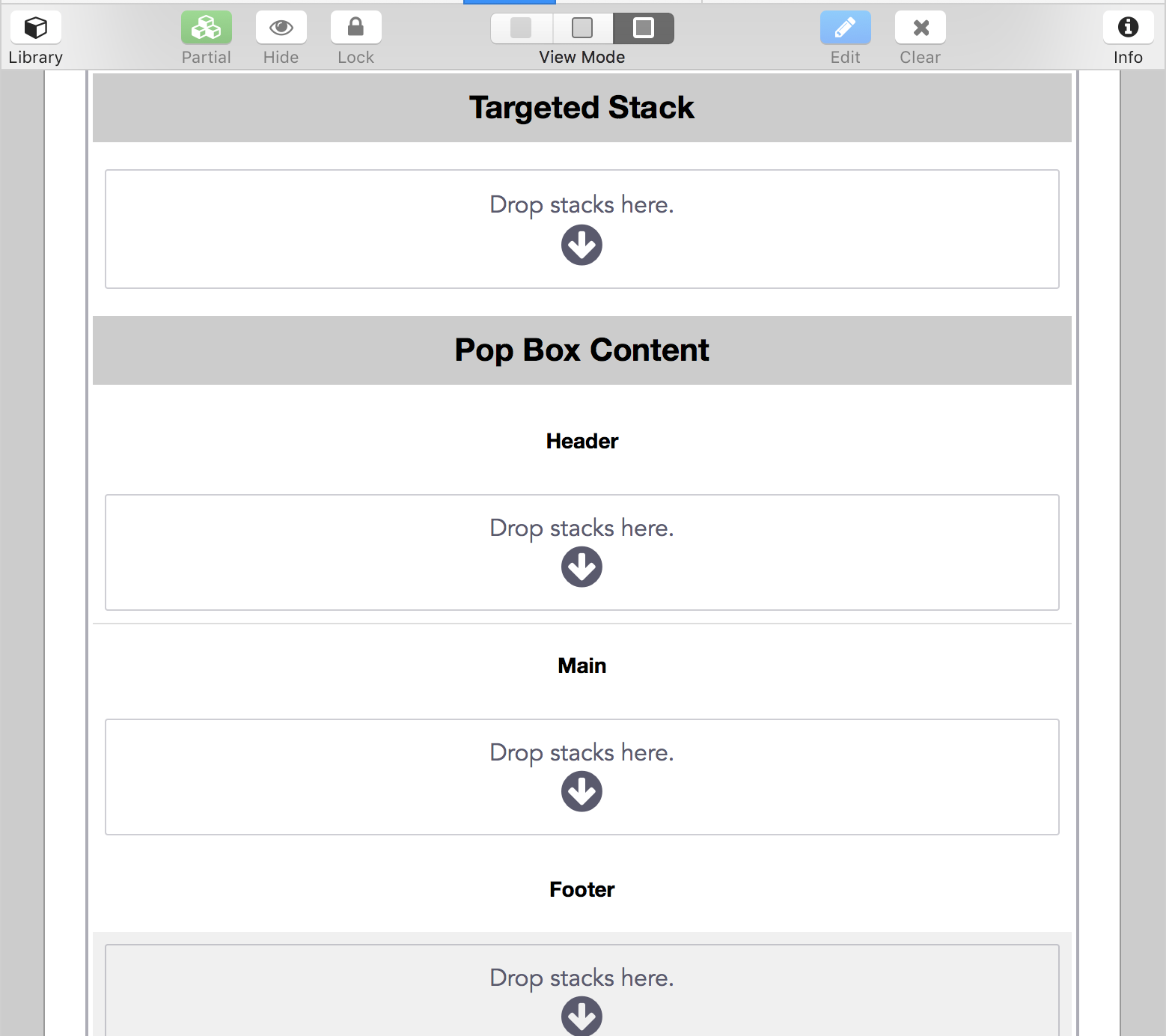
There are four empty stack slots available when you add Pop Box to the editor. First you will want to place a stack into the “Target Stack” slot. This stack can be text, button stack, or anything else. When a user clicks on this stack the pop up window/box will display.
After you have set up the target stack, you can then start to add content in the remaining three slots. A demonstration of what the pop up window/box will display at the top in edit mode, however you will want to switch to preview mode to get an idea of what it will look like with your added content.
Options
Initialization Options
Initialize – Choose to have the pop up appear after the target stack has been clicked or automatically after a defined amount of time has elapsed.
Style Options
Pop Box Theme – Choose between 6 different themes that change the appearance of the pop up window/box.
Use Percentage Widths – Enable this to have the width of the pop up window/box be declared as a percentage instead of a pixel value.
Outer Padding – This adjusts the space to the inside parameter of the entire pop up window/box.
Inner Padding – This adjusts the space between the Header, Main, and Footer sections.
Border Radius – Use this slider to add rounded corners to the pop up window/box. Note: You must have the Header and Footer enabled for the rounded corners to display.
Border Thickness – Use this slider to add a border around the pop up window/box.
Header On – Disable this option to hide the header for the pop up window/box.
Footer On – Disable this option to hide the footer for the pop up window/box.
Z-index – You can adjust this number to a higher or lower value if you have issues with theme or stack and the pop up is displaying below or above something it should not be.
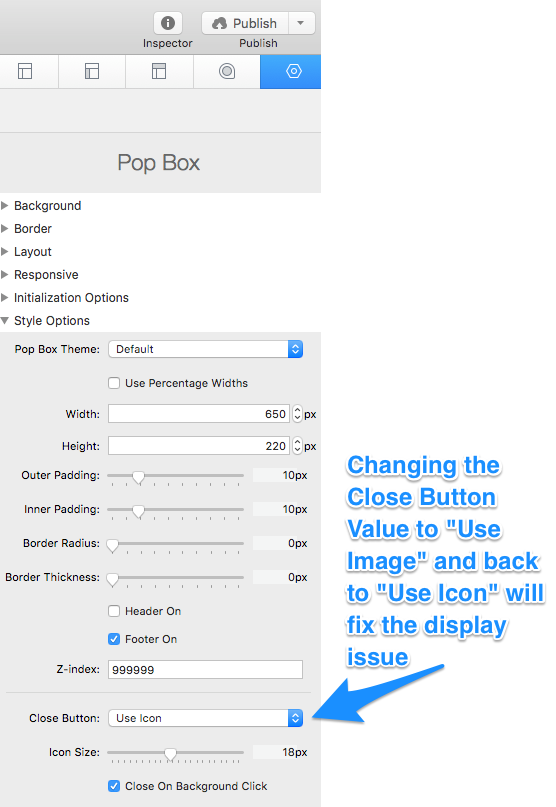
Close Button – Choose from three different methods (icon, image, text) for visitors to close the pop up window/box.
Close On Background Click – When this option is enabled, users can click on the background behind the pop up window/box to close it. If disabled, users must use the close button method you have selected above or the pop up will not close. Note: The escape key will always close the pop up window/box regardless if this option is enabled or not. This is to prevent the user from getting stuck with the pop up open and unable to figure out any other way to close it.
Responsive Options
Tablet Break – If the browser window width is less than this value, the pop up window/box will use the defined tablet width and height.
Tablet Width – Define the width of the pop up window/box for tablet sized browser windows.
Tablet Height – Define the height of the pop up window/box for tablet sized browser windows.
Mobile Break – If the browser window width is less than this value, the pop up window/box will use the defined mobile width and height.
Mobile Width – Define the width of the pop up window/box for mobile sized browser windows.
Mobile Height – Define the height of the pop up window/box for mobile sized browser windows.
Edit mode Display Issue when upgrading old versions to 3.0.0+
An update to the way the stack handles the close button can cause a display error in edit mode for some users. If Pop Box’s content is non selectable in edit mode it’s possible the “Close Button” value has been reset. This can be remedied by choosing a new value and switching it back to the value you want to use.