First Steps
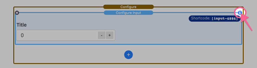
After adding the stack to the editor you will see two components. The main Configure stack which contains a single Configure Input stack. There is also a blue add button that can be used to insert more Configure Input stacks.
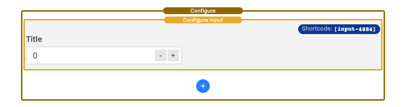
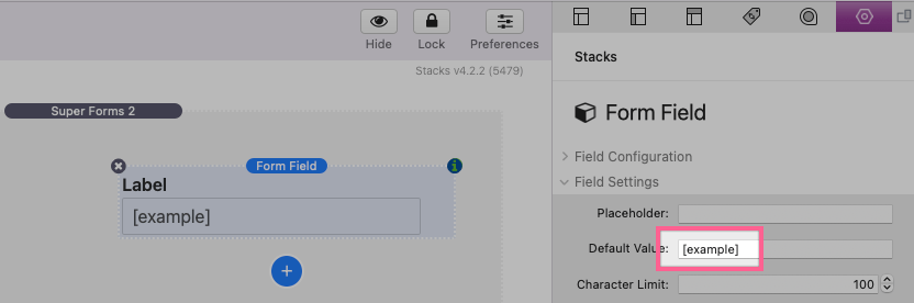
Select a Configure Input stack and open the settings panel.

The main Configure stack may be ignored at first. Its settings panel only contains optional style controls. Please refer to the “Configure Styles” section below for a breakdown of those style settings.
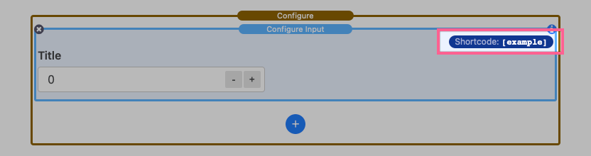
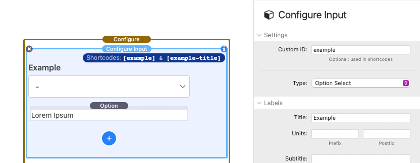
By default, each Configure Input stack added to the editor is automatically assigned an ID. The Settings Panel: Setup > Custom ID field allows you to optionally define a custom ID for the selected input. This ID should be unique, not include any spaces, and not include any special characters except for dashes and underscores. Here are few examples of acceptable IDs:
example
example_two
exampleThree
example-4
The ID is used to link the selected input’s value to a shortcode that can be placed anywhere on the stacks page (where text is accepted). The next tutorial will go over the use of these shortcodes.
Using Shortcodes
The shortcode for a given Configure Input stack can be found in the top right corner of the stack in the editor.
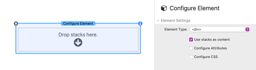
In order to use a shortcode, you must first add a Configure Element stack to the editor.
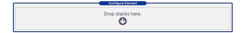
Shortcodes will only work inside of content added to these Configure Element stacks (with a few exceptions listed in following tutorials). The Configure Element is just a container stack that does not have any styling by default. It accepts any stack as content.
The Configure Element stack settings can be ignored for basic usage. Please refer to the “Configure Element Settings” section to learn more about those settings.
Shortcodes can be placed inside of any stack that has editable text:
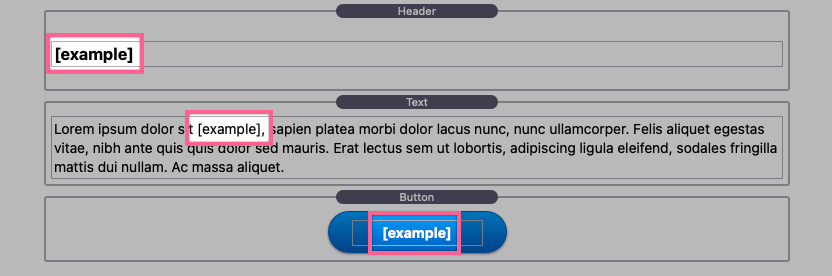
They can also be placed inside of any settings panel text input fields:
Any shortcode placed will instantly be updated every time an associated input value has been changed. There are six input types to select from. Each option will have a slightly different setup process. The next few tutorials will breakdown each option as well as the rest of the Configure Input settings panel sections.
Number Input & Slider Setup
Number input types support numerical values. The Number Input type includes plus and minus buttons (steppers) that allow you to increase and decrease the input value. The Number Slider type displays as draggable knob between a defined range of numbers. Ticks will display below the slider if the range is small enough to reasonably fit the number of ticks needed.
You must switch to preview mode in RapidWeaver for the ticks to appear.
To get started, select or add a new Configure Input stack and open the settings panel.

In the Settings Panel: Setup section, click on the Type dropdown list and select either “Number Input” or “Slider Input”. The following will go over the available settings used to complete the setup process for this input.
Settings Panel: Setup
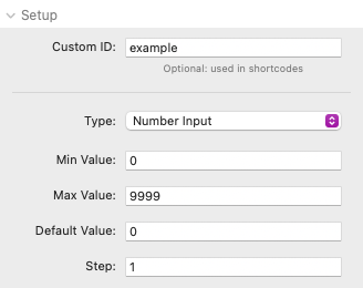
Min Value – The minimum value the input accepts.
Max Value – The maximum value the input accepts.
Default Value – The default value of the input on page load.
Step – The interval at which the plus and minus number steppers increase and decrease by.
These fields support decimal values using the period symbol. Do not add formatting (spaces, units, or number grouping symbols) to these fields. Number formatting can be defined in following sections of the settings panel.
Settings Panel: Labels
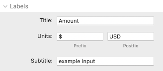
Title – Optional text that appears above the input. If no title is provided, the title element will be removed allowing you to use your own 3rd-party stack as the title.
Units: Prefix – An optional text character may be added to this field. For the Number Input type, the prefix displays inside the input field before the value. For the Number Slider type, the prefix displays before the value found above the slider.
Unit: Postfix – Optional text may be added to this field. For the Number Input type, the postfix displays inside the input field on the right side. For the Number Slider type, the postfix displays after the value found above the slider.
Subtitle -Optional text that appears centered below the input.
These fields only apply to the design of the input field and will not be added to an associated shortcode’s output.
Settings Panel: Styles
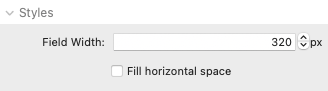
Field Width – Define a width for the input. If the value would exceed the available space, the input will instead fill the horizontal space available.
Fill horizontal space – Enable this option to ignore the Field Width value and automatically fill all available horizontal space. This is equivalent to 100% width.
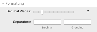
Settings Panel: Formatting

Decimal Places – Define the number of decimal spaces to show in the value of the input.
Separators: Decimal – The localized formatting symbol for decimal values.
Separators: Grouping – The localized formatting symbol(or space) for grouping values.
The formatting defined in this section will only be visible when published or previewing the page. The formatting will be applied to any associated shortcode’s output.
Option Select Setup
Option select input types support numerical and text values. The options show as a dropdown select list.
To get started, select or add a new Configure Input stack and open the settings panel.
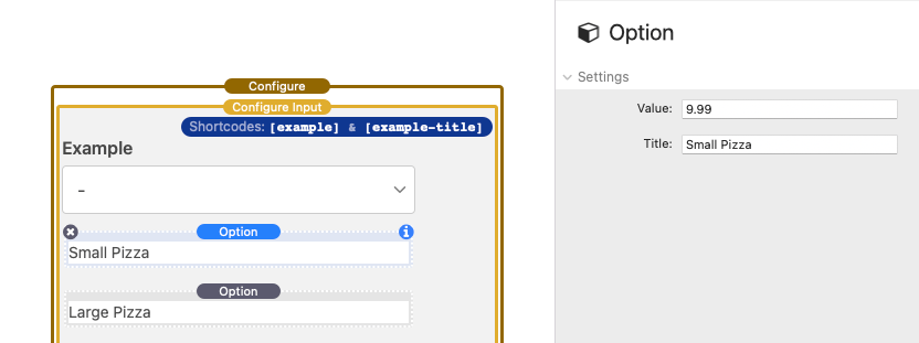
In the Settings Panel: Setup section, click on the Type dropdown list and select “Option Select”. By default a single option stack is added.
Clicking the blue add button will insert more options. Select an Option stack and open the settings panel to define the value and title for that option.
Settings Panel: Setup (Option stack)
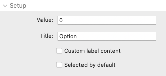
Value – Define the value an associated shortcode will output if this option is selected.
Title – A text title that will display in the dropdown list representing the option. This value is automatically assigned a shortcode that will output the title when this option is selected.
After defining values and titles for each option, select the Configure Input stack and open the settings panel to finish setup.
Settings Panel: Styles

Field Width – Define a width for the input. If the value would exceed the available space, the input will instead fill the horizontal space available.
Fill horizontal space – Enable this option to ignore the Field Width value and automatically fill all available horizontal space. This is equivalent to 100% width.
Option Group Setup
Option group input types support numerical and text values. The options show as an always visible group of clickable buttons.
To get started, select or add a new Configure Input stack and open the settings panel.
In the Settings Panel: Setup section, click on the Type dropdown list and select “Option Group”. The following will go over the available settings used to complete the setup process for this input.
Settings Panel: Setup
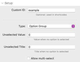
Unselected Value – The value an associated shortcode will output if no option has been selected.
Unselected Title – The title an associated title shortcode will output if no option has been selected.
Allow multi-select – Enable this option to allow multiple options to be selected from the group.
Next we need to define the options. By default a single option is added.
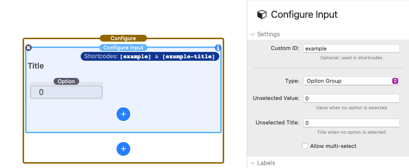
Clicking the blue add button will insert more options. Select an Option stack and open the settings panel to define the value and title for that option.
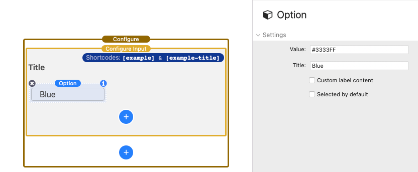
Settings Panel: Setup (Option stack)
Value – Define the value an associated shortcode will output if this option is selected.
Title – A text title that will display in the dropdown list representing the option. This value is automatically assigned a shortcode that will output the title when this option is selected.
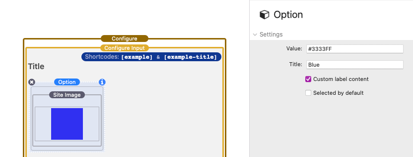
Custom label content – Optionally remove the title displayed for the option and replace it with stacks content. (see image below)
Selected by default – Enable this option to make it the default selected value for the group.
After defining values and titles for each option, select the Configure Input stack and open the settings panel to finish setup.
Settings Panel: Labels

Title – Optional text that appears above the input. If no title is provided, the title element will be removed allowing you to use your own 3rd-party stack as the title.
Settings Panel: Styles
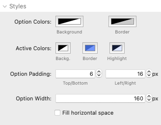
Option Colors – Adjust the background and border color applied to every option in the group.
Active Colors – Adjust the background, border, and highlight color applied to the selected option. These colors also affect options that are hovered by the mouse pointer.
Option Padding – Adjust the space applied around every option in the group.
Option Width – Define a width applied to each of the options in the group. Individual options will fill any available horizontal space and then break to new lines. If the width of a single options would exceed the available space, the option will instead fill the horizontal space available.
Fill horizontal space – Enable this option to ignore the Option Width value and have each individual option automatically fill all available horizontal space. This is equivalent to 100% width.
Option Checkbox Setup
Option checkbox input types support numerical and text values.
To get started, select or add a new Configure Input stack and open the settings panel.
In the Settings Panel: Setup section, click on the Type dropdown list and select “Option Checkbox”. The following will go over the available settings used to complete the setup process for this input.
Settings Panel: Setup
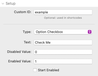
Text – Define the text that will display to the right of the checkbox.
Disabled Value – The value an associated shortcode will output if the checkbox has not been enabled.
Enabled Value – The value an associated shortcode will output if the checkbox has been enabled.
Start Enabled – Click this option if you would like the checkbox to be enabled by defalut.
Settings Panel: Labels
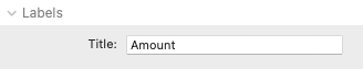
Title – Optional text that appears above the input. If no title is provided, the title element will be removed allowing you to use your own 3rd-party stack as the title.
Settings Panel: Styles

Field Width – Define a width for the checkbox text. If the value would exceed the available space, the text will instead fill the horizontal space available.
Fill horizontal space – Enable this option to ignore the Field Width value and automatically fill all available horizontal space. This is equivalent to 100% width.
Using Math (Math Configure Input Type)
Math input types allow you to define static numerical values. They also support shortcodes and math expressions. The solution to the math expression will be output to any associated shortcodes. Any time a change is made to any Configure input, the math expression will reevaluate and update the associated shortcodes.
This field type is hidden from view.
To get started, select or add a new Configure Input stack and open the settings panel.
In the Settings Panel: Setup section, click on the Type dropdown list and select “Math (Invisible)”. The following will go over the available settings used to complete the setup process for this input.
Settings Panel: Setup
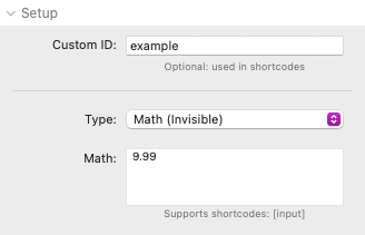
Math – Add a static numerical value or a math expression. Math expressions support the use of shortcodes from any Configure Input used on the page. Math expressions follow the PEMDAS order of operations.
If you need a refresher on the order of operations check out this link.
Supported Operators
+ Addition
Example: 2+2 = 2
– Subtraction
Example: 2-2 = 0
/ Division
Example: 10/2 = 5
* Multiplication
Example: 10*2 = 20
% Remainder
Example: 19%5 = 4
( ) Parenthesis
Example: 2*(5+5) = 20
** Power
Example: 2**4 = 16
PI Pie
Example: PI*1 = 3.14
Supported Methods
abs(x) Returns the absolute value of x
Example: abs(-21) = 21
round(x) Returns the value of x rounded to its nearest integer
Example: round(1.3) = 1, round(1.8) = 2
ceil(x) Returns the value of x rounded up to its nearest integer
Example: ceil(1.3) = 2, ceil(1.8) = 2
floor(x) Returns the value of x rounded down to its nearest integer
Example: floor(1.8) = 1, floor(1.3) = 1
max(x, y, z, …, n) Returns the number with the highest value
Example: max(4, -23, 7, 0) = 7
min(x, y, z, …, n) Returns the number with the lowest value
Example: min(4, -23, 7, 0) = -23
sqrt(x) Returns the square root of x
Example: sqrt(16) = 4
Supported Advanced Methods
random(1) Returns a random number between 0 and 1
cos(x) Returns the cosine of x (x is in radians)
sin(x) Returns the sine of x (x is in radians)
tan(x) Returns the tangent of an angle
log(x) Returns the natural logarithm (base E) of x
acos(x) Returns the arccosine of x, in radians
asin(x) Returns the arcsine of x, in radians
atan(x) Returns the arctangent of x as a numeric value between -PI/2 and PI/2 radians
atan2(y, x) Returns the arctangent of the quotient of its arguments
Settings Panel: Formatting
Decimal Places – Define the number of decimal spaces to show in the output of an associated shortcode.
Separators: Decimal – The localized formatting symbol for decimal values in the output of an associated shortcode.
Separators: Grouping – The localized formatting symbol(or space) for grouping values in the output of an associated shortcode.
Using the Configure Condition Stack
Included with the Configure stacks is a Configure Condition stack.
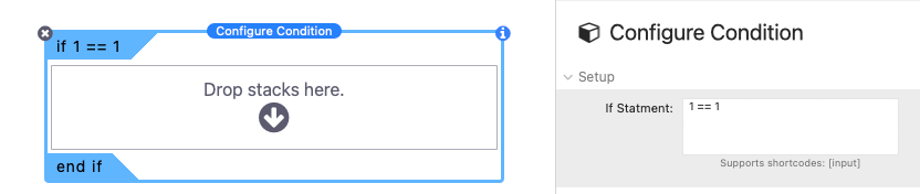
This stack can be used to create true or false comparisons called “If statements”. If the comparison evaluates as true, the contents of the stack will display. Conversely, if the comparison evaluates as false, the contents of the stack will be hidden. If statements support the use of shortcodes from any Configure Input used on the page. If statements may be nested inside other if statements. Evaluations follow the PEMDAS order of operations.
To get started, add a Configure Condition stack to the stacks page and open the settings panel.
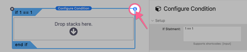
The following will go over the available settings used to complete the setup process for this input.
Settings Panel: Setup
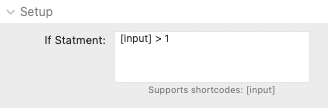
If Statement – Define a custom comparison using numbers, shortcodes, math, and comparison symbols. Refer to the Examples section to see a list of copy and paste examples.
Supported Comparisons
== Equal to
Numeric comparison example: 2 == 2 evaluates as true, 1 == 2 evaluates as false
Text comparison example: “title” == “title” evaluates as true, “title” == “Title” evaluates as false
!= Not equal to
Numeric comparison example: 2 != 2 evaluates as false, 1 != 2 evaluates as true
Text comparison example: “title” != “title” evaluates as false, “title” != “Title” evaluates as true
Quotation marks are required for text comparisons. They must be placed around text and around any shortcodes used. Example: “[input-id]” == “Blue”
> Greater than (numeric comparisons only)
Numeric comparison example: 2 > 2 evaluates as false, 2 > 1 evaluates as true
< Less Than (numeric comparisons only)
Numeric comparison example: 2 < 2 evaluates as false, 1 < 2 evaluates as true
>= Greater than or equal to (numeric comparisons only)
Numeric comparison example: 2 >= 2 evaluates as true, 1 >= 2 evaluates as false
<= Less than or equal to (numeric comparisons only)
Numeric comparison example: 2 <= 2 evaluates as true, 2 <= 1 evaluates as false
A list of optional copy and paste examples are provided in the Settings Panel: Examples section.
Using Configure Conditions to Modify Input
The Configure Condition stack can be used to conditionally display/hide Configure Input fields. Only input fields that are visible (not hidden) will affect the output of the shortcodes used on the page. This means you can create two or more inputs with the same “Custom ID” while setting each of them to only apply under a specific condition. For example:
Let’s say we have an input that accepts a number and that number represents a quantity.

Using a Math Configure Input stack we multiply this quantity by 9.99 to get a total cost.
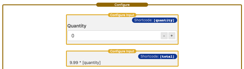
Now let’s say we want to apply a discount if the quantity is greater than 2. We could place the previously created Math Configure Input inside of a Configure Condition stack set to only apply when the quantity is less than or equal to 2.

And then create a new input that defines a new total with a discount. This new input should use the same Custom ID as the previous total. This total would then be placed inside of a Configure Condition stack set to only apply when the quantity is greater than 2.

Now when the quantity is less than or equal to 2, the [total] shortcode will output the total. When the quantity is greater than 2, the [total] shortcode will output a discounted total.
Configure Element Settings
Aside from enabling the use of shortcodes, the Configure Element stack also contains some optional settings.
Settings Panel: Element Settings
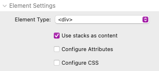
Element Type – Change the element HTML type.
Element attributes support the use of shortcodes. Some element types have different useful attributes you may want to control. For example, when using a link element type, you could place a shortcode in the url of the link to change where it navigates based on input from the Configure form.
Use stacks as content – Enabled by default. Allows stacks to be placed as content inside of the element. Disable to use HTML instead.
Configure Attributes – Enable this option to see additional attribute fields that support the use of shortcodes.
Configure CSS – Enable this option to see a nearly exhaustive list of CSS properties that support the use of shortcodes.
Settings Panel: CSS Transition Settings
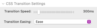
Transition Speed – Adjust the time it takes in milliseconds to animate any CSS property that uses a shortcode. The animation triggers whenever the shortcode value has been updated with a new value. The animation will transition from the previous value to the new value over this defined period of time.
Transition Easing – Select from a list of animation easing options. Each option uses a different acceleration curve so that the speed of the transition varies over its duration.
Configure Styles
You can optionally adjust the styles of the Configure stack as well as the style of the contained input fields.
Settings Panel: Background, Border & Shadow, Layout
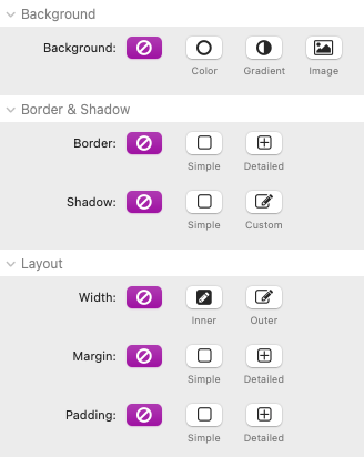
Most of the style options found in these sections function just like they do with any built-in stack with the exception of the “Width” setting. By default, the Configure stack will fill the entire width of the container it is placed inside. You can optionally enable one of two width options for advanced layout functionality.
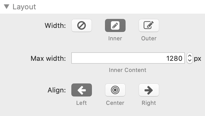
Width: Inner – Select this option to define the max width of the inner content of the stack. Background colors/images will fill the entire width of the container, but the content will not expand beyond the defined width. The content can be aligned horizontally.
Width: Outer – Select this option to define the max width of the entire outer element. Background colors/images and the content will not expand beyond the defined width. The element can be aligned horizontally.
Settings Panel: Typography
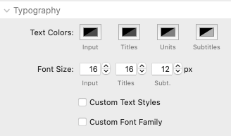
Text Colors – Adjust the text colors of the input, titles, units, and subtitles.
Font Size – Adjust the size of the input, titles, and subtitle text. These settings also automatically adjust the overall size and spacing of the input fields.
Custom Text Styles – Enable this option to optionally define font weights for the input, titles, and subtitle text. You also can define the margin above the input field titles.
Custom Font Family – Be default the font family is inherited from the project. Enable this option to define a specific font.
Settings Panel: Input Field Styles
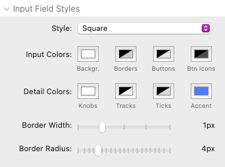
Style – Select between three input field themes. Each one affects the appearance of any Configure Input stack used in the Configure form.
Input Colors – Adjust the colors of the input background, borders, buttons, and button icons.
Detail Colors – Adjust the colors of the slider knobs, slider tracks, slider ticks, and slider/checkbox accent color.
Border Width – Adjust the width of the border around each input field. When the “Underline” style option has been selected, only the bottom border width is affected.
Border Radius – Adjust the corner rounding applied to each of the input fields. This option is only available when the “Square” style option has been selected.