General Settings
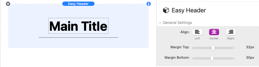
Use the Align setting to adjust the horizontal alignment of the Title, Subtitle, and Divider as a whole. The Margin Top and Bottom sliders control the amount of space above and below Title, Subtitle, and Divider.
Divider Settings
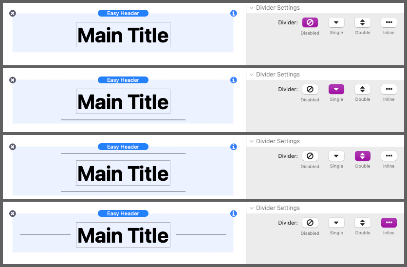
The first button group in this section defines the Divider line layout. “Disabled” will remove the lines all together, “Single” will place a single line below the title with an option to move it to the top, “Double” will place a line above and below the title, and “Inline” will place a line to the left and right of the title.
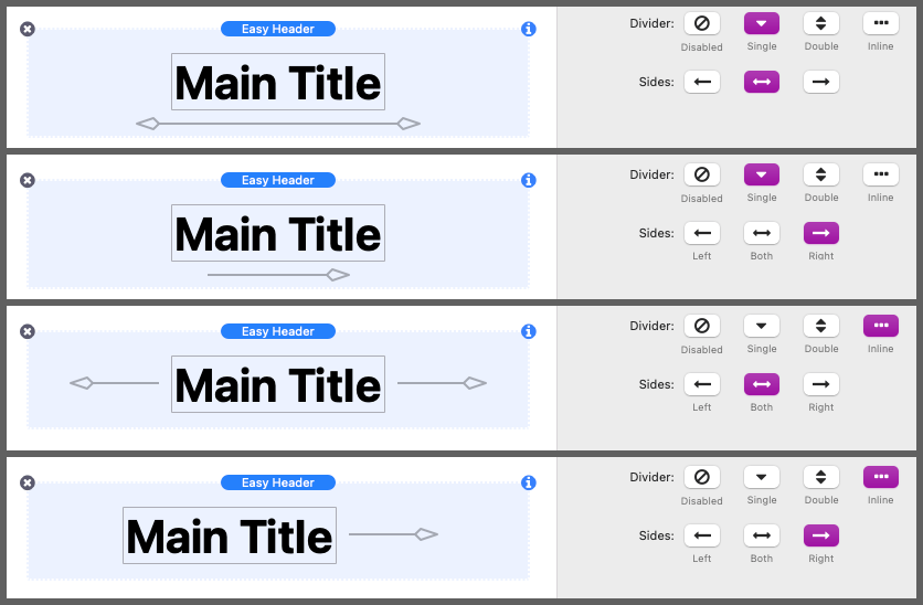
Some divider line styles have a left and right side to their design. Use the Sides button group to optionally enable a single side. When the Divider is set to “Inline”, the options will instead enable the lines to the left and right of the title.
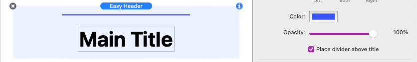
The Color setting in this section controls the color of the line and any added shapes. Opacity is not supported through the color picker and is instead adjusted using the Opacity slider.
If the the Divider is set to “Single”, an additional checkbox is provided to allow the divider line to be place above the title instead of below it.
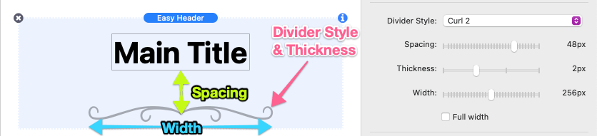
The design of the divider line can be changed by choosing one of the Divider Style options. Each option has settings to adjust the Spacing between the line and the title, the Thickness of the line, and the Width of the line in pixels. You can also optionally enable the Full width checkbox to set the width of the line as wide as possible (depending on the available space).
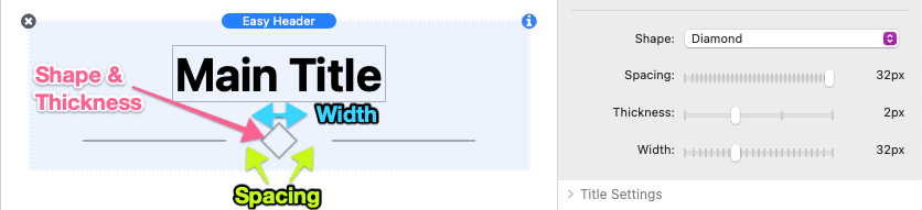
Below the Divider Style settings are the Shape settings. These allow you to optionally add a shape to the design of the divider line. Each shape option has settings to adjust the Spacing between the shape and the divider line, the Thickness of the shape path, and the Width of the shape in pixels.
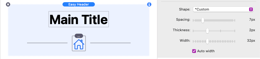
The Shape: *Custom option can be used to add a custom images, text, or icons in place of a shape. The Width and Spacing options still apply to any content you add. Use the provided Auto width checkbox to ignore the width setting and use the default width of the added content instead.
Title Settings
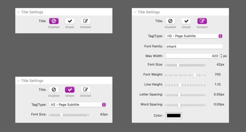
The Title can optionally be disabled if you would like to use the stack as divider line instead of a heading. Use the “Simple” option to enable the title and inherit the styles of the selected Tag/Type. These styles are either defined by the theme or stack framework you are using. If you would rather customize the style of the title, select the “Detailed” option to get a full list of adjustable style options.
Subtitle Settings
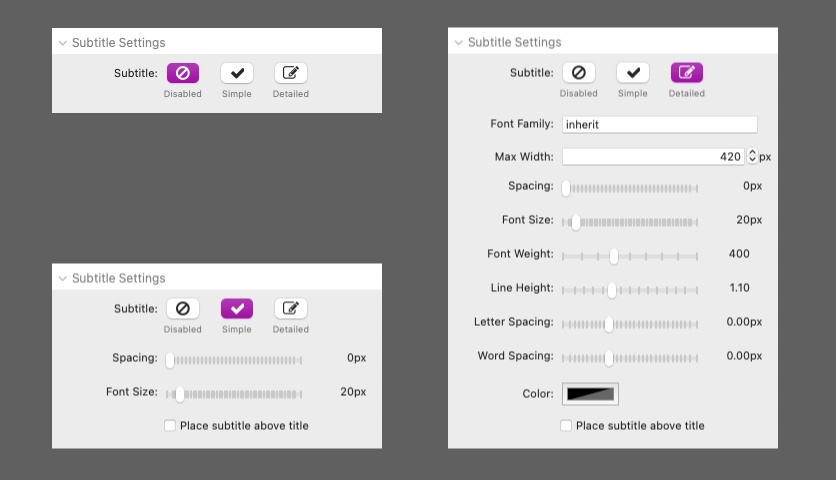
A Subtitle can optionally be enabled by selecting the “Simple” option. The subtitle styles will be inherited from the default text styles either defined by the theme or stack framework you are using. If you would rather customize the style of the subtitle, select the “Detailed” option to get a full list of adjustable style options.
When the subtitle is enabled, a checkbox is provided to allow you to optionally place the subtitle above the title rather than below it.