Overview
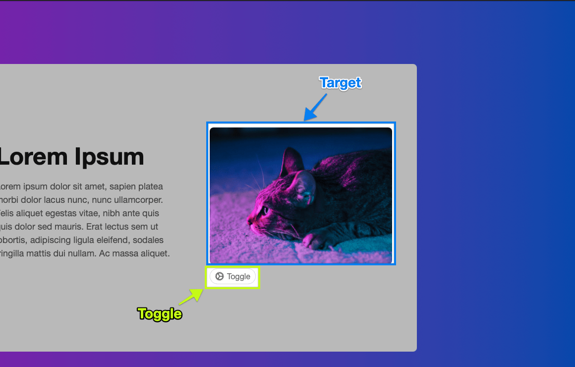
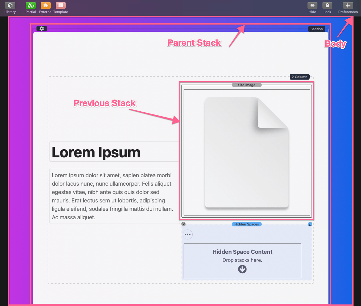
The Hidden Space stack has three important components, a target, a toggle, and a hidden content space. The target is the element that moves when the toggle has been activated.
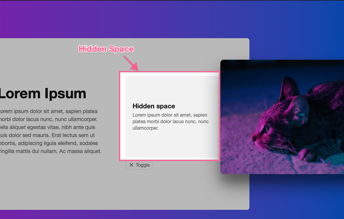
The hidden space is the content that displays behind the target when the toggle is activated.
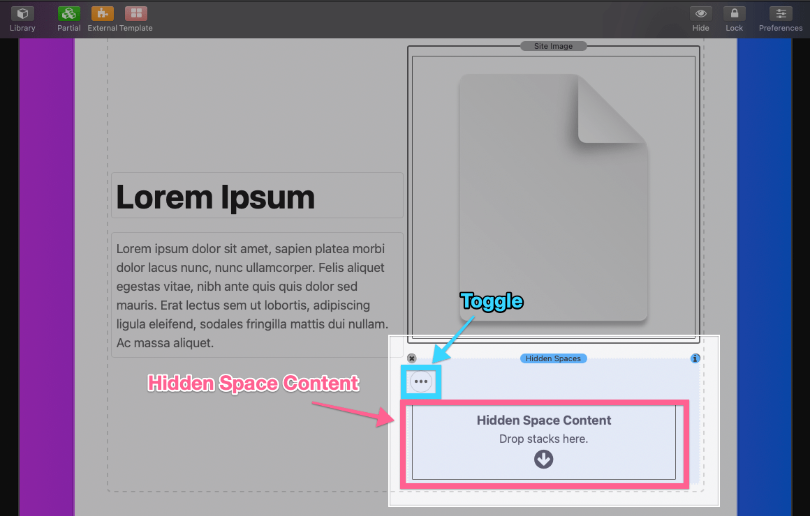
The stack itself when added to the Stacks editor will contain two of those components.
The third component or the target, is not apart of the Hidden Spaces stack and must be defined in the stack settings panel.
Setup
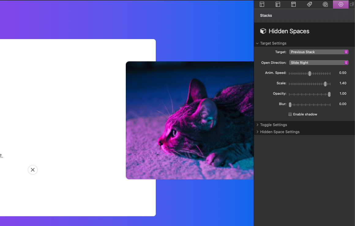
After adding the stack to the editor, select the stack and navigate to the settings panel. The settings panel has three categories each corresponding to the three components. First we must define our target in the Target Settings category.
Target Settings: Target
By default, the target is set to “Previous Stack”. This will target any stack placed above the Hidden Spaces stack. “Parent Stack” will instead automatically find a container parent stack to use as the target. “Body” will target the entire webpage and “Custom” will allow you to define your own target using a class.
In our example we will use the “Previous Stack” option which will target the image stack placed above the Hidden Spaces stack.
Target Settings: Open Direction
Select from one of four options to define the animation direction of the target.
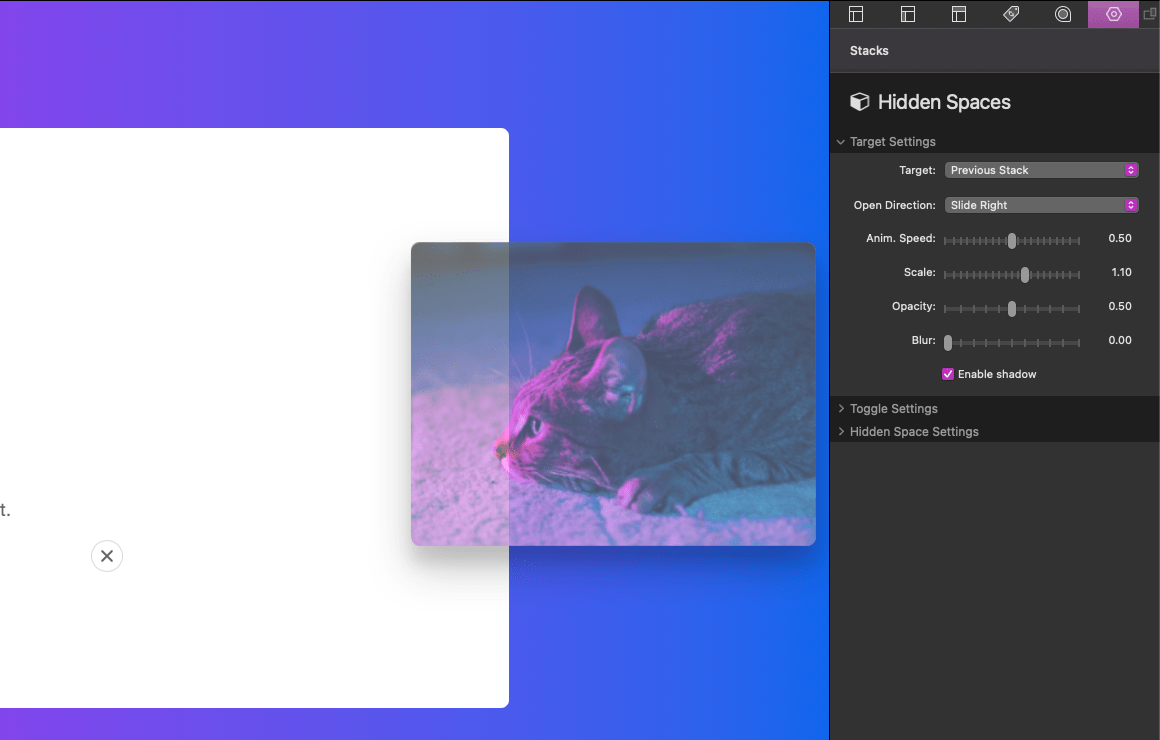
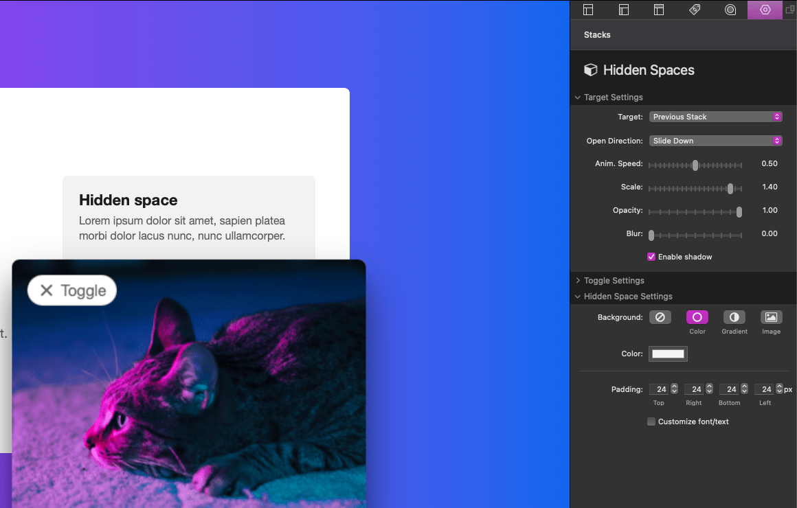
Target Settings: Animation Customization
The remaining settings allow you to customize the target animation. Anim. Speed adjusts how long in seconds the animation takes to complete after it has been toggled.
Scale changes the size of the target when toggled.

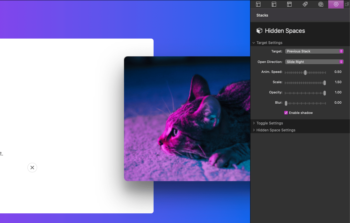
Opacity changes the transparency of the target when toggled.
Blur adds an optional blurring effect when a value greater than 0 is defined.
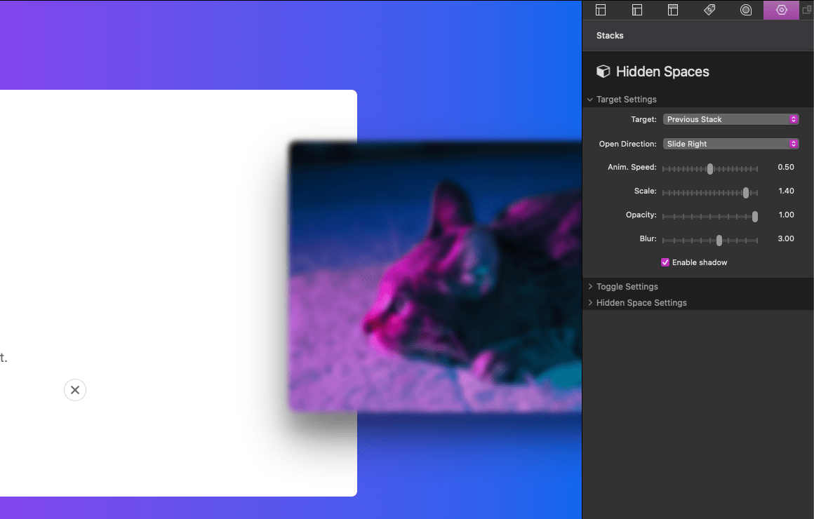
Enable shadow is on by default and adds a shadow around the target when toggled. Below is an example of the shadow disabled.
Next we will need to setup the toggle in the Toggle Settings category.
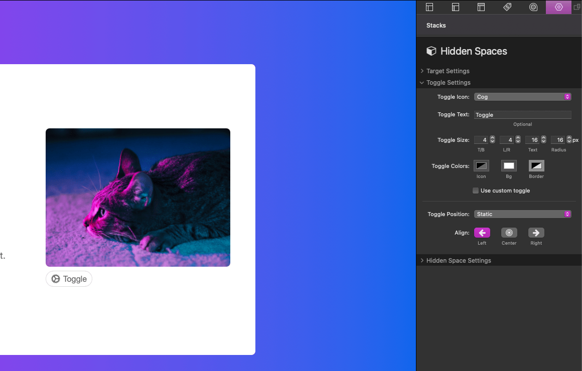
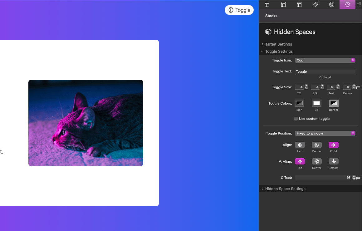
Toggle Settings: Toggle Appearance
The Toggle Icon setting has 19 icon options to choose from. You may also remove the icon from the toggle by selecting “None”. Toggle Text is optional text that can be added to the toggle. Toggle Size provides four options for defining the size of the toggle. The first two adjust the toggle padding while the latter two adjust the text size and border-radius (corner rounding). Toggle Colors define the colors of the Icon/Text, background (Bg), and border of the toggle.
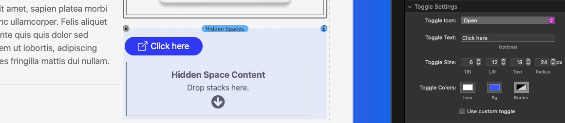
Use custom toggle will disable the appearance settings and allow you to add a custom button or link stack to use as the toggle.
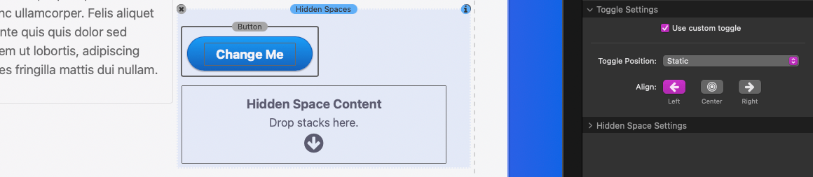
Toggle Settings: Toggle Position
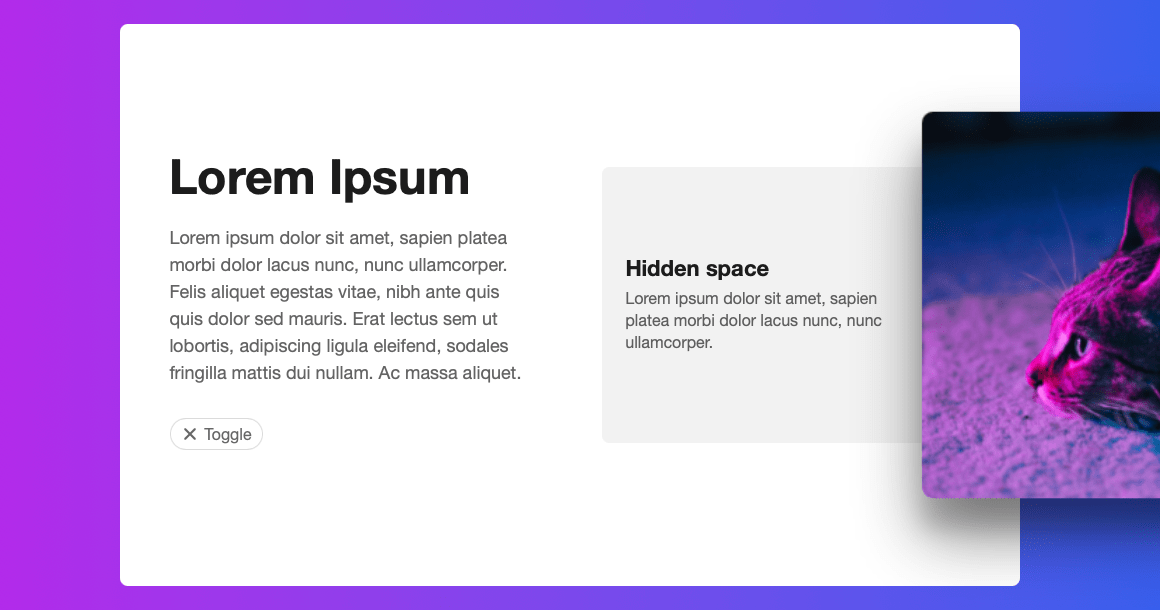
By default, the toggle’s position is set to “Static”. This means the toggle will display in the location the Hidden Spaces stack has been placed. In our example that is directly below the image stack.
“Fixed to target” will automatically move the toggle on top of the target. The remaining alignment and offset settings allow you to adjust where the toggle appears on the target.

“Fixed to window” will automatically attach the toggle to the browser window. The remaining alignment and offset settings allow you to adjust where the toggle appears when attached to the browser window.
Now that the target has been defined and the toggle has been styled and setup, we just need to add content to our Hidden Space. There is no limit to how much content you add to the hidden space content area, a scrollbar will be added to the space if the content is longer than the space behind the target.
After adding content we can adjust the style of the Hidden Space.
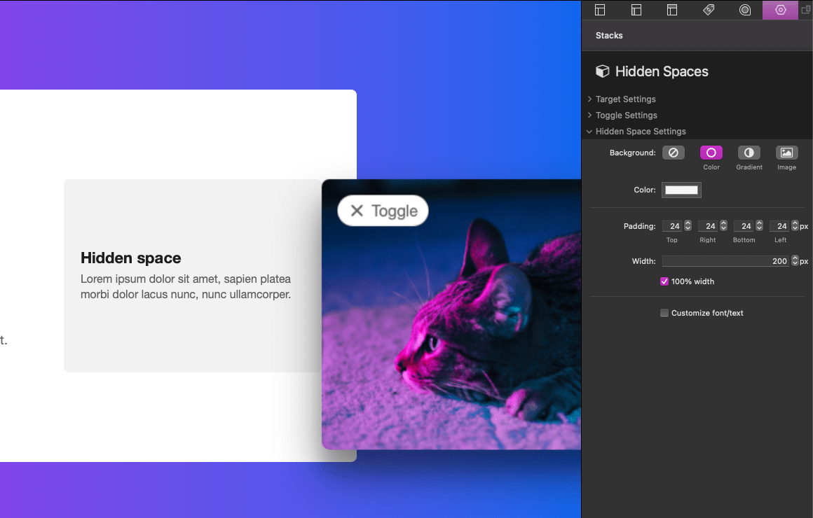
Hidden Space Settings
Background allows you to define a background color, gradient, or the option to use a background image. “Padding” adjusts the space surrounding the content. The Width setting is only available when the Target Settings: Open Direction has been set to “Slide Left” or “Slide Right”. This will adjust the width of the hidden space area.

There is also a 100% Width setting if you would like the hidden space area to match the width of the target. When enabled the Width setting is ignored.
When the Target Settings: Open Direction has been set to “Slide Down” or “Slide Up” the height of the hidden space area is automatically determined based on the content.
The final setting Customize font/text allows you to optionally define a custom font family for the hidden space content as well as define default colors for the text.
Defining a custom target
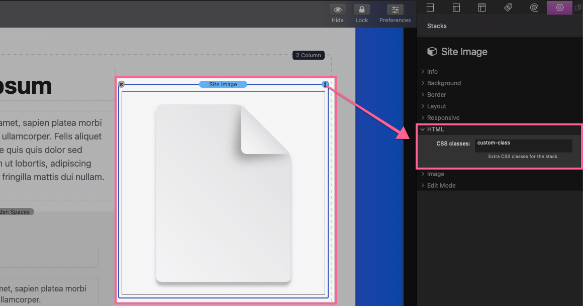
In the Hidden Spaces stack settings panel open to the Target Settings category. Select the “Custom” option for the Target setting. An input field will appear allowing you to define a custom class name. This class name should not include spaces or any special characters other than dashes “-” or underscores “_”. It must also be unique and not match any other class names you may have created.
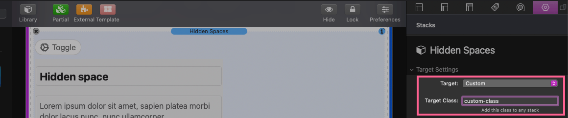
Once you have created a custom class name, select the stack you want to target. In our example we will be selecting an image stack. In the selected stack settings panel open the HTML category. Add your custom class to the CSS classes field.
This stack will now be the target of the Hidden Spaces stack. In our example, when toggled the image stack will animate revealing a hidden space content area behind it. The toggle can be placed anywhere on the page and still toggle the targeted stack.
Create a ‘cutout’ effect
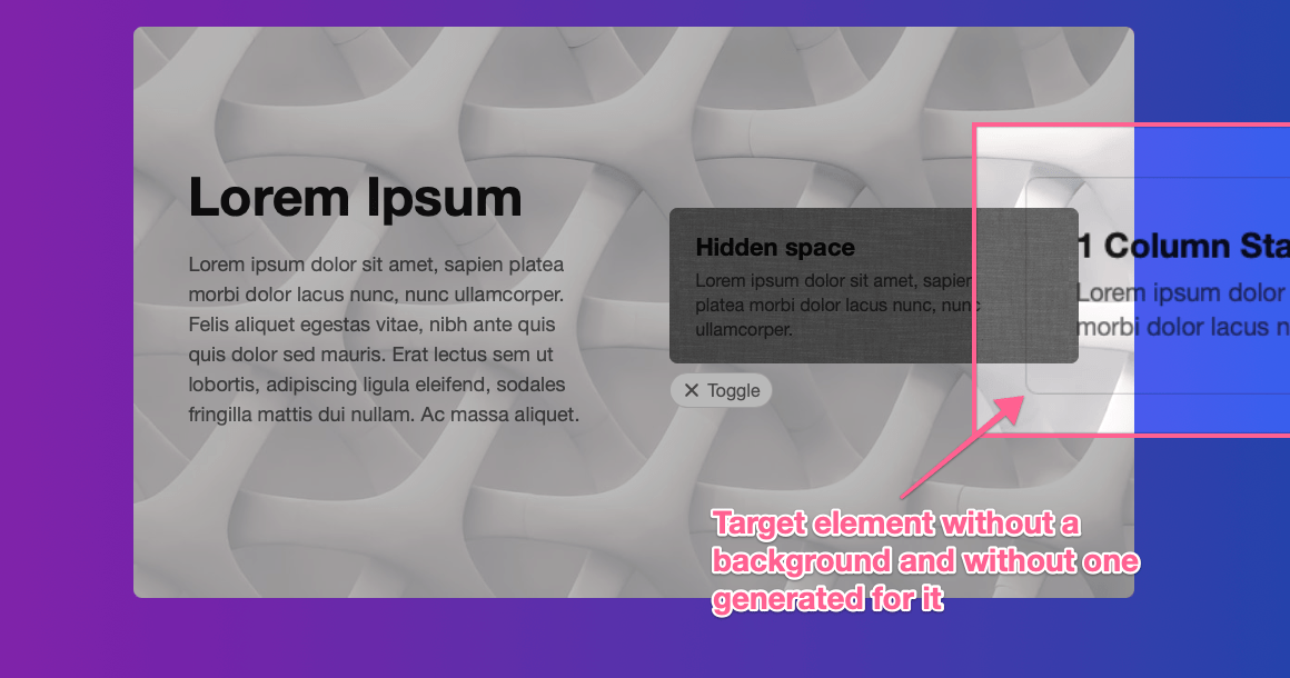
When the target of a Hidden Spaces stack does not have a background color/gradient/image it will automatically generate one based on the background of a parent element/stack.
In this example we have targeted a 1 Column stack and have not defined a background for it. When the target is toggled the Hidden Spaces stack automatically generates a background to match the parent element. This ‘cutout’ effect is best illustrated when the parent element/stack has an image for a background.
Disabling the ‘cutout’ effect
All targets must have a background color/gradient/image in order to mask the Hidden Space content behind it.
This is why the Hidden Spaces stack automatically generates a background to match the parent element if one is not defined. However, there may be some cases where you actually want the target to be transparent. Like when using a transparent PNG image and you want the Hidden Space content to be visible through the transparent parts of the image.
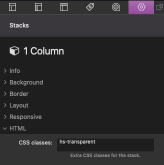
To disable the target’s background generation and to make it transparent, simply add the class “hs-transparent” to the target stack.
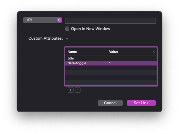
Add a custom close button
Custom close links and buttons can be added to any Hidden Space content area. All you need to do is add the custom attribute “data-toggle” to the button or link settings, the value can be set to “1”. When this button or link is clicked it will toggle the hidden space closed.