Setup & Settings Menu Explanation
Sections
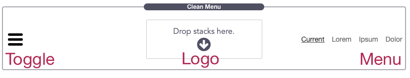
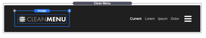
To get started, add the Clean Menu stack to your stacks page. There are 3 main sections of the stack: Toggle, Menu, and Logo.
Note: In edit mode the top level menu will not be able to display your menu items and will instead display some example items. Switching to preview mode will reveal your actual menu items.
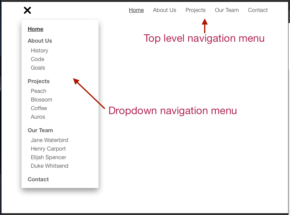
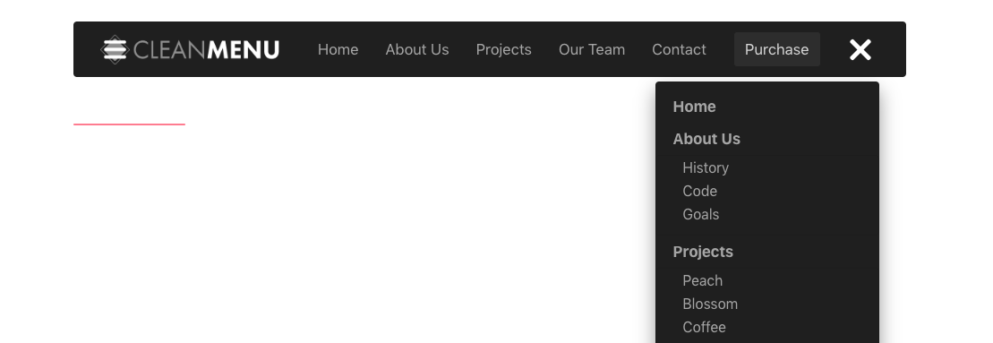
By default, the stack will display your project files top level pages in the top level navigation menu and all sub-level pages will only be found in the dropdown menu that appears when the toggle is clicked.
Background
To get started we will add an optional background color to our menu.
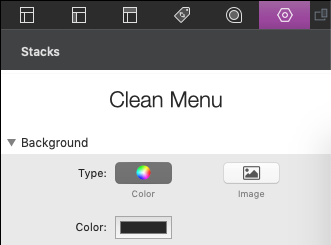
The background color will extend to the edges of your content area. Depending on the theme or framework you are using it may extend to the edge of the browser window (You may have a setting to change the content width or max-width to allow it to do so). The theme we used restricted the content space to the center.

Layout
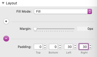
We don’t want our menu to extend to the browser window edges so we will add padding to the left and right in order to keep the toggle and logo from hugging the edges.
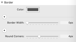
Border
You can also adjust the border settings to change the appearance of the menu. We will add 4px rounded corners.
General Settings
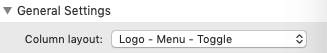
Next, navigate to the settings menu and open the “General Settings” tab. The first setting titled “Column layout” will allow you to choose the location of each of the 3 menu sections. In our setup example we are going to use the option “Logo – Menu – Toggle”.
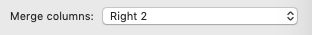
The next setting “Merge columns” will allow you to combine the center section with the left or right sections of the menu. This setting is optional, but we will select the option “Right 2” to combine our menu with the dropdown toggle. If you want to keep your 3 menu sections separate leave this setting set to “None”.
To set up our logo we can either drag in an image or text stack to create a title for our menu or website.
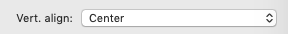
The “Vert. align” setting will change the vertical alignment of all 3 menu sections in relation to eachother. You will not notice much of a difference between the options unless your logo or title text is taller than your menu and toggle sections. Typically, you will want to leave this set to it’s default option “Center”.
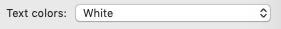
The “Text colors” setting will change the over all color theme for the toggle and menu items. Since our background is black we will select “White”. There is also an option titled “Custom” that will allow you to set specific colors for the toggle and menu items.
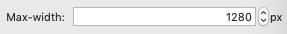
The “Max-width” setting will change how wide your combined 3 menu sections will be. If there is enough space the menu contents will be 1280px wide. This option will not effect the width of the background color we set and is most useful for when your background extends to the browser edges. In our case, the width is being determined by the theme so we can change this value as is.
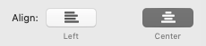
The “Align” setting will change the horizontal alignment of the menu sections. Typically you will want to leave this set to it’s default option “Center”. The “Left” option is only useful if your content area extends to the browser edges.
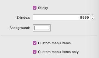
When the “Sticky” setting is enabled your menu will stick to the top of the browser window when it is scrolled to and past. When enabled you will have two extra settings: “Z-index” which only needs to be adjusted if your sticky menu is sliding behind other elements on your page (rare cases) and “Background” which is were you define the background color of the menu when it is attached to the browser window. The sticky menu will always extend to the browser edges no matter what theme or framework you are using. We will not be enabling this option in our example.
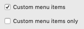
When the “Custom menu items” setting is enabled, a new section that allows you to add your own menu items will appear in edit mode. You will also have an additional setting to disable your project file’s navigation menu items and only use the custom menu items. We will be adding custom menu items in our example.
Clean Menu Item Settings
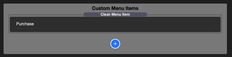
In the editor you will now see a new section titled “Custom Menu Items” with a single menu item added by default (You can add more custom menu items by clicking the blue add icon). Double click the title to change it.
Selecting the item will bring up it’s own settings menu.
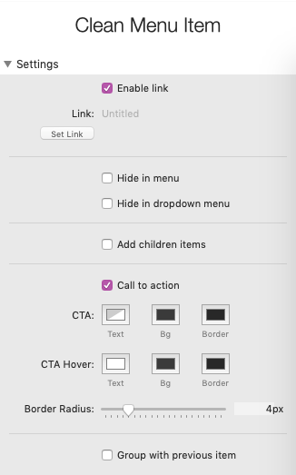
The “Enable link” setting can be disabled to remove the link from this specific menu item. This is useful for when you want to add categories or titles to your toggle dropdown menu that are not links.
The “Hide in menu” and “Hide in dropdown menu” settings allow you to chose where the selected menu item will display. “Hide in menu” refers to the top level navigation menu.
The “Add children items” setting allows you to drag and drop other menu items beneath it as sub-menu items. These sub-menu items will only display in the toggle dropdown menu.
The “Call to action” setting give us extra color and border radius settings to make the selected menu item unique from the rest of the menu items. For our example we will enable this option.
The “Group with previous item” settings removes the space between the selected item and the item to the left of it. This is useful for grouping small icon links next to each other.
Next, we need to click on our Clean Menu stack in the editor to bring it’s settings menu back up.
Top Level Navigation Menu
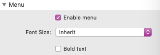
In the “Menu” tab we can optionally disable the top level navigation men, set a specific font-size for our menu items, and bold the menu item text. If you have selected “Custom” in the previous “Text colors” settings there will also be some color settings in this tab. We wont need to change any of the settings found in the “Menu” tab in our example.
Toggle / Dropdown Menu
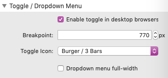
In the “Toggle / Dropdown Menu” tab we can optionally disable the toggle dropdown menu.
Note: If the toggle is disabled no sub-menu navigation items will be displayed. This option is only useful for those with small websites who only have a few top level links.
The point at which the mobile version of the toggle is displayed is defined by the “Breakpoint” setting. If the browser is more narrow than the defined breakpoint, the top level menu navigation will hide and only the mobile toggle will display. The mobile toggle menu will contain all links defined in both the top level navigation and toggle dropdown navigation.
The “Toggle icon” setting lets you choose between 3 different animated toggle icons.
When the “Dropdown menu full-width” setting is enable the dropdown menu will match the width of the entire Menu stack. This is most useful when your dropdown many has a lot of sub-menu items. We do not need to enable this option in our example.
If you have selected “Custom” in the previous “Text colors” settings there will also be some color settings in this tab.
Logo
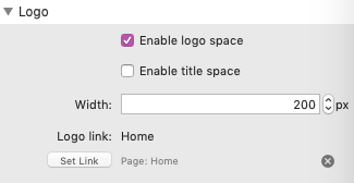
In the “Logo” tab we can optionally disable the logo. There is also an option to enable an extra stacks space to add a text title. This will force the logo section to be smaller and is mostly useful for square logos with text titles.
The “Width” setting defines the width of the entire logo space. If you are only using an image, you can use this setting to adjust the size of your logo.
The “Logo link” is where you can add a link to your logo. Typically you will want to set this link to your website’s homepage.
After the logo is setup, our menu is complete.
Same Page Navigation
The Clean Menu stack link’s support navigating to sections found on the current/same page. You will just need to know the ID of the element you want to navigate to.
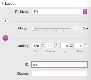
You can find the ID of a section using the developer tools of any browser or set an ID using a stack that allows you to assign your own. The Layouts stack supports setting an ID (as of version 1.0.4) so we will be using that stack in this example.
We will add 3 Layouts stacks to the stacks page. Each one will represent a different section: Top, Middle, and Bottom.
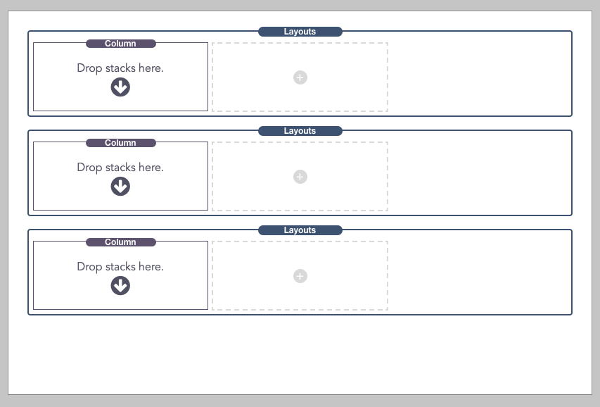
In the Settings Menu “Layout” tab of each Layouts stack we will assign a unique ID. The ID is case sensitive and must not contain any spaces or special characters other than dashes “-” or underscores”_”. We will simply ID our sections “top”, “middle”, and “bottom”.
Now we will add the Clean menu stack to the top Layouts stack and enable the “Sticky”, “Custom menu items”, and “Custom menu items only” options. Sticky will ensure that the menu is always available for navigating to new sections.
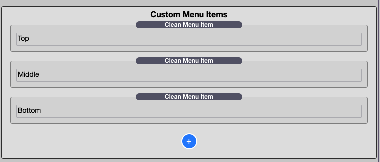
With the Custom menu items enabled we will add three items, each one titled appropriately.
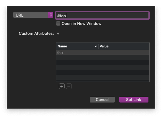
Next we need to click on each item and use the “Set link” button. In the link dialog window, type a hash symbol followed by the unique ID of the relevant section.
Finally, we just need to add our website content to each section. It’s important to keep all of our content inside these 3 Layouts stack sections so that the “Current” menu item can highlight properly depending on where the page is currently scrolled.
The menu will now automatically scroll to each section when each of the menu items are selected.