Text & Image Setup Example (Using Stacks 4)
Drag and drop the stack into the editor to get started.
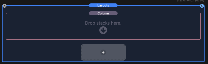
By default a single column stack will be present in the main Layouts stack (The main Layouts stack is highlighted in blue in the screenshot above). Though the Main Layouts stack has column and sizing settings, it’s recommended that you leave those settings set to their default values and use the inner column stack settings instead. The main Layouts stack serves as a complete content section where you define the background color/image and add padding to separate it from other content sections.
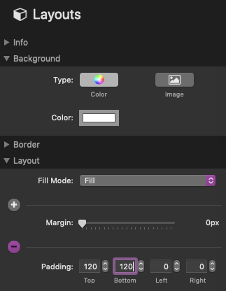
For our example we will be adding 120px of padding to the top/bottom and setting the background color as white.
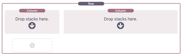
Next we will select the preloaded column stack and change it to a row by using the “Content” setting. After that we will change the “Column count” to 3.
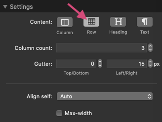
We can then click on the + icon in the stacks editor to automatically add 1 more inner column stack.
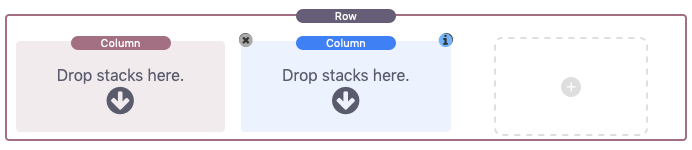
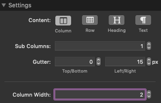
Each column can have their own sub-columns and can also be adjusted to take up variable widths based on the column count of the parent “Row” stack. In our example we are going to expand the second column by changing its “Column Width” setting to 2. This means it will take up 2 of 3 columns spaces or 2/3 of the entire row (The 3 in 2/3 was defined when we set the parent Row stack column count to 3).
From here we can optionally add more column stacks to create other unique layouts inside this row. In our example we are going to click on a + icon to add 2 more stacks and use the “Content” setting to change them into a heading and text stack. We can then move those two stacks into the first column.
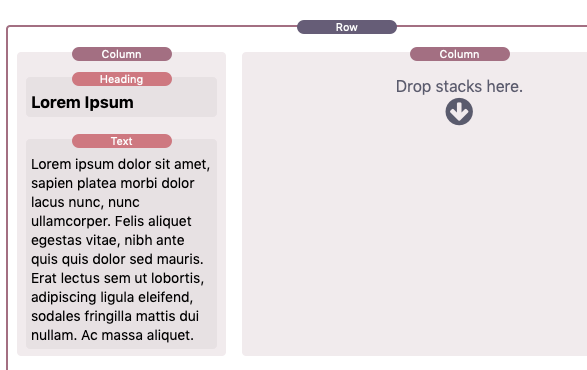
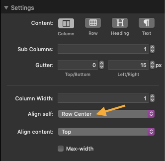
In the second 2/3 column we will add an image. By default, each column’s content will align to the top of the Row. In our example we want the text to align to the middle of the image we have added. To achieve this, select the first column and change the “Align self” setting to “Center”.
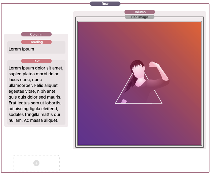
We have now created a simple image and text section. See the Stack settings section below to learn more about the different things you can do with the Layouts stack.
Stack Settings
Layouts (Main stack)
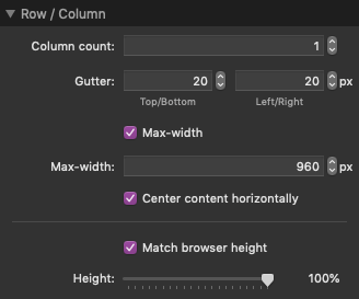
Column count – The amount of columns that will appear on one row. This value should be set higher if you wish to create mixed column widths. The inner column stacks width are set by units based on this value.
Gutter – The space between the columns in pixels.
Max-width – Optionally declare a maximum width to the content. This option is useful when used with the included Blank theme or inside of a stacks framework.
Match browser height – Optionally force the minimum width of the section to match the browser height by percentage.
Layouts Item (Column stack)
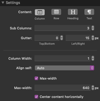
Content – Choose between 4 options. “Column” is default and can contain all other stacks inside it. “Row” is like column but will automatically fill an entire row regardless of what column width is set for the stack. “Heading” is a quick add option if you would like to add a header stack. The contents of this stack can be edited as styled text (color, text alignment, etc) unlike the built-in header stack. “Text” is a quick add option if you would like to add a styled text stack.
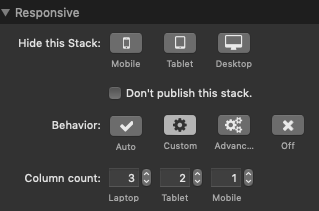
Sub columns – Like the “Column count” setting in the main stack, this will set the amount of sub columns that appear on one row. If this value is above 1 it will also add an additional setting found in the “Responsive” section (detailed below).. Note: If the value is increased above the default, the content will reset, be sure to add your content after setting this value.
Gutter -Like the “Gutter” setting in the main stack, this adjusts the space between the sub columns in pixels.
Column width – Set the width of the column in units based on the “Column count” in the main stack. If this value is 0, it will automatically fill an entire row’s width, this is useful when creating headings. If the main stack “Column count” is 3, setting this value to 2 would take up 2/3 of the width of the row. If the main stack “Column count” is 6, setting this value to 2 would take up 2/6 or 1/3 of the width of the row. Setting a high column count on the main stack is useful for creating more detailed column widths.
Align self – This sets how the column itself aligns vertically to the other columns in the row. The default setting “Auto” will not align the column but rather stretch the column to match the height of the other columns. This can only been seen if a background color is set to the column. See below for a visual example of the remaining options.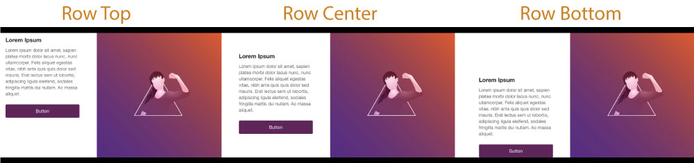
Note: The column must be shorter in height than one of the other columns in the row for these options to have any effect. Like in the example above, the images are already at both the top and bottom of the row and cannot be aligned.
Align content – This setting is only available in column stacks without sub-columns. This sets how the content aligns vertically inside of the column. See below for a visual example of the options.
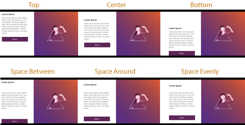
Note: The column content must be smaller than the total height of the column for these options to have any effect. A column with content equal to the height of the column has no space to align.
Responsive: Behavior – This setting is only enabled when the column stack “Sub columns” or “Column count” is greater than 1. It will allow you to declare custom behavior for the columns contained in this stack. “Off” is default and will keep the column count the same no mater what width the browser is. “Auto” will adjust the contents automatically for each device. “Custom” will allow you to set a custom column count for each device. “Advanced” allows you to create even more advanced layouts as well as set a different layout for each device.
Using the advanced responsive behavior setting
Enable advanced responsive behavior
The “Behavior” setting is only enabled if the column stack (Layouts Item) column count or sub column count is above 1.
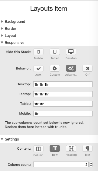
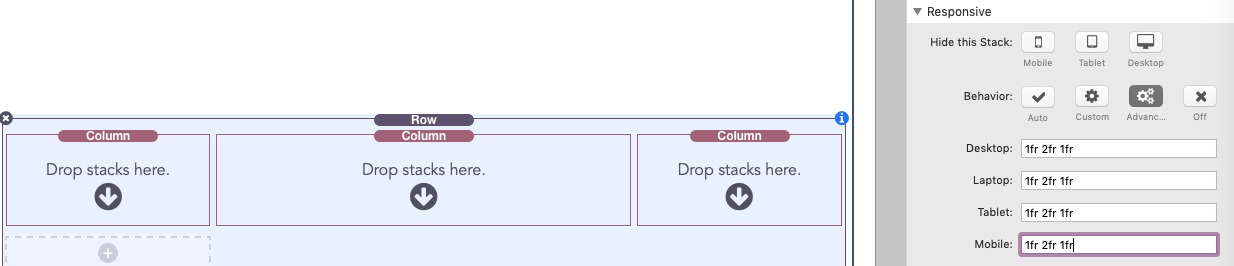
When the responsive behavior is set to “Advanced” you are presented with 4 input fields. Each field controls the layout for a different device. When advanced is selected the sub column or column count is ignored and the “Desktop” field now controls the column count. By default, the fields use “fr” units, we will refer to these units as fractions. 1fr = 1 fraction.
Using fractions widths
Each device field allows you to set custom widths for each column in a row. Each width should be declared in a pixel value (200px) or as a fraction (1fr) separated by a space. The more widths you declare the more columns a row will have. The value “1fr 1fr 1fr” will translate to 3 columns, each will be 1 fraction of the width of the row, this means you will have 3 evenly wide columns.
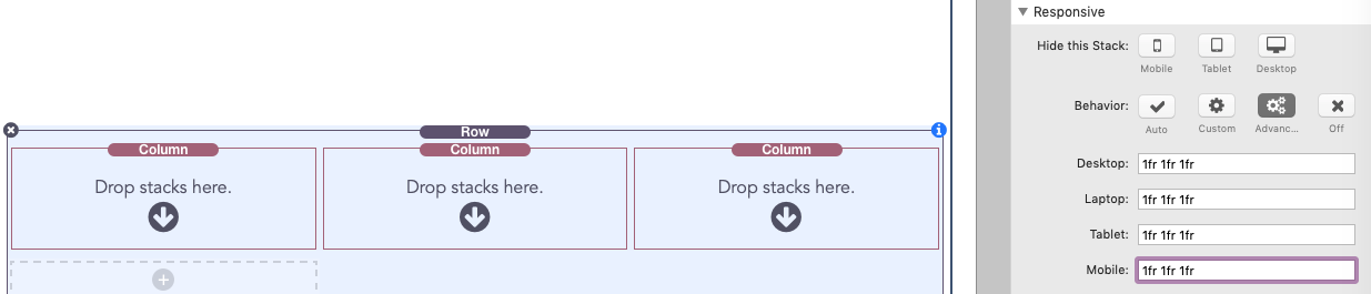
You can increase the value of the fr units to increase the width of a single column. The value “1fr 2fr 1fr” will translate to 3 columns with the center column being twice as wide as the left and right columns.
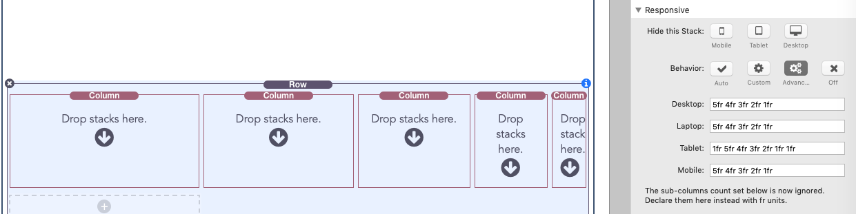
To calculate the width of a column just divide the value by the total fr units added up. The value “5fr 4fr 3fr 2fr 1fr” will translate to 5 columns with varying widths. If you add all of the fractions up you will get 15. This means the first column will be 5/15 (or 1/3) the width of the row. The remaining column widths in order will be: 4/15, 3/15 (or 1/5), 2/15, 1/15 wide.
Using pixel widths
You are not limited to using fractions. If you need a column to be a specific width you can use a pixel value instead. The value “200px 1fr 1fr” will translate to 3 columns with the first column being exactly 200 pixels wide while the last two column are 1 fraction of the remaining space (which calculates to the last two columns being 1/2 of the remaining space each).
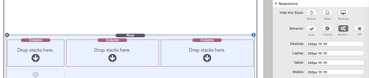
Each column can have a pixel width, but you will always need to include at least one fraction value to maintain responsive behavior. Each device field can have a different value, just keep in mind as you go down the fields you will have less and less room to play with.