Setup
After adding the stack to the editor, select the stack and open the Stacks settings panel in the inspector.
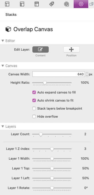
There are 3 main sections in the settings panel. In the section labeled “Editor” are controls that are only related to the Stacks editor, they will be gone over later in the tutorial. The “Layers” section is where you can adjust position and size of 1-6 layers of content, but first we will want to look at the “Canvas” section.
Defining Canvas Size
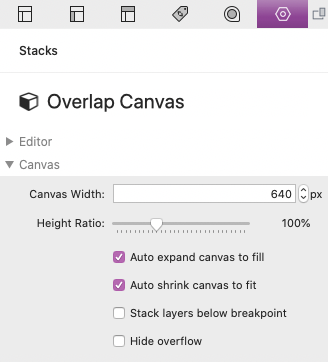
To get started, you must define the size of the canvas. The width is defined in pixels while the height is a ratio to the width in percentage (100% is a height equal to the width, while 200% would be a height double to the width).
You can think of the size of the canvas more like an image rather than as typical stacks content. For example, in typical stacks content, a narrow browser/device width causes the width of the content to decrease but the size of text does not change (leading to new line breaks and an increase in the height of the content).
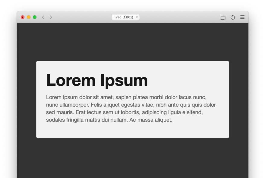
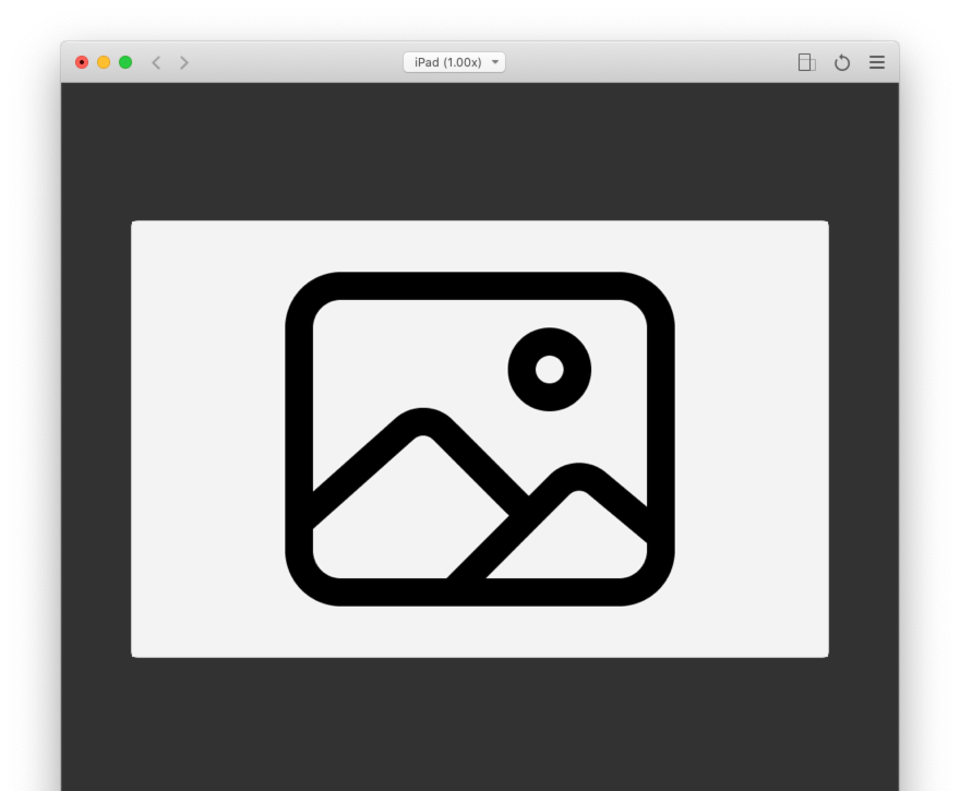
768px wide device:
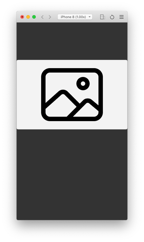
375px wide device:
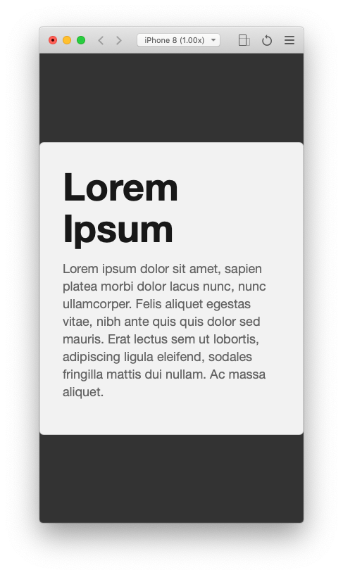
This is not the case with the canvas which will instead respond more like an image.
768px wide device:
375px wide device:
All of the content inside of the canvas, even text, will scale down (shrink) proportionally. This is to keep the content layout/design the same across all devices. Just like how you should use an image with a width at least equal the size you want it to display at, you will want to do the same with the canvas width. By default the Canvas Width is set to 640px, which is about half the content width of most themes. With a height ratio of 100% this would create a square canvas perfect for a two column layout. If you were creating a full content width canvas you could use values between 960px to 1440px.
Note: The canvas width does not need to be exact, it will scale automatically to fit whatever container you have placed it in.
Here are common aspect ratios converted to percentages that you can use for the Height Ratio field:
- Square – 100%
- Portrait Photograph – 150%
- Landscape Photograph – 66%
- Fullscreen – 75%
- Widescreen – 56%
In some cases, you may not want the canvas to scale according to container or browser/device width, so there are options provided to change the behavior.
Defining Canvas Behavior
Below the canvas size settings are a few checkbox options.
The first, “Auto expand canvas to fill” is enabled by default. This option will allow the canvas, text included, to scale up (expand) to fill its container if the container is larger than the canvas’ defined width. Disable this option if you don’t want the canvas to display any larger than the width you have defined. Once disabled you will be provided with an alignment setting to define where content displays horizontally.
The next option “Auto shrink canvas to fit” is also enabled by default and handles the opposite case. When the width of the container or browser/device is smaller than the canvas’ defined width it will scale down (shrink) proportionally to fit. Disabling this option will prevent the canvas from displaying any smaller than the width you have defined. The canvas will instead flow outside of its container. This can sometimes be desirable when the canvas only contains visual non-interactive content that does not scale down well.
The 3rd option “Stack layers below breakpoint” allows you to define a browser/device width at which the canvas is removed. When the canvas is removed the canvas layers will instead display one by one stacked on top of each-other. This is useful when the canvas contains any interactive content that does not scale down well.
Lastly, the “Hide overflow” option will turn off the canvas overflow, meaning any layer content that extends past the edges of the canvas will be clipped or cut off. The theme or framework you are using must support overflow content, if not, some layers that extend outside of the canvas may still clip.
Adding Content & Layers
In the settings panel “Layers” section is a slider that allows you to define how many layers your canvas will have. You can have up to 6 layers of content. Each layer has a corresponding and labeled “Drop stacks here” area in the Stacks editor. You can add any stacks content to each layer as you need.
Positioning Layers
Each layer has a few slider controls associated to them, but before you start using them you will want to check out the previously mentioned “Editor” section in the settings panel.
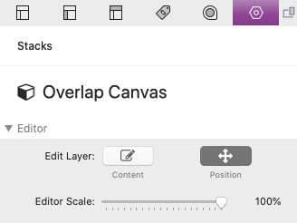
By default, the Edit Layer option is set to “Content”. Changing this to “Position” will remove the your ability to add or edit the layer content and instead put the stack in positioning mode. In this mode you can see a representation of the layers as they will display when published or during preview. This allows you to see a live representation of the layers as you adjust things.
Position mode also has a slider control for adjusting the size of the canvas in the editor titled Editor Scale. The canvas is scaled to 50% by default so you can move layers outside of the canvas and still see them. It is also good to scale the canvas when the RapidWeaver app window is smaller than the size of the canvas you are working with.
Each layer has 5 slider controls:
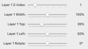
- Z-index: Adjusts the z position of the layer, a higher value will allow the layer to display over top of lower z-index value layers.
- Width: Adjusts the width of the layer in relation to the width of the canvas. If the canvas width is 640px, 100% would be equal or 640px wide, 50% would be half or 320px wide, and 200% would be double or 1280px wide.
- Top: Adjusts the y position of the layer. The position is relative to the center of the layer.
- Left: Adjusts the x position of the layer. The position is relative to the center of the layer.
- Rotate: Adjust the rotation of the layer. Rotation is relative to the center of the layer.
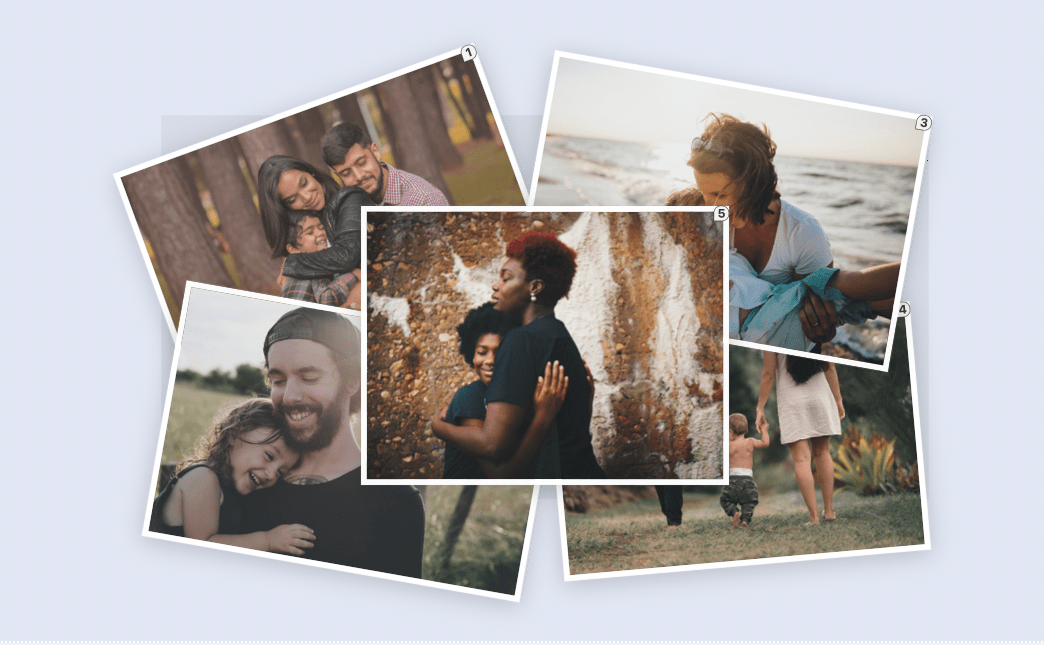
Each layer is marked with a number and light bounding box to help you keep track of the layers as you edit. The canvas is also represented with a darkened background and border to help you keep things aligned correctly. Any layer content that extends past the edge of the canvas will overflow overtop of content around the canvas (Unless it has been disabled with the “Hide overflow” option). This can be done intentionally to create layouts that overlap content outside of the canvas. The theme or framework you are using must support overflow content, if not, some layers that extend outside of the canvas may clip or get cut off.
Last thing to note is that in position mode the content may not display 1:1 as it would in preview or when published due to the nature of how some stacks display while in edit mode. It is recommended to switch to preview mode after you are finished editing to ensure everything is positioned correctly.