Background/Banner Settings
After adding the stack to the editor, select it and navigate to the Page Inspector > Page Tab > Settings Menu > Banner section.
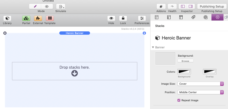
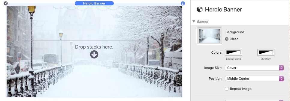
To add a background image simply drag and drop an image into the Background area or us the “Browse” button.
Beneath the background setting you can optionally set a Background Color if you are not using an image or if the background image is partially transparent.
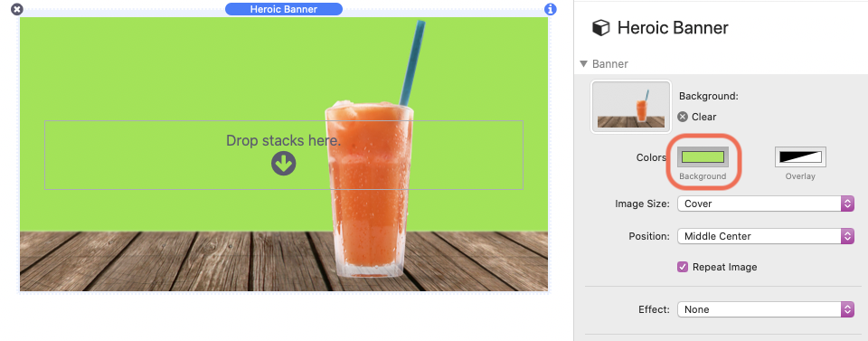
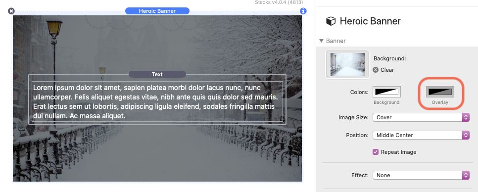
The optional Overlay Color should be set to a semi transparent color and will apply over top of the background image. This is useful if you need to darken or lighten the background to increase contrast between the image and any content added to the stack.
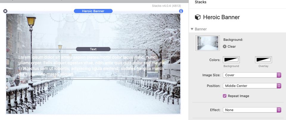
You can adjust how the background image fits by selecting any of the following Image Size options.
Cover
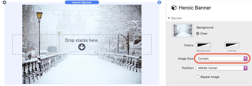
Scale the background image to be as large as possible so that the background area is completely covered by the background image. Some parts of the background image may not be in view within the background positioning area.Contain
Scale the image to the largest size such that both its width and its height can fit inside the content area.Fit to Width
Scale the background image so that the left and right sides of the image fit to the width of background area. The left and right of the image will always be visible. The image may be cropped vertically or the image may repeat in the vertical direction, depending on the size.Fit to Height
Scale the background image so that the top and bottom of the image fits the height of background area. The top and bottom of the image will always be visible. The image may be cropped horizontally or the image may repeat in the horizontal direction, depending on the size.Actual Size
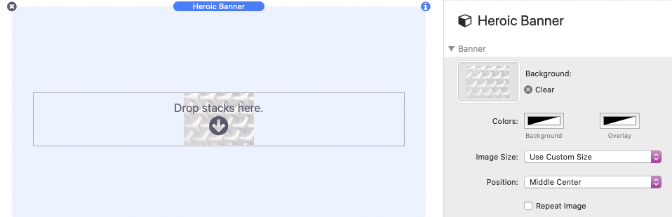
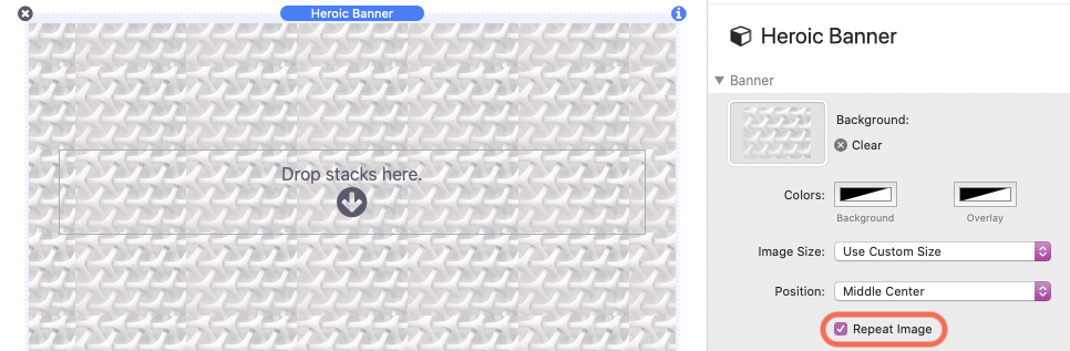
The image will not be scaled and will display at it actually resolution. The image may be cropped on all sides or repeat vertically and horizontally, depending on the size. This option is good for patterns.Use Custom Size
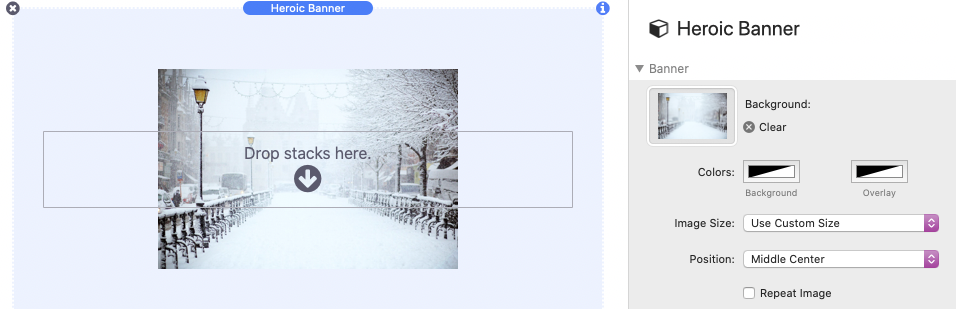
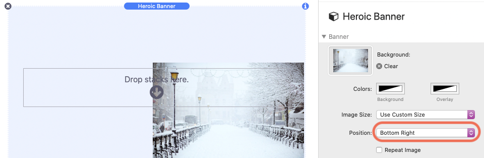
Declare a set height and width of the image. The image may be cropped on all sides or repeat vertically and horizontally, depending on the size. This option is also good for patterns.
Adjust the background image position with the Position setting.
If the image you are using should display as a pattern, you can enable Repeat Image to have the image duplicate in all directions.
By default the Effect option is set to “None”. There are 8 effect options that you can choose from. Options that begin with “Auto” animate automatically, options that begin with “Mouse” rely on the position of the mouse to animate, and options that begin with “Scroll” rely on the browser scroll position to animate.
Note: Animations are disabled in edit mode, you must switch to preview mode to test the effect animations.
Some Effect options have additional settings, below are descriptions for them.
Auto – Animation: Direction
Change the direction the image animates.Auto – Animation: Animation Speed
Increasing this value causes the animation to move more quickly.Auto – Gradient: Colors 1 & 2
These set the color of the gradient inside of the background area. The color values support opacity, especially useful when also using a background image.Auto – Gradient: Stop Points
Adjust at what point colors 1 & 2 overlap.Auto – Gradient: Orientation
Change the direction or shape of the gradient.Auto – Gradient: Animate Gradient
Enabled by default, this option makes the gradient transition from color 1 to color 2 and back continually.Auto – Gradient: Animation Speed
Adjust how quickly Animate Gradient transitions between colors.Mouse – 3D Parallax: Nearness
Adjust how far away from the background the content sits in 3D space. A higher percentage brings the content closer to the screen.Mouse – 3D Parallax: Rotation
Adjust how the rotation of the background and content in 3D space by degrees. A higher degree will increase the rotation.Scroll – Frosted Glass: Blur Amount
Adjust how much blur is applied to the transparent content. Note: the content must have an opacity value lower than 90% to display.Scroll – Parallax: Parallax Speed
Adjust how fast or slow the background image moves in relation to the browser’s scroll speed.Scroll – Transition: Switch Point
Adjust how far from the top of the browser the stack should be before it fades the background image out and the transition image in. Setting the value to 1px will mean the image will not transition until the stack is 1px away from the top of the browser window.Scroll – Transition: Animation Speed
Change how fast the image blurs out and in.Scroll – Transition: Transition Image
Set an image to transition to whens the Switch Point has been reached.
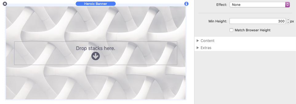
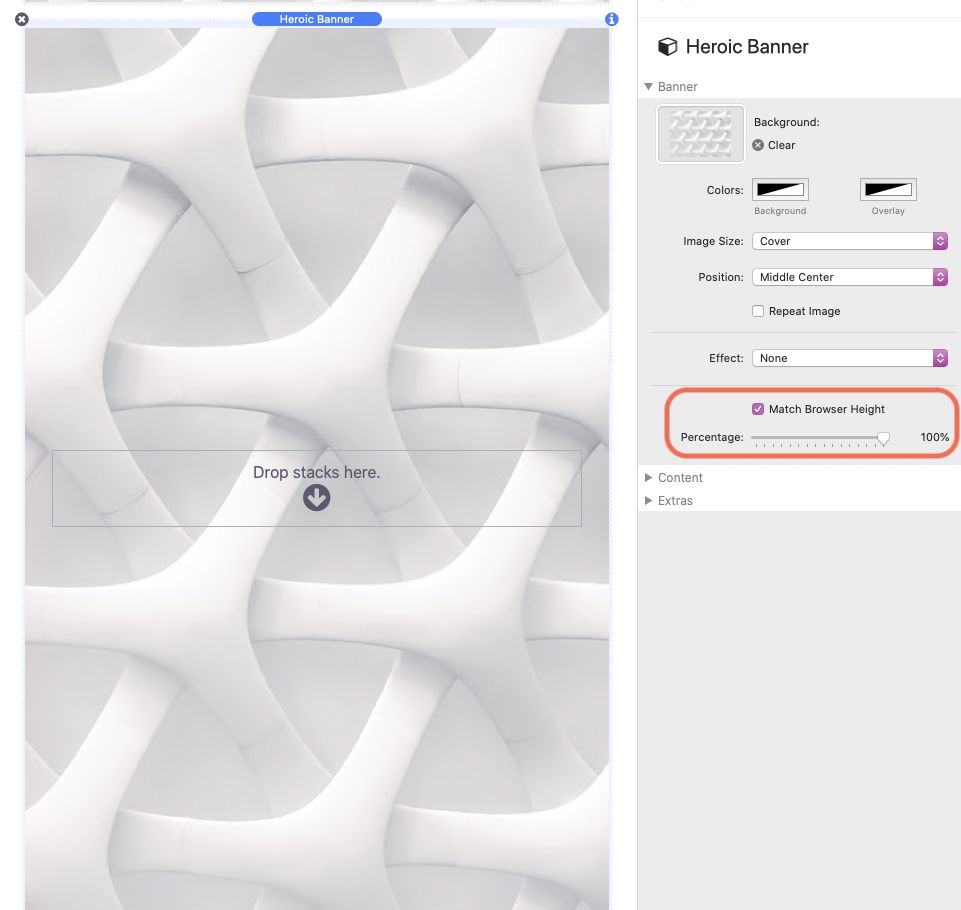
The Min-Height setting is used to set the minimum height of the background. The content will always remain vertically centered inside of the the background. You can also alternatively set the min-height to match the height of the browser window with the Match Browser Height option. This will make sure the background fills the entire browser window regardless of the size or dimensions of the device. You are also provided a Percentage setting that you can use to have the height only match a portion of the browser.
Note: This Min-Height only sets a minimum height. If the content would cause the height to exceed the set value the background will expand beyond it.
Content Settings
Select the Heroic Banner stack and navigate to the Page Inspector > Page Tab > Settings Menu > Content section.
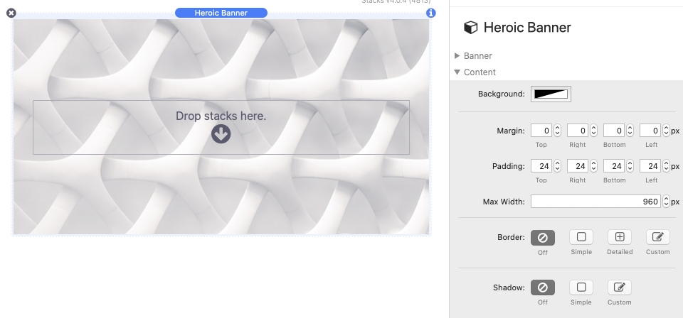
You may add any desired content to the Drop stacks here section of the Heroic Banner stack. That content will be automatically centered (horizontally and vertically) inside of the background/banner area.
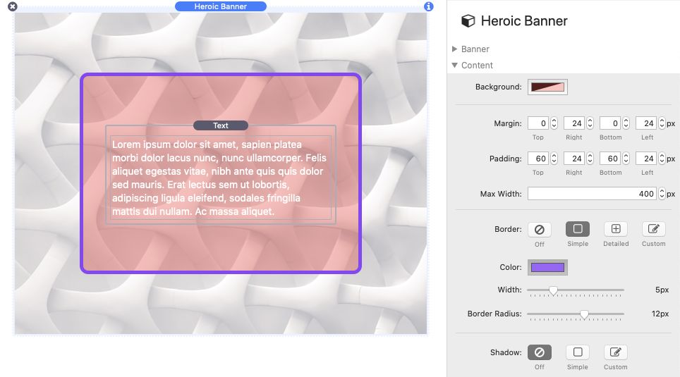
The Background color setting allows you to add an optional background color to the content.
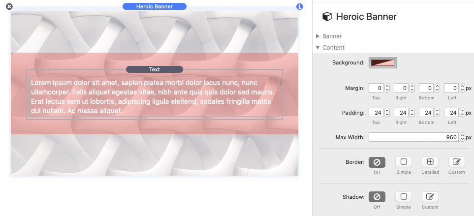
Margin adjusts the space on the outside of the content background.
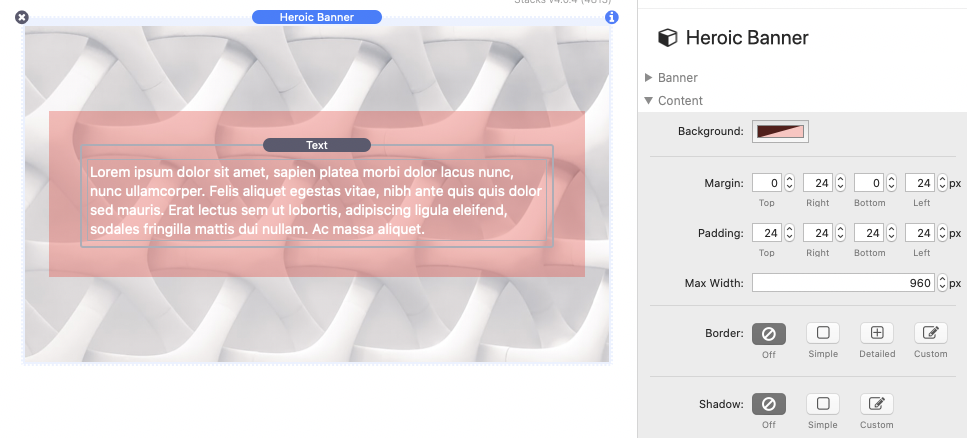
Padding adjusts the space on the inside of the content background.
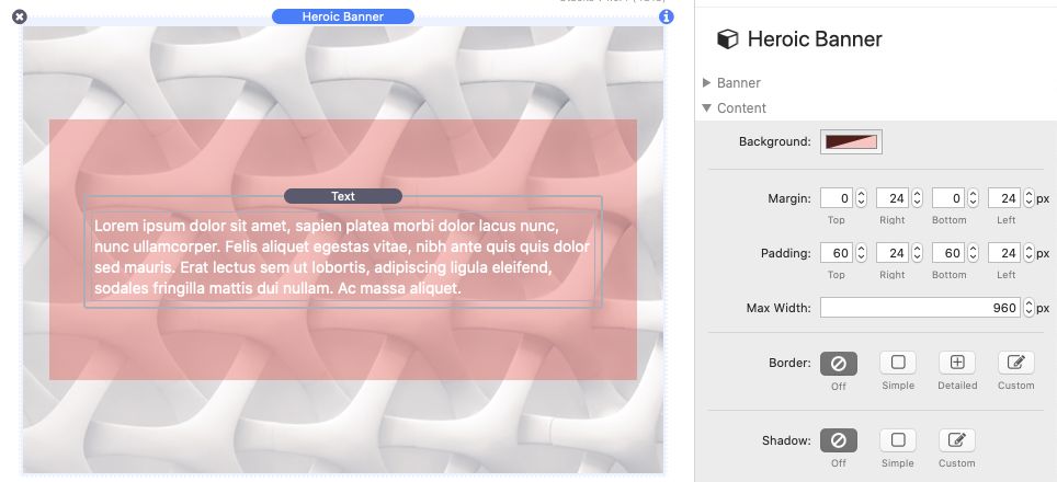
The Max-Width setting is used to set the maximum width to the content. The content will always remain horizontally centered inside of the the background.
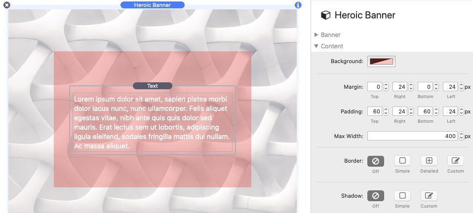
Note: The Max-Width only sets a maximum width. If the browser window with is less than this value the content will fill all available space.
Adjust the border and border-radius (corner rounding) of the content background with the Border settings.
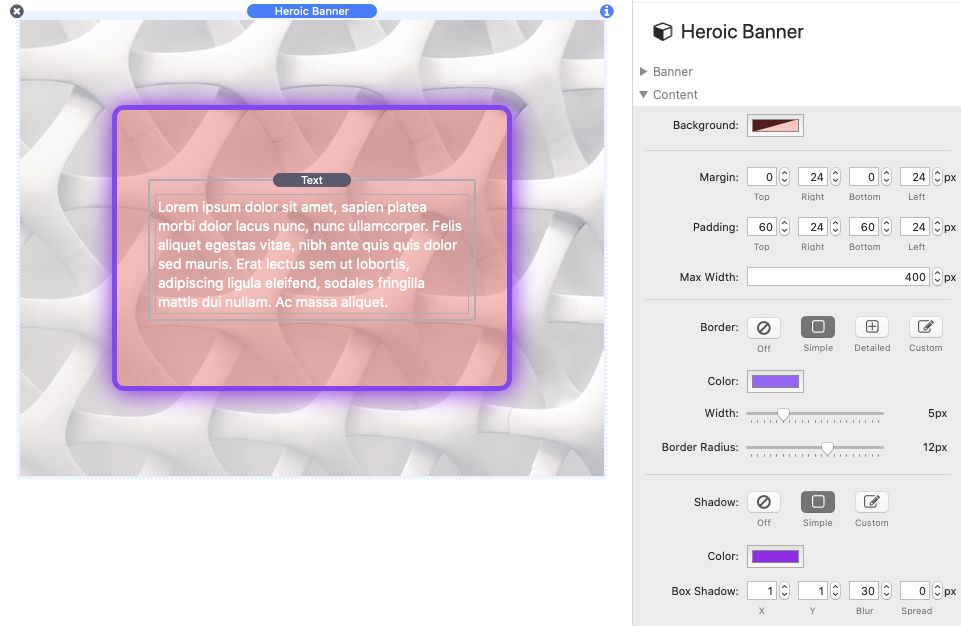
With the last content setting Shadow, you can optionally add a custom colorable shadow to the content background.
Extra Settings
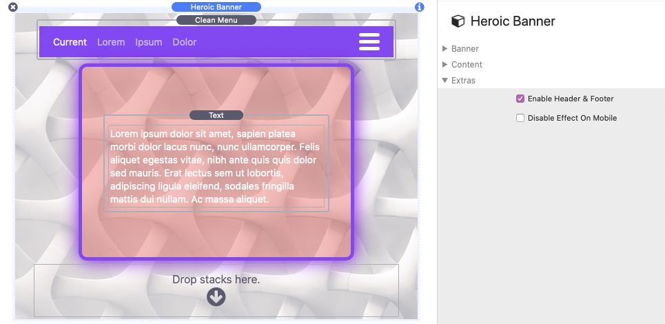
Select the Heroic Banner stack and navigate to the Page Inspector > Page Tab > Settings Menu > Extras section.
Use the Enable Header & Footer setting to add two additional Drop stacks here sections to the top and bottom of the background. These areas are unaffected by the content settings defined above and are useful when you need to add custom content (like a menu bar for example) to the top or bottom of the background area.
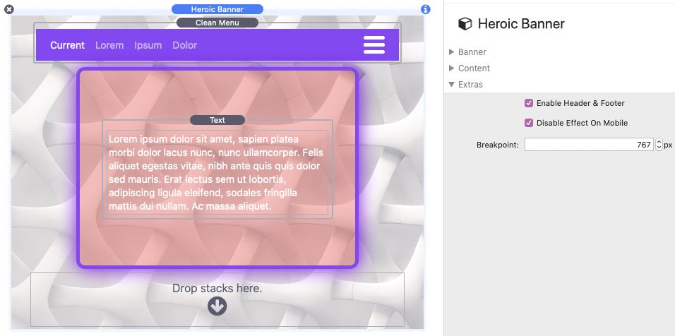
Some Effect options may need to be disabled on smaller mobile sized screens. Use the Disable Effect On Mobile option to turn the effect off based on screen width. When the effect is disabled the animation will not animate on any width below the defined Breakpoint.
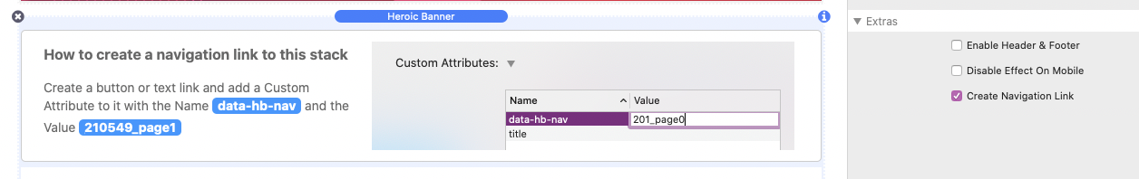
The Create Navigation Link option will display instructions on how to setup a link that will make the browser window scroll to the stack’s location.