Greater Than Less Than Comparisons
Using Import IDs in Custom Expression Formula Segments
Setup
This tutorial will lead you through the set up of a custom calculator that displays the cost of a hypothetical 199.99 product. The total price output will be based on quantity needed, selectable extras, a slider for adding a ‘tip’, and a checkbox used to offer warranty.
Add the Stack to the Stacks page
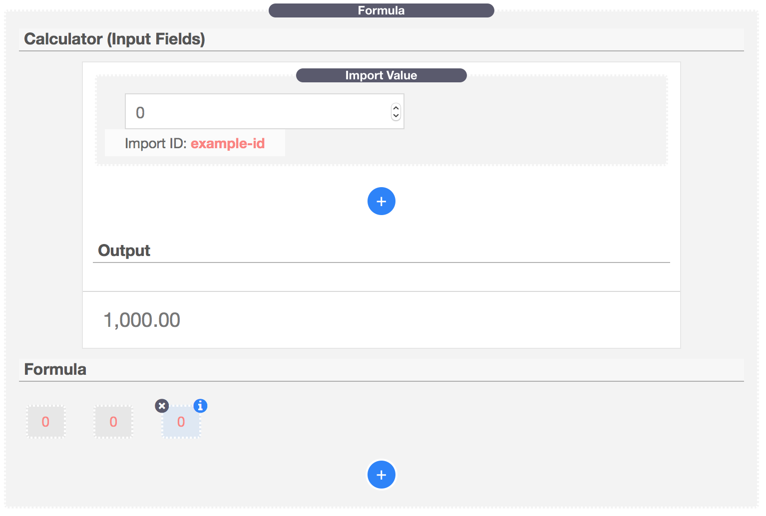
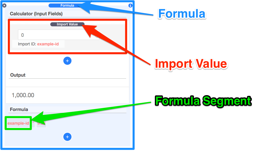
After adding the Stack you will see two sections, one labeled “Calculator (Input Fields)” at the top and another labeled “Formula” at the bottom. The “Calculator” section is where all of the usable input fields will be declared. The “Formula” section is where the math used to calculate the output will be declared, this section is only visible in edit mode while the “Calculator” fields will be visible and usable by page visitors.
Add Input Fields
Number Input
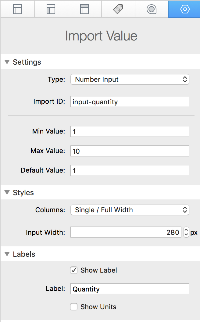
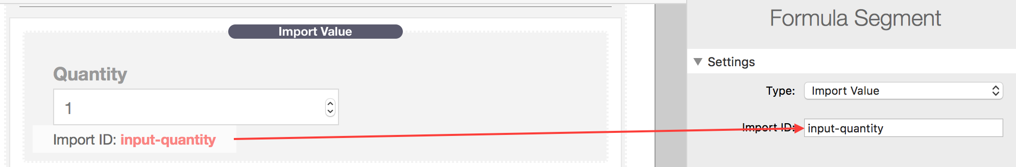
First we will create the Quantity input field. Click on the “Import Value” segment found in the “Calculator” section. In the settings panel found to the right of the RapidWeaver window, leave the “Type” option set to “Number Input” and change the “Import ID” to a unique value. It should start with an alphabet and should only use [ a-z A-Z 0-9 _ – ] characters. For our example we will call it “input-quantity” in order to make it intuitive when reading the formula later on. Set the “Min Value” to “1” so that the user has to at least order at least 1. Our “Max Value” will be set to “10” to put a limit of 10 units to purchase. Set the “Default Value” to “1” so that it is automatically that value when the page loads. Finally, enable the option titled “Show Label” and add the title “Quantity”. We will ignore the “Styles” and “Output” options for now (they will be gone over in the “Settings & Styles” tutorial below).
Select Field
Next, add a new “Import Value” segment by clicking on the blue plus button found in the “Calculator” section. Change the “Type” option to “Select”. This will be our selectable options field. Just like the “Import Value” segment before, create a unique “Import ID”, we will call this one “input-options”. Enable “Show Label” and add the title “Options”. Now in the editor, we can add the selectable options. The “Import Value” now has it’s own blue plus button for adding more selectable options. Click the add button 3 times to add 3 more options for a total of 4. You can click each segment to change the title and selected value. Change the first segment to “No Extras” and in the settings panel set the “Value” to “-5” (This will subtract 5 from the total cost if this value is selected). Note: the “Value” field accepts numbers (99), negative numbers (-5), and decimal values separated with a period [.] (12.99). The value must be a numerical.
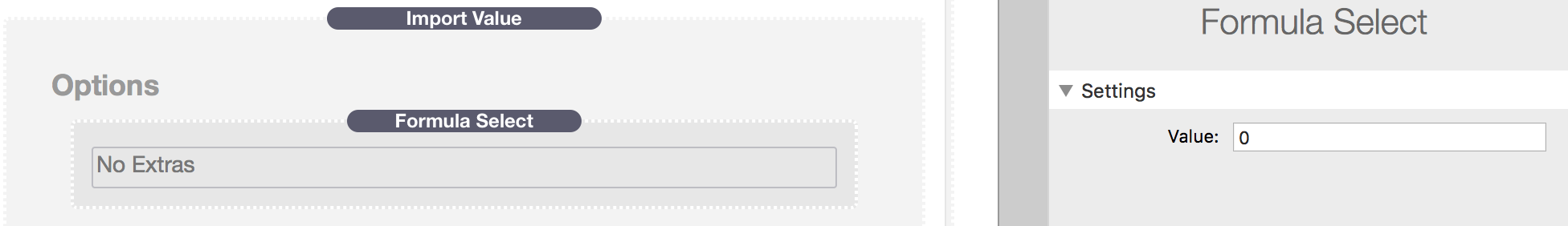
We will update next three select segments with these values:
Title=Extra Paper | Value=0
Title=Extra Paper and Pencils | Value=5
Title=Full Kit | Value=30
To pick which select option is enabled by default, drag the value you want to the top of the Select list. We will leave “No Extras” as the default value.
Checkbox
Add add a new “Import Value” segment. Set the “Type” to “Checkbox” and the “Import ID” to “input-warranty”. The “Text” option is the text that displays next to the checkbox, let’s change it to “Warranty”. In the formula to be created later, this field will multiply the total cost by 20% and add it to the total if enabled. We will need to set the “Disabled Value” to “1” (The total multiplied by 1 equals no change to the total value) and the “Enabled Value” to “1.2” (The total value multiplied by 1.2 will increase the value by 20%, 0.2 is 20% in decimal form, adding 1 to that value keeps the original value when it’s multiplied). We don’t wont this field to be enabled by default, so leave the “Start Enabled” option disabled.

Slider
Add add a new “Import Value” segment. Set the “Type” to “Slider” and the “Import ID” to “input-tip”. We want to allow the user to add a 0-20% tip so set the “Max Value” to “20” and the “Default Value” to “0”. Leave the “Step” value on “1” so they can choose any value between 0 and 20. Enable “Show Label” and put the title “Include a Tip”. Also enable the “Show Units” options and place a percent symbol [%] in the “Units” field. Note: The Slider type does not allow decimal or negative values.

Note: In version 1.0.1, the slider now accepts negative and decimal values in these settings: Min Value, Max Value, Default Value, and Step.
Now we have added all the of the fields we want the user to fill in, we just need to create the formula that calculates the total cost.
Add Formula Segments
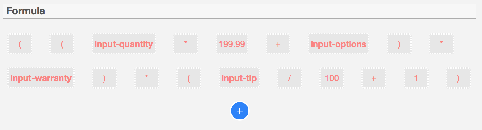
First it is best to write out the formula and then type it into the “Formula” section after we have it laid out how we need it to be. If you need a refresher on the Order of Operations check out the link here. Here is the formula for our example:
((input-quantity * 199.99 + input-options) * input-warranty) * (input-tip / 100 + 1)
Note: The Slider type (Import ID: input-tip) does not allow decimal values. We will need to divide it’s value by 100 to turn it into a percent value in decimal form and add 1 in order for it to calculate the total correctly. (input-tip / 100 + 1)
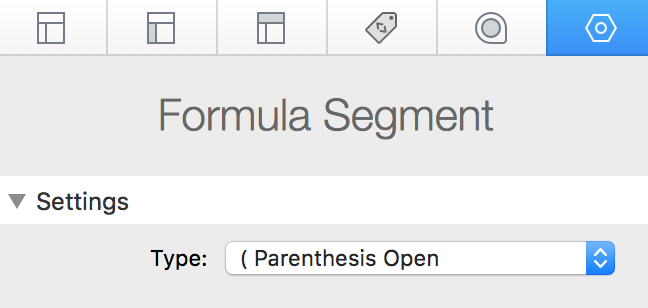
In order to add the formula you must first add “Formula Segments” by clicking the blue plus button found in the “Formula” section. These segments are the numbers, math symbols, and values to be imported from the input fields found in the “Calculator” section. Each segment has a type that can be declared in the settings panel to the right of the RapidWeaver window. Our first two segments will be open parenthesis symbols [(].
These formula segments can be dragged and dropped into any order after they have been created/added.
Helpful Tip: When dragging a segment, It’s best to place the segment over the the bottom right corner of the segment you want to place it in front of. Alternatively, you can place it over the top left corner to have it be placed behind the segment you are hovering over.

Next we will want to import a value in the next formula segment. Set the “Type” to “Import Value” and in the “Import ID” field put the ID of the corresponding “Import Value” segment from the “Calculator” section. In our example it is “input-quantity”.
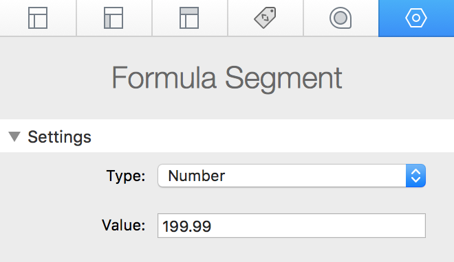
Next insert two more formula segments and set the first to “Type” to “* Multiply” and the second “Type” to “Number”. In the Number “Value” field add “199.99”.
Continue to move each part of the formula laid out above until the full formula has been added.
Setup is complete, you can now switch to preview mode to see the calculator in action. In the next tutorial we will go over all of the settings and styling.
Alternative Input Method V1.1.0+
Formula Segments can now be condensed together by using the option “Custom Expression”. You can type out entire formulas in a single segment if you wrap import IDs with brackets ([input-quantity]).
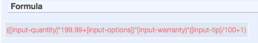
Note: If you see errors reporting that any of the “Import Values” are missing, check for typos in the “Import IDs”.
Settings & Styles
The Formula Stack has three major parts each with their own settings panels. Below we will go over the options found it each one.
Formula
This settings panel is where you will find all of the style options (Calculator, Input Fields, and Output).
Calculator
Calculator Theme – Choose between 3 different Themes with limited customization options or “Custom” which will enable more styling options.
Max Width – This sets the width of the Calculator. When the window width is smaller than the set value, the calculator will fill 100% of the width. When the width is greater than the set value the calculator will center itself in the available space.
Background – Set the background color of the the Calculator.
Border Style (Custom) – Change the display type of the Calculator border.
Border Color (Custom) – Individual color settings for each side of the border.
Border Width (Custom) – Individual width settings for each side of the border.
Border Radius (Custom) – Individual rounding settings for each corner of the Calculator.
Box Shadow (Custom) – Declare a shadow using four settings. “X” moves the shadow to the right with a positive value and to the left with a negative value. “Y” moves the shadow downward with a positive value and up with and negative value. “Blur” adjusts how sharp the shadow is, 0 means no blur, 10 means 10 pixels of blur. “Spread” adjust how large the shadow is, a positive value increases the size while a negative value decreases the size.
Shadow Color (Custom) – Set the color of the Shadow.
Input
Input Padding – Adjust how much space sits around the text inside the input field and to the inside of the input field’s border. “T – B” controls the top and bottom and “R – L” controls the right and left.
Font Family – Declare a custom font for the input. “inherit” will use whatever font the theme has set for the page.
Font – Set the font size and line height of the input field text. The “Line Height” value should be greater than the “Size” value.
Text – Individual color settings for the Input text, Labels, and Units.
Font Weight – Set the thickness of the Input text.
Input Bg (Custom) – Set the color of the input background.
Border Style (Custom) – Change the display type of the Input field.
Border Color (Custom) – Individual color settings for each side of the border.
Border Width (Custom) – Individual width settings for each side of the border.
Border Radius (Custom) – Individual rounding settings for each corner of the Input field.
Box Shadow (Custom) – Declare a shadow using four settings. “X” moves the shadow to the right with a positive value and to the left with a negative value. “Y” moves the shadow downward with a positive value and up with and negative value. “Blur” adjusts how sharp the shadow is, 0 means no blur, 10 means 10 pixels of blur. “Spread” adjust how large the shadow is, a positive value increases the size while a negative value decreases the size.
Shadow Color (Custom) – Set the color of the Shadow.
Output
Answer – Set where the outputted answer to the formula will display. “Show Answer / Calculator On / Calculator On” is default and will simply place the answer below the Calculator input. “Export Answer / Calculator On / Calculator On” will reveal more options and allow you to send the value to another Stack’s input field on the page. The last two options are meant to be used in conjunction when using multiple Formula Stacks on one page. “No Answer / Calculator On / Formula Off” will remove the the output all together (this is useful if you want to display the outputted answer somewhere other than underneath the Calculator). “Show Answer / Calculator Off / Formula On” will only show the answer with no Calculator section (Use the Formula section to import values from another Formula Stack).
Decimal Places – Set how many decimal spaces show for the decimal value. Set this value to 0 to not show a decimal value.
Separators – Change the symbol used as a Decimal (9.99) with the first input and the symbol used to group the numbers (1,000,000) in the second input.
Labels – Add a prefix or postfixed label by typing a value into either input field.
Show Title – When enabled, the “Title” input value will display above the output answer.
Font Family – Declare a custom font for the output. “inherit” will use whatever font the theme has set for the page.
Font – Set the font size and line height of the outputted answer.
Text – Individual color settings for the Answer value, Prefix, and Postfix.
Font Weight – Set the thickness of the Answer.
Field # (Show in an External Field) – Add the numerical value of the field you want to export the answer to.
Help: Show Field # in Preview (Show in an External Field) – Enable this option to see the numerical value of each of the external input fields found on your page while in preview mode. Locate the field you want to export to and copy the number into the “Field #” setting to have it display there. Make sure to disable this setting after obtaining the value you need.
Import Value
Import Values can be found in the Calculator section. Each Import Value has it’s own settings panel.
Settings
Type – There are six options to choose from, each will display a different input method. To learn more about the “Sub Formula” option, see the tutorial titled “Sub Formulas” below.
Import ID – Expects a unique ID. It should start with an alphabet and should only use [ a-z A-Z 0-9 _ – ] characters. This ID is then used to link this “Import Value” to a “Formula Segment”.
Min Value (Number Input & Slider) – The minimum value that can be entered into this field.
Max Value (Number Input & Slider) – The maximum value that can be entered into the field.
Default Value (Number Input & Slider) – The value that will display when the page is loaded.
Step (Slider) – The amount of steps the slider shifts by when moved left or right.
Text (Checkbox) – Add text that will display next to the checkbox.
Disabled Value (Checkbox) – The value imported into the formula when the checkbox is left unchecked.
Enabled Value (Checkbox) – The value imported into the formula when the checkbox is checked.
Start Enabled (Checkbox) – Enable this to have the checkbox start checked when the page is loaded.
Start Date Text (Date / Time Range) – Text displayed inside the start date field.
End Date Text (Date / Time Range) – Text displayed inside the end date field.
Language (Date / Time Range) – Set the language the pop up calendar date selector will display in.
Date Format (Date / Time Range) – Set an order for the day, month, and year to display in.
Week Starts On (Date / Time Range) – Choose which day of the week the calendar week starts on.
Enable Sunday-Saturday (Date / Time Range) – Disable or enable certain days of the week. Disabled days are not able to be chosen by the form user.
Include Time (Date / Time Range) – Include a time picker next to the calendar date selector.
Time Format (Date / Time Range) – Select a format for the time display.
Allowed Times (Date / Time Range) – A comma separated list of available times to select. Times listed here will show up for both the start end date time pickers.
Output As (Date / Time Range) – Will change the value imported into the formula based either on days, hours, or minutes.
Styles
Columns – “Single / Full Width” will set the width of the Input Field to fill the full width of the Calculator. “Two / 50% Width” will only fill half of the width of the Calculator and is only useful if the following “Import Value” field is also set to the same to create two columns.
Input Widths – The max width the field will display at.
Labels
Show Label – Displays a label for the field.
Label (Show Label) – Text displayed above the “Import Value” input field.
Show Units – Displays units for the field.
Units (Show Units) – text that will display to the right of the “Import Value” input field. If the input field is too wide for the units to display, they will be moved below the input field instead.
Output
Output Dates to External Fields (Date / Time Range) – Will allow you to set numerical values to output the dates and times to external fields.
Start Field # (Date / Time Range) – Add the numerical value of the field you want to export the start date and time to. Only works if “Output dates to External Fields” is enabled.
End Field # (Date / Time Range) – Add the numerical value of the field you want to export the end date and time to. Only works if “Output dates to External Fields” is enabled.
Output Value to External Field – Outputs the difference in days, hours, or minutes to an external field.
Field # (Output Value to External Field ) – Add the numerical value of the field you want to export the answer to.
Help: Show Field # in Preview (Output Value to External Field ) – Enable this option to see the numerical value of each of the external input fields found on your page while in preview mode. Locate the field you want to export to and copy the number into the “Field #” setting to have it display there. Make sure to disable this setting after obtaining the value you need.
Formula Segment
Type – Choose to import a value from one of the calculator fields or select a math symbol to use.
Import ID (Import Value) – Place the “Import ID” of the corresponding field that you want to add to the formula.
Value (Number) – A numerical value. Accepts decimals and negative values.
Expression (Custom Expression) – In this field you can add any of the supported math operators and or methods (listed in the “Formula Math” section below ). This field is also useful for condensing your formula.
Exporting Values to a Form
The Formula Stack allows you to export calculator values to 3rd-party form fields so they can be saved or used.
To do so, Click on the option “Output Value to External Field” in the “Import Value” settings panel. Then enable “Help: Show Field # in Preview”.
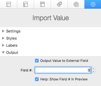
Switch to preview mode and you will notice that all of the fields (excluding those found in the Calculator) have numerical values. Find the field you want to export to and copy it’s field number.
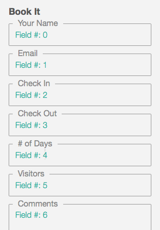
Switch back to edit mode and change the value “Field #” (in the “Import Value” settings panel) to the number you copied. Now when ever the field in the Calculator is changed, that field will automatically update with the current value.
Sub Formulas V1.1.0+
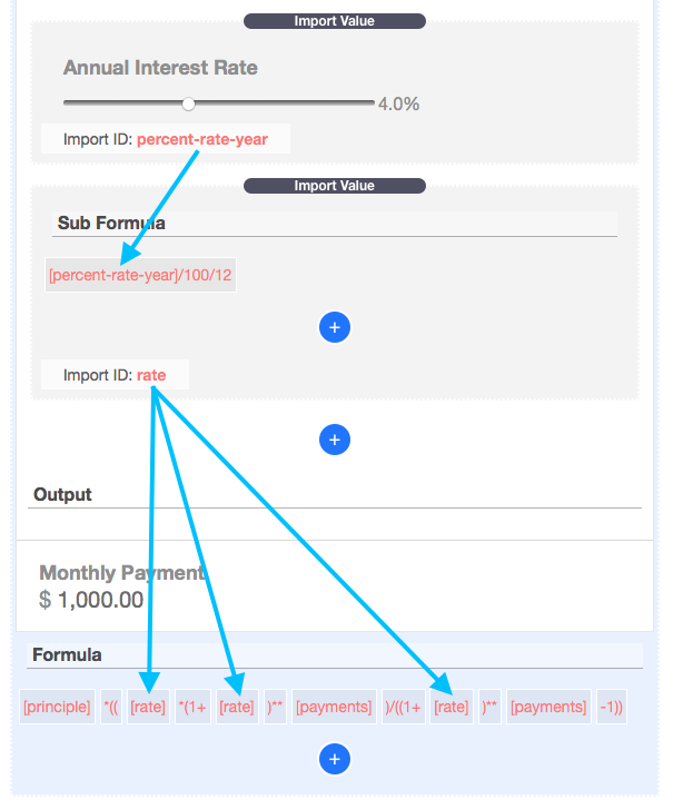
The Import Value Stack includes a type named “Sub Formula”. This will allow you to create a formula just like in the main Formula section, but the answer will be stored inside of and import ID that you can then use in other formulas on the page. This is useful when you need to repeat parts of a formula. Below is a Mortgage payment calculator as and example of when it is useful.
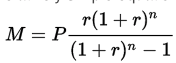
The mortgage formula when written in the Formula stack will appear as:
1+[principle] *((( [rate] /100/12)*(1+( [rate] /100/12))** [payments] )/((1+( [rate] /100/12))** [payments] -1))
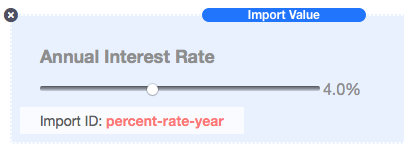
When we collect the “rate” in the calculator it’s determined as a percentage based on year (I.E. 4%) but the formula calls for the rate based on month and as a decimal value. 4% becomes 0.003333333, and now you can see why it’s better to have the user provide the yearly rate instead of the monthly rate. To get from 4% to 0.00333333 you first need to change the percent value to a decimal by dividing by 100.
[percent-rate-year] /100
Then it needs to be converted from a yearly rate to a monthly one by dividing by 12, with the final formula segment appearing as below.
([percent-rate-year] /100/12)
This formula segment is placed inside the final formula everywhere the Mortgage formula calls for the rate, but we can create a “Sub Formula” out of it so that we can call it just like we call in other Imported values.
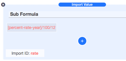
You would simply add the formula segment to the “Sub Formula” just as you would add a formula to the main “Formula” section. Create an Import ID (This example simply calls it “rate”). Now instead of typing out the full monthly rate out each time its used we can simply use [rate].
Formula Math
Supported Operators
+ Addition
Example: 2+2 = 2
– Subtraction
Example: 2-2 = 0
/ Division
Example: 10/2 = 5
* Multiplication
Example: 10*2 = 20
% Remainder
Example: 19%5 = 4
( ) Parenthesis
Example: 2*(5+5) = 20
** Power
Example: 2**4 = 16
PI Pie
Example: PI*1 = 3.14
Supported Comparisons V1.1.0+
> Greater than
< Less Than
>= Greater than or equal to
<= Less than or equal to
Examples:
15 >= 10
Result: 1
15 < 20
Result: 1
15 < 10
Result: 0
(15 > 20) * 99
Result: 0
(15 >= 10) * 99
Result: 99
(15 >= 10) * (15 < 20) * 99
Result: 99
(15 >= 10) * (15 < 12) * 99
Result: 0
((15 >= 10) * (15 < 20) * 99 ) + ((15 >= 20) * (15 < 30) * 88 )
Result: 99
((25 >= 10) * (25 < 20) * 99 ) + ((25 >= 20) * (25 < 30) * 88 )
Result: 88
Supported Methods
abs(x) Returns the absolute value of x
Example: abs(-21) = 21
round(x) Returns the value of x rounded to its nearest integer
Example: round(1.3) = 1, round(1.8) = 2
ceil(x) Returns the value of x rounded up to its nearest integer
Example: ceil(1.3) = 2, ceil(1.8) = 2
floor(x) Returns the value of x rounded down to its nearest integer
Example: floor(1.8) = 1, floor(1.3) = 1
max(x, y, z, …, n) Returns the number with the highest value
Example: max(4, -23, 7, 0) = 7
min(x, y, z, …, n) Returns the number with the lowest value
Example: min(4, -23, 7, 0) = -23
sqrt(x) Returns the square root of x
Example: sqrt(16) = 4
Supported Advanced Methods
random(1) Returns a random number between 0 and 1
cos(x) Returns the cosine of x (x is in radians)
sin(x) Returns the sine of x (x is in radians)
tan(x) Returns the tangent of an angle
log(x) Returns the natural logarithm (base E) of x
acos(x) Returns the arccosine of x, in radians
asin(x) Returns the arcsine of x, in radians
atan(x) Returns the arctangent of x as a numeric value between -PI/2 and PI/2 radians
atan2(y, x) Returns the arctangent of the quotient of its arguments