General

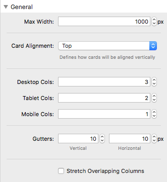
Max Width
Determines the maxiumn width of the inner portion of the stack where the features are located. This is helpful when you want to have a small number of columns in the center of the page.
Card Alignment
Top / Center / Bottom / Stretch
- Top
- Center
- Bottom
- Stretch
When set to Top, all cards will be aligned vertically to the top, meaning that shorter cards will have a gap underneath them.
When set to Center, all cards will be aligned to the center, meaning that there will be no gap on the bottom of the cards, but instead the extra space will be on the top and bottom of the cards
When set to bottom, all cards will be aligned to the bottom, leaving extra space above the cards
When set to stretch, all cards will be stretch to fill the height of the highest card in the row, making a really clean and even look. (Recommended)
Columns
There are 3 column inputs:
- Desktop
- Tablet
- Mobile
Each column input determines the number of columns that there will be at each different screen size. This is helpful when you want to have 3 columns of feature cards on desktop, but say only 2 on tablet, or 1 on mobile!
Padding
This is the general padding around the edge of the loader
Gutters
The gutter inputs determin how much spacing will be place inbetween each card
Cards

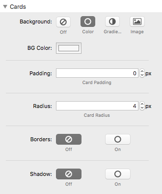
Background
Here you can set the background for each card. You can choose between:
- No Background
- Solid Color
- Gradient
- Image
Note that all cards will share the same background.
Padding
This simply determines how much padding will be around the outer edges of the card.
Radius
Controls the roundness of the corners of each card
Border
Controls the border of each card. When turned on you will see inputs appear for setting the thickness and color of the border
Shadow
Controls the shadow of each card. When turned on you will see inputs appear for setting the X-offset, Y-offset, Blur, Spread and color of the shadow
Card Icons
Alignment
Here you can set the horizontal alignment for each icon. You can choose between:
- Left
- Center
- Right
Note that all cards will share the same icon alignment.
Icon Size
The Icon Size option controls the font-size of the actual icon itself
Icon Color
The Icon color option controls the color of the inner Icon
Background Size
Each Icon has a background around it, making it useful to create cool designs. The size of the background can be controlled separately from the icon itself
Background
A unique background can be used for each Icon as well. You can set a color, gradient, or even an image. Note that all icons will share this same background.
Padding
In addition to sizing options, which controls the width and height, you can add specific padding between the Icon Background and the Icon itself, this is helpful when creating unique designs such as icons that are fixed to the left or right.
Margin
The margin inputs control the amount of space around the edge of the entire Icon Background.
Radius
The radius inputs determine the roundness of each corner of the icon background.
Card Content

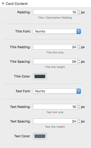
Padding
Here you can set specific padding around the title and description of the cards.
Title Font
Determines the font family of the Title of each card. Can be set to a font from the list of presets or a custom font. If a custom font is selected, then you will need to input a URL for the font, as well as the name of the font.
Title Size
Controls the font size of the title of each card
Title Spacing
Controls the line-height or vertical spacing between lines when titles is long enough to wrap
Title Color
Controls the color of each card title
Text Font
Determines the font family of the Description of each card. Can be set to a font from the list of presets or a custom font. If a custom font is selected, then you will need to input a URL for the font, as well as the name of the font.
Text Size
Controls the font size of the description text of each card
Text Spacing
Controls the line-height or vertical spacing between lines in the description text
Text Color
Controls the color of each card description
Hover Effects

General Info about Hover Effects
Cards can have special effects applied to them when hovered. Each effect is toggleable, meaning that you can turn them on or off. Mix and match different effects to create something really cool.
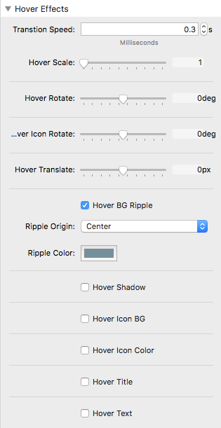
Transition Speed
Controls the speed of all effects that take place when a card is hovered
Hover Scale
Controls the zoom of cards on hover. 1 is the original size, meaning that higher numbers will make the card zoom in on hover, and lower numbers will zoom out on hover. The sweet spot is around (1.1) or (1.2)
Hover Rotate
Controls the rotation of cards on hover. Can be any number between -360 degrees and 360 degrees.
Icon Rotate
Feature Card Icons can have their own separate rotate when cards are hovered. You can set this rotation here. It can be any number between -360 degrees and 360 degrees
Hover Translate
Translate refers to the vertical movement of a card when hovered. Positive values will move the card down, while negative numbers will move the card upwards.
Text Font
Determines the font family of the Description of each card. Can be set to a font from the list of presets or a custom font. If a custom font is selected, then you will need to input a URL for the font, as well as the name of the font.
Hover BG Ripple
You can add a special background ripple to each card when hovered. If you check this option, you will see two new inputs appear:
- Ripple Original – Used to set the start point of the ripple
- Ripple Color – Used to set the color of the ripple
Hover Shadow
When turned on, adds a custom shadow to the cards on hover. Good for creating a lifting or dropping effect.
Hover Icon BG
A custom Icon Background color can be added on hover; this can be controlled here.
Hover Icon Color
This controls the color of the actual icon itself when a card is hovered
Hover Title
Controls the color of card titles on hover
Hover Text
Controls the color of card descriptions on hover
