Set up
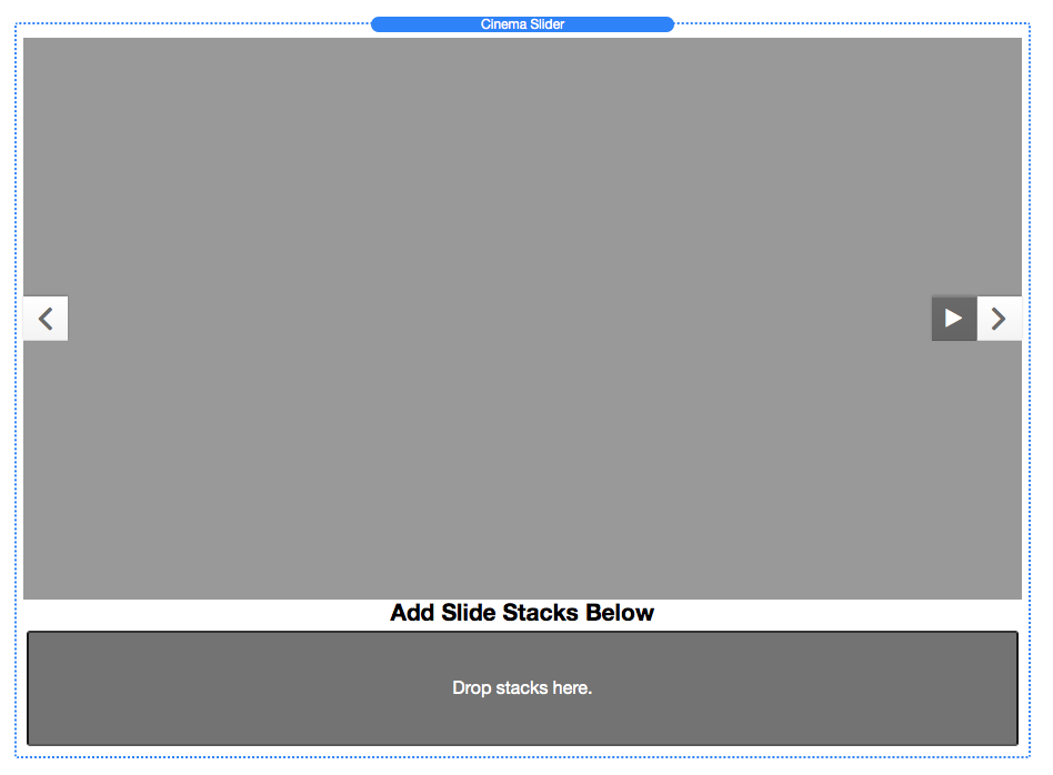
- First drag and drop the Cinema Slider Stack into the Stacks editor. It should appear like the screenshot below.
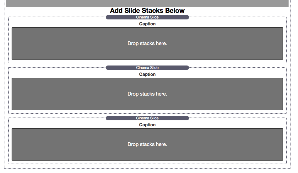
- Then drag and drop the Cinema Slide Stack into the “Drop stacks here.” section located underneath the heading “Add Slide Stacks Below”. Repeat this step until you have as many slides as you want to use. Your finished result should appear like the screen shot below.
- Now select the first Cinema Slide stack and in the panel on the right side of RapidWeaver click the browse button underneath the section labeled “Slide Settings”. Locate the first image you wish to use. Repeat this step for all of the slides you have added.
For additional help on styling your slider refer to the Slider Settings guide below.
How to Add Captions
All you need to do is drag and drop a text stack inside the Cinema Slide‘s “Drop stacks here” section to add captions to your slides. For additional help on styling your captions refer to the Slide Settings guide below.
How to Create a YouTube Video Slide
- After adding your slide stack to the editor, select the stack and in the panel on the right side of RapidWeaver underneath Slide Settings select the YouTube Video slide type.
- Locate the video you want to use on YouTube.com and place the video code into the Video Code input. You can find the video code in the address bar at the end of the URL string (after “?v=”)
 or found in the share tab for the video after the last slash
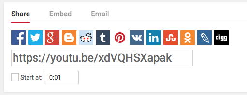
- Next you need to add a screenshot (of the video itself or of some other image) so that the transition effect will work. Click on the browse button to add your screenshot and you are done.
How to Create a Vimeo Video Slide
- After adding your slide stack to the editor, select the stack and in the panel on the right side of RapidWeaver underneath Slide Settings select the URL Video slide type.
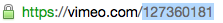
- Locate the video you want to use on Vimeo and place the video code into the Video Code input. You can find the video code in the address bar at the end of the URL string after the last slash
- Next you need to add a screenshot (of the video itself or of some other image) so that the transition effect will work. Click on the browse button to add your screenshot and you are done.
Slider Settings Guide
Settings
Image Alignment – This sets what area of the image the slider will focus on if the image is too large to fit the aspect ratio. Note: The images will still scale to fit the slider, cropping will only happen if the images have a different aspect ratio than what the slider has.
Height Type – There are three options for height type: Aspect Ratio, Percentage, and Static Pixel Height.
- Aspect Ratio – If you know what aspect ratio your images are use this option. This will keep the slider fully responsive and ensures a great fit for most photos and videos.
- Percentage – Use this option if you want to adjust the height till you get a good fit for your non-standard sized images. The percentage is in relation to the slider’s width (I.E. 50% means one half the size of the width or 2:1 ratio) This option will also keep the slider fully responsive.
- Static Height – This option will keep the slider at a specific height no mater what size the browser window is. This option is not fully responsive for images and videos.
Slider Max Width – This option is for when you don’t want your slider to fill the entire width of where you place it. Set a max value and the slider will not stretch to fill the width.
Slide Hang Time – This sets the time between the end of the last sliding effect and the start of the next one.
Transition Time – This sets the length of the transition effect.
Autoplay – Enabling this will set the slider to automatically start playing when the page is loaded.
Navigation Hover – If this is enabled the navigation buttons (prev, next and play/stop buttons) will be visible on the mouse hover state only, if this is disabled they will be visible always.
Frame Settings
Detailed Size – Use this option to set specific values for the frames top, bottom, left, and right widths.
Size – This sets the size of the frame on all sides.
Style – These are different templates to add shadows to the frame (for sliders with frames) or to the slider (for sliders that use the frame as a background instead). To use the frame as a background be sure to set you slider’s max-width and the slider will automatically center inside the frame.
Texture – Add a colorable texture to the frame or background.
Advanced Settings
Slider Min-Height – Set the minimum value height the slider can be regardless of the aspect ratio. This is useful only for mobile sized screens, when the slider becomes too small. increase this value to enlarge the slider.
Secondary Slider – Enable this option if there is already another Cinema Slider on the page. This will reduce load time by removing unnecessary code as it can “borrow” the code from the first slider you placed.
Don’t Crop Images – This will disable cropping on the image. Useful if you want to use portrait style images.
Hide Prev/Next Buttons – Enable this to hide the prev/next buttons.
Hide Play/Stop Button – Enable this to hide the play/stop button.
Show Thumbnails – This will display the thumbnail images you have set inside each Slide Stack below the slider so that users can navigate through the slider by clicking on them. If you also enable “Show Pagination”, the thumbnails will display when the pagination bullets are hovered instead of below the slider. Note: This option only works if you have set thumbnail images for each of the slides in your slider. See the Slide Settings Guide below to learn about adding those thumbnail images.
Disable Pause On Hover – By default the slider will pause whenever the mouse is over it. Enable this option to turn that feature off.
Show Pagination – Enable this to show a bullet style navigation in the bottom right corner of the slider. As mentioned above, if you enable “Show Thumbnails” with this option also enabled, thumbnail images will display above the bullets when hovered.
Show Loader – Enable this to show a circular loader while the slide hangs. The slider will transition to the next slide when the bar fills the entire circle.
Loader Position – Choose where the loader will display.
Loader Opacity – Set how transparent the loader will be. 10% is barely visible and 100% is opaque.
Loader Diameter – This controls the size of the loader.
Loader Stroke – This controls the thickness of the loader bar.
Slide Settings Guide
Slide Settings
Slide Type – You are able to choose either an image, YouTube video, or other video (I.E. Vimeo). There is also an option titled “No Image (Caption Only)”, use this option when you do not want to add and image but are going to use Stacks content instead.
Image – Browse for the image you want to use for the slide.
Transition – This sets what animation the slide transition will use.
Caption Settings
Text – This sets the color of your captions text, this can be overwritten by the stacks you place inside of the caption area.
Background Style – Set a color as a background for the caption so that it can be more easily read.
Transparency – Change the opacity of the captions background.
Advanced Settings
Thumbnail – Add a thumbnail of your image. This is only useful if you are using the “Enable Thumbnails” advanced setting in the Cinema Slider.
Add Link – Optionally add a link to your slide, so that when it is clicked, it will navigate to there.