Getting Started
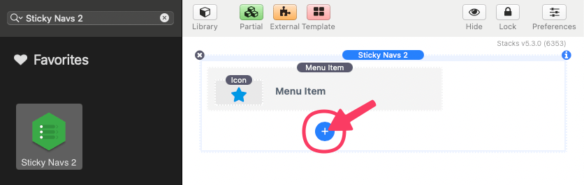
To get started, add Sticky Navs 2 to the editor. Initially, a single Menu Item appears in the content. Use the blue add button to add as many menu items as needed.
Editing Menu Items
To edit a menu item, select the element in the editor and open the settings panel.
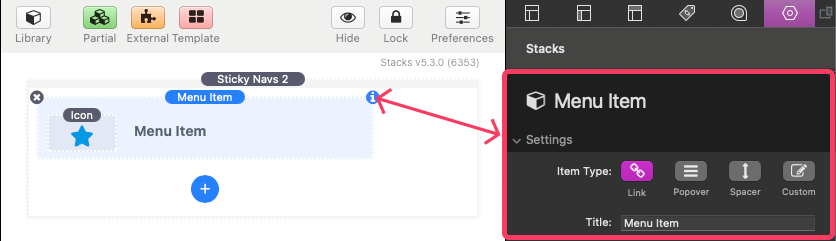
The following is a description of the available settings.
Menu Item: Settings
Item Type
Choose what this menu item does:
- Link – Opens a link when clicked.
- Popover – Reveals additional content, like a tooltip or submenu. Custom content can be added to the submenu in place of or along side menu item links.
- Spacer – Adds blank space between items (non-interactive).
- Custom – Allows you to display different content when collapsed and expanded. The icon will display when collapsed and will be removed when expanded and replaced with any custom content added to the field. This content does not display in a popover.
Title (Item Type: Link & Popover)
Set the label or name shown next to the icon for this menu item. This is what users will see when the menu is expanded.
Link (Item Type: Link)
Add the destination URL that the menu item should open.
Convert into an Item Divider (Item Type: Link)
Turns this menu item into a visual divider — a horizontal line used to separate groups of items. This item will not be clickable and will not display an icon. The title will still show when the menu is expanded allowing it to be used as a section header.
Icon Color (Item Type: Custom)
Customize the color of the icon for this menu item.
Align Icon (Item Type: Custom)
Choose how the icon is vertically positioned within the menu item space in relation to the custom content added.
Icon Padding (Item Type: Custom)
Set the space around the icon inside the menu item. The left and right padding will adjust the size of the icon to fill the available space.
Content Padding (Item Type: Custom)
Adjusts the spacing around the custom content of this item.
Changing Menu Item Icons
To edit a menu item’s icon, select the Icon element inside the menu item and open the settings panel.
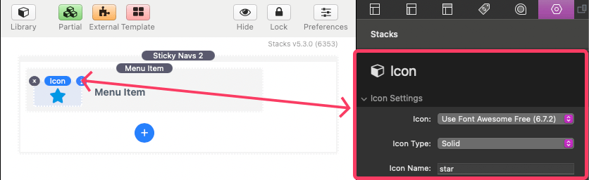
The following is a description of the available settings.
Icon: Settings
Icon
Choose the type of icon you want to use for this menu item.
- Font Awesome (Free) – A large, widely used icon set.
- Ionicons – Clean and modern icons, great for apps and interfaces.
- Material Icons – Google’s official icon library.
- Custom Image – Upload your own icon image.
- Custom SVG Code – Paste in your own SVG code.
Icon Type (Icon: Font Awesome)
Choose a style for your icon:
- Solid – Bold and filled
- Regular – Outlined version
- Brand – Logos like Facebook, Twitter, etc.
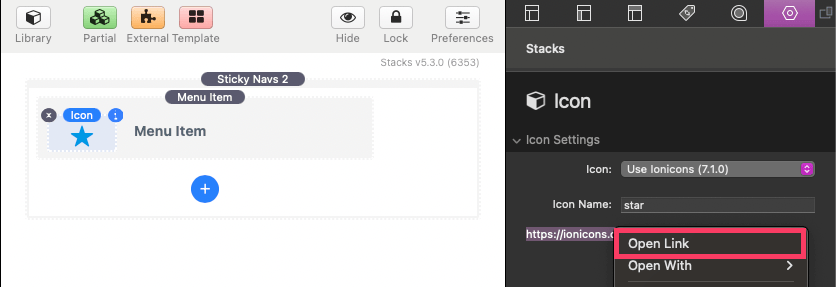
Icon Name (Icon: Font Awesome, Ionicons, Material Icons)
Type the name of the icon you want to use. To get a usable icon name for a selected icon library, right click (or CTRL + Click) the url found beneath the Icon Name field and click “Open Link”.
Icon Image & Image URL (Icon: Custom Image)
Upload your own image from your computer. You can also paste a link to a hosted image file instead of uploading one.
SVG Code (Icon: SVG Code)
Paste your full SVG code directly into the field.
Adjusting Global Settings & Styles
To edit a global settings & styles, select Sticky Navs 2 in the editor and open the settings panel.
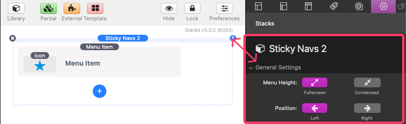
The following is a description of the available settings.
Sticky Navs 2: General Settings
Menu Height
Choose whether the menu fills the entire height of the screen or is condensed to a smaller vertical space.
- Fullscreen: Stretches from top to bottom.
- Condensed: Centers or aligns to the top/bottom based on your preference.
Align (Menu Height: Condensed)
When using the condensed menu height, this setting controls where the menu sits vertically.
- Top: Pins the menu near the top of the screen
- Center: Vertically centers the menu
- Bottom: Aligns the menu near the bottom
Align Offset (Menu Height: Condensed)
Fine-tune the vertical position of the menu when it’s condensed. Use this to nudge the menu up or down.
Position
Choose which side of the screen the menu appears on.
Z-index
This value can be adjusted to a higher or lower value if you have issues with the menu displaying below or above something it should not be. A higher value will allow the menu to display over top other fixed or absolutely positioned elements.
Keep Menu Collapsed
If enabled, the menu will stay collapsed (showing only icons). On mobile the entire menu is hidden behind a toggle button. In this case when the toggle is used, the menu will show fully expanded.
Sticky Navs 2: Menu Item Colors
Background
Choose the background color for menu items. This effectively works as the background color for the entire menu. Supports different colors for normal and hover states.
Icon
Set the color of the menu item icons. Supports different colors for normal and hover states.
Title
Customize the text color for each menu item label. Supports different colors for normal and hover states.
Details (Borders & Shadows)
Control the appearance of menu item borders and shadow applied to popover content.
Sticky Navs 2: Menu Item Styles
Width
Adjust how wide the menu becomes when expanded to show titles. This width also applies to popover menus.
L/R Padding
Controls the horizontal padding (left and right) inside each menu item.
T/B Padding
Controls the vertical padding (top and bottom) inside each menu item.
Corner Rounding
Adjust the roundness of the corners of the menu. Applies when the Menu Height is set to “Condensed” and to popover menus.
Icon Size
Set how large each icon appears.
Text Size
Control the font size used for menu item labels.
Font Family
Enter a font family name (like Arial, Roboto, or inherit) to match your website’s typography.
Font Weight
Adjust how bold or thin the label text appears — from light (100) to extra bold (900).
Letter Spacing
Add or reduce space between letters in the item labels.
Word Spacing
Adjust spacing between words in the item labels for fine control of text layout.
Sticky Navs 2: Mobile Toggle Settings
Breakpoint
Set the screen width (in pixels) at which the full menu is hidden and replaced with a toggle button. Example: If set to 600, the toggle appears on screens smaller than 600px wide.
Align
Choose where the mobile toggle button appears — at the top or bottom of the screen.
Horizontal Offset
Move the mobile toggle button left or right from its default position.
Vertical Offset
Move the mobile toggle button up or down.