Setup
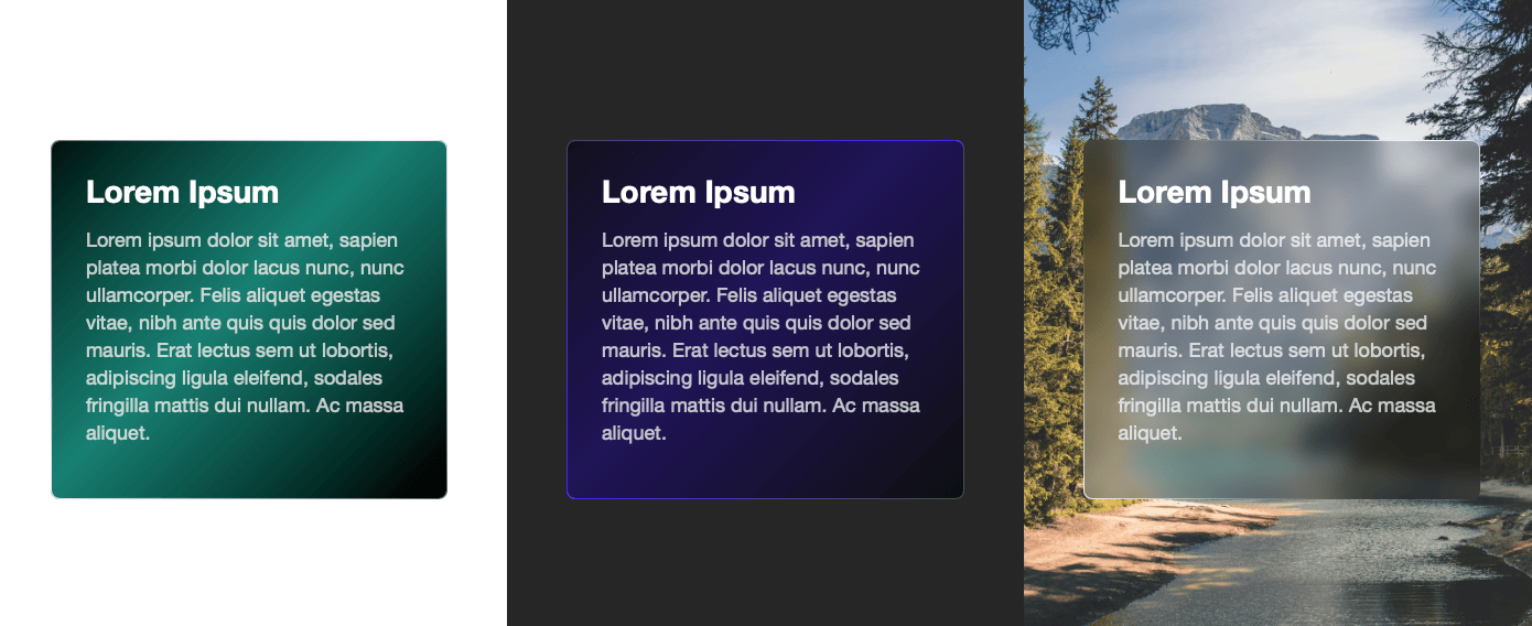
Let’s get started with setting up Shimmer. First locate the section of your page where you’d like Shimmer to work its magic. It’s important to note that Shimmer effects tend to stand out more when they’re added to sections with backgrounds that aren’t white or have an interesting background image.
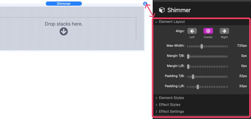
Once you’ve added your desired content to Shimmer, it’s time to customize it to your liking. To do this, select Shimmer in your editor and open up the settings panel.
Within this panel, you’ll find four sections that you can tweak to complete your setup:
- Element Layout: Here, you can adjust the size and position of the Shimmer element in relation to its container. You can play around with settings like alignment, maximum width, margins, and padding to get it just right.
- Element Styles: This section allows you to customize the appearance of the Shimmer element itself, including its background color, opacity, backdrop blurring, border color and width, border radius, and the colors of the text and links within the element.
- Effect Styles: Here’s where the fun begins! You can choose from three different effect styles: Spotlight, Shine, or Glass. Each style applies a unique effect to the background and border of the element. You can also customize the color and opacity of the effect, and even add an image that will be visible through the effect.
- Effect Settings: Finally, you can define how the effect is animated. You have options like having the animation follow the mouse cursor or the page scroll, triggering the animation on hover, or even autoplaying it with various settings like speed, direction, delay, and interval.
You can optionally make the Shimmer element clickable by adding a URL link to it. And as you tweak these settings, keep an eye on the preview to see how your changes affect the overall look and feel of your Shimmer element. Once you’re satisfied, you’re all set to dazzle your website visitors with your shimmering creation!
Settings Panel Breakdown
Element Layout
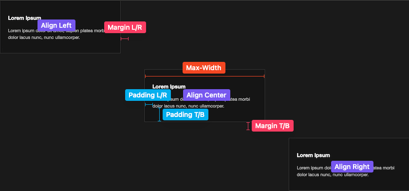
- Align: Choose how the element aligns horizontally.
- Max-Width: Set the maximum width of the element.
- Margin T/B: Adjust the space above and below the element.
- Margin L/R: Set the space to the left and right of the element.
- Padding T/B: Define space inside the element, above and below its content.
- Padding L/R: Set space inside the element, to the left and right of its content.
Element Styles
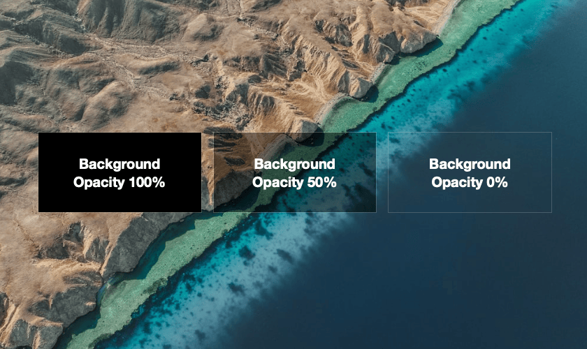
- Background Color: Choose the element’s background color.
- Background Opacity: Adjust transparency of the background color to allow things behind the element to show through.
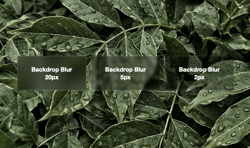
- Backdrop Blur: Apply a blur effect to things behind the element. The Opacity should be less than 100% for the blur effect to apply.
- Border Color, Opacity, Width, and Radius: Customize the element’s border.
- Text & Link Colors: Define text and link colors inside the element.
Effect Styles
- Style: Choose from Spotlight, Shine, or Glass effects.
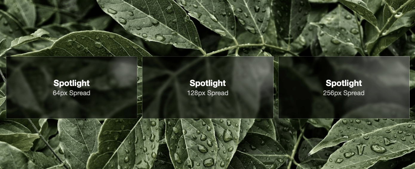
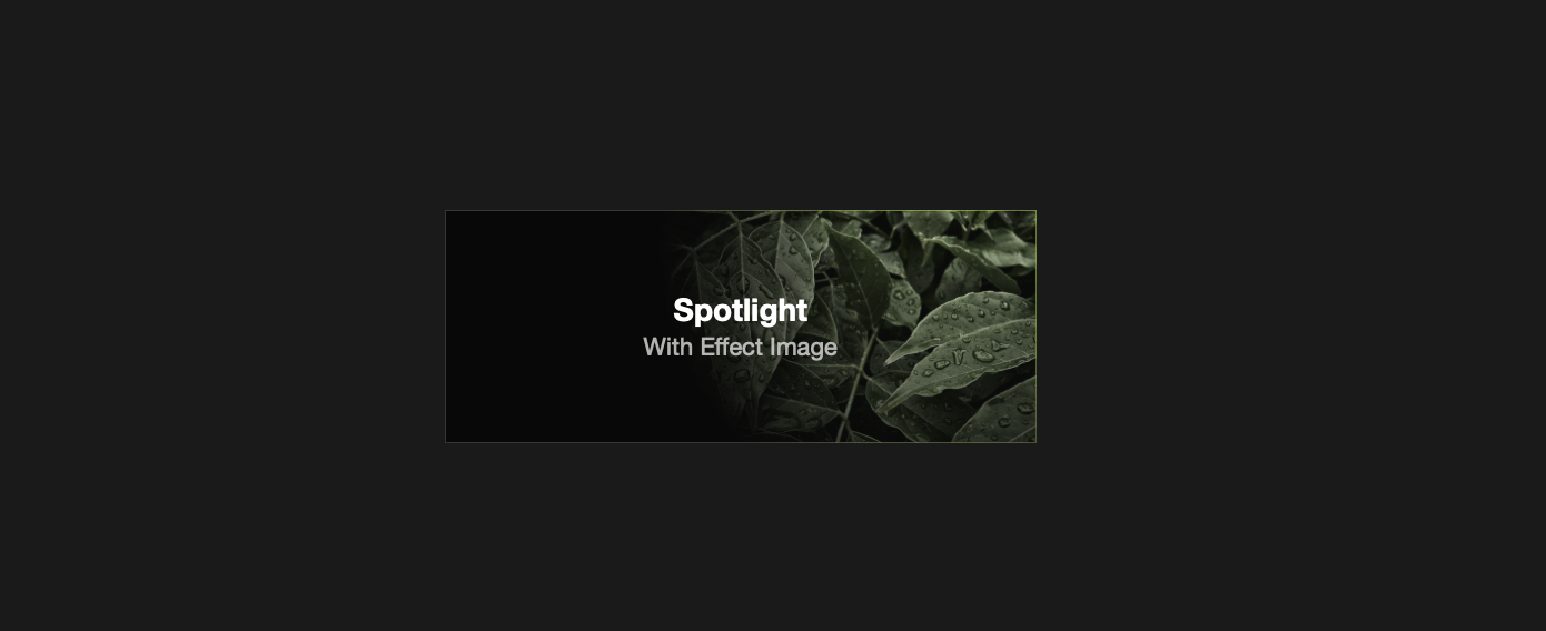
- Spotlight: This effect creates a radiant, radial light that shines outwards from the center, giving it a glow reminiscent of a spotlight on a stage.
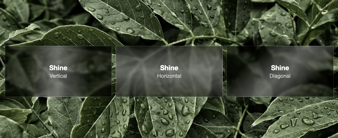
- Shine: This option adds a light effect that can be oriented vertically, horizontally, or diagonally across the element.
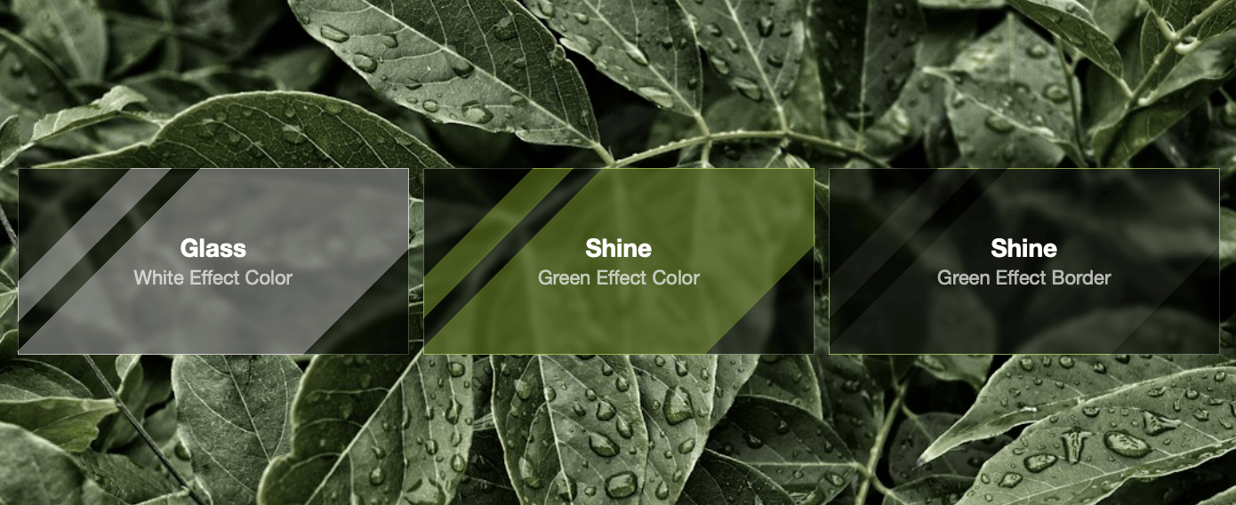
- Glass: This effect simulates the reflective qualities of glass surfaces. It adds a light reflection that creates a polished look.
- Spotlight: This effect creates a radiant, radial light that shines outwards from the center, giving it a glow reminiscent of a spotlight on a stage.
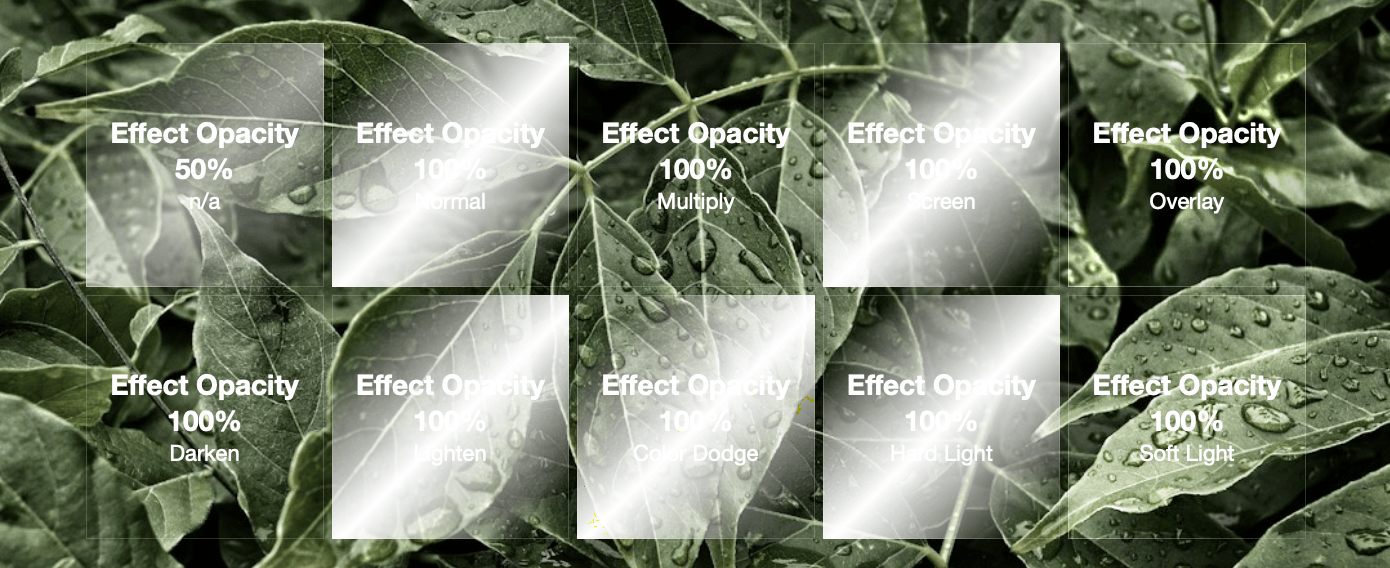
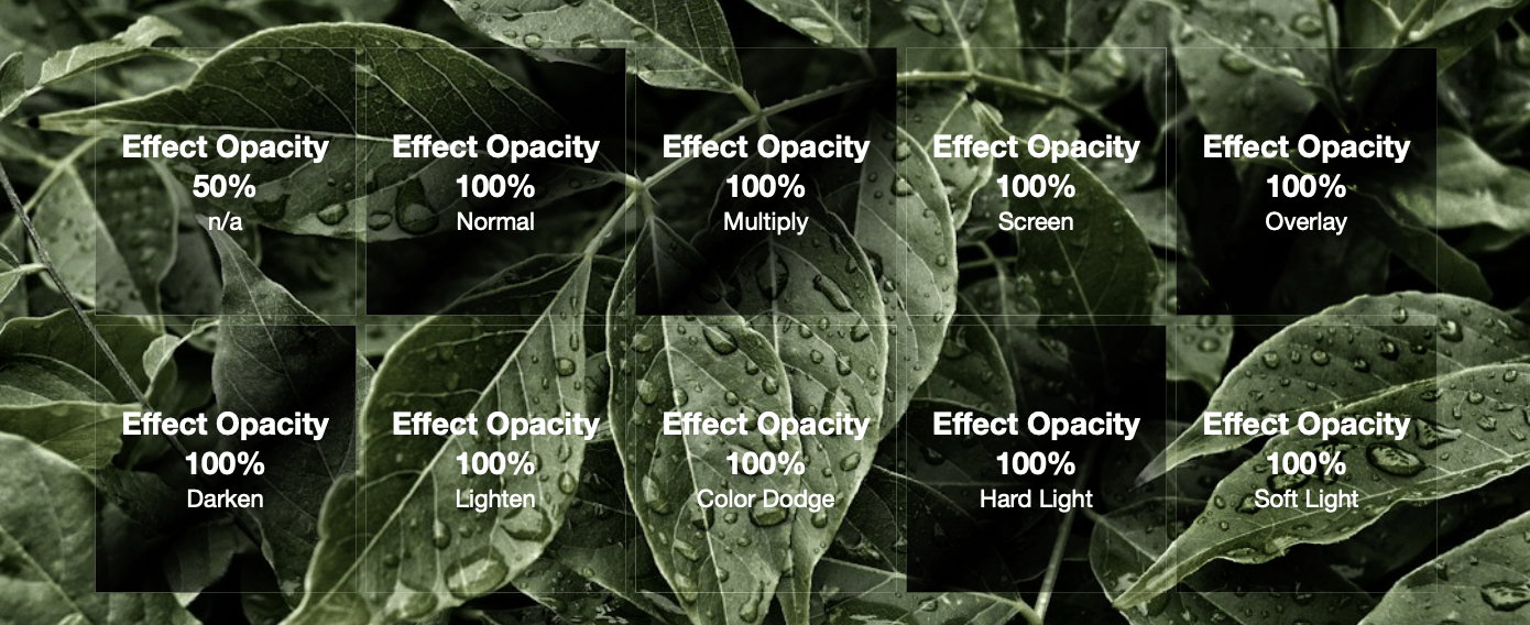
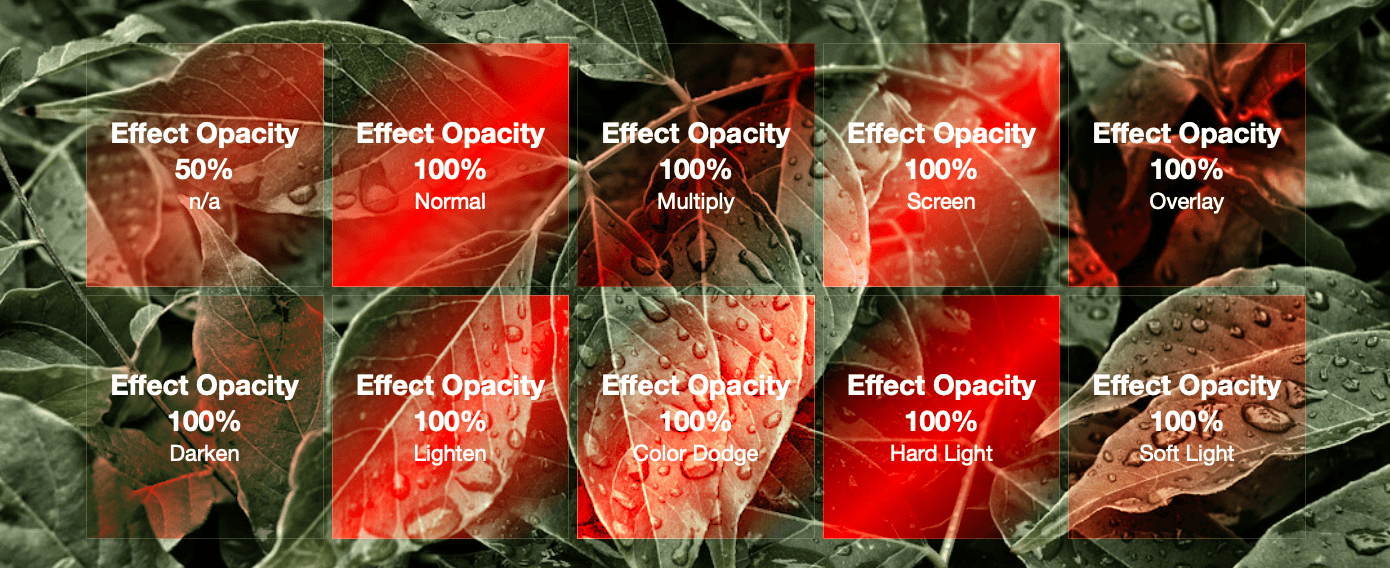
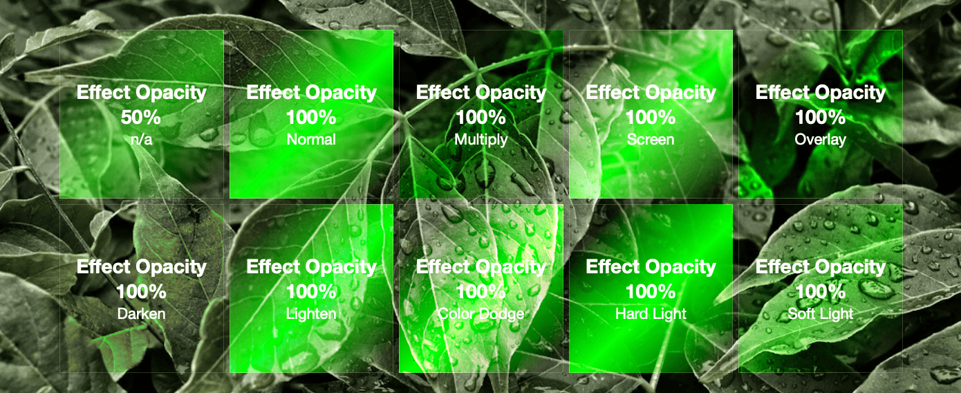
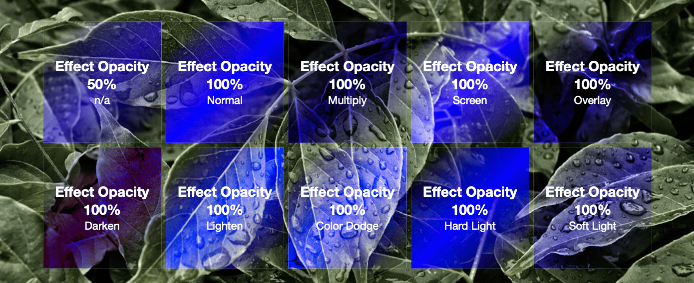
- Effect Color & Opacity: Set the color and transparency of the effect. If the opacity is set to 100%, a special Effect Blending setting is added to allow you to adjust how the color blends with the background of the element and/or the things behind the element. You can refer to the “Effect Blending Visuals” section for visual examples of the different options.
- Effect Border Color & Opacity: Customize the effect’s border.
- Effect Image: Optionally add an image visible through the applied effect.
Effect Settings
- Animation: Choose how the animation is triggered from five available options.
- Follows Mouse Cursor: This option makes the effect follow the movement of your mouse cursor. On devices without a mouse cursor, like touchscreens, the effect is controlled by scrolling the page instead.
- Follows Page Scroll: With this setting, the effect moves along with your page scroll. As you scroll up or down, the effect is revealed accordingly.
- Activate on Hover: Choosing this option triggers the effect when you hover your mouse over the element. Unlike following the cursor directly, the effect remains centered within the element itself. On touch devices, the effect activates based on page scroll.
- Autoplays: Selecting this option starts the animation automatically, without any need for user interaction. It continues to loop at a preset interval.
- Autoplays (Alternating): Similar to the Autoplays option, this setting also triggers the animation automatically in a loop. However, before each loop, the animation changes direction, providing variation in the visual effect.
- Animation Speed: Adjust the time it takes for the animation to complete.
- Reverse Direction: Reverse the animation direction.
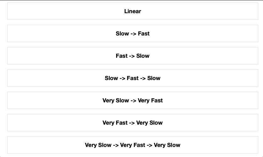
- Easing (Forward & Back): This option allows you to control how the animation speed changes over time. Different easing types create different effects, such as smooth transitions or more abrupt changes in speed. Refer to the accompanying image for a visual demonstration of each easing option’s effects.
- Initial Delay, Alternate Pause, Interval: Control timing aspects of the animation. Refer to the accompanying image for a visual demonstration of some example values.
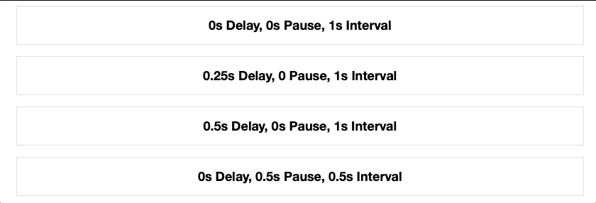
- Initial Delay: Adjust the time it takes, in milliseconds, for the first cycle of the autoplay animation to start after the element is loaded. This delay occurs only once and does not affect subsequent animation cycles.
- Alternate Pause: Set the pause time, in milliseconds, before the animation changes direction in alternating autoplay animations. This pause occurs each time the animation reverses direction.
- Interval: Determine the time, in milliseconds, before the autoplay animation restarts its loop. This interval sets the duration between the end of one animation cycle and the beginning of the next.
- Content Opacity: Customize the default transparency of the content within the element. When the animation effect is applied, the opacity of the content automatically transitions to 100%, ensuring it’s fully visible during the animation or when the element is in focus.
- Link: Optionally add a URL to make the element clickable, turning it into a hyperlink. This enables users to interact with the element, redirecting them to the specified web address when clicked.
Effect blending Visuals
The Effect Blending setting is enabled if the Effect Opacity is set to 100%. The available options change how the effect color blends with the background of the element and/or the area behind the element. Below are some examples of how the different options apply using various colors. Each example uses Shimmer elements with 0% Background Color Opacity.
White:
Black:
Red:
Green:
Blue: