Setup
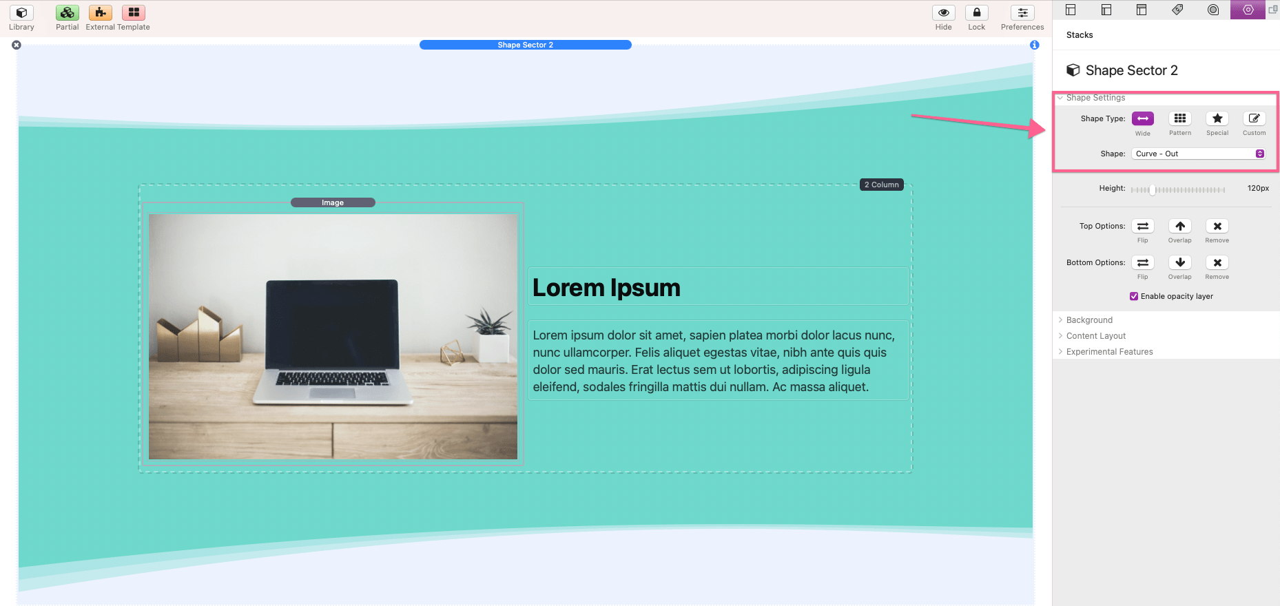
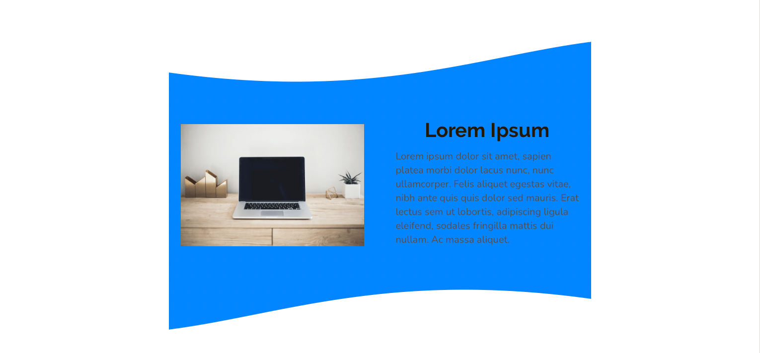
Setup is quite simple for the Shape Sector 2 stack. After adding the stack to the editor, you only need to add you desired content and select a design from the provided options in the Settings Panel > Shape Settings.
The only thing to note is that the design will not overlap adjacent sections above or below it. This will only be an issue if the adjacent sections have a background color or images applied to them.
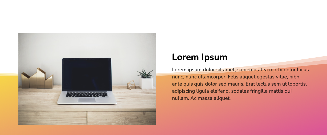
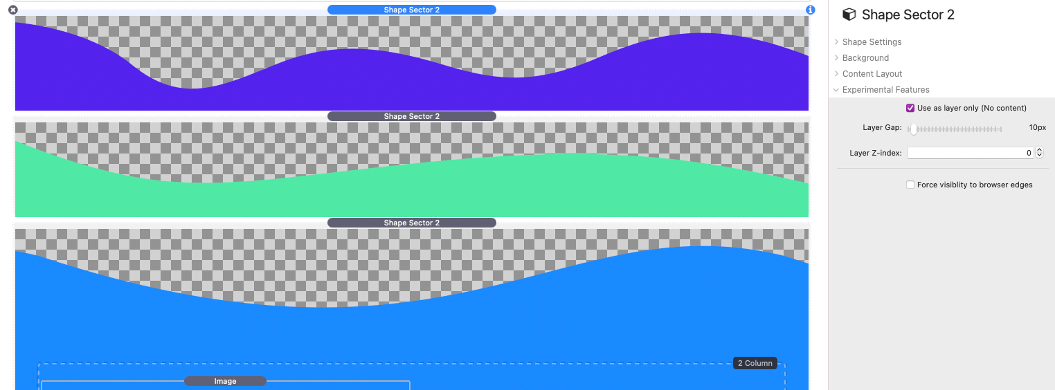
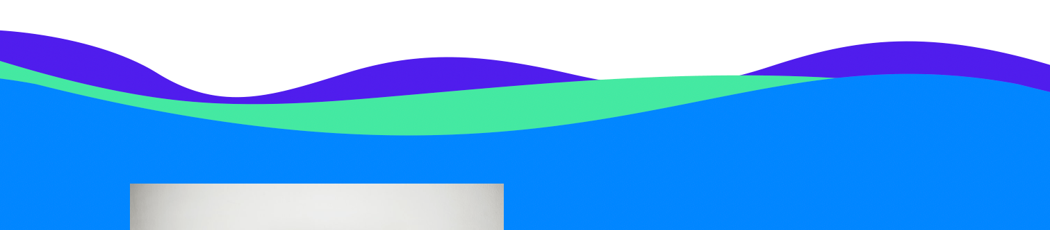
The sections above and below the Shape Sector 2 stack in the example below do not have background colors and inherit color from the body:

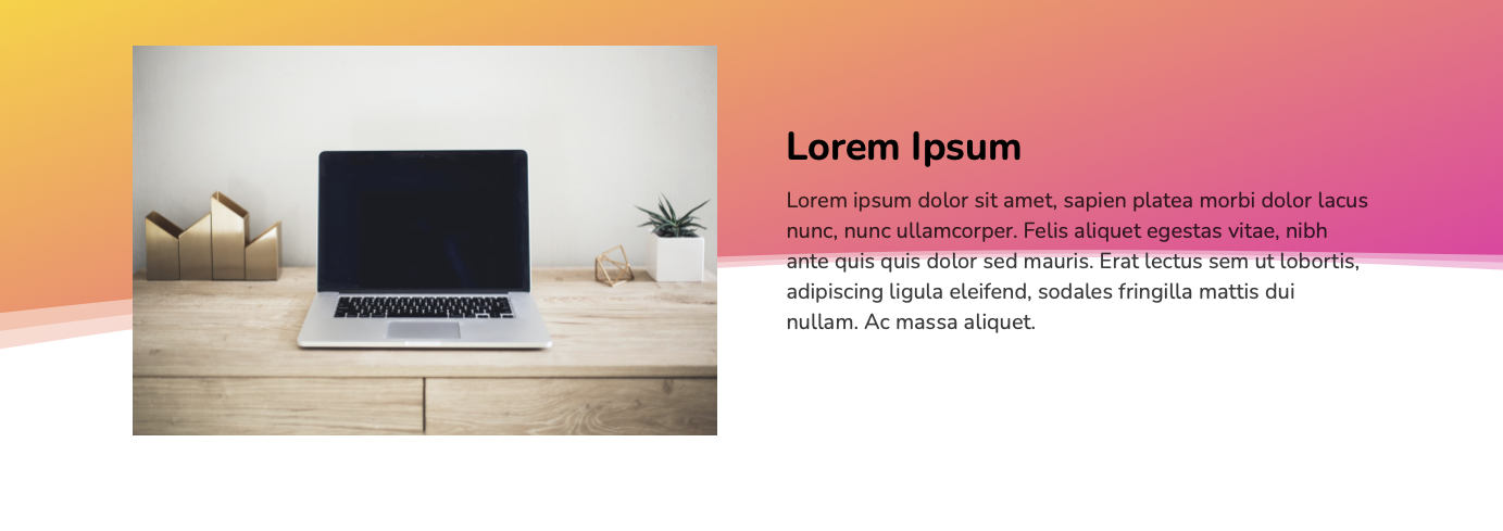
However, the adjacent sections in the next example below do have defined background colors:
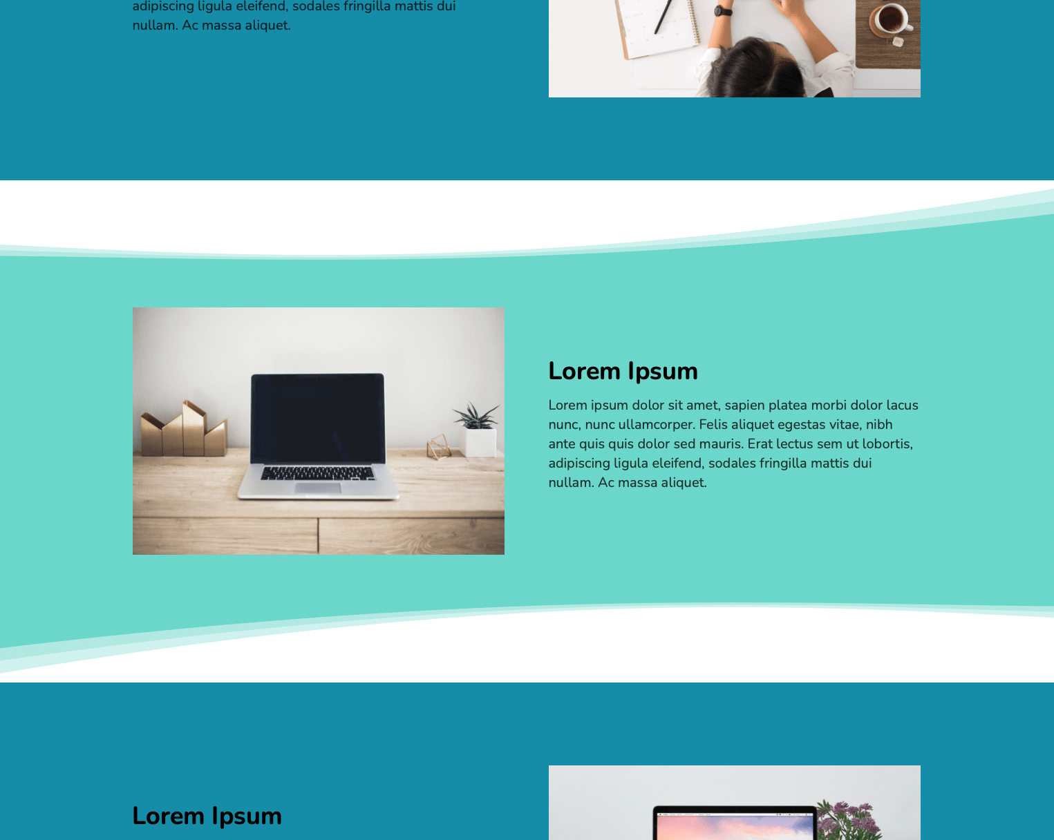
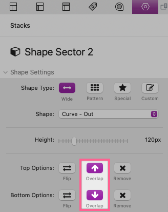
This will reveal gaps between the sections where the body background color can be seen. To close these gaps we just need to enable the top and bottom Overlap options in the Shape Sector 2 stack settings panel.
This will allow the design to overlap the adjacent sections hiding the gap:

To learn how to customize the design and to learn how to adjust the remaining settings please refer to the “Settings Panel” section below.
Settings Panel
Shape Settings
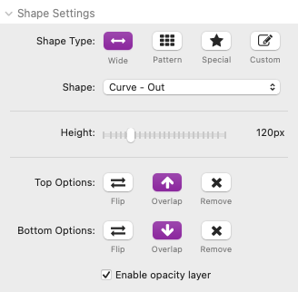
Shape Type
There are four Shape Type options to choose from:
Wide – These shape types are non-repeating designs that stretch across the entire browser window. There are 17 different options to choose from and each option can be adjusted in height.
Pattern – These shape types are patterns that repeat horizontally. There are 7 different options to choose from and the pattern can be adjusted in height and width.
Special – These shape types are special patterns that are designed to be seamless as they repeat horizontally. There are 8 different options to choose from and the pattern can be adjusted in height.
Custom – This shape type allows you to paste your own design created with the Shape Tool. You can create custom repeating patterns or wide designs that stretch across the entire browser window. See the “Creating custom designs” tutorial to learn how to make your own designs.
Shape
The available options for the selected Shape Type will display here.
Height/Width
This slider adjusts the height of the selected shape/design. The width will always fill the entire browser window with the exception of Pattern Shape Types, which have a width setting to adjust the size of the repeating pattern blocks.
Top/Bottom Options
There are three enable-able options for both the top and bottom shapes/designs:
Flip – Use this option to flip the design along the x axis. Note that this option will not have an effect on symmetrical designs.
Overlap – Use this option to allow the design to overlap adjacent sections. This option is useful for closing visible gaps between sections.
Remove – Use this option to remove the design from the top or bottom of the section. This option is useful when you want another Shape Sector 2 stack design to overlap with this section.
Enable Opacity Layer
Enabled by default, this option adds extra layers to the design that are partially transparent. If this option is disabled an opacity setting will be available in the Background settings.
Background
Background
There are three background options for the selected design/shape:
Color – Define a sold color for the design. The opacity can be adjust if the Shape Settings > Enable Opacity Layer option is disabled.
Gradient – Define a 2 color gradient for the design.
Image – Add an image background to the design. This option includes a settings to change the Background Color, add an transparent Overlay Color, and apply a Blur effect to the image.
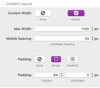
Content Layout
Content Width
Selecting the “Define” option will allow you to set a max width for the content. The content will automatically be centered in the available space. There are two associated settings:
Max Width – Define the max width for the content in pixels.
Mobile Spacing – Define the space the the left and right of the content when the browser window is smaller than the defined max width.
Padding
Enable padding for the content by selecting the Simple or Detailed options.
Experimental Features
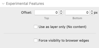
Offset
These settings allow you to adjust the offset of the content in relation to the top or bottom edge of design.
Top – A positive value will move the top edge of the design downward, allowing the content to overlap the top edge of the design.
Bottom – A positive value will move the bottom edge of the design upward, allowing the content to overlap the bottom edge of the design.
Use as layer only (No content)
Enable this option to remove the content from the stack. The selected shape/design will still be visible but will not take up any space. It can then be placed above or below another Shape Sector 2 stack to serve as a layer to that design. You can adjust the distance between the layers by increasing or decreasing the provided Gap slider.
Force visibility to browser edges
Enable this option if you are using a theme that does not allow content width to span to the browser edges:

Creating custom designs
The shape tool used to create custom designs can be found here: shape tool
With this tool you can create your own shapes to add to the Shape Sector 2 stack.
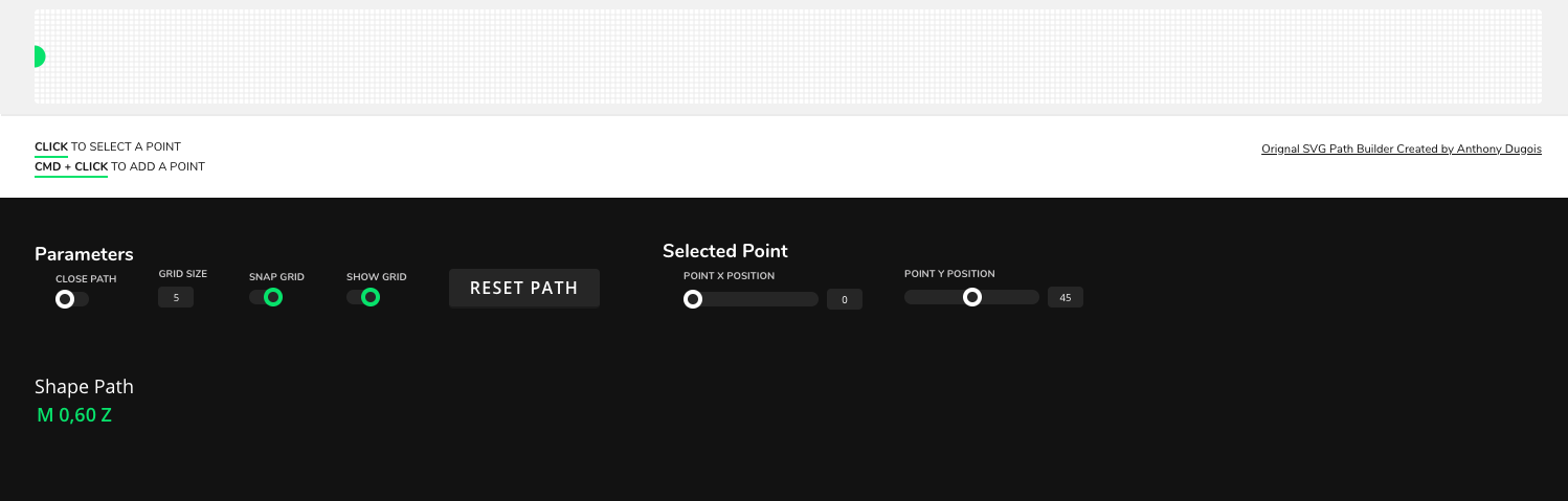
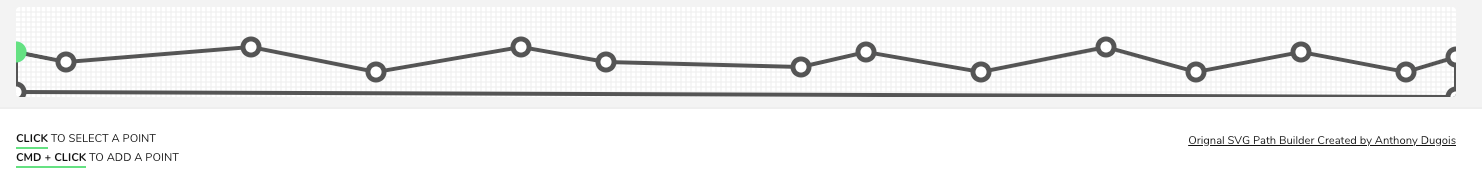
The viewbox is 1440px wide by 320px tall by default and starts with a single point shown as a green dot. To add new points hold down the command key and click anywhere on the artboard grid.
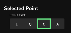
Each new point can be set to 4 different types. “L” is for “Line” and will simply be a straight line from the previous point. “Q” stands for “Quadratic Bezier” and will give you two handles to adjust the S curve of the line leading up to this point. “C” stands for “Cubic Bezier” and will give you a single handle to adjust the curve of the line leading up to this point. “A” stands for “Arc” and will create a circular shape between the selected point and the one preceding it.
Continue to add more points and adjust them to create a completed shape. Make sure your design covers the entire grid area from left to right in order to fit all device screen sizes.
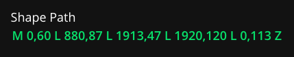
Once you are satisfied with the design, copy and paste the “Shape Path” into the Settings Panel > Shape Settings > Shape Path field.
You will need to copy the viewbox dimensions over into the corresponding fields as well.
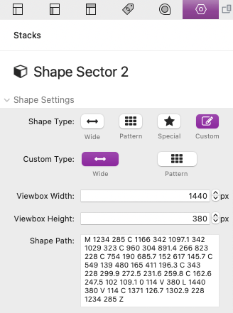
By default, your design will stretch across the entire width of the browser window. If you would rather the design repeat along the x axis, select Custom Type > Pattern.
Shape tool settings
Close path: By default the shape will automatically be closed. Disable the “Close path” option if you would like to close the path manually after completing the design (By adding a new point in the same exact position of the starting point).
Grid size: Adjust the size of the grid lines by px.
Snap grid: When enabled, newly created points and points that have been moved will automatically attach to the closest grid intersection.
Show grid: When enabled, grid lines based on the grid size will display on the artboard.
Point x position: The position of the currently selected point along the x or horizontal axis.
Point y position: The position of the currently selected point along the y or vertical axis.