Initial Setup & Info
To get started, add the Pick A Card stack to the page.
When first added, you’ll see a single Pick A Card container stack with three Card stacks already inside it. The outer stack contains all of the settings and serves as the container and background, while each inner Card stack represents an individual card in the deck.
Adding Cards
Click the blue Add button to insert additional cards. You can add as many cards as you like — the deck is designed to comfortably handle 20 or more cards without overwhelming the layout.
How the Deck Behaves
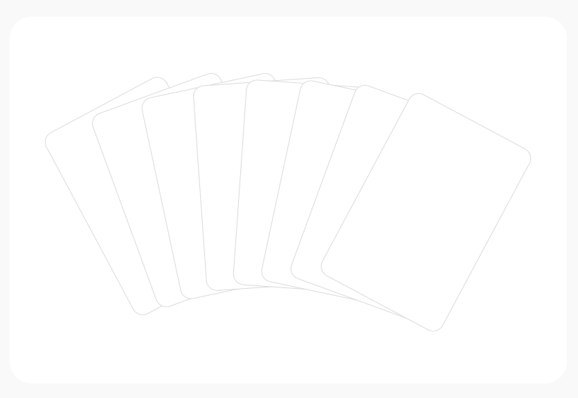
By default, cards appear as a fanned deck:
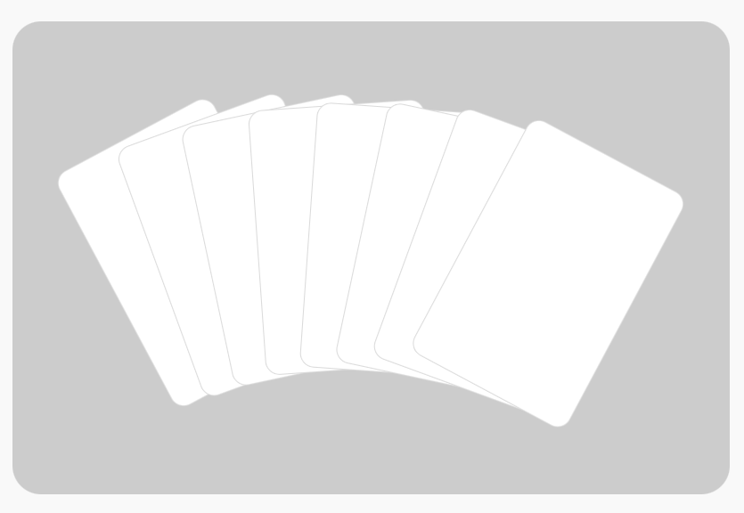
or as a stacked pile of cards:

When the mouse cursor enters the outer container:
- A definable overlay will display over top of the container background if enabled.
- If the cards were stacked as a pile, they will animate into a fanned position.
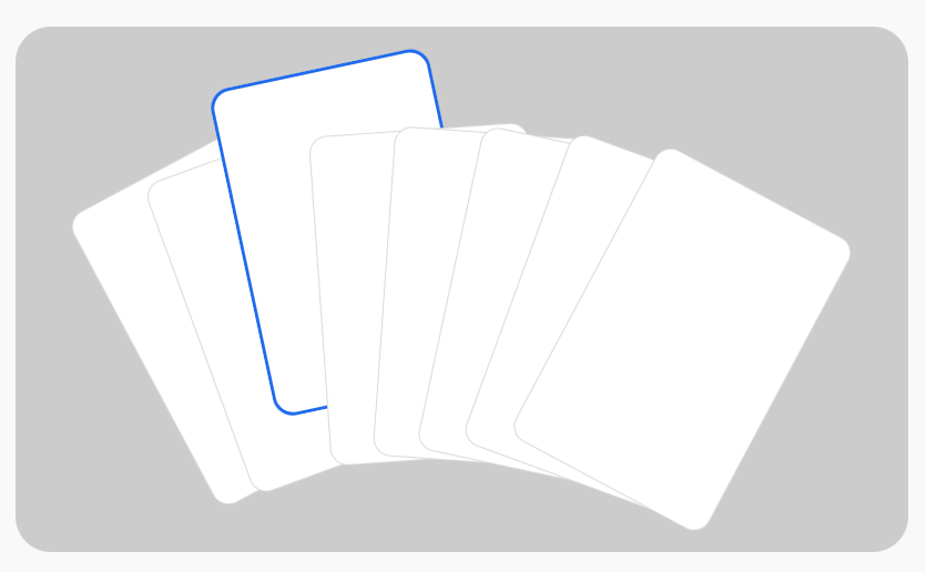
When the mouse cursor hovers over a card:
- The card will shift upward a definable amount to reveal the header area of the card.
- A definable highlight accent border will appear around the hovered card.
If a hovered cards is clicked:
- The card will be brought into center focus, while the other cards shift downward and are clipped at the bottom of the container.
- The contents of the card can be interacted with.
- Clicking outside the active card and inside the outer container returns the deck to its fanned state.

When the cursor leaves the container (and no card is active):
- The deck can optionally return to a stacked pile position if enabled.
- The outer container overlay will fade out.
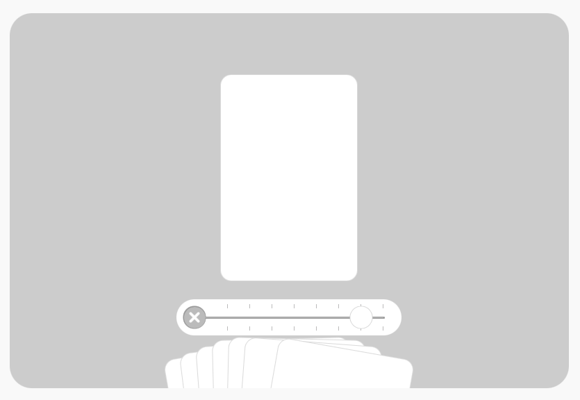
On touch devices, where hovering isn’t available, the deck automatically switches to a slider-style navigation for smooth, intuitive browsing. Mouse cursor interactions not involving the slider are disabled.
Adding Content to the Container
The Pick A Card container stack includes an optional content header area located above the cards. This area is intended for supporting content that introduces or explains the deck as a whole.
Common uses include:
- Section titles
- Short descriptions or instructions
- Introductory text
- Icons or small decorative elements
Any content added here remains separate from the cards themselves and does not count as part of the deck.
How the Container Header Behaves
The container header is designed to stay visually connected to the deck, but it responds intelligently to card interaction:
- When no card is active, the header remains clearly visible above the deck.
- When a card is selected and brought into focus:
- A definable overlay will display over top of the header content
- Cards may animate upward or overlap this area, depending on your settings
This behavior helps keep attention on card interaction while still preserving the context of the section.
When to Use (and When Not to)
The container header works best for supporting information, not essential controls.
Good uses:
- Section headings
- Short explanatory text
- Context-setting descriptions
Avoid placing:
- Important buttons or navigation
- Critical information that must remain visible at all times
Since this area can be visually de-emphasized or partially covered during interaction, it’s best used for content that enhances the experience rather than content that must always be accessible.
Customizing the Container & Deck
Select the Pick A Card container stack and open the Stacks Inspector.

Container Styles
These controls affect the outer area that holds the entire deck.
Background
Choose a style for the container background:
- Color
Sets a single background color for the container.
Use this if: you want a clean look and maximum readability. - Gradient
Pick two colors to blend together.
Use this if: you want a more modern look than a flat color.- Stop Points
Controls where each gradient color sits.
Simple explanation:
If you move the stops closer together, the blend happens faster in a smaller area.
If you spread them out, the blend is smoother and more gradual. - Orientation
Changes the direction of the gradient
- Stop Points
- Image
Choose an image to use behind the deck.
Use this if: you want texture, a photo backdrop, or branding imagery.- Bg Image URL
Optional. Lets you use an image from a web address instead of picking a local file.
Use this if: you keep images hosted somewhere and want to swap them later without reselecting files. - Bg Image Size
Controls how the background image fills the container:- Cover – fills the whole area, may crop edges (best general choice)
- Contain – shows the full image, may leave empty space
- Stretch – fills the area but may distort the image
- Custom – lets you define exact size
- Tile – repeats the image like a pattern
- Dimensions
Sets the width/height used for tiling or custom sizing. - Bg Image Colors
Two colors that help you control contrast:- Background – sits behind the image
Use this if: your background image has transparency. - Overlay – sits over the image (great for darkening or softening it)
Use this if: your background image is making text/cards hard to see.
- Background – sits behind the image
- Bg Image URL
T/B Padding (Top/Bottom Padding)
Adds space inside the container above and below the deck.
Increase this if: hover/active motion feels like it’s too close to hitting the top edge of the outer container.
Decrease this if: the outer container has content and there is too much space.
L/R Padding (Left/Right Padding)
Adds space inside the container on the left and right.
Increase this if: the fanned card edges look too close to the edges.
Decrease this if: the fanned cards feel too cramped.
Container Radius
Rounds the corners of the container.
Apply this if: you want a softer look, especially if your cards also have rounded corners.
Card Styles
These controls change how each card looks and how much space it has.
Colors
Sets the default card colors for the background and border.
Card Width
Controls how wide each card is.
Card Height
Controls how tall each card is.
T/B Padding (Card Top/Bottom)
Adds space inside the card above and below your content.
Increase this if: card content feels too close to the card edges.
Decrease this if: card content has it own applied padding & margin.
L/R Padding (Card Left/Right)
Adds space inside the card on the left and right.
Increase this if: content looks too cramped and narrow.
Decrease this if: content has it own applied padding.
Border Radius
Rounds the card corners.
Border Size
Controls how thick the card border is.
Increase this if: you want a more distinct card edge or you want to offset the card background color/image.
Decrease this if: you want the cards to have a flat/minimal look.
Deck Fanned Styles
These settings affect the default “fanned out” layout (the main interactive look).
Fan Max-Width
Controls how wide the deck is allowed to spread.
- Higher value = the fan spreads more and up to half of the left side of each card can be visible, depending on the number of cards and available horizontal space.
- Lower value = the fan stays tighter and the outside cards have more of a rotation. Only the top left corner of each card may be visible.
Bottom Offset
Controls how much the cards are pushed downward and clipped by the bottom edge of the outer container.
Use this if: you want the cards to have a more pronounced animation with more visual appeal.
Stack cards in a pile when inactive
When ON:
- the cards display as a stacked “pile”.
- if the mouse enters the container, the cards move into the fanned position.
- if the mouse leaves the container (and no card is active), the cards return to a stacked “pile” look.
Use this if: you want a cleaner resting state when the user isn’t interacting or you want the cards to look less busy and more compact.
Stacked Deck Styles
These settings only display if “Stack cards in a pile when inactive” is ON.
Depth X
Adds a tiny sideways shift between stacked cards (creates a layered depth effect).
Higher = more “spread” side-to-side.
Depth Y
Adds a tiny up/down shift between stacked cards.
Higher = more “spread” vertically.
Depth Curvature
Adds a subtle curve to the stacked layering so it feels more natural.
- Negative values create a downward curve
- Positive values create an upward curve
Use this if: the stack feels too “perfectly straight” and you want a more organic look.
Pre-Fanning
Slightly rotates the cards while stacked, so they look like they’re ready to fan out.
Navigation Settings & Styles
These controls affect how the deck reacts and how navigation elements look (including touch/slider mode).
Colors
- Overlay: the dimming layer used during focus/interaction (helps card interaction standout from the background)
- Highlight: the accent border used to show focus or selection
Modify these if: you want clearer “active” feedback when a card is being selected.
Highlight Width
Controls how thick the highlight accent border is.
- 0 = no highlight
- Higher = stronger focus indicator
Slide Card Up by
How far a card moves upward on hover.
Increase this if: you want a to reveal more of the header of a card, where useful information like a title can be revealed.
Decrease this if: you want a more subtle feedback when a card is being selected.
Animation Speed
How fast the card movements/animations are in miliseconds.
- Faster (150ms) = snappier UI feel, better feedback and usability
- Slower (500ms) = smoother, more “premium” motion
Disable card active state
When ON, clicking a card will not “lock” it into the centered active focus state.
Use this if: you have non interactive card content and only want hover and shift to the top portion of cards in view.
Touch Nav
These color settings style the touch slider UI:
- Background
- Background Border
- Track
- Track Border
- Knob
- Knob Border
- Ticks
- Close button
Note: Only relevant when the slider is shown to touch screen devices or if “Always use touch navigation slider” is ON.
Always use touch navigation slider
Forces slider navigation even on desktop (non-touch).
Use this if:
- you want one consistent behavior across all devices
- you have many cards and prefer “scroll/slide” navigation
Adding Card Content
Each card has three content areas, allowing you to control the layout and readability of each card:
Card Header (Top Section)
The top section acts as the header of the card.
- Content placed here is aligned to the top of the card.
- When the deck is fanned, this area is typically what’s visible first.
- When a card is hovered and slides upward, the header can be fully revealed, making it ideal for:
- Titles
- Icons
- Thumbnails
- Labels or category indicators
This section is designed to give users a quick visual cue about what the card contains.
Card Body (Center Section)
The center section holds the main content of the card.
- Content is vertically centered within the card.
- This content is:
- Partially visible when the deck is fanned, or
- Hidden when the cards are displayed as a stacked pile.
- The body becomes fully visible when a card is brought into focus.
This area is best suited for:
- Descriptions
- Feature lists
- Images
- Rich content that benefits from extra space
Card Footer (Bottom Section)
The bottom section serves as the footer of the card.
- Content is aligned to the bottom of the card.
- This area is usually only visible when a card is active.
Common uses include:
- Buttons or links
- Calls to action
- Secondary information
Supported Content Types
Each section of a card can contain almost any Stack, including:
- Text
- Images
- Icons
- Buttons
- Feature lists
- Profiles
- FAQs
- Linked content
This flexibility makes the cards suitable for a wide range of uses, from product listings to profiles and interactive galleries.
Individual Card Styling
Selecting an individual Card stack and opening the Stacks Inspector reveals optional background styling controls for that card.
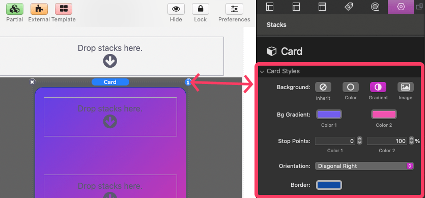
These settings allow you to customize cards individually when needed.
There are three background options, and they behave exactly like the background settings used for the main Pick A Card container stack:
- Color
- Gradient
- Image
This makes it easy to highlight important cards or add visual variety while maintaining a consistent overall design.