Setup
After adding the stack to the editor you will see a demonstration of the book styles at the top of the stack element with 6 pages add by default at the bottom.
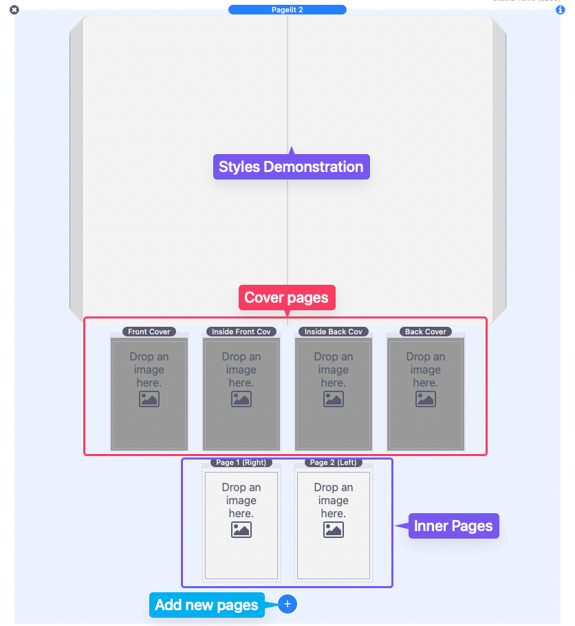
The four pages at the top represent the front and back cover of the book as well as the inside portion of the cover. The section below that contains the pages of the book.
To add an image to a page, simply drag and drop the image into the “Drop an image here” section.
A blue add button can be used to add more pages. As you add more pages take note of the page labels. The labels for each page contain the page number and the side of the book the page appears on when opened.
Open the settings panel of the main Pagelit 2 stack to adjust the General Settings.
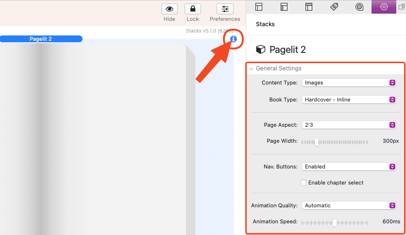
General Settings
Content Type
The content type defaults to “Images”, use the “Stacks” option to use stacks for the content of the pages.
There is also an option to provide a list of image URLs (warehoused images) to use in place of manually adding images.
Book Type
There are 3 book types to choose from, each can animate inline or popup to fill the screen when clicked.
“Hardcover” applies a stiff 3d rotation effect to the cover pages while soft page turning animation is applied to the individual pages.
“Paperback” applies a soft page turning animation to the cover and individual pages of the book.
“Boardbook” applies a stiff 3d rotation effect to the cover and individual pages of the book.
Page Aspect
Use this field to set the aspect ratio of your pages. The aspect should match the aspect ratio of the images you are using for the pages. There is also a “custom” option to allow you to specifically define the width and height of the pages if necessary.
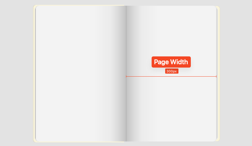
Page Width
Use this slider to define the width of the individual pages of your book. The book will be at least twice this wide when opened as the pages display next to each other. If the book does not have enough horizontal space to open it will scale down in size to fit when using any “inline” Book Type.
Popup Width (Popup Book Types only)
Use this slider to define the width of the individual pages of the book when the popup is active. If the book does not have enough horizontal screen space to open it will shift so that only one side of the book is visible. It will also automatically shift as the pages are turned to display the most relevant page. The book may also scale if there is not enough screen space to fit a single page.
Nav. Buttons
By default the pages of the book can be navigated by clicking on the pages. Use the “Enabled” option to provide next and previous navigation buttons that can be used in addition to clicking the pages.

The “Enabled + Next/Previous Chapter” option adds two additional buttons used to jump to the front or back cover of the book.

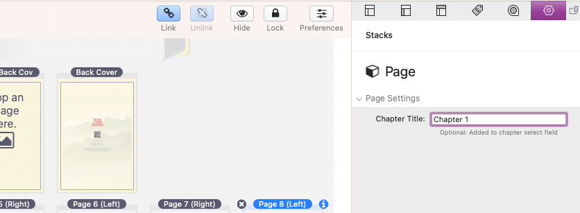
Enable chapter select
When this option is enabled a dropdown select field will display below the book.

Each page element has an optional Chapter Title field that can be used to mark the selected page as a jump to navigation point. The value provided will be added to the chapter select field as a selectable option. These pages will also be jumped to in order when using the Next/Previous Chapter navigation buttons.
Animation Quality
There are three options to choose from.
“Automatic” will automatically adjust the quality of the shadows and animation based on device pixel density.
“Best Performance” will remove the animation shadows and use the lowest level of detail for the animation. This prioritizes the animation to be a smooth as possible.
“Best Quality” will always use the highest level of detail for the animation. This setting is only recommended if the images used for the pages are well optimized and have tested to find out that high dpi devices (mobile devices) do not experience slow down when the book is animating.
Animation Speed
Use this slider to adjust the speed (in milliseconds) of the page turn animations.
General Styles
Book Colors
Use the provided color fields to define the colors of the cover, pages, and the loader that displays while the book loads.
Only pages that do not have an image or background image applied will display the defined color. However the color can still be seen on the edges that stick out from the sides of the book.
Popup Colors (Popup Book Types only)
Use the provided color fields to define the colors of the popup overlay and popup close icon.
Nav Btn Colors (Nav. Buttons Enabled only)
Use the provided color fields to define the colors of the navigation buttons.
Book Margin
These input fields adjust the space above and below the book. When a “popup” Book Type is used these values only applied to the book while it is not opened.
Book Rounding
This slider adjusts the corner radius of the book edges.
3D Depth
This slider adjust the thickness of the pages that stick out to the side of the book. A value of “0x” will remove the 3D effect while larger values will increase the size of the effect.
3D Perspective
Use this slider to adjust the perceived 3d depth of the pages that stick out to the side of the book. Higher pixel values create a flattened appearance while lower values create more pronounced 3d effect.
Cover Size +
Use this slider to adjust how much larger the cover pages are in relation to the inner pages.
Page Settings & Styles
Image Margin
Use these number input fields to optionally add space around the edges of the page images.
Content Margin (Stacks Content Type only)
Use these number input fields to adjust the space around the edges of the stacks content used inside the pages.
Page Shading
This checkbox enables or disables the inner page shading that can be seen at the spine of the book when it is opened.
Show magnifier on page hover
Enable this option to display a magnifying glass over the page images. It is recommended that you enable Navigation Buttons when using this option to allow the pages to be turned.
Show page numbers
Use this checkbox to optionally enable page numbers that display on each of the inner pages. A few additional options are provided when this option is enabled to allow you to customize the appearance and location.
Using image urls (Warehoused images)
If you have images that you would like to use as the pages that are already uploaded and hosted somewhere you can use the Content Type: “Warehoused images” option.
This will replace the pages section with an editable text field. The image URLs can be added to this text field as a comma separated list. Pagelit 2 will then automatically create the book from the provided list of images.
The first 2 images will be used as the front cover while the last two listed images will be used as the back cover.
If the list of images is quite long and you do not wish to manually type each URL you can use an online tool like the one found here (http://www.mynikko.com/tools/tool_incrementstr.html). The only requirements are that the images are all stored in a single folder and have a repeating filename structure using numbers.
For example, if the images are found at the following location:
http://www.yoruwebsite.com/some/folder
and every image is batched named in the following manner:
image_1.jpg, image_2.jpg, image_3.jpg, etc…
You could use the following value to generate your list:
http://www.yoruwebsite.com/some/folder/image_[x].jpg,
In my example let’s say I have 100 images to use so I will set the Starting value to 1 and the Ending value to 100 and click generate. I can then copy and paste the provided list into the warehoused images text field.
If you would like to add a Chapter Title to a specific page, you can add the title to the end of the corresponding image URL in-between parentheses.
…
image_11.jpg,
image_12.jpg,
image_13.jpg.
image_14.jpg,
image_15.jpg(Chapter 1),
image_16.jpg,
image_17.jpg,
…
This will allow that page to be marked as a jump to navigation point when either using the Next/Previous Chapter navigation buttons or the Chapter select dropdown.
Creating Custom Navigation Links
Any link can be used as a custom way to open a Pagelit 2 book to a specific page when clicked. All you need to do is create the link and add a custom attribute to it named “data-pagelit-goto”. The value should be set to the page you would like to navigate to. The value can either be the page number of the page or the Chapter Title if one is defined for the page.
Improving Animation Performance
If you notice that the animation is not smooth while the pages animate there are a few things you can do to help. First would be to change the Animation Quality to “Best Performance” to remove the animation shadows that can be quite taxing on certain devices.
Another important thing that can help is to optimize the images you use for the pages. Ideally a single page image should be less than 100kb in size. The image should also be resized to the pixel size defined for the page.
Finally if you still have trouble getting the animation smooth, we recommend setting the Book Type to “Boardbook”. This uses a page turn animation that generally performs better than the soft page turning effects of the other types.
Using PDFs For The Pages of the Book
PDF images are unfortunately not supported by HTML. In order to convert a PDF into a usable format you will need to use an online tool like the one found here (https://pdftoimage.com/pdf-to-jpg). After the PDF has been converted to images and downloaded, you can then add those images to the pages of the Pagelit 2 stack.
If there are a lot of images to add it is recommended that you instead upload those images to a folder and use the “Using image urls (Warehoused images)” tutorial above to generate a list that can be used to easily add the images all at once.