Setup
Step 1: Change the Element Background
To start, add the More Corners widget to your editor. Once added, select it and open the settings panel.
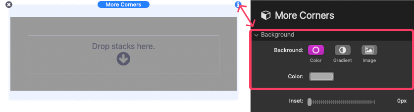
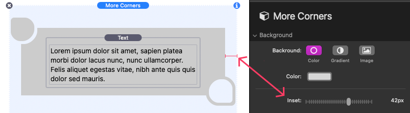
In the Background section of the settings panel, you’ll find three background options to choose from:
- Color: Define a solid color for the element background.
- Gradient: Define a two-color gradient that applies across the element background.
- Image: Add an image that applies across the element background. This option includes settings to define a color, add a transparent overlay color, and apply a blur effect to the image.
Step 2: Create Corner Definitions
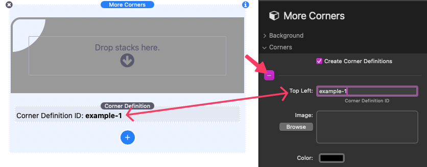
In the Corners section of the settings panel, you will find four border-radius controls, one for each corner of the element. Above each control is a button that allows you to import a custom corner definition instead. To create a corner definition, enable the “Create Corner Definitions” checkbox. A new element will appear in the editor at the bottom of More Corners.
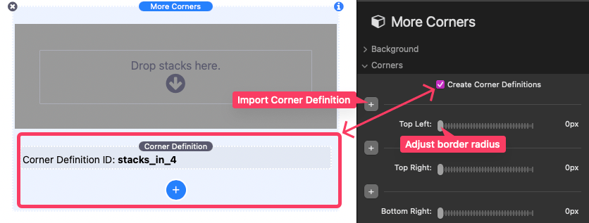
Select the Corner Definition element in the editor and open the settings panel.
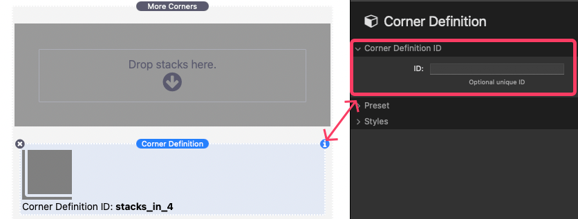
By default, each Corner Definition is automatically assigned an ID. In the Corner Definition ID section of the settings panel, you can optionally create a unique ID for the design. This ID should be unique, not include any spaces, and should avoid special characters except for dashes and underscores. Here are a few examples of acceptable IDs:
- example
- example_two
- exampleThree
- example-4
In the Preset & Styles sections of the settings panel, you can choose a preset design and customize its appearance.
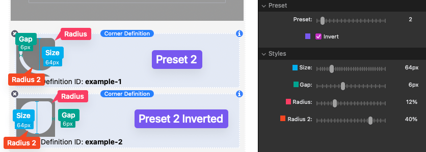
A demonstration of the applied preset and styles is shown in the editor as you make changes. Presets 1–12 include an “Invert” option to swap the solid and transparent parts of the design. The Size slider adjusts the overall size of the design, and the Gap slider adjusts the space between the design and the edge of the element background. Additionally, a Radius slider allows you to adjust the corner rounding of the design. Some designs also include a second Radius 2 slider to adjust the rounding of secondary corners.
More Corner Definitions can be created by clicking the blue “Add” button if necessary.
Step 3: Apply Corner Definitions
When you’ve finished creating your Corner Definitions, select the outer More Corners element in the editor and open the settings panel. In the Corners section, click the button above the corner options where you’d like to apply your defined corners. In the provided field, add the Corner Definition ID of the design you want to use. This ID will either be the custom value you provided or the default assigned ID, which can be seen in the editor.
Below the field where the ID is entered, there are optional settings to add either an image or a color to the corner design. If no values are provided, the design will inherit the background of the element. Each corner can be styled individually.
Once you’ve applied all your Corner Definitions, you can optionally adjust the inset of the element background relative to the corner designs. Just use the Inset slider in the Background section of the settings panel to adjust the inset as desired.
Corner Definitions created in one More Corners stack can be used across all stacks on the same page, so you don’t need to redefine a design that will be reused.
Step 4: Adjust Element Layout
In the Layout section of the settings panel, you can optionally adjust the dimensions and spacing of the element.
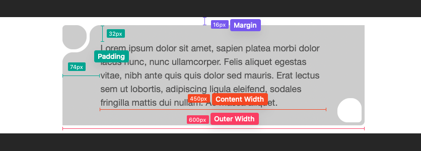
You can also define an Outer Width to set a specific width for the element or a Content Width to set a specific width for the content. Both options allow you to set horizontal alignment. Finally, use the Margin inputs to control the space around the element and the Padding inputs to manage the space inside the element around the content.