Getting Started
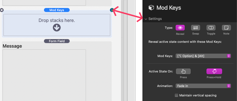
To begin, add a Mod Keys stack to the area in the editor where you want mod key–activated content to appear. Then, select the stack and open the settings panel.
Below is a description of each available setting:
Settings
Type
Choose the function of this Mod Keys stack:
- Reveal – Reveals active-state content.
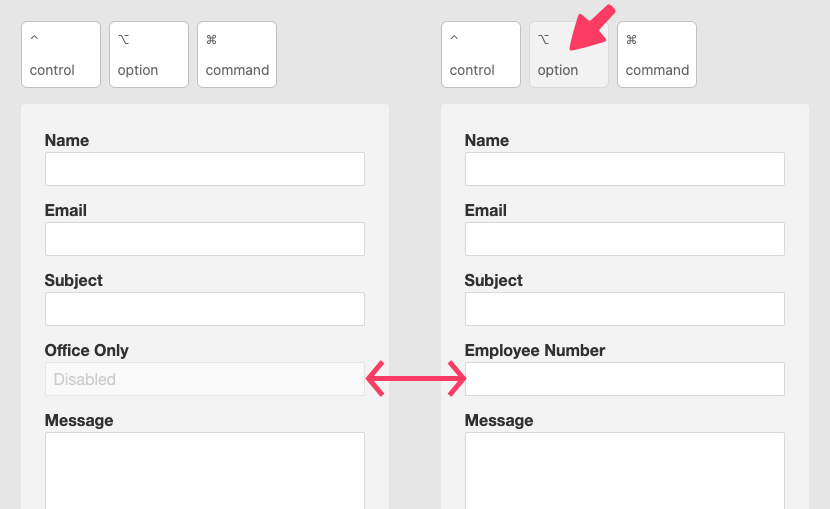
- Swap – Swaps inactive content with active-state content.
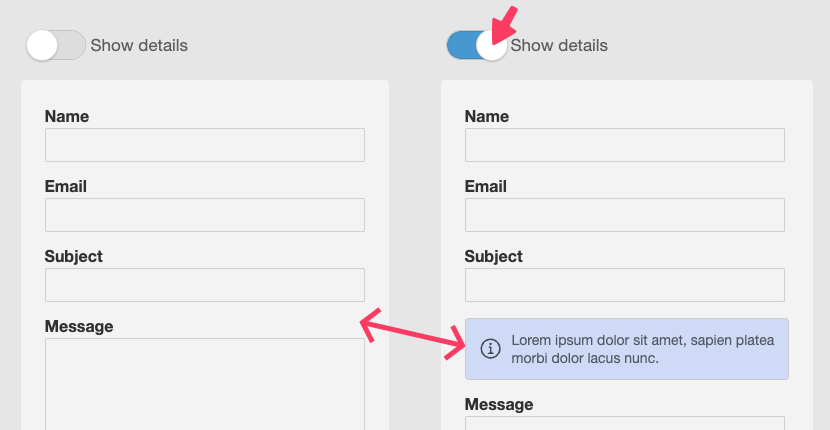
- Toggle – Displays an onscreen toggle that can be used to activate other Reveal or Swap elements.
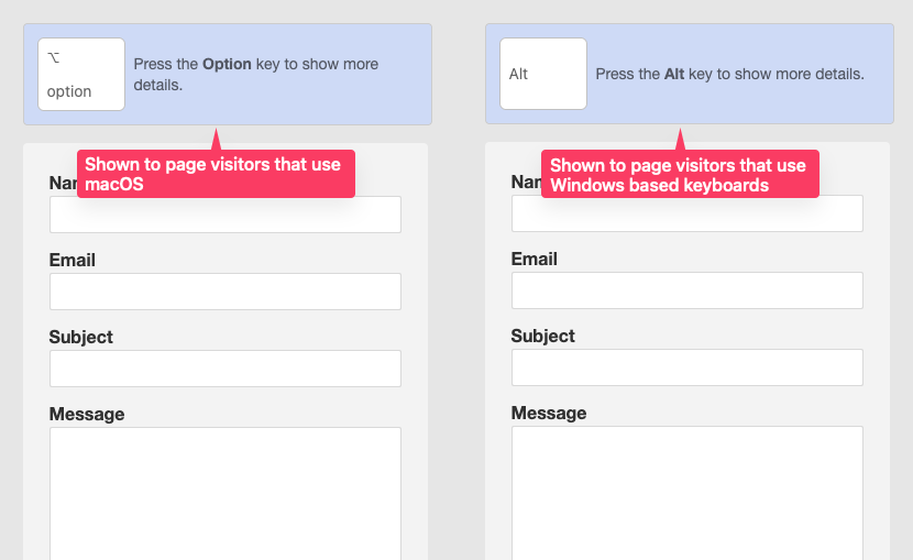
- Note – Displays custom content tailored to the user’s operating system (macOS or Windows). You can also choose whether this content appears for users with a physical keyboard or those using a touchscreen device.
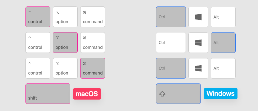
Mod Keys
This setting is available when Type is set to Reveal, Swap, or Toggle.
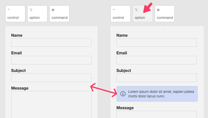
- Reveal – Select the keyboard key that must be pressed to reveal content.
- Swap – Select the key that triggers the content swap.
- Toggle – Select the key the toggle is linked to. When toggled on, any other Mod Keys stack using the same key(s) will also activate.
Each option shows the corresponding key for both macOS and Windows keyboards. Choosing Custom allows you to define your own keys—separately for macOS and Windows.
macOS & Windows
These input fields appear when Mod Keys is set to Custom. They allow you to define one or more required keys for each operating system.
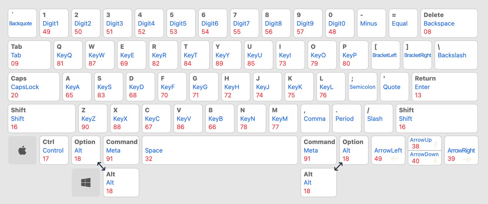
Keys can be referenced in three ways:
- By label – e.g., A, Option
- By name – e.g., KeyA, Alt
- By code – e.g., 65, 18
To require multiple key presses, separate them using a plus sign (+).
Example combinations for Alt + A:
- Label: Option+A
- Name: Alt+KeyA
- Code: 18+65
Refer to the chart below for a full list of labels, names, and codes. For non-U.S. keyboards, use the U.S. equivalent.
Activate State On
Available for Reveal and Swap types. Choose how the active state is triggered:
- Press – The content becomes active when the specified key(s) are pressed. Pressing the same key(s) again toggles the state off.
- Press & Hold – The content stays active only while the key(s) are being held down. Releasing any key will deactivate the state.
Animation
Also available for Reveal and Swap. Choose how the active content appears when triggered.
Select None to disable animations.
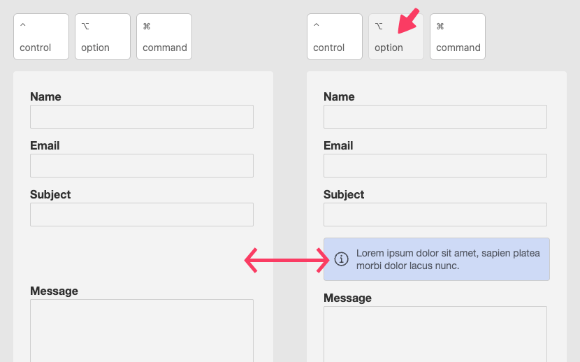
Maintain Vertical Spacing
Available for Reveal and Swap types. When enabled, content activation won’t change the layout vertical height:
- With Reveal, empty space is reserved when the content is hidden.
- With Swap, both active and inactive states occupy the same vertical space.
Toggle Styles
These settings are available when the Type is set to Toggle.
Size
Adjusts the overall size of the toggle graphic.
Type
Choose from three toggle types: Default, Thin, and Checkbox.
This setting affects appearance only; all types function the same.
Style
Select from three styles: Default, Flat, and Detailed.
Each style visually modifies the toggle based on the selected type.
High Contrast
This option appears when Style is set to Detailed.
Enable this setting to increase shadow contrast—especially useful when using dark backgrounds or dark-colored toggles.
Shape
Choose the edge style of the toggle graphic:
- Round
- Rounded
- Square
- Square Sharp
Align
Controls the toggle’s alignment based on available space to the left and right.
Content Styles & Layout
These settings apply to the following, depending on the Type:
- Reveal / Swap – Active-state content
- Toggle – The toggle container
- Note – The OS-specific content display
Most settings are self-explanatory, except for Width & Position, which offers more advanced layout options.
Width & Position
Choose how the content is sized and positioned within the layout. Four options are available:
- None
Content fills the entire available horizontal space. - Static
Set a fixed width. The content stays in flow with surrounding elements and can be horizontally aligned. - Absolute
Set a width and position the content on top of surrounding elements. You can also define:- z-index
- Horizontal/vertical positioning
- Margins for offset adjustments
- Fixed
Set a width and position the content fixed to the browser window. You can define:- z-index
- Horizontal/vertical positioning
- Margins for offsets from the edges of the viewport