Loaderz
General

Hide On
Determines when the loader will hide. Can be set to hide when the page loads, or it can be set to hide after a set time duration (milliseconds)
Position
Fixed / Inline
When set to Fixed the loader will fill the entire screen.
When set to Inline, the loader will remain in its place on the page, and a stacks container will appear. Inside of the stacks container, you can place specific content inside. The loader will then cover this content until the page loads
You will also see an initial height option appear when setting the loader to INLINE. This initial height option can be used to set a specific height while the content is loading, and then after the loader is finished, the content will expand to it’s full height. This can be good for long peices of content.
Background
You can choose between 4 background options
- None
- Color
- Gradient
- Image
Padding
This is the general padding around the edge of the loader
Opacity
This option controls the background opacity of the loader
Loader Text

Show Loader Text
Text can optionally be displayed with the loader if wanted. Simply check this option and you will see a few more settings appear for adjusting the text. For some loaders, specific text placement may be required, and you will see those option in the settings for that specific loader.
Loading Text
This is the actual text content that will appear with the loader when the show text option is checked
Font Family
Here you can choose from a list of basic fonts for the text
Font Size
Choose the size of the loading text here
Color
Choose the color of the loading text here
Android Material Loader


Size
This setting controls the thickness of the loading bar
Max Width
This setting controls with maximum length of the loading bar
Color 1, Color 2, Color 3
These are the 3 colors that will cycle through while loading. The 3rd color is the base/start color for the loader
Folding Square


Size
This setting controls the width/height of the square. The sizes are always proportional.
Color 1, Color 2, Color 3
The square will cycle through these 3 colors. Note the the CENTER color (color 2) will appear twice.
Racing Inner Circle


Outer Circle Size
Controls the width/height of the outer circle
Outer Color
Controls the color of the outer circle
Inner Circle Size
Controls the width/height of the inner circle
Inner Circle Offset
The spacing between the edge of the outer circle and the inner circle
Inner Color
Controls the color of the inner circle
Growing Shrinking Vertical Bars


Bar Width
Controls the width of each individual bar
Bar Height
Controls the height of each individual bar
Bar Spacing
Controls the horizontal space between each vertical bar
Bar Radius
Controls the radius of each bar. Can be used for making them round or squared.
Text Position
When the “loader text” is set to “show”, this option will allow you to choose whether the text is on the bottom or top of this loader.
Text Offset
This option will control how much vertical space is between the loader text if the loader text is set to be displayed.
Bar Color 1, 2, 3, 4
There are 4 bars for this loader, and the color of each bar can bet set individually.
Pulsating Circle Square


Circle Size
Controls the width/height of loader
Border Size
Controls the thickness of the cicle border
Border Radius
Controls the roundness of the loader. Can be used to make it a square or a circle. For perfect circles, set the radius to be the same as the “circle size” option.
Border Color
Controls the color of the circle
Flowing Circles / Squares


Bar Size
Controls the width/height of each square/circle
Border Radius
Controls the roundness of each sqaure/circle.
Bar Color
Controls the color of each sqaure/circle in the loader.
Expanding Load Bar


Bar Size
Controls the thickness of the loading bar
Max Width
Controls the maximum length of the bar
Bar Color 1
Controls the color of the background bar
Bar Color 2
Controls the inner moving bar
Striped Loader


Max Width
Controls the maximum length of the bar
Text Position
When the “loader text” is set to “show”, this option will allow you to choose whether the text is on the bottom or top of this loader.
Text Offset
This option will control how much vertical space is between the loader text if the loader text is set to be displayed.
Bar Color
Controls the background color of the bar
Stripe Color
Controls the stripe color and the border color of the bar
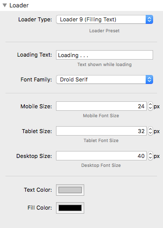
Filling Text


Loading Text
The actual text content that will be filled
Font Family
A list of fonts that can be used for the loading text
Mobile, Tablet, Desktop Size
These options can be used to set a specific size for the loading text on different device sizes.
Text Color
Controls the base color of the text
Fill Color
Controls the color that will fill over the base text
Rotating Circle With Image


Circle Size
Controls the maximum length of the bar
Border Size
Controls the thickness of the circle border
Base Color
Controls the background color of the circle
Fill Color
Controls the color of the inner circle fill
Loading Image
With this loader, an image can be added in the center, you will see options for adding the image, and controlling the size of the image (percentage).
