Setup
Add the stack to your page and open the settings panel.
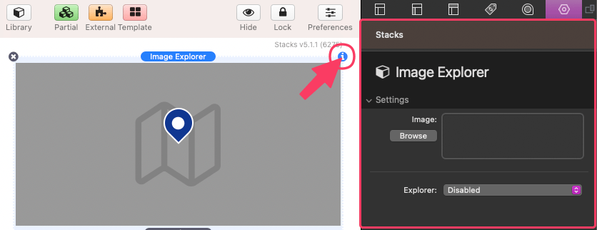
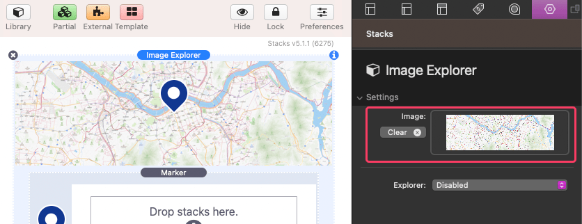
Add an image by dragging and dropping it into the Image field or using the browse button to select an image from your computer. The added image will display inside the stack while you edit.
Below the Image field, you’ll find a setting for enabling the Explorer feature. This allows your page visitors to pan the image by clicking and dragging or touch dragging on touch-enabled devices. However, we will focus on the Marker feature in this tutorial. Please refer to the “Explorer Options” tutorial for more information on the different options.
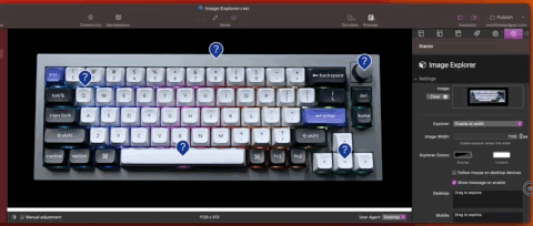
By default, there is a single Marker component below the image. If you don’t want to place markers on your image, you can delete this marker. Alternatively, you can add more markers using the blue add button.
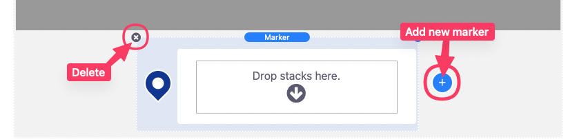
To edit a marker, select it and open the settings panel.
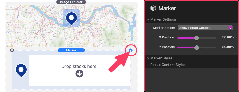
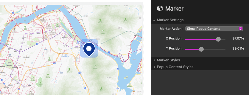
The first section of the settings panel contains marker settings. Here, you can choose a Marker Action, which determines what happens when the marker is clicked on. The “Show Popup Content” option displays custom content in a customizable popup window within the image. The “Link” option allows you to define a URL for the marker to navigate to instead of showing popup content. The “Off” option disables interaction with the marker entirely.
The other two marker settings control the X and Y positions of the marker within the image. A demonstration of the marker’s placement will be highlighted and updated as you make changes to the position.
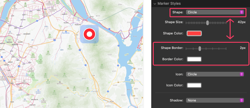
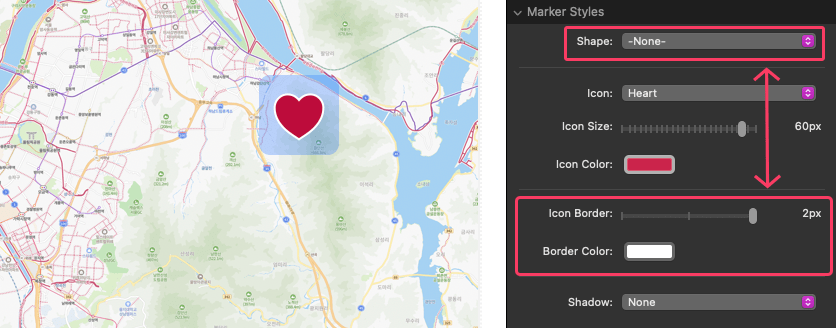
After positioning the marker correctly, move to the next section of the settings panel to modify the marker styles. Use the Shape select field to choose from three different marker shapes. You can also define the size and color of the shape. The “Map Marker” option will position the marker so that it points at the defined x and y position. The “Circle” and “Square” options will instead center the shape at the defined x and y position. If you only want to display an icon, you can select the “None” option to remove the marker shape.
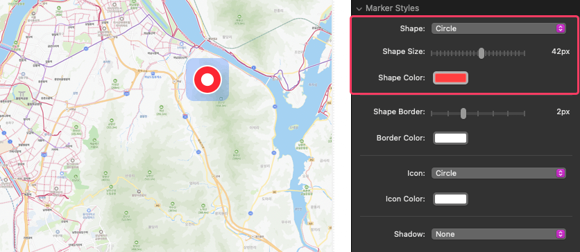
If the Shape setting is not set to “None,” you can adjust the size and color of the border around the shape using the Shape Border & Color fields.
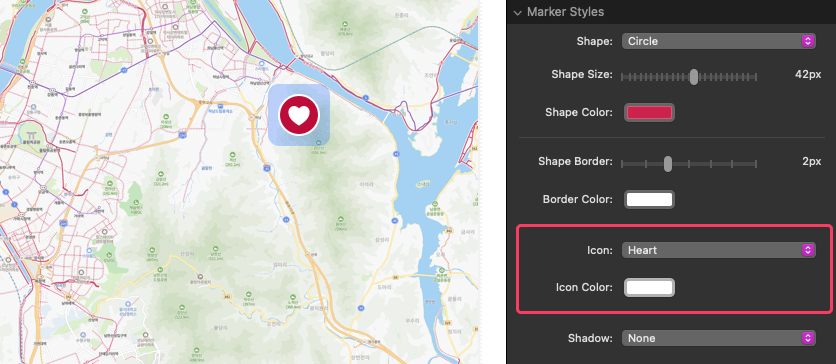
Below the Shape settings, you’ll find the Icon select field. It offers over 70 icons that can be assigned a custom color. You can also use the “Custom” option to add your own icon image. Additionally, there is a “Number” option to display a custom number instead of an icon. The “None” option disables the icon.
If the Shape setting is set to “None,” you can adjust the size and color of the border around the icon using the Icon Border & Color fields.
The Shadow select field allows you to optionally add a custom color shadow to the marker. The shadow appears at the bottom of the marker, and some options include an animation for highlighting specific or all markers on the image. If any shadow is applied, the marker position will adjust so that the shadow sits on the x and y position.
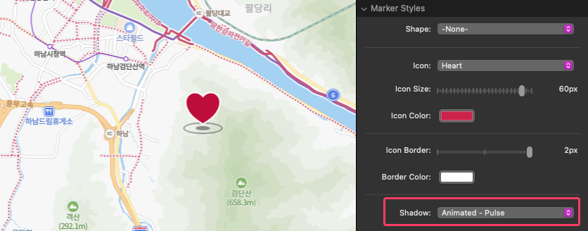
Shadow animations are only visible in preview or when published.
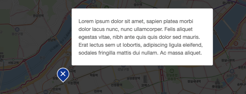
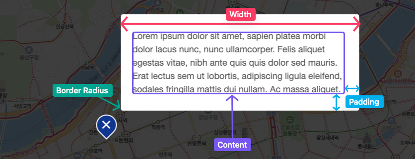
If you selected the “Show Popup Content” Marker Action, there will be a third section in the marker settings panel. The Width field allows you to define the width of the popup content. Use the Padding fields to adjust the space around the popup content from the left/right and top/bottom. The Border Radius field lets you round the corners of the popup.
Once you finish configuring the marker settings and styles, you can add any third-party stacks content to the marker popup content by placing it in the “Drop stacks here” area.

Explorer Options

In this tutorial, we will explore three different options available for the Explorer feature, each serving different purposes:
- “Always enabled”: This option is ideal for large images with markers, such as maps or floor plans. You can use the provided Explorer Height field to define the height of the explorer viewport. The width of the viewport will automatically match the available horizontal space. The image will display at its actual dimensions/size and will always expand beyond viewport. Visitors to your page will be able to pan the image to view any part that extends beyond the viewport.
If the image is too small to cover the viewport, it will scale up to fit allowing the image to only be panned vertically.
- “Enable at width”: Use this option when you want the image to be contained and only overflow when necessary, particularly on small screens where the available horizontal space would make the image too small to see or interact with. To implement this, specify a minimum acceptable width for the image using the Image Width field. If the available horizontal space is less than this value, the Explorer will activate, allowing the image to be panned while ensuring it is displayed at a desired size.
- “Enable on zoom”: This option is suitable for images with intricate details that require zooming in for examination. By default, the image will fill the available horizontal space and provide zoom in and out buttons. You can set the Base Width field to define the width of the image at 1x zoom. If the image is displayed smaller than this defined width, the first zoom-in will increase the image size to the defined width without affecting the viewport around the image. Visitors can then pan the viewport to explore any overflow. Additionally, you can use the Max Zoom field to include zoom options up to 16x the Base Width.
If the image is already larger than the defined Base Width multiplied by the Max Zoom, no zoom options will be displayed.
You can customize the appearance of the Explorer feature using the following settings:
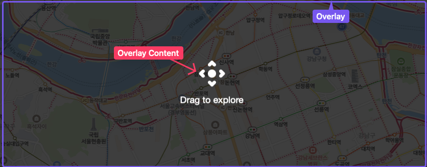
- Use the first Explorer Color field to define the color of an overlay that appears when a marker with popup content is clicked.
- The second Explorer Color field modifies the color of optional text or icons displayed when the overlay is active.
There are two additional options available:
- The “Follow mouse on desktop devices” checkbox allows panning of the image by hovering the mouse over it, instead of clicking and dragging, on desktop devices.
- The “Show message on enable” option displays a customizable text message when the explorer is activated for the first time. You can define separate messages for desktop and mobile devices, enabling you to provide tailored instructions based on the user’s device. The overlay will also display while the message is active.